Democratic Convention 2020 Bid Branding
by Andrew Papenheim · 15 March 2019
The Good, The Bad, and the Very Bad
As we prepare for pale lagers and fried cheese in the city of Socialist mayors, let us reflect upon the municipal beauty pageant organized for the benefit of the Democratic National Convention site selection committee. Yes, that is correct: The rooftop parties culminating in fireworks. The stadia reserved for a handful of people. The visits to Art Basel. …apparently, there were some managed strategies behind each of those spectacles all along.
Houston, Miami, and Milwaukee all developed pitches to woo the convention1 to their gracious premises. While the more familiar and costly examples of event-specific city branding may be related to the Olympic Games, municipalities are now investing considerable sums into branding themselves to attract specific meetings and conventions. Further, the response to an RFP is not merely sealed in a packet and shipped off to Washington. All three candidate cities are, to at least some degree, choosing to expose elements of their campaigns to the public online. As such, the study of political design needs to organize a new body of work: While we know well how the party pitches itself to the public, how does the public (via municipalities) pitch itself to the party?
Selected City: Milwaukee
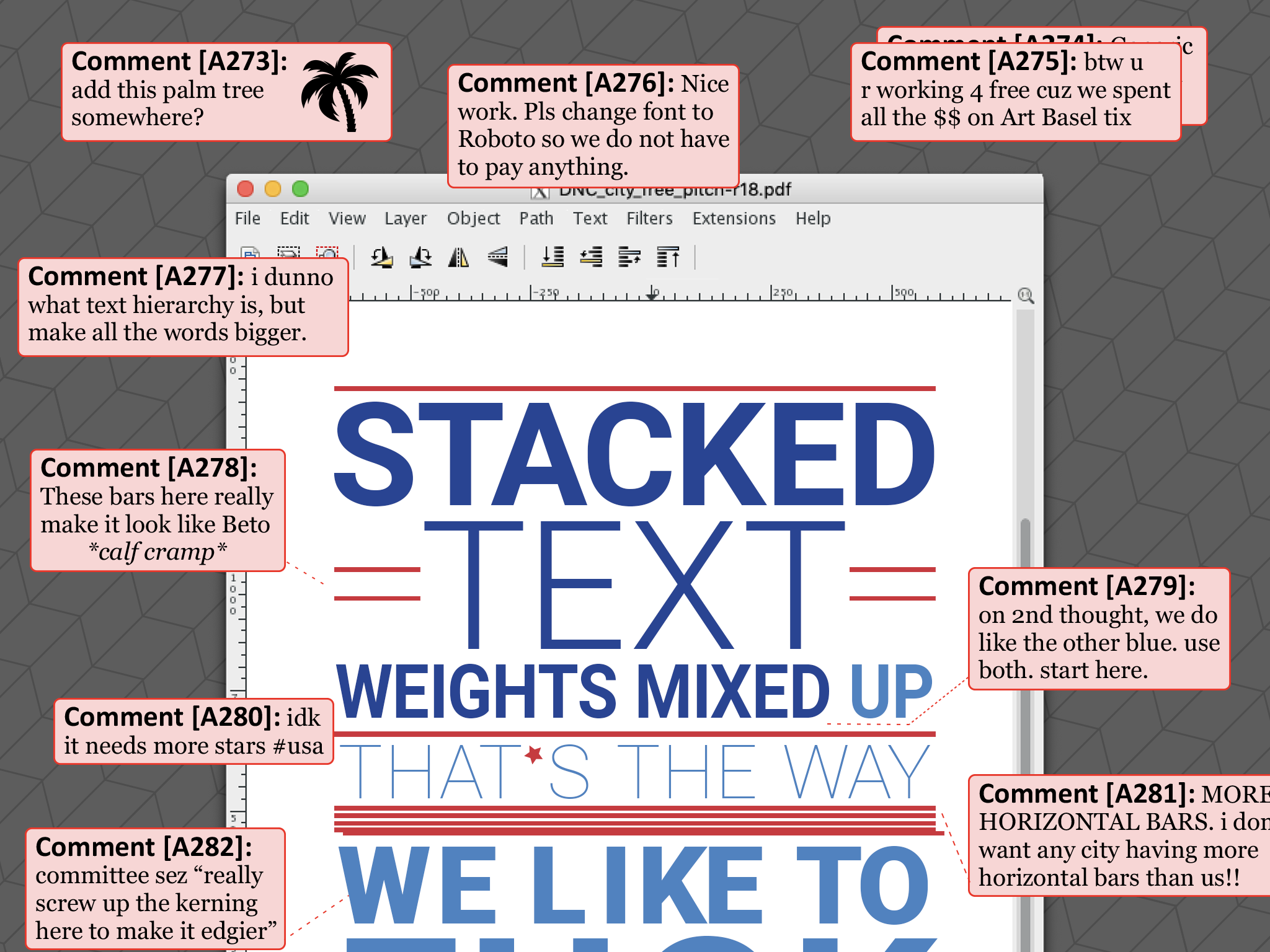
It is with dismay that I note my home state, a reservoir of creative people, announced their candidacy with visuals as above. A palette of red, white, and blue is the most hackneyed and unwelcome approach in the entire canon of US political visual identity. There is even a star, of which one would genuinely prefer evocation of the threadbare cliché of the US flag. When merely deposited onto a map, it erroneously suggests that Milwaukee is Wisconsin’s capital city. The horizontal bars are thin and spindly, while the type is thinner and spindlier.
The primary mark features stacked type in three weights. Weight differentiation makes sense when there is an underlying bed of purpose and structure. In this application, I strain to find such purpose. Why is DEMOCRATIC in a heavy weight? Why is the location of the event barely readable? I have no idea! The type is not set on a pixel grid, and the logos provided in their press kit (kudos!) are severely anti-aliased and difficult to read. One hesitates to file the capital charge – that the designer(s) pointlessly used multiple shades of red in this work – as it is certainly possible that such an appearance is merely a result of anti-aliasing on very thin graphics. …and how ever so emaciated those graphics get. It is distracting that the outline of Wisconsin, supplanting the terminal zero and drawn in far too much detail, is of a different stroke thickness than the date it is set alongside. The font looks to be Cooper Hewitt, a free, open-source face by Chester Jenkins and for the eponymous museum. A horizontal lockup is also available. There are no vector copies; I checked each press release.
Overly delicate, overly complex, and not tremendously successful. It would look okay on a free t-shirt. In smaller sizes, such as on the web, things get pretty gross.
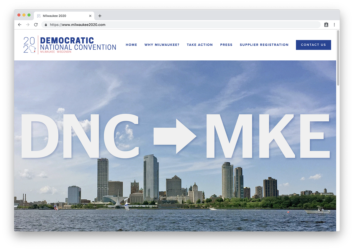
Let us talk about the web. The bid committee (The Good Land Committee, Inc.) does have a web presence. It is a SquareSpace webpage, nothing to write home about. The blue used in headings, navigation, and calls-to-action matches that used in the logo, which is nice. The red of the logo is not employed anywhere on the site, a mystifying choice being that the CTA buttons are crying out for the kind of urgency and differentiation that a strong red would offer. Selected photos emphasize the city’s experience hosting events, new public transit infrastructure, and half-billion dollar arena. In lieu of a press dossier (their press kit consists of nothing but headshot images), they offer a few un-proofed snippets laid over the Burke brise-soleil:
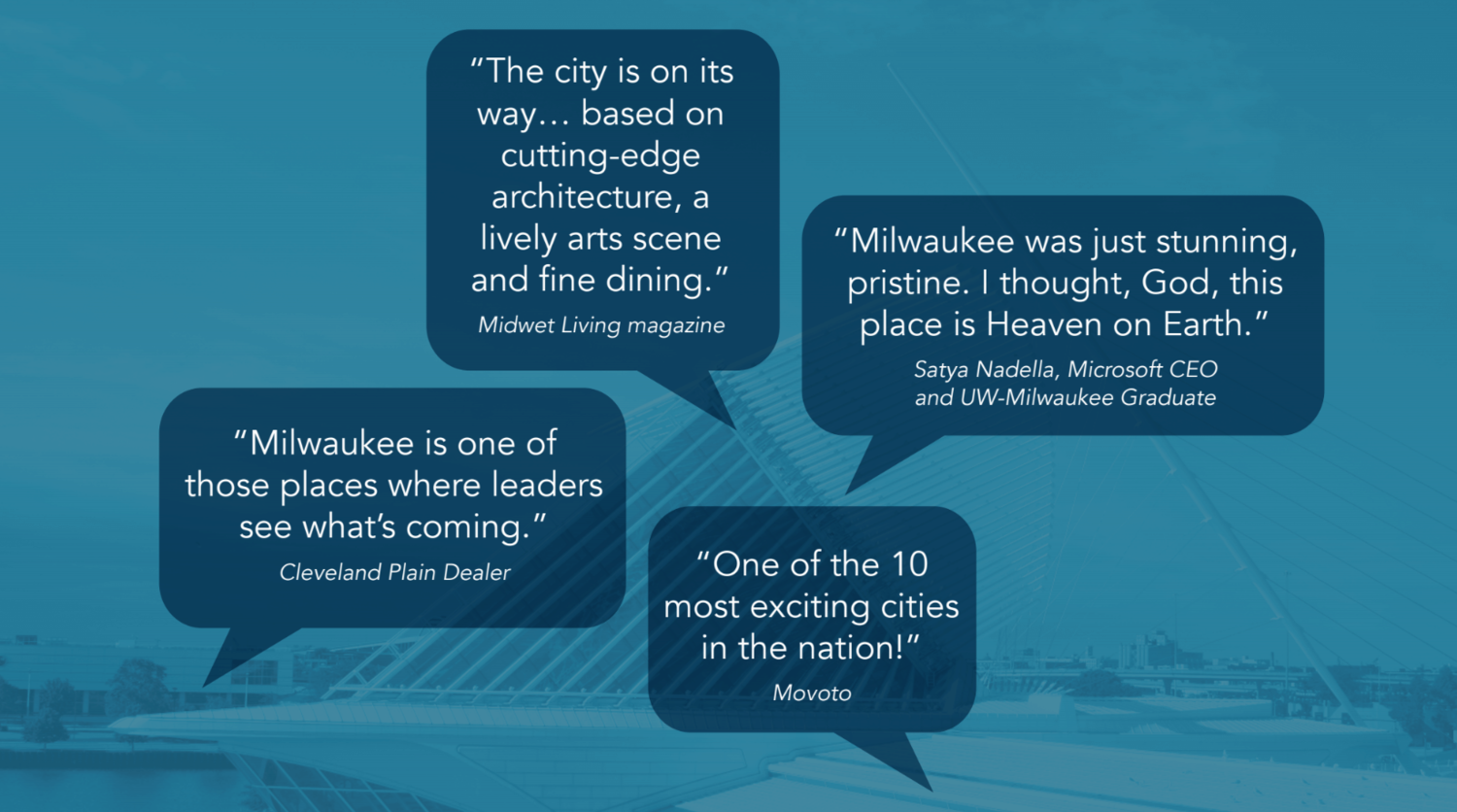
Which newsstand carries Midwet Living magazine?
The image choices are smart, though I am not sure experience hosting Summerfest is directly transferable to the Democratic National Convention, but meet the very bare minimum. Milwaukee’s bidding brand is unsubstantiated. Where are the links to favourable press coverage? Where are the food, arts, and architecture that make Milwaukee enticing? Where are the statistics assuring that this mid-size city can meet the accommodation demands of a large conference? Show the reader everything that makes Westown a great place to hold congress.
TRC is not in the habit of haranguing websites for their favicon, but this example proves extremely confusing. The favicon is a 100x138 pixel rectangle, which is unceremoniously transformed by Chrome into the… rather filled-out specimen shown below.
That is one plump Wisconsin.
But how harsh can I be on a design that carried the day? Let us look at the runners-up.
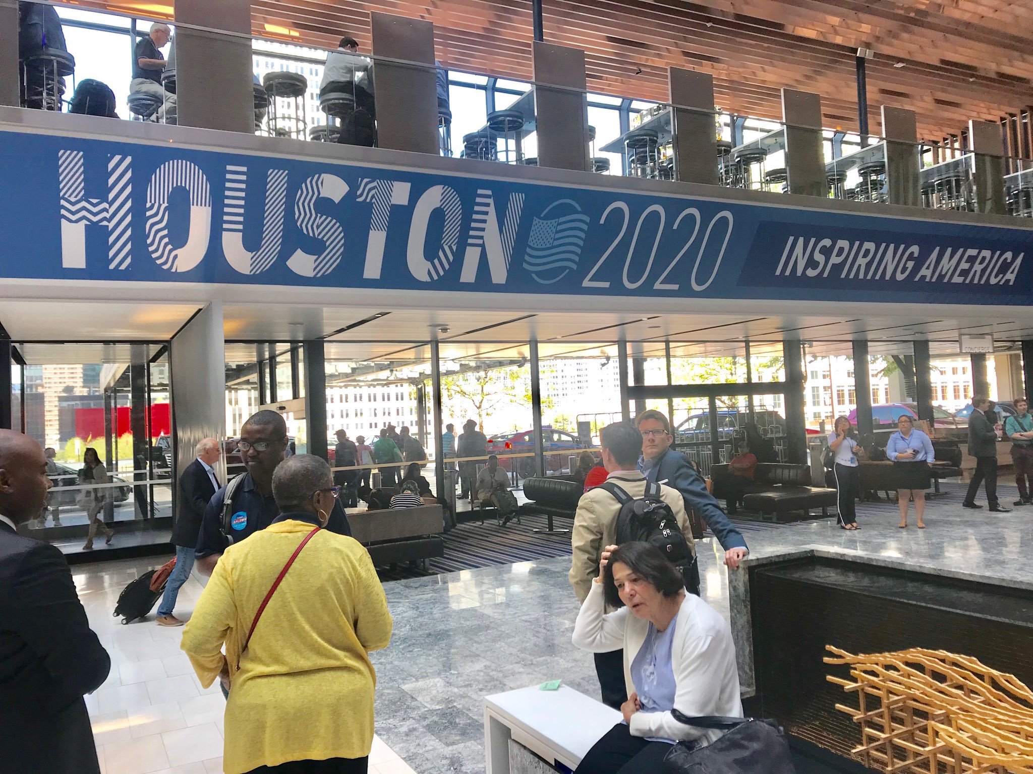
Candidate City: Houston
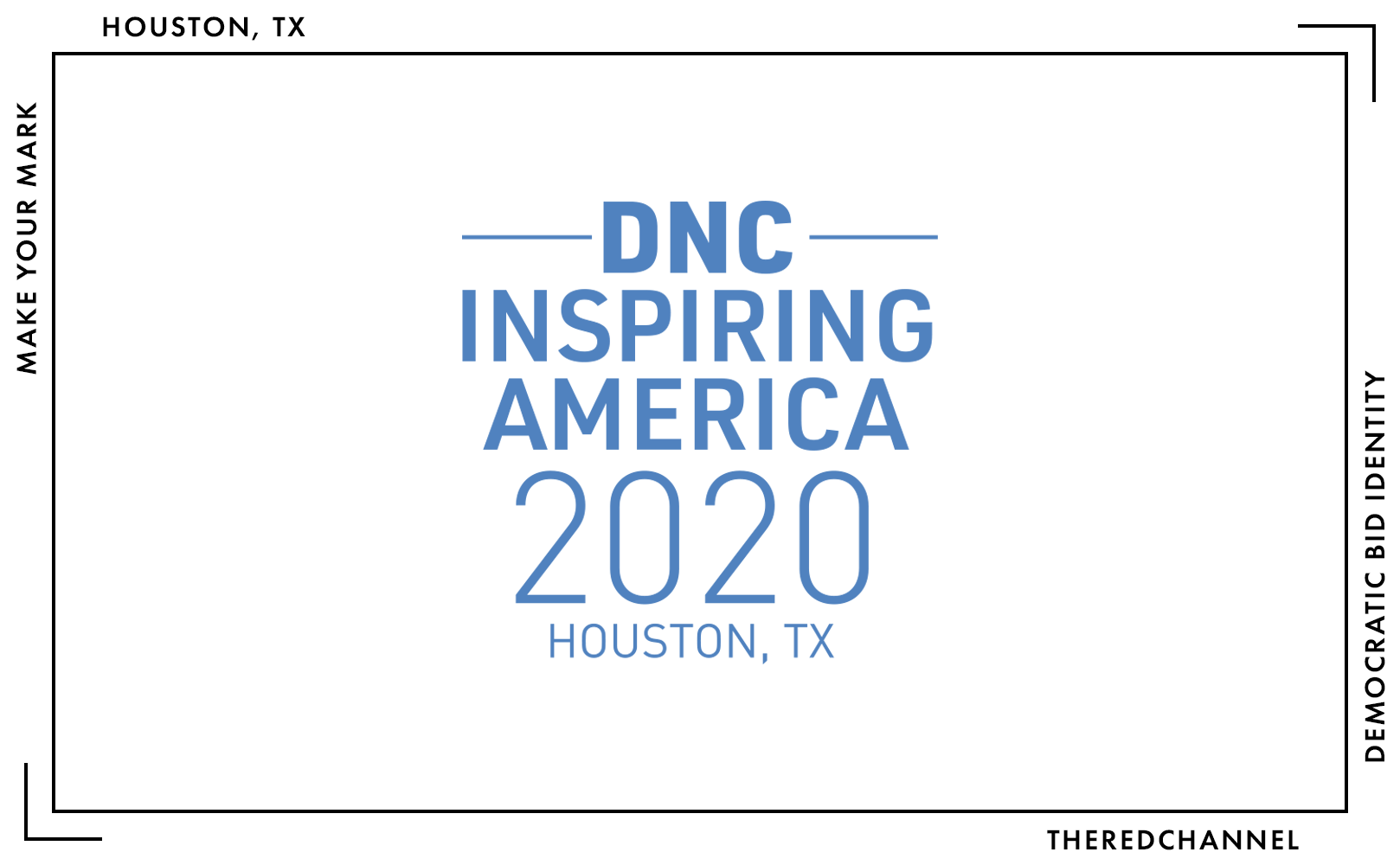
Just what I had hoped! More stacked text (it is URW DIN, by the way), more horizontal bars, more mixed weights. Nothing about this logo scans definitively Houston, and furthermore, nothing about it seems distinctively Texas. This bid comes with a slogan, “Inspiring America,” though unlike cat videos, tacos made from Doritos, and unlikely animal friendships, I fail to see how this identity itself could serve as an inspiration to the American public.
The yawning chasm between “Houston” and “2020” in the horizontal lockup makes absolutely zero sense. The use of mismatched weights on the lower text line eliminates the stylistic need for spacing, yet they kept it anyway. There is a thing or two for Milwaukee to learn about hierarchy in here, however. Notice: There is no unnecessary bolding of component words in the phrase “Democratic National Convention,” and it is place-first. Houston is the dominant element in this construction…

…except in the short-form horizontal lockup, where DNC magically transforms in relative importance. Oh well.
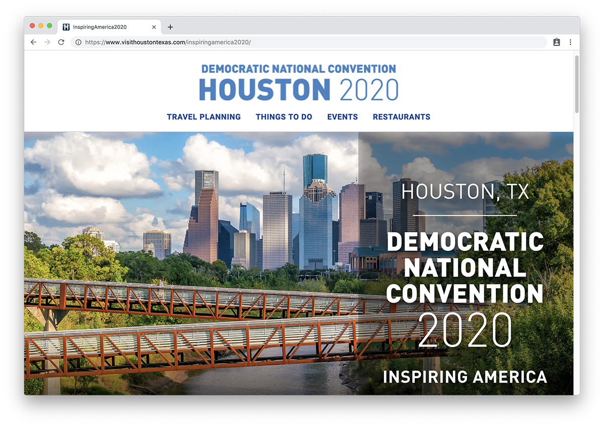
On the web, Houston opts for a landing page based off of the same template as their general tourism site, and which links liberally into said site. This is a smart approach. There is no need to duplicate high-quality content available elsewhere within the same organization, only a need to make it readily accessible.
Compared to the general home page, that which is unique to the Democratic Convention bid is the press dossier. They choose to refer to it as a “Houston Blog,” despite the fact that all links are external and none were authored by the committee. The articles selected for inclusion are quite smart, highlighting Houston’s billing as the most diverse metro area in the states, a lively dining scene, and the increasingly purple characteristics of Texas politics. (Purple Texas lore is catnip to Democrats.) There is a decent array of outlets showcased, with material from both national dailies and specialized magazines.
While the works of external authorship are well-represented, there is relatively scant promotional copy originating from the committee itself. I am not too bothered by it. The suggested reading is diverse and robust enough that the lack of original content may not necessarily be working to the site’s demerit. Why re-write what others wrote better, eh?
This site and the bid itself are the work of Houston First Corporation. One of three logos is in a vector format. Thanks for following best practice 33 per cent of the time, friends!2 Headings are, like the logo, set in URW DIN, while Google’s Roboto joins the party in the body text. Their front-end framework is Foundation from ZURB, and it is all via a CMS from destination marketing titan Simpleview.
Were the review to end here, that would be grand. A weak mark which does not overwhelm and dilute the (honestly, pretty decent) brand to which it is attached. Unfortunately, Houston sees the need to continue ahem Inspiring America with an explosion of heterogeneous identities applied to this bid.
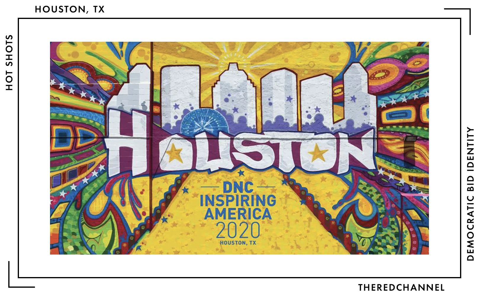
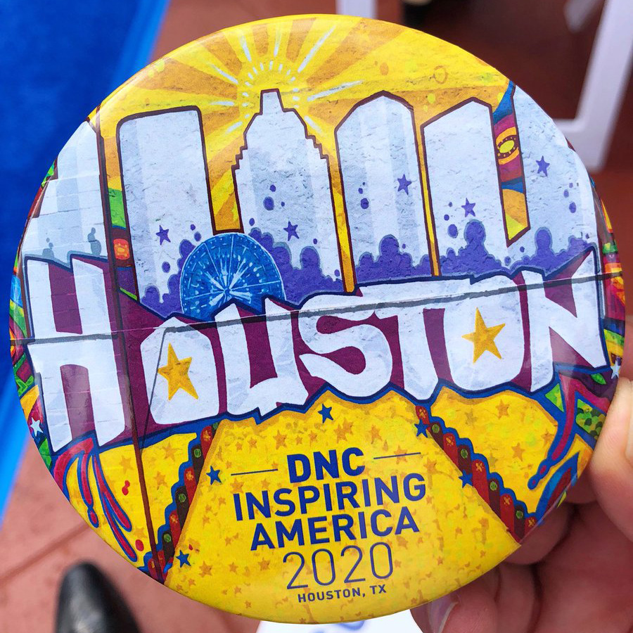
Shown above, courtesy of Mayor Sylvester Turner, is a colourful mural-type banner graphic unfurled for the visiting DNC site selection committee in August 2018. It is a distinctive visual element that bears some area resemblance. The graphic is quite clearly an adaptation of the Houston Is Inspired mural by GONZO247. It is also reminiscent of the mural installed by Grupo BT in a campaign targeted toward the Mexican and Latin American travel markets. As one component of a broader, mural-driven tourism marketing strategy, it makes sense. It also appears on brand collateral, depicted here on a button:
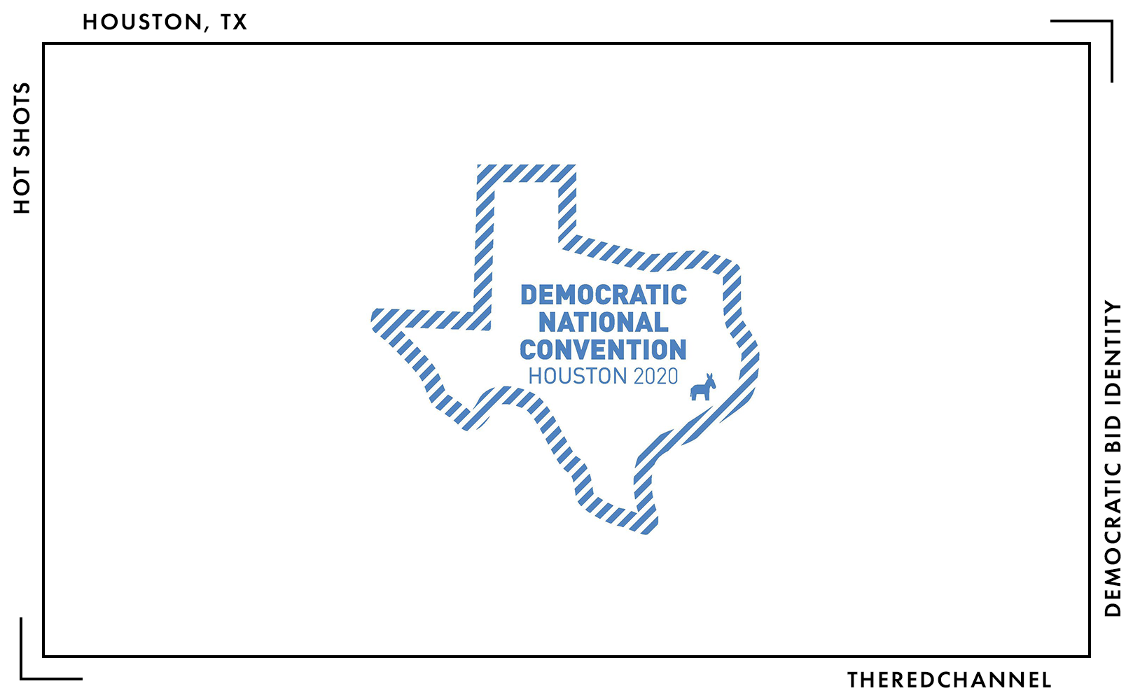
If identity experimentation was done and dusted by this point, the work would still be reconcilable. Instead, per Representative Gene Wu, the committee was to add a different mark altogether, an outline of Texas sporting a Democratic donkey sprouting from Houston’s city centre. (Though, free note to Milwaukee, this Not-the-Capital-of-Texas did not opt for a star.)
Cohesion suffers even further on the road. Blake Green spotted an advertising blitz in Chicago with the addition of various striped textures to the Houston wordmark.
Since they came this far, why not send the collateral completely off the rails, as well? Twitter’s own Seth Masket reports receiving a commemorative coin that is in a different style altogether.
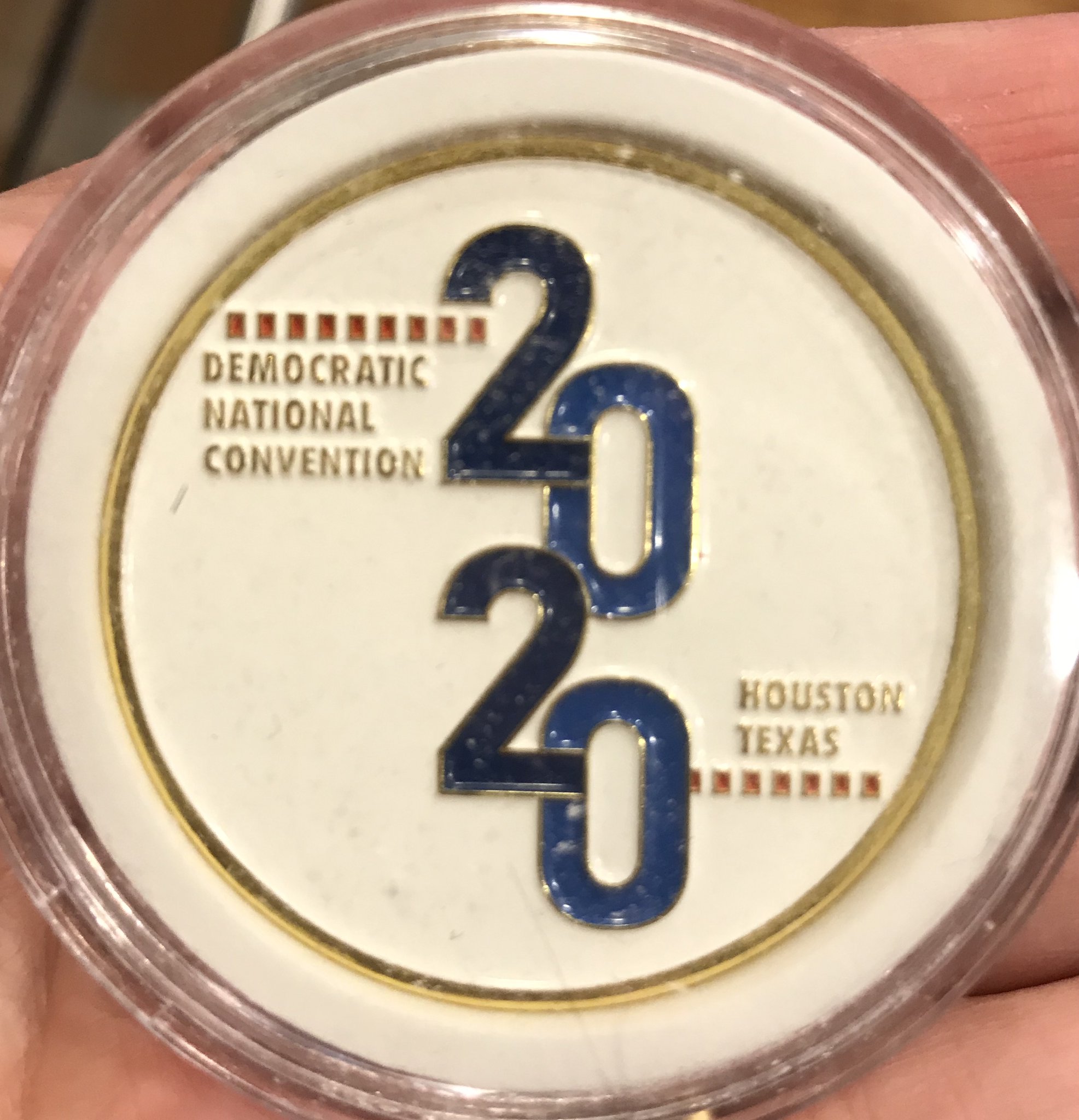
It sure is great that the bid committee had a budget healthy enough to make a whole bunch of fun stuff, but if the only things linking it all together are DIN fonts: Houston, we have an identity problem.
Candidate City: Miami
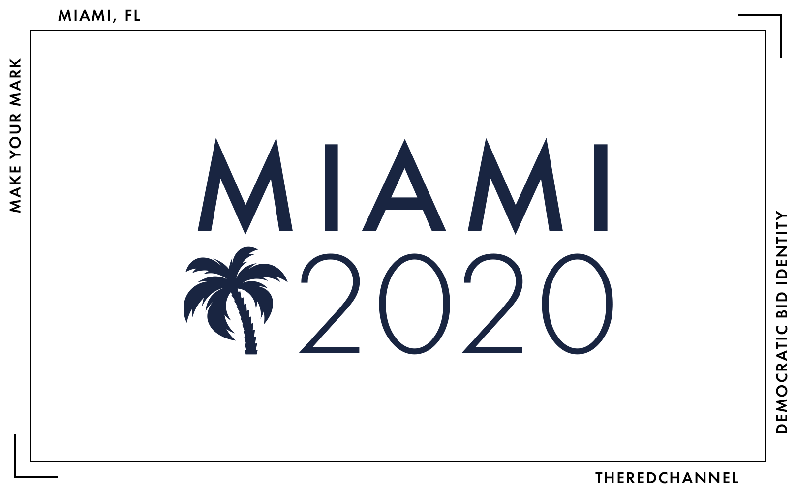
Does this logo evoke the feeling of Miami in mid-July? Is Miami in mid-July indeed a feeling that is desirable to express? Personally, I would be expressing nothing but mojito-tinged perspiration. It is unlikely my pores would ever forgive me, so it is quite lucky that Miami’s bid committee instead opted for a clipart palm. Call me an uncultured Québécois castaway, unable to differentiate reliably between a palm and a palmetto, but dark navy and a tropical tree immediately recalls the flag of South Carolina, not the energy of South Florida. Of the three, it is the only attempt at a symbolic identity, and the symbol is just okay.
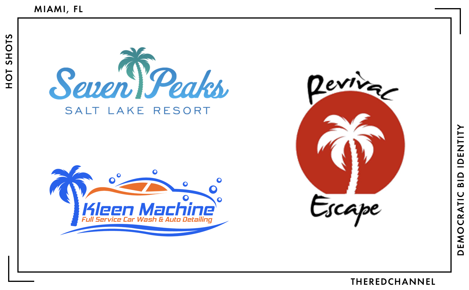
The gravest problem with the symbol is its lack of originality. The fault of imagination lies not with the broad concept of a palm , but with this specific palm. It sells waterparks in Provo, Utah. It sells car washes on the Space Coast. It sells fitness bootcamps in Phuket, Thailand. Walmart offers a version you can stick on your wall. It may not be of South Carolina, but is it of Utah? Of Thailand? Of nowhere?
One can buy a license to exploit the Miami bid committee’s symbol to their heart’s content from David Benes on just about any stock photography marketplace.
This is definitely a battle of the wordmarks, and on the word-y front, Miami is using… a Futura of some sort. Does not really matter which. It sure looks like URW’s to me, but I am not prepared to rule definitively off of such a small sample. I adore Futura. I can speak no ill of the choice to use Futura. In making such a choice, Miami co-opts the graphic heritage of everyone from Supreme Barbara Kruger, to Richard Nixon’s campaign buttons, to the innumerable candidates in the 2020 Democratic presidential primary who would very much like to grace Miami’s stage.
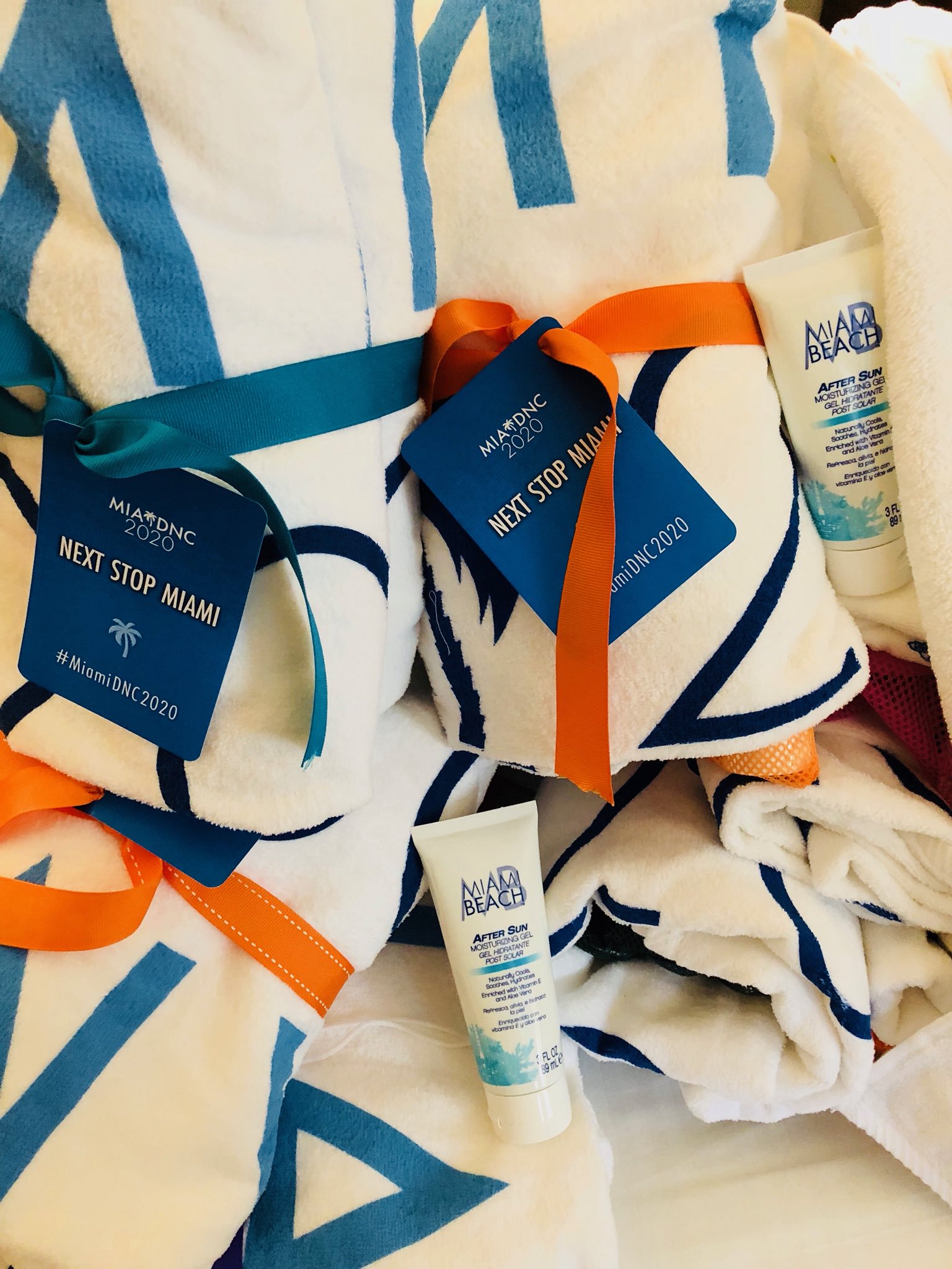
Marketing collateral includes the somewhat cheeky suggestion of a branded beach towel. I love it. In a sense, Miami gets off easy, able to offer branded parasols and sunglasses in their earthly paradise. What are the other pretenders to the throne to do? Perhaps Houston puts murals on take-home barrels of West Texas Intermediate, while Milwaukee serves up beer-battered cod nuggets in the shape of the state.3 Ah, to be so lucky as to live in Miami. Allow me to humbly suggest pairing these towels with a navy swizzle stick (topped with the brand’s jagged palm clipart, of course).
Miami is the only candidate city to produce a bid video released to the public. As I very much doubt their Twitter account’s continued vitality, it is mirrored on YouTube. On the audio track: It is a smarmy vision board of soothing buzzwords. The in-camera choices, however, are quite nice. It is a human-centric video, interspersed with the requisite envy shots of sun and sand, and it does indeed sell the idea of Miami as a trans-border locus of American community.
Interestingly, the bid materials of all three candidates take pains to stress the number of MNCs in their metro areas. That this is a pertinent fact in hosting the Democratic National Convention is fertile ground for a thinkpiece of its own, but this is not-that-time and not-that-type-of-blog.
I can only go so far evaluating the bid brand: An event invitation indicates the committee can be reached on the web at MiamiDNC2020.com, which is nice and all, but that domain is parked. There are no hits for it on Google. It is not captured in the Internet Archive. Thus, I must question whether such a website ever did, in fact, exist. Bummer.
Unique Challenges Posed in the Study of Bid Logos
Do notice that I opted to title this section “bid logos,” which gets to the heart of the most fundamental problem with these branding efforts – any attempt at actual branding, as a process, ranges from haphazard to nonexistent. The bid committees do not appear to have undertaken brand assessments of real rigour, positioning was not articulated to the designer, and the resulting product is an uninspiring visual system. Now, do bear in mind that a brand is not a visual system, but perceptions uniquely shaped through both an identity and corporate actions. Unless one is a cow, a brand is not a logo alone. Still, a brand is in no way served well by a half-hearted crack at one.
Bid logos are particularly vulnerable to bad outcomes. There are two principal anti-patterns here which are highly synergistic, and together do more damage than either acting alone: One of time, and the other, all-to-common to any design work which is civic in nature, of typical solicitation and selection processes.
These campaigns are highly ephemeral. In the Democratic Convention cases, public-facing promotional activity began in earnest around late August 2018. Site selection took place less than a year later, and the presences of those unlucky, second-best/first-loser cities will assuredly soon recede from view.
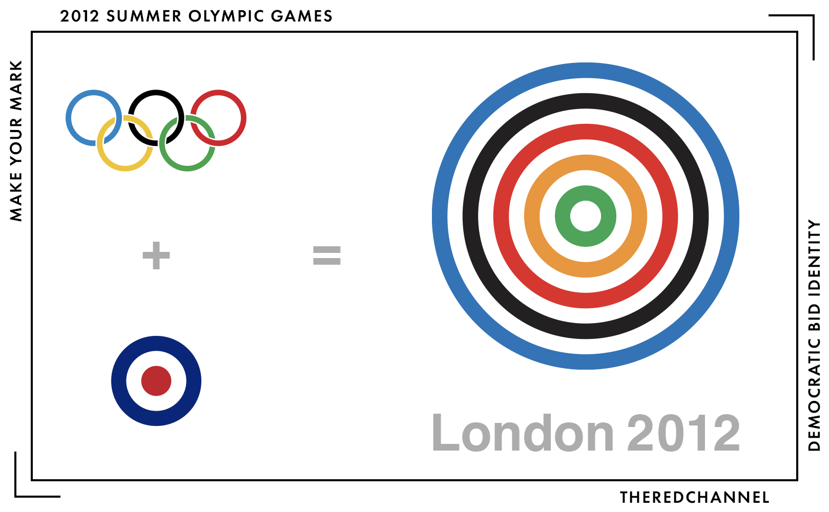
Partly as a consequence of their shelf life, candidature campaigns are designed on a shoestring. Construction constraints far too often lead to misbehaviour. Recall that the London 2012 Summer Olympics bid logo, an identity acquired through a crowd-sourced approach which attracted 1100 gratis submissions, was to be judged by a motley panel of laypersons. Per Michael Johnson, this pile of 1100 was summarily and opaquely chopped down to just seven put before the committee and, harmonizing the chaos of a crowd-sourced free pitch with the chaos of crowd-sourced free opinions on said pitches, that sagely group was unable to arrive at a consensus. The compromise result, yet another ribbon logo:
Yawn. Much like Johnson, I tend to prefer Daniel Eatock’s submission, which did not even make the arbitrary shortlist:
But how is Johnson to advocate from any position of authority on a panel composed of “a celebrity, [Johnson], a taxi driver, an athlete (and a bunch of suits)”? Not to go all Tom Nichols here, but such choices place a zero value on the expertise and experience of the professionals one has ideally entrusted to handle this skilled work. So, we arrive at a first iron law of civic branding: Do not outsource the selection procedure. When crowd-sourced approaches are not resulting in bland, uninspired compromises, they alternatively show their tendencies to permit far more pernicious abuses:
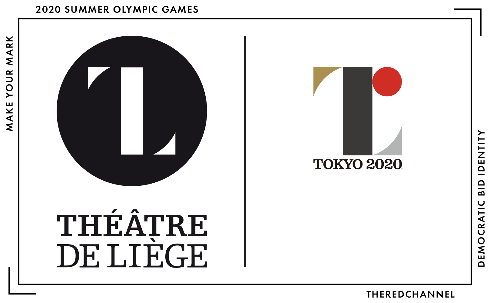
Recall the 2020 Tokyo Games imbroglio, a contest culminating in symbols similar enough to catapult a studio in Wallonia onto the world stage. The symbol of the Théâtre de Liège is not trademarked and hence did not generate a hit in Tokyo’s perfunctory search of global trade marks. The Japan-based selection committee, understandably not versed in the current graphics portfolios of the French bits of Belgium, did not catch it. The artist, standing to gain up to the princely sum of a little over eight thousand U.S. dollars (but, as it was a free pitch, likely zero), did not invest the time necessary to validate the mark’s originality. Is it any wonder that a thorough review against existing marks was never conducted?
Eight thousand dollars, while nothing to sneeze at, is a wholly inappropriate sum for this kind of mark. It will be reproduced on high-profile platforms world-wide. Of course it will get back to the Walloons. Alright, a second iron law: Place a high value on the practice of design. Organizers implement brand strategies and identifying marks because they value their event and value that it looks consistently good. The practice must be similarly valued to the output, or the output will only suffer in quality.
Spec work does nothing but define the value of design down. But “hire a tonne, pay only one” is not the only sin of the, how to put it, over-enthusiastic selection committees often present in and around civic identification:
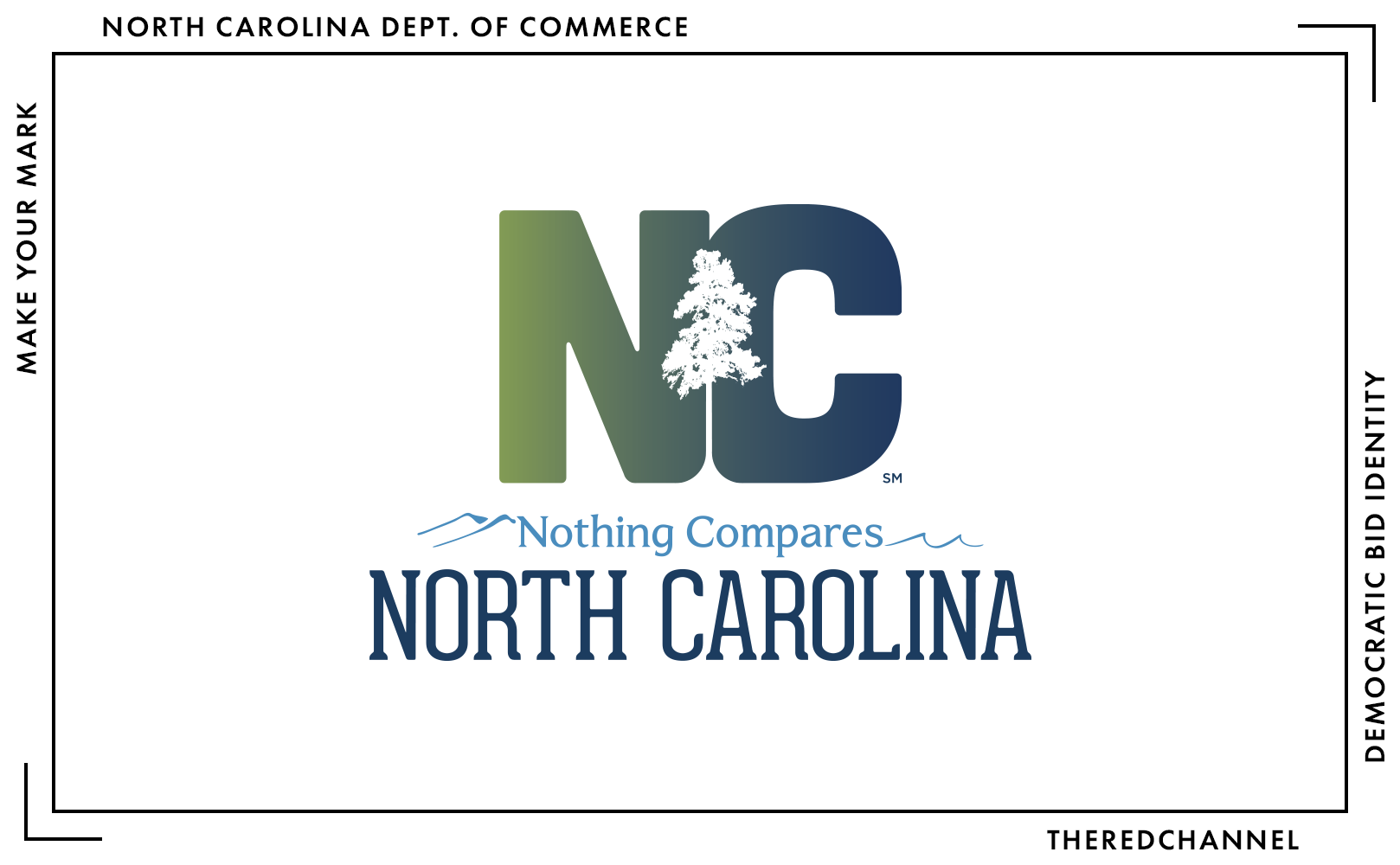
Over-involvement of selection authorities can, with results similar to North Carolina’s state brand, result in the incorporation of far too much information at the expense of cohesion and meaning. Too many blues, a questionable green, bizarrely-modified type with a gradient slapped onto it, an absurdly detailed and difficult-to-reproduce pine tree for some reason… all set above the waves, the mountains, and a whole jumble of typefaces that really do not work well together. It feels like the aggregate of everyone’s opinion, and as such, pleases no one. A good mark should be singularly opinionated. It should push a point-of-view. As such, one will never please all parties sitting on a diverse committee. That is okay, steamroll them!
No, we cannot see how the wordmark would look in Souvenir; no, we are not about to incorporate the clipart you found online into a second symbol; and no, we will not put a drop shadow behind it.
All great place brands are fundamentally arguments – do not kneecap them!
Status Forward wrote a dramatic re-enactment of how this design process may have played out, and it makes for excellent light reading.
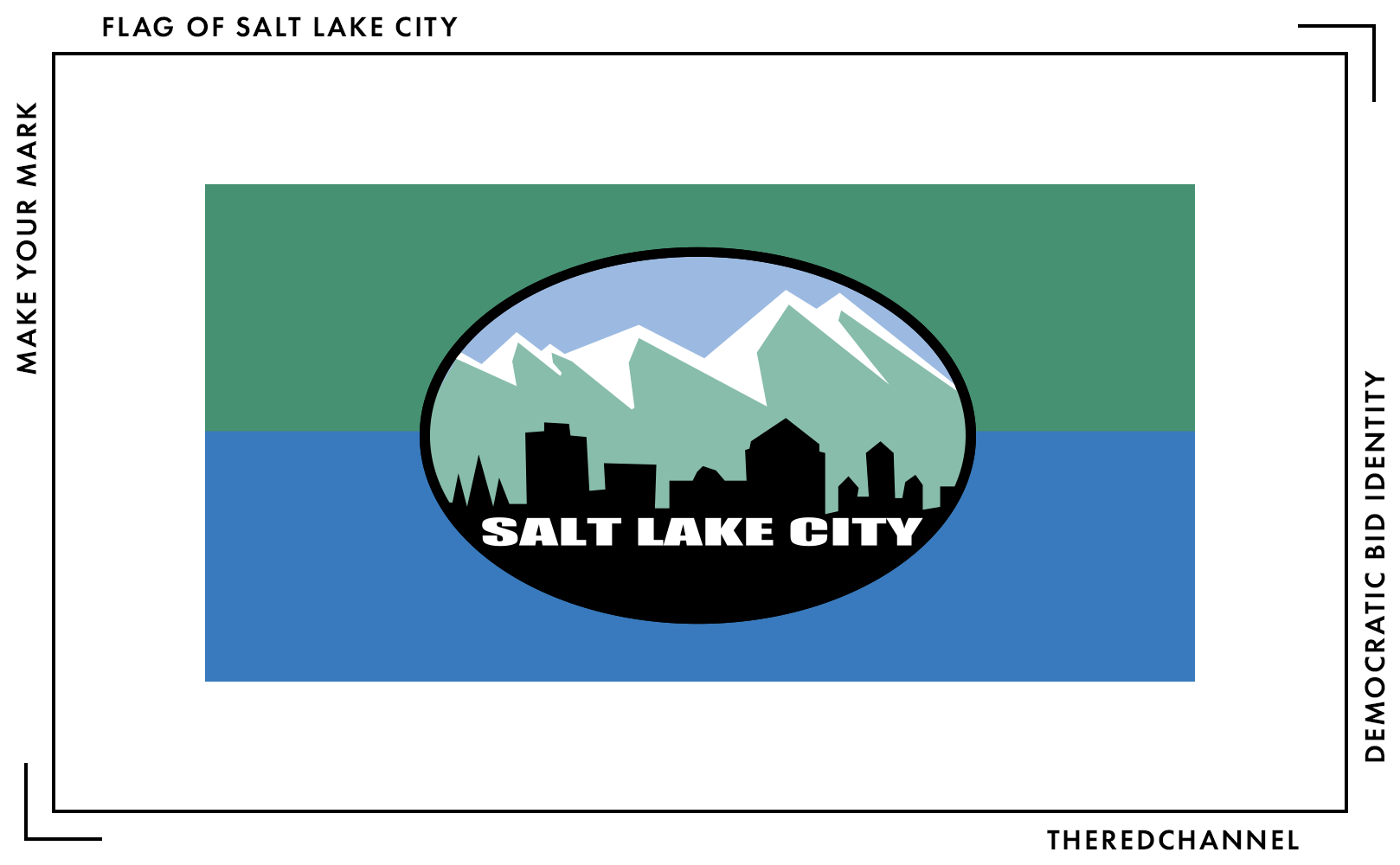
Neither is it acceptable to off-load work in a field which requires considerable judgement and skill to a friend-of-the-board with a copy of CorelDRAW, which is the only explanation that jumps to mind for the flag of Salt Lake City. It feels more like the title card for an off-brand remake in the Survivor franchise than an identifying symbol fit for the Crossroads of the West.
This is not to disabuse the reader of what beauty there is in municipal logos, even short-term bid logos. Returning to the Olympics, and keeping this from being a roundly negative article, here are two cases which, especially given their context, show flashes of brilliance:
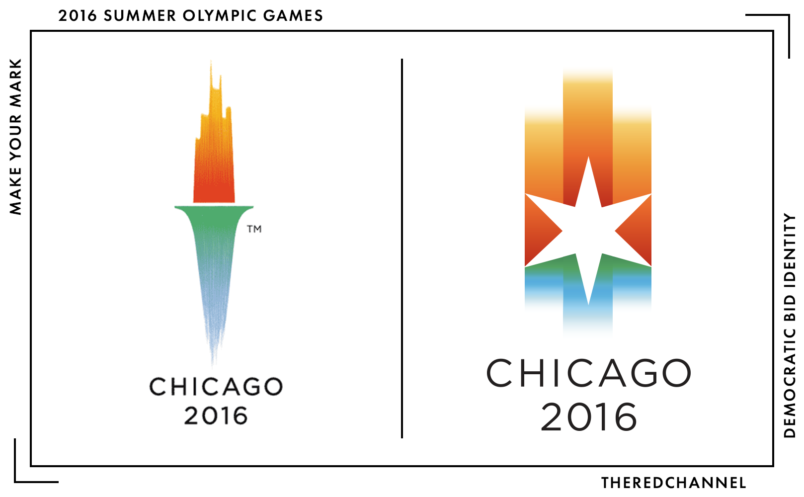
At left is the VSA Partners logo for Chicago’s Summer Olympics bid made in 2006. The CBD skyline licks upward like flames from the ashes of a complicated past, while Lake Michigan takes the form of a verdigris-clad torch body in a stroke of beautiful brushwork. I am a fan of neither gradients, nor complex brushwork in marks, yet I cannot deny the appeal and sophistication of this attempt.
All was right with the world until late 2007, when the IOC ruled in a circular that candidate city brands…
…shall not contain the Olympic symbol, the Olympic motto, the Olympic flag, any other Olympic-related imagery (such as) flame, torch, medal, etc. [Link]
This left Chicago in crisis, holding nothing more than an illegalized work. VSA once again sprung into action, constructing the Chicago Star (above, at right). The vertical gradient is shifted but maintained, while the six-pointed star defacing that gradient is a nice hat tip to the city flag. I do not buy the rationale provided for the rather arbitrary colours selected, but I find it to be very strong work. Stronger and more versatile, in fact, than the first crack. A graceful, well-constructed mark crafted under chaos conditions.
VSA did all this (twice!) pro bono for the city that they love. Top notch!
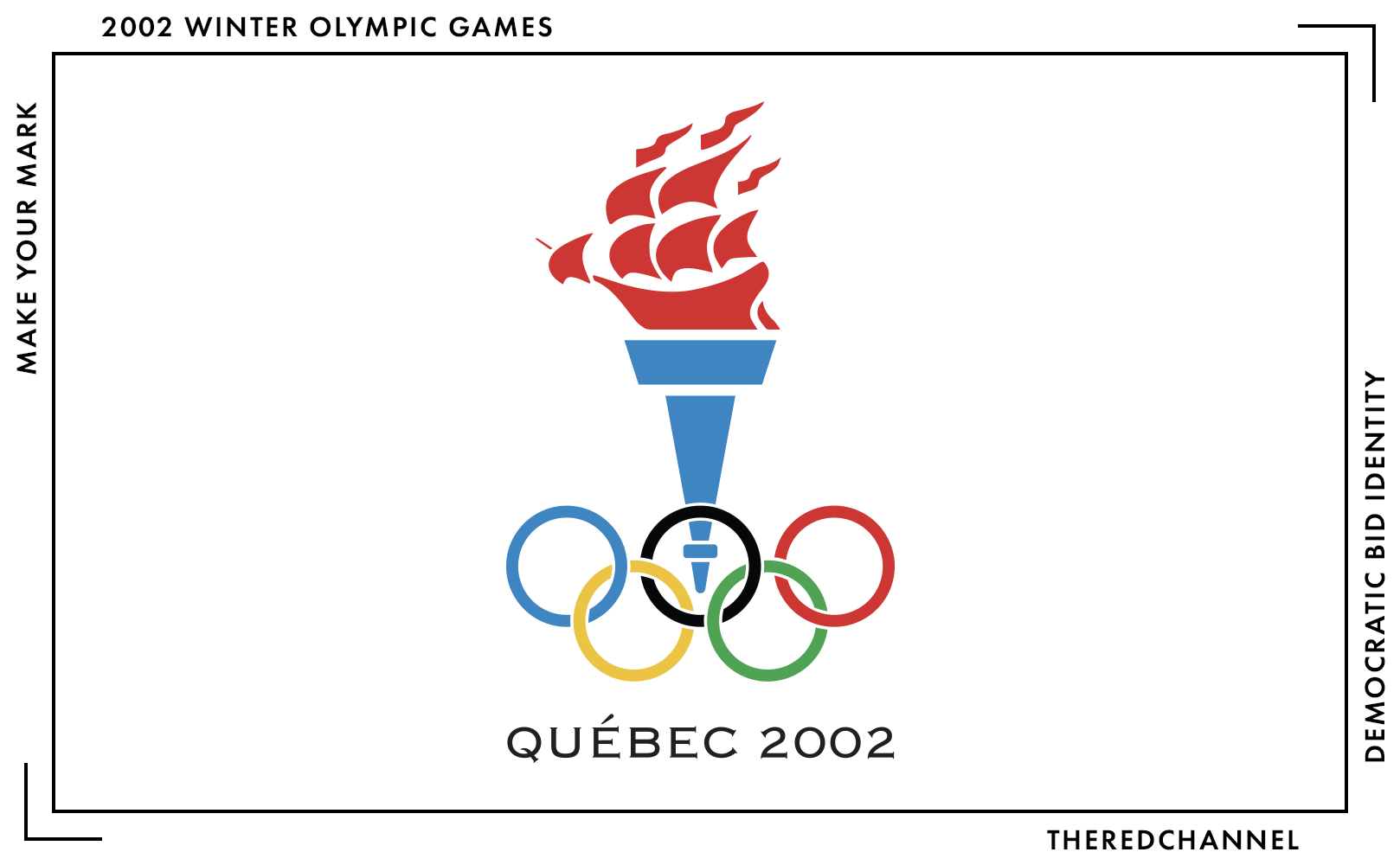
Another mark that leaves me quite pleased is Québec City’s bid for the 2002 Winter Games. Here, Samuel de Champlain’s ship replaces the flames of the Olympic torch. The work is admittedly quite simple. The decision to use Copperplate Gothic is, to be frank, confusing and underwhelming. Why am I nonetheless happy with it? It neatly avoids a tic which has come to characterize our few arpents of snow: In the annals of Canadian (and also very much Québécois) iconography, it is taken as a given that one’s Canadian-ness must be overwrought. A stylized eleven-point maple leaf (or fleur-de-lys) can and should adorn every surface. While I am a proponent of Maximum Canada, I am not convinced that this is what anyone had in mind.
We must shoehorn, to the point of self-parody, our country’s distinctive marks into everything we produce. This mark subverts that trope. There is no fleur-de-lys, no tortured attempt to warp some non-maple-object into a national symbol, and yet it is essentially Québécois. Beyond the incorporation of Champlain’s ship, there is a preponderance of cyan-heavy blue. 100% cyan, of course, is our national shade, and was the identifying colour of the Gouvernement du Québec at the time. The colour management is smart for another reason: It samples exclusively from the colours of the Olympic rings. The Olympic rings are already a five colour logo, and adding more is only to the benefit of confusion. Many bid logos of this time period feel like nothing more than complex set dressing around the rings themselves, while this feels like a cohesive whole. Clever work.4 Don de Dieu feray valoir, indeed.
This mark is mostly lost to the sands of time. Even in our national archives, it is tough to come by. A (UV damaged!) poster carrying the logo recently realized $3,000 at auction. I think paying three thousand dollars for a poster is total bullshit. So here, I snagged a copy for you. [PDF] Obviously, it is for your private study. Do not print it, do not sell it, do not think about selling it, do not modify it, do not look at it for too long, do not fold, spindle, or mutilate, etc.
Conclusions
tl;dr: It is arguable whether a bid to host a public event indeed requires a separate brand at all. My prescription for municipalities would be to consider leaning on the strength of their existing place brand. (You folks do have a place brand, correct?) Branded collateral targeted towards meeting and event planners should already be comfortably within a destination city’s repertoire: Here is an example from Houston. Here is a smartly designed portal for Milwaukee. Here is Miami’s, with 12 well-produced videos that likely came at no small expense. Not only is it cost-effective to adapt existing materials to meet new demands, but the bid then carries the brand value and goodwill associated with these longer-running, generalist campaigns.
Instead, the results of this most recent effort are hastily-constructed orphans. This is apparent in the branded materials, ranging in quality from unfinished to nonexistent. This is apparent in the forgettable design that is designed to be forgotten. This coterie of stacked wordmarks – in Democratic blues, in mixed weights, in inoffensive typefaces and not much else – lacks staying power in the consciousness. For most, they will be gone before they even entered.
The question stuck in my craw as I write this article is: Who, precisely, is the audience for a candidature brand? Is this all corporate pageantry? The Democratic National Committee does indeed want to hear about how great an area is, as well as how amenable it is to their event. This can certainly be assisted through attachment of branded materials to an RFP response, but does not really require new branded materials. This stuff is not cheap when done well, and cities appear to be doing this both not well and not cheaply. Houston’s unsuccessful bid has already been a drain on the public coffers to the tune of $680,000. Personally, I see a far greater return in shipping Washington a copy of Houston’s event planning guide, and instead using that half million to throw up a few more murals, produce a walking tour booklet, and further the development of other visitor markets.
I feel the audience for these efforts may, instead and at least in part, be the public. There is no need for public-facing webpages, murals, concerts, and social media accounts if one’s audience is Tom Perez alone. Either it is jumping the gun and beginning the tourism pitch before the visitors have occasion to come, or this is an attempt by municipalities to engage their own residents in the excitement of bidding for a mega-event. Setting aside that involving the social media-addled populace in this process can backfire spectacularly, I am not sure the push for engagements is gaining any purchase. As of midnight 12 March, the Twitter page for Miami’s DNC bid boasts 283 followers. Houston never bothered to make one, so they are sitting at zero. Milwaukee has 1,507, though this surely derives in no small part from the euphoric afterglow of being selected as the host city. (As a point of comparison, Milwaukee 2020 had 717 followers on 4 February 2019.) If this is meant for the public, the public is not clicking.
Discerning one’s audience is the very first step in communicating effectively. Is this a participatory campaign, for and by the city, or is it corporate pillow-fluffing? Ambiguity here wastes time, wastes money, and serves no one well.
Some graphical best practices for attracting meetings and events:
- Are you sure that you really need new graphics? Positive?
- Yes, I am sure. Fine, then do not send designers out in the dark. The result will not make anyone happy. Complete a brand assessment and begin with some preliminary positioning work before involving them.
- Know the audience. Any candidature campaign that is intended to engage the residents of a city in the process must be engineered catering to their perspective from day one.
- Avoid spec work if at all possible. A tonne of unremunerated effort is not merely a nice-to-have. This is a matter of mutual respect among professionals. Refer to AIGA’s position on spec work.
- If budgetary constraints necessitate the use of spec work, place a hard limit on the number of proposals solicited. Do make sure to divulge this number to the relevant firms. 🔥 Hot Tip: Want firms to value work that they are doing for free? Try to cap it at three. 🔥
- If one calls for a free pitch on a logo, do not similarly free pitch the process of selection itself.
- In fact, one should never free pitch opinions on visual identity systems.
- Unless the bid is for the Olympics, a new visual system is likely not required at all. Return to point #1.
- Seriously, just work within the existing place brand. If the visual identity is weak, this is a great excuse to develop a new one.
![]()
Hi, fancy seeing you down here! I write TheRedChannel to increase civic-minded visual literacy. This work is available to the end user without advertisements and free-of-charge, and I think it is important to try and keep it that way forever. If you saw something here that made you happy today, please do consider helping to keep the lights on and the servers running.
If you saw something that made you unhappy today, please flame me on Twitter!
-
As well as the small matter of the 50,000 visitors, accommodation surge pricing, and all the world’s cameras that come part-and-parcel with the event. Read more about the economic and social impact of political conventions for host cities at CityLab and ESI. ↩︎
-
No really, thanks! None of the other candidate cities bothered with even a single vector logo. ↩︎
-
Note that while neither of these things Is-A-Thing, it would be super cool if they were. ↩︎
-
It was less clever when Québec recycled the idea for their 2010 bid. [LINK] ↩︎