2020 Visual Identity: The View at the Starting Line
by Andrew Papenheim · 10 February 2019
We are a bit less than a year out from Iowa caucuses. A whole raft of people are seeking the expeditious removal of Donald Trump, and they are starting their work early. As someone who shares their interest in the expeditious removal of Donald Trump, but also as someone who does not want to endure one more millisecond of this primary season than absolutely necessary, I feel that now is the appropriate time to jump in and begin writing on the embryonic campaign identities.
Any textbook published following 2008 or anyone selling marketing services will laud the newfound primacy of design in political communication, though as recent events have thrown into painful relief, a campaign does not necessarily live or die on decent design. Despite this, candidates will generally put varying amounts of money into looking good, with similarly varying degrees of success. The exuberance of the late aughts may have been unwarranted, but the anti-design ethos of the current unpleasantness is by no means thus necessarily the answer. There are myriad (slightly more important, I suppose) factors upon which a campaign may live or die, but a candidate who affords due consideration to their logo, web presence, merchandise, and printed communication is an absolute joy to follow through the dismal ordeal of electoral politics. This article will break down the particulars of everyone running1, even some token aspirants from the snowball’s chance parties, in order of the date they announced.
They’re Running: Delaney, Nwadike Jr., Yang, Braun, Wells, McAfee, Gabbard, Castro, Harris, Williamson, Booker, Warren, Klobuchar
They’re Basically Running: Gillibrand, Hunter, Buttigieg, Brown, Schultz
They Ran: Ojeda
Note: This is a collation of what has every right to be eighteen individual posts. There are a lot of images and it gets lengthy. Check out the hamburger button at the top right should you wish to jump directly to a favourite. Oh, and I do not own and make no claims of ownership over any of the graphic assets depicted below, which are the property of the relevant campaigns. Any identifying marks down there appear for editorial and informational purposes in the service of commentary on each aspirant's campaign visual identity. I have no affiliation with – and claim no affiliation with – any campaign. Anything in here which might seem to imply otherwise is hashtag-fake-news-media. Okay, allez-go!
They’re Running
John Delaney
![]()
Date Announced: 28 July 2017. (An amazing 562 days at date of publication.)
Slogan: “Focus on the Future”
It takes more than a focus on the future to start running for president in 2017 and see it through to completion: It takes blinders, magnifying goggles fixed on that light at the end of the tunnel, an indestructible larynx, and, likely, stimulants. Delaney has been running this campaign since I was but a wee lad. The branding and website are the handiwork of Rally Campaigns. (Here is the FEC filing.) Going by their portfolio, this is Rally’s first presidential campaign, so let us show an abundance of good humour and charity.
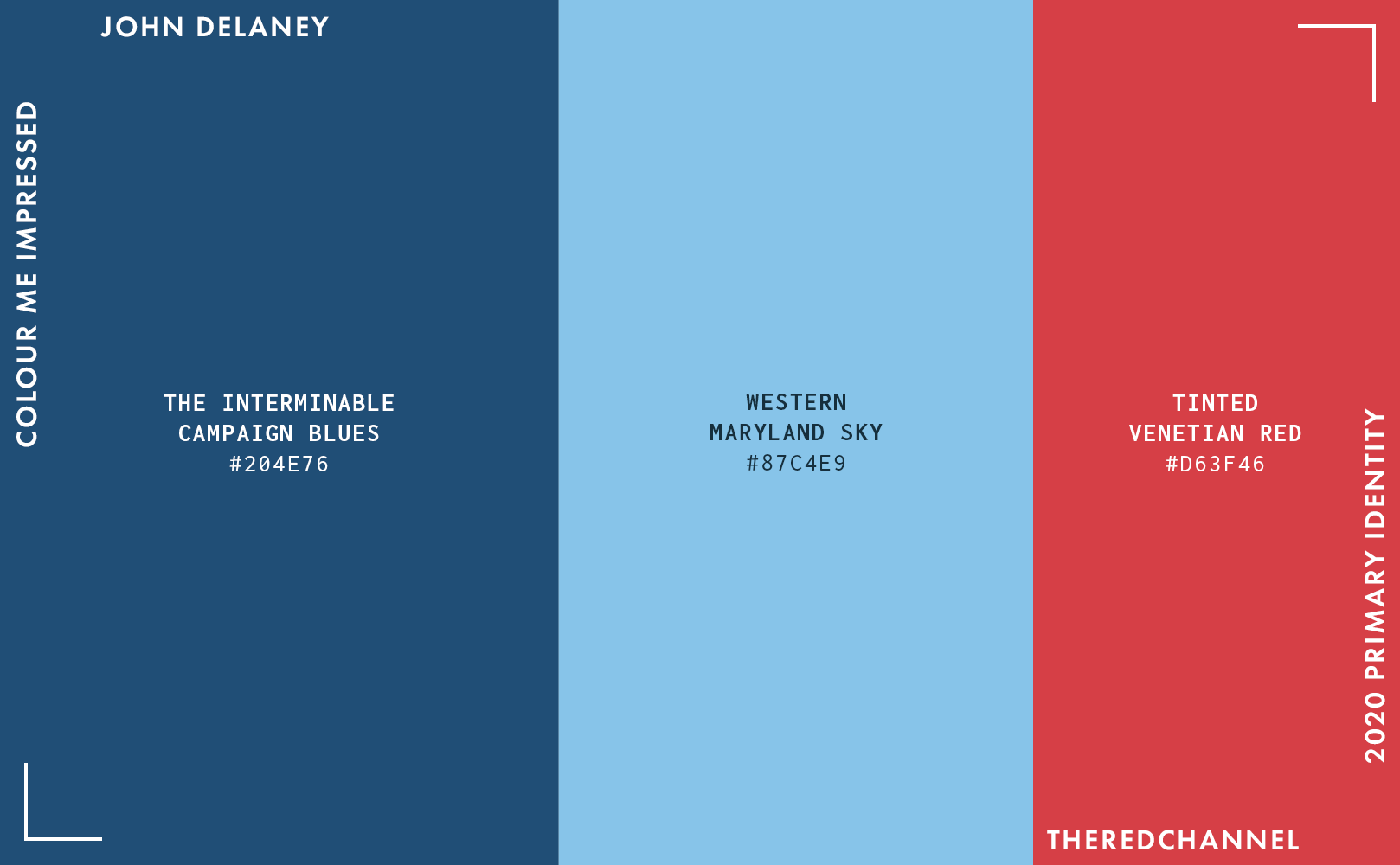
The colours are confined to the traditional U.S. political palette, a smattering of reds and blues, though the bit edging towards cyan is a by-no-means-original break from the monotony. Thank heavens Rally has the good sense to shy from #ff0000 and #0000ff. Of particular note, the use of initial caps in the logotype stands relatively unique in the 2020 field. I do enjoy that the first letter suits itself well to being broken out for standalone use. It is a fine corporate mark, in corporate colours. Tireless, like anyone who has been campaigning for 562 days with another 632 to the general. Trusted. Sedate.
The defaced D appears – and I am fully aware this is from an original insight – rather directly cribbed from Sol Sender. We paved Obama’s pastoral paradise and put in… an autoroute? Not that I mind too much, as I could never turn down a decent D.
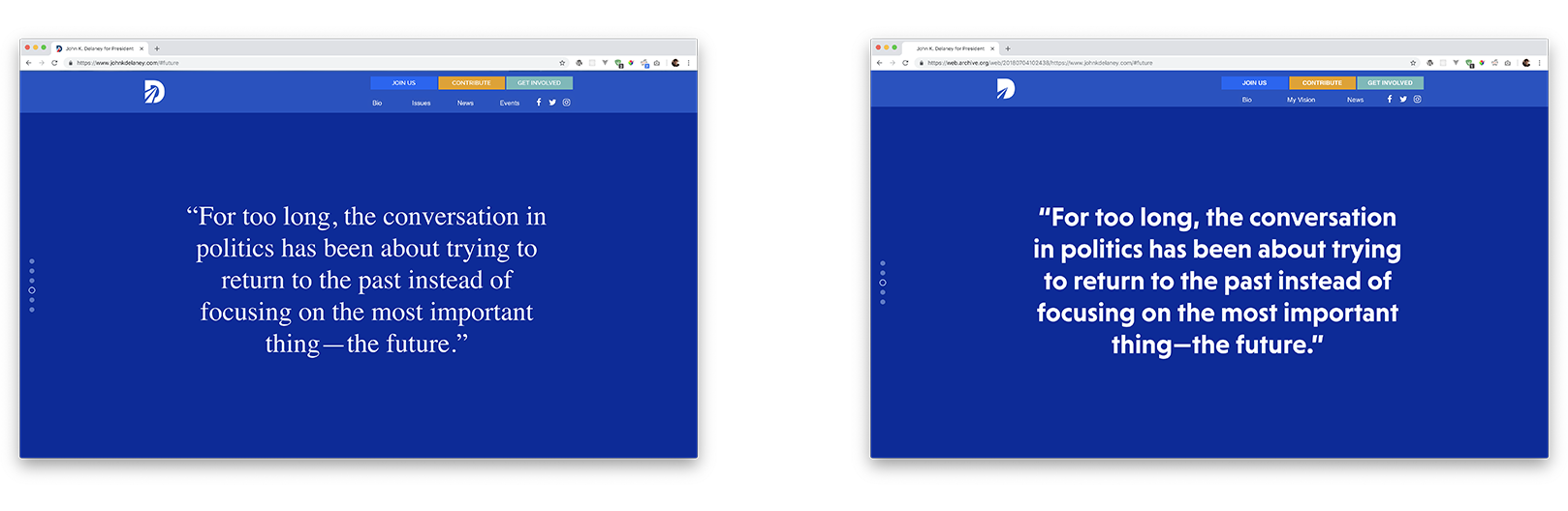
One must also keep in mind that Delaney has been running for a long, long time. So long, in fact, that his identity system has already undergone a refresh:
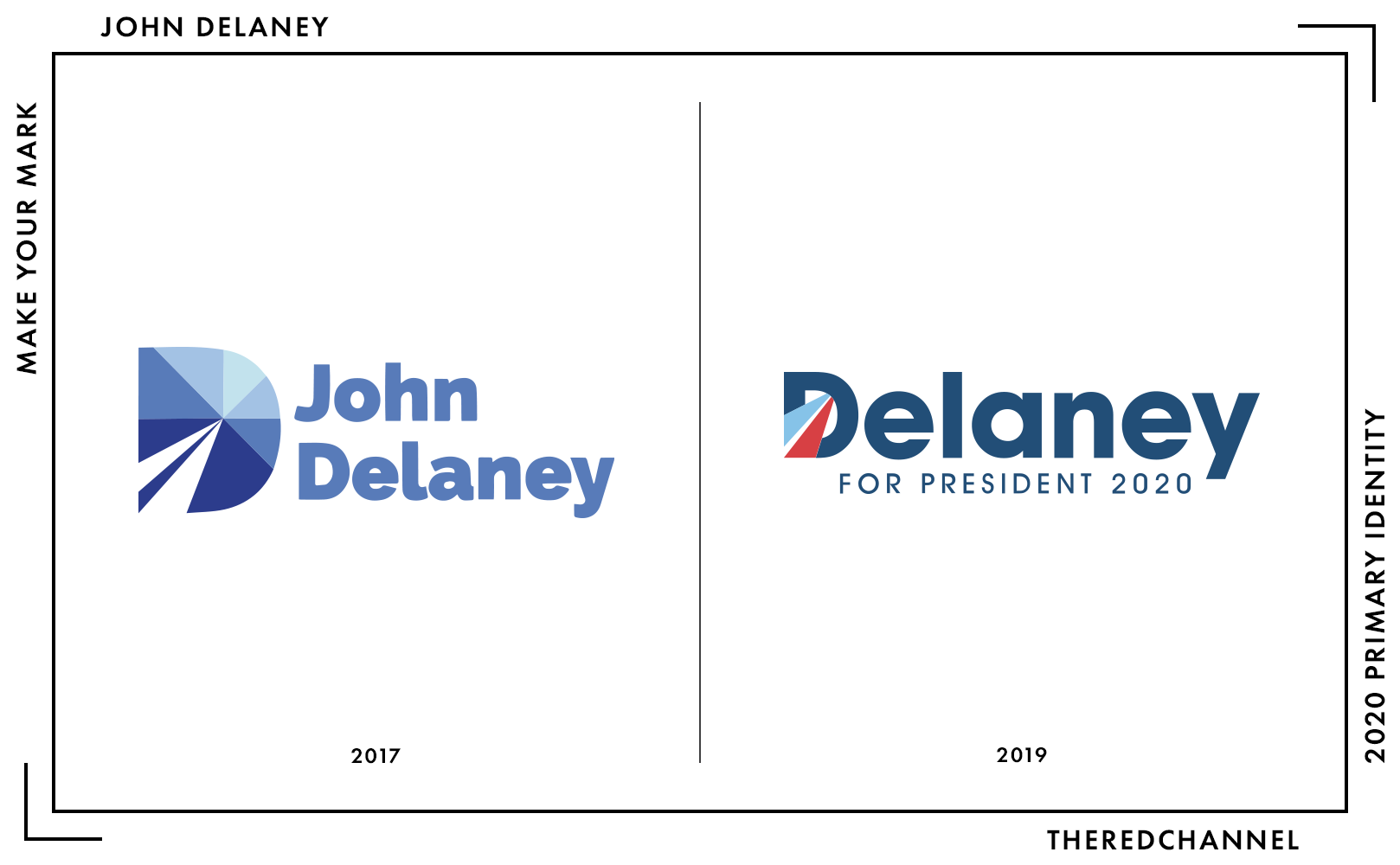
Was this a smart change? I am undecided. On the one hand, the switch to ITC Avant Garde does clean things up a bit, but offers precious little that would assuage the tremendous blandness of the work. One must praise the designer in exercising the exceptional restraint required to refrain from angular ligatures, which would have taken the identity in an entirely different direction, indeed. The mark may benefit from an Avant Garde-alike that has been re-conceived to contemporary standards, such as Sharp Sans …except, oh, someone already tried that.
I vastly prefer the monochromatic palette of the original, which situates this work more firmly as a Democratic Party primary identity. While both schemes of blue and white (as in the original) and blue, red, and white (as refreshed) are contextually cliché, the former feels more situationally appropriate. Not to mention, there are other, competent branding efforts built on a palette of blues and white. It can be done. Leave the little shock of red for the 2020 General, John!
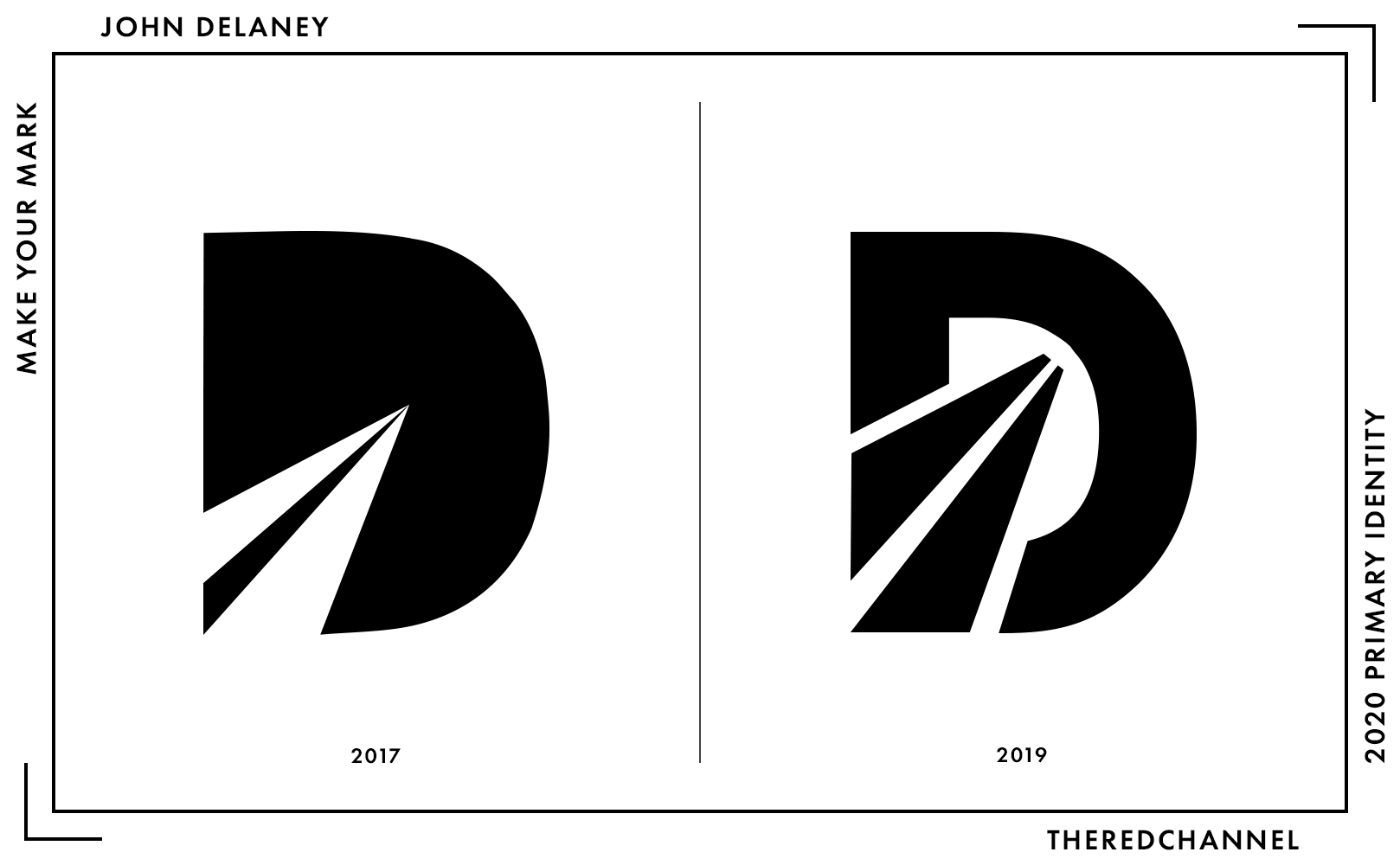
On just the merits of the symbol: the 2017 one-colour rendition is not strong. This is a textbook case of reliance on colour for effect, and the work is entirely unsuitable for display in black and white. The segmented nature of the newer symbol gives it an almost industrial feel. The autoroute or paper aeroplane (or whatever it is) almost takes on the appearance of a fountain pen nib, an unintended interpretation which I quite like.
The symbolic mark needs to be stronger than this, particularly as there is no full-colour logo to speak of on the campaign website:
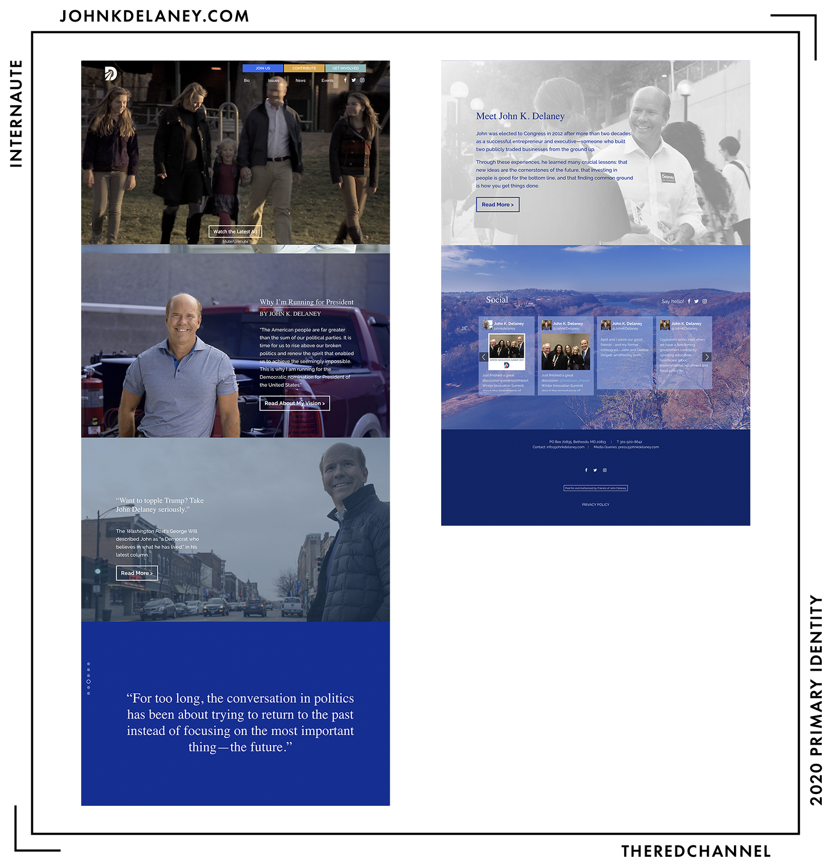
Bad news for those unfond of the full-screen splashpage, as we will be seeing a lot of them today. Immediately upon scrolling, thrust forward and leapfrogged down to the next full-screen element, the viewer is treated to a fleeting glance of… a dress shirt? (See the uncharacteristically bright bar towards the top in the above screenshot.) It appears that a video element now overlays the original content on the splash screen, and the two objects are of different dimensions.
The inattention to detail continues through to the remainder. Colour is not handled with care in this web presence, and it seems every full-screen, browser-hijacking slide in this internet-ified PowerPoint deck has a different overlay and entirely disparate character. While the photography may have been intelligently selected, each is so individually processed and distinctive that I see no real “family resemblance” between any of the work. The duotone landscape shown above the footer is really funky. Rusty trees remind me of the Chernobyl Exclusion Zone, though – for those playing along at home in the Old Line State – I am sure that Western Maryland has copious idyllic charm.
I am torn on how to mark this effort, as what is shown above is really not what the site is supposed to look like. The webfonts are, for whatever reason, not loading properly. The awkward serif used on the headings is not supposed to be there. Archived copies of the site show a geometric sans, an Avant Garde-alike almost (but not quite) matching the one seen Delaney’s earlier logo. Does one mark on what the firm did, or does one mark on what the viewer sees?
For our purposes today, it is a distinction without a difference, as neither is tremendously exciting. There are far too many colours, and they do not even match those used on Delaney’s current or former logo. This is surprising to me, as the branding and web design are reportedly the work of the same firm.
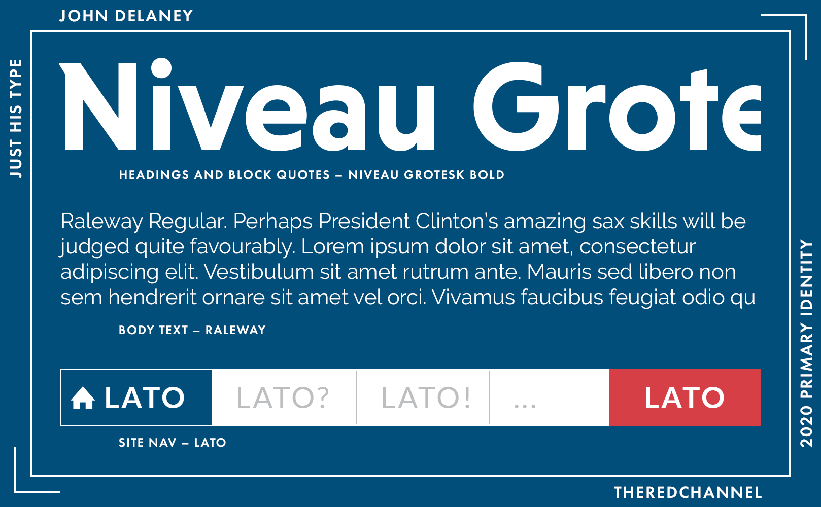
Here is what the type selection looks like. Or, at the very least, what it is supposed to look like. Headings are HVD’s geometric sans Niveau Grotesk. It has a lot of flair, and it packs quite a punch at heavier weights. It exudes what I can only describe as “a futuristic take on Art Deco, if made in the early 2010s.” I am a little bit enamoured with the N set in capital. It really does play best when it is big, however, which makes its diminutive size on Delaney’s website especially disappointing. …that is, on the occasions when one can even get it to load properly.
Body text is reliable Raleway from the good people at The League of Movable Type – really one of the better free fonts out there – which handles capably in either text or display. Also joining the party is Łukasz Dziedzic’s Lato on the navigation bits. Ah, Lato and Raleway: for when one must look great, but also just like everyone else on the web.
In the tangible realm: Delaney will not sell you any merchandise, so all comment is reserved on that front. Unbought and unbuyable – incredible!
There you have it. A hackneyed and unoriginal review of what is, I must confess, a hackneyed and unoriginal product. The work is as tired as Delaney must be, following 562 days riding that autoroute.
→ Vector copies of Delaney’s logo are available as a graphics package here. ←
Who is talking about it?
- Anchored Creative absolutely panned it. (Their score: 3/10)
- Greenhead Design gave it a shrug.
- An anonymous brand guru in The Washingtonian decries its utter conventionality.
Ken Nwadike
![]()
Date Announced: 18 October 2017.
Slogan: “Moving Forward Together,” per his footer. Or maybe “United We Stand.” (Per his campaign events?)
Also known as the Free Hugs Guy. Being that the campaign shows zero dollars in disbursements, it is rather safe to assume that the creative direction here is in-house. If it is not in house, I will personally assist Ken in securing a refund for this work. After puzzling over the typeface for a few minutes while redrawing the logo, I came to a realization: It is not Arial Bold Condensed, but Arial Bold laterally scaled to approximate condensed letterforms. For what possible reason?
The colours are trite, and there are numerous small (and simple to correct!) faults of spacing and symmetry riddled throughout the unoriginal symbol. The dual-coloured drop shadow is, in a single word, unforgivable. Please , please, tell me that this is in-house work. A miss of a mark.
At least, I think that is his mark…
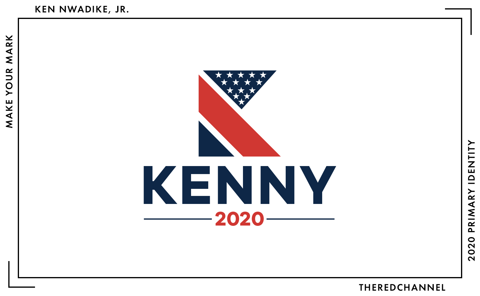
It is confusing, as his ActBlue page shows something entirely different. This is a more successful logo, if only because it courageously steps forward in a non-Arial typeface and lacks a drop shadow. That is to say, the (date-impaled, horizontal) bar is set low enough that any movement away from system fonts and WordArt is perceived as a transformative success.
Like other men in the field (Booker, Buttigieg, Castro), Nwadike opted to identify by his given name in this graphic treatment. As Nwadike announced first of the lot, an exceptionally kind reading would place him in the vanguard driving this change. More concerning regarding the handling of his name, the logotype identifies Nwadike by a diminutive form of his given name, Kenny, while his primary logo sticks with Ken.
The lack of standardization betrays a lack of care which is, sadly, more painfully evident in the construction issues which, unlike treatment of Nwadike’s name, are a thread of continuity between these two examples. The logotype is not Arial, but also not great. On the mark itself, there are myriad errors of spacing, but chief among them is the slapdash application of stars. The compression of the cantonal stars in the topmost element, as if the crushing gravity of existence pulls them down from the field, inspires nothing but anxiety. If this logomark is a call to tradition, tradition’s clarion call sounds none too sweet.
Overall, a disjoint, unpolished experience, which unfortunately carries through to the website.
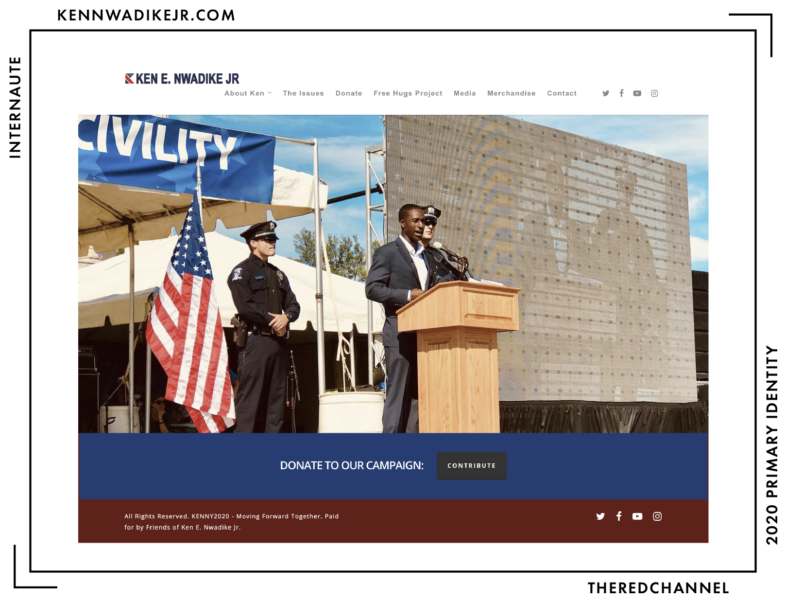
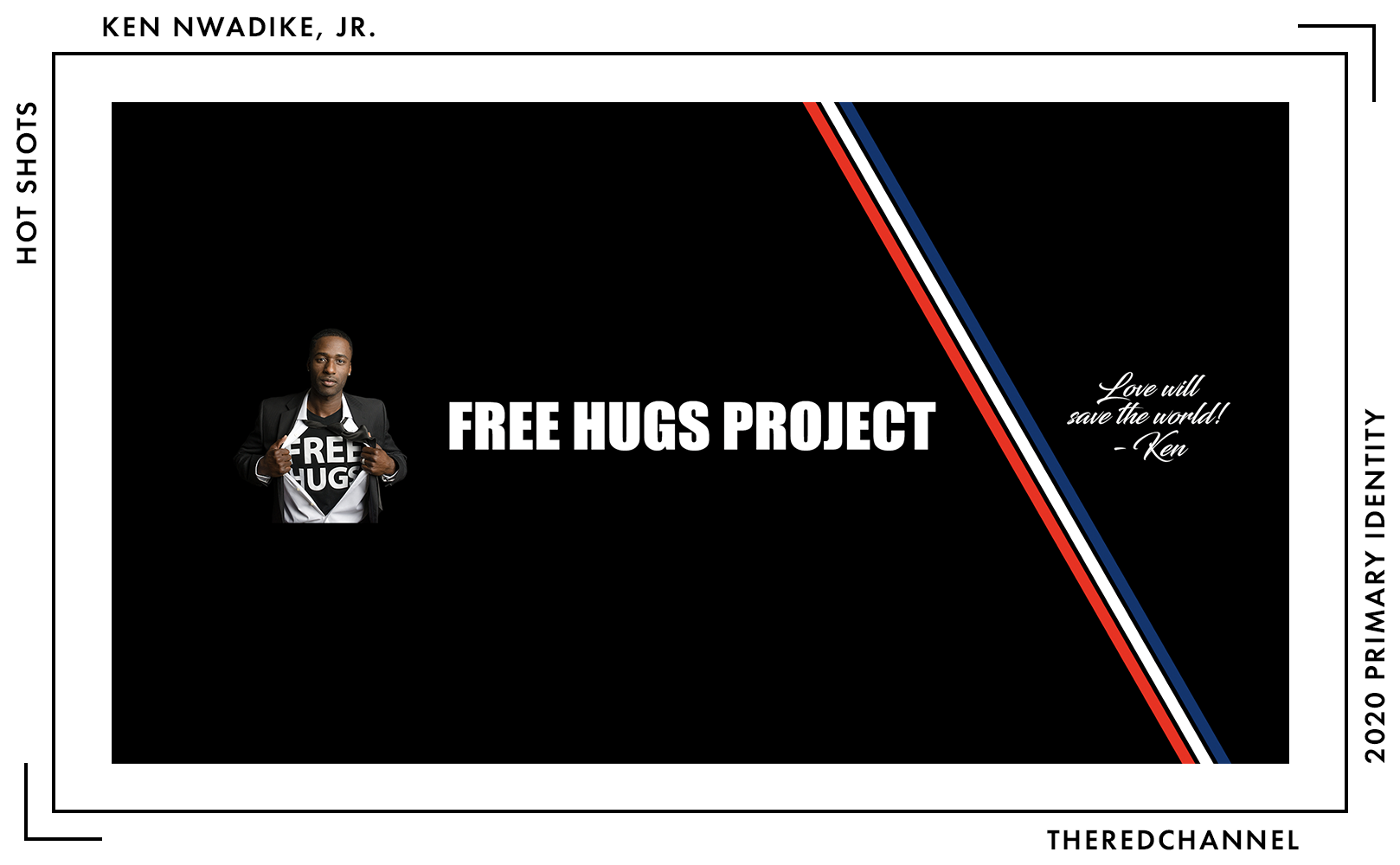
At least it is short. This website is vertigo-inspiring. It will disorientingly fling the viewer to external links frequently, without warning, and seemingly at random. “Tour Schedule” is a redirect to the Free Hugs Project webpage. Clicking over to “The Issues” will take you to actnow.io, and appears geared more heavily towards driving social engagement for some indeterminate end than presenting a platform.2 “Donate” escapes out to the safe harbour of ActBlue. “Merchandise” is a dead link to a non-existent domain. The Press Kit is a Google photo gallery containing no branded assets of which to speak – Literally none! His logo does not make an appearance once! – and a link to a YouTube channel.3
Of principal concern in this web presence is its lack of uniformity. For colours, there is no concordance between the shades selected for the mark and the shades in use online. There is no consistency between the hero banners up top on the component pages, no thematic coherence between the image assets used elsewhere on the website, and no sense of connection between the web fonts in use on the page and the… heterogeneous stylistic and typographic choices on offer in the images:
Wonderful bit of ribbon for making a cocarde tricolore. This is a YouTube banner featuring the branding from a previous endeavour. So why is it on (and cropped, dangling off the edges of) Nwadike’s contact page? Since it is recycled work and looking at brush script specimens is no one’s idea of fun, I am not even going to source the type, leaving it as an exercise to any particularly masochistic readers.
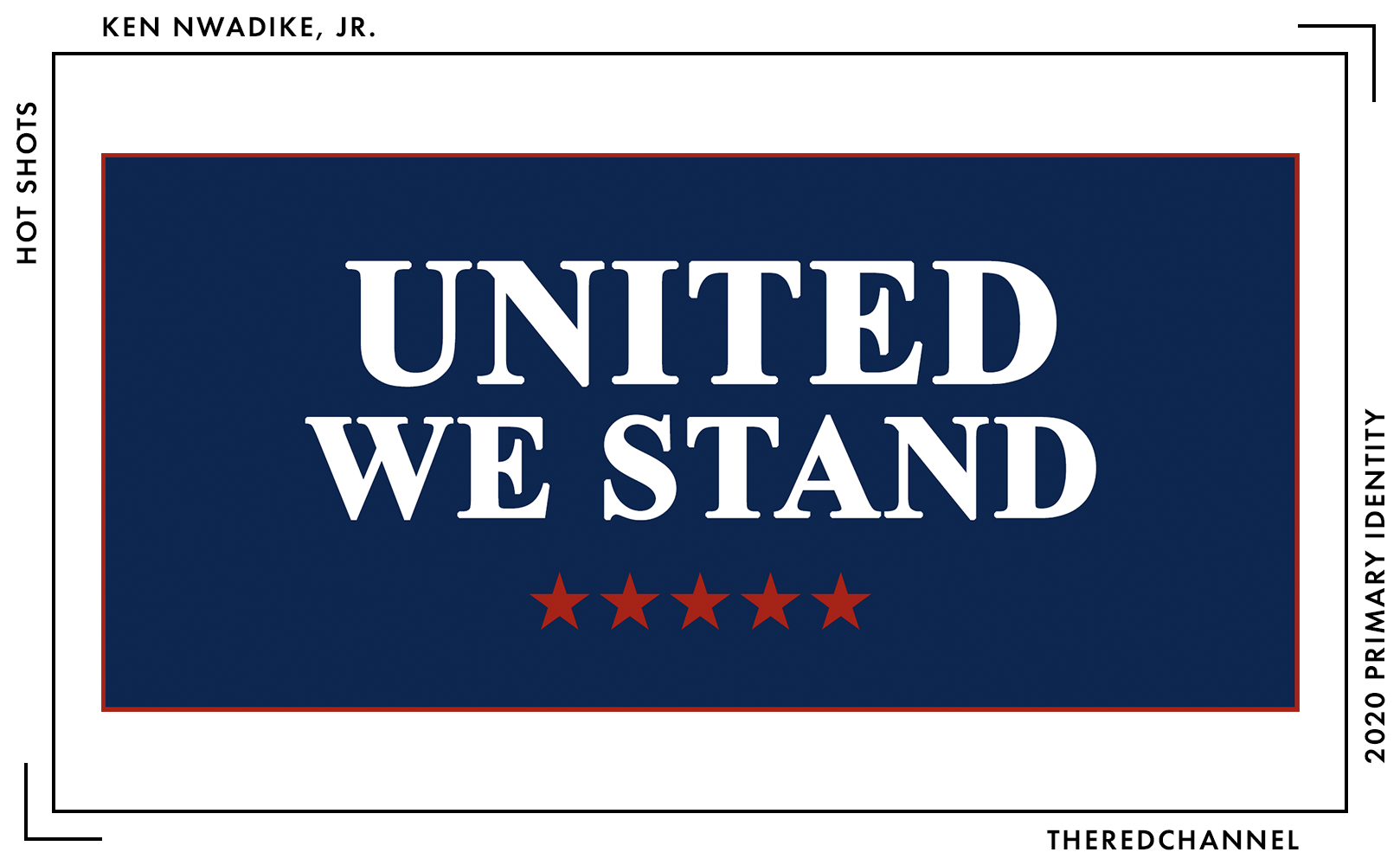
A downright quixotic choice on the media page. And it really seems like an unforced error. A navy background bordered by red, with a big, white serif… and stars in the lower third? Is he kidding?
*sigh* This project is a WordPress site. The theme is called Salient, available for purchase at ThemeForest. Headers and body text are Open Sans by Steve Matteson. Enough of this, let us go to the physical goodies…
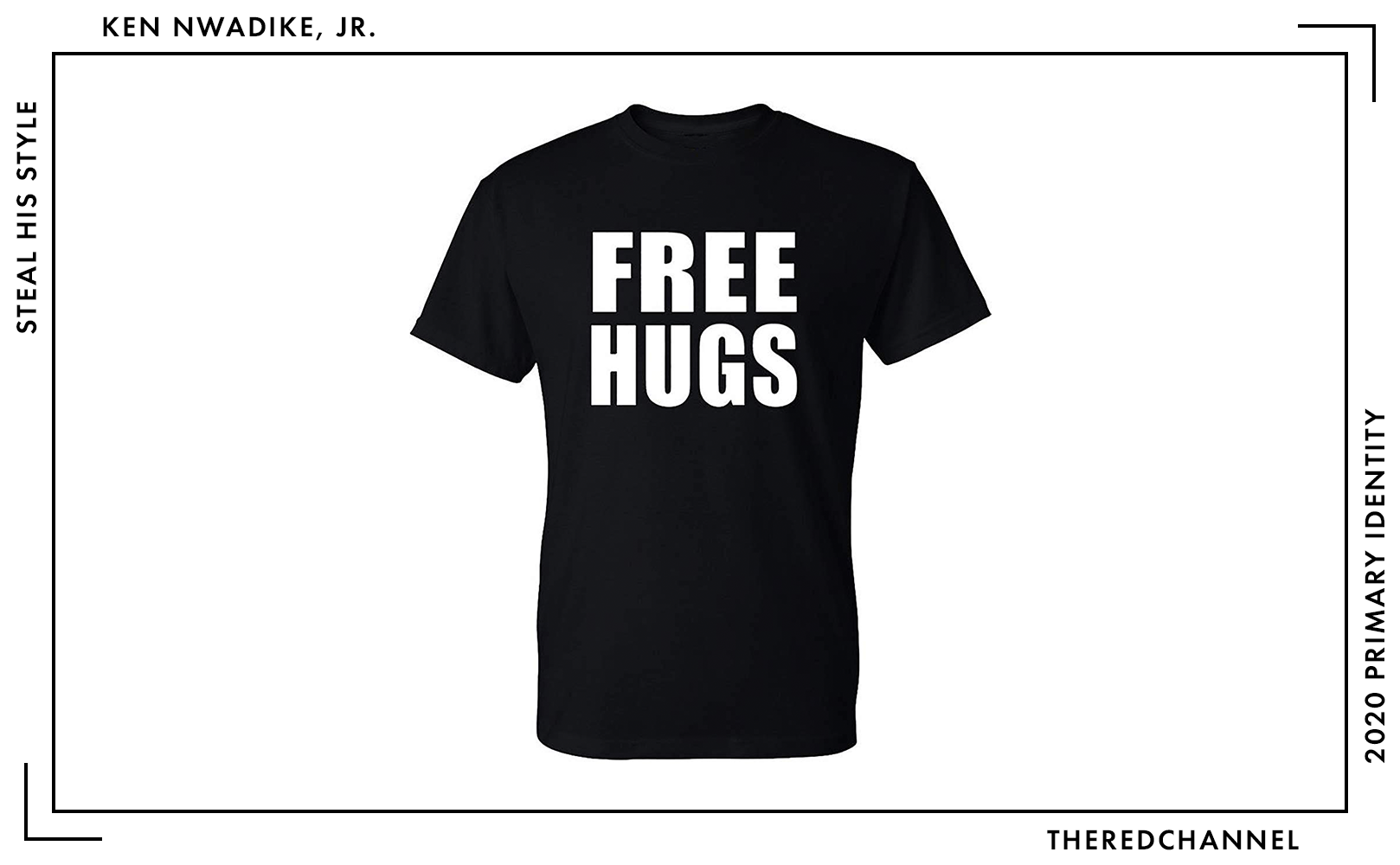
No branded merch, as the website is broken. That is, of course, unless anyone fancies the official (??) Free Hugs shirt. The type on it is Monotype’s glorious and perennially appropriate Impact. The meme font. Super. I will be noting the cost of every candidate’s t-shirt throughout this article, as printed campaign t-shirts are the one fairly homogeneous good that everyone whose merchandise is noted today offers for sale. At $18.95 on Amazon, Kenny’s is the least expensive of the lot.
I think I need a hug now. Bonne chance, Ken. Or Kenny. Either and/or both!
→ Vector copies of Nwadike’s logo are available as a graphics package here. ←
Who is talking about it?
- Only mention I can find is a tweet by the good people at the Center for American Politics and Design.
Andrew Yang
![]()
Date Announced: 6 November 2017.
Slogan: “Humanity First”
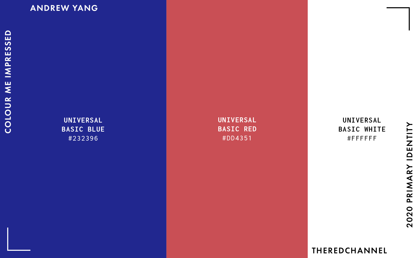
Ah, the UBI candidate. This mark is the work of one Hannah Liz White. (Here is the relevant FEC filing.) Of the bunch, Yang has the most traditional logotype. It consists of bright, near-process reds and blues. It works a flag motif into the ribbon. It is set in a big, bold, wide sans-serif. It is even in initial caps! (The specific sans-serif in question is Darden Studio’s Halyard.) That is unusual for this crop of candidates, and unfortunately it is as a whole not up to the artistic standard set by later entrants in this race.
I do appreciate that the Y letterform can be busted out of the lockup and used elsewhere. It is certainly distinctive, yet it is distinctive for rather strict adherence to convention amongst a field that is shattering political design orthodoxy. All hail the slice of undulating U.S. flag! This mark could appear just as readily on a placard pre-2008. Vintage, and not of a particularly appealing vintage. Please do run for president in 2000 and endeavour to change the outcome of that election, Mr. Yang.
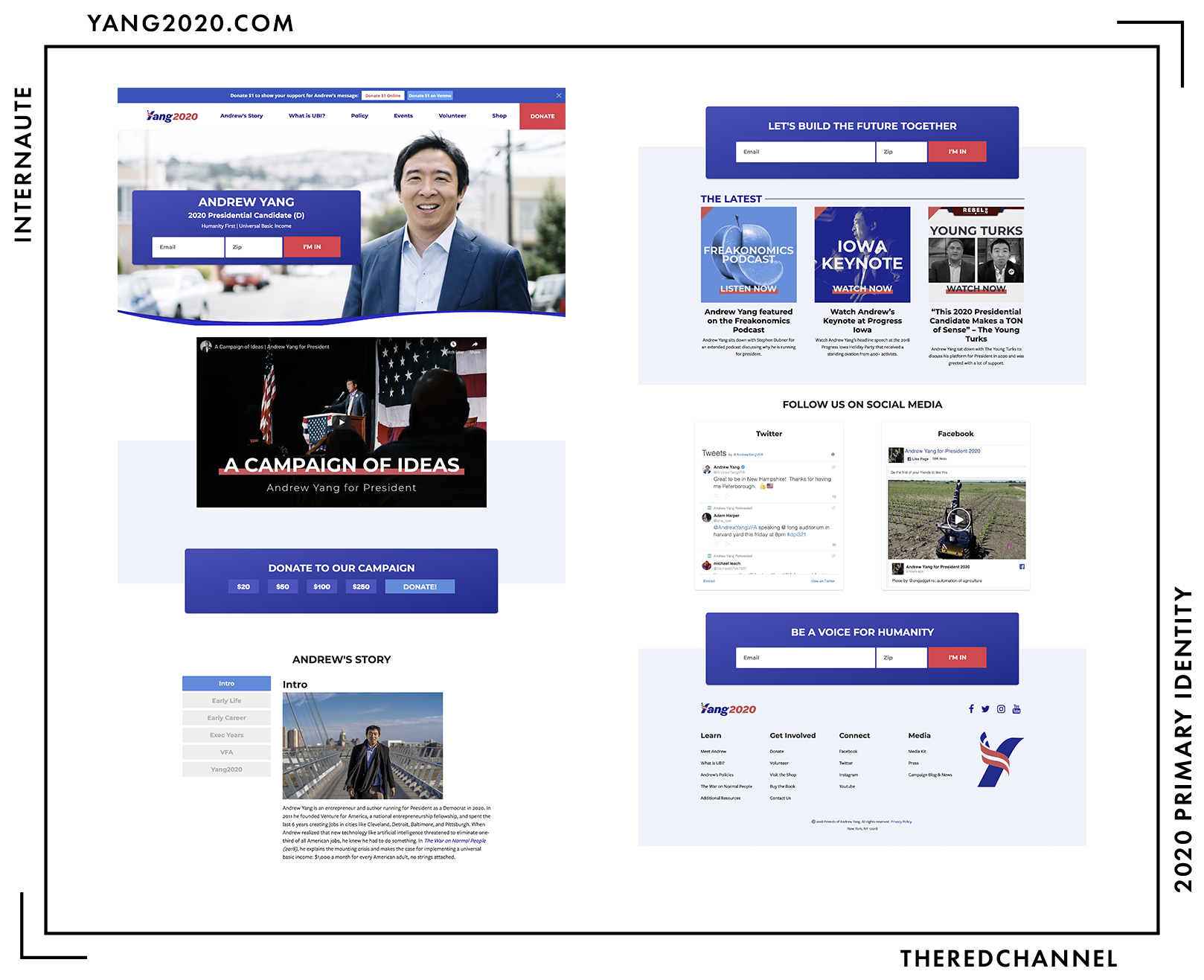
The web design is courtesy of Danielle Rivers (also known as Identitytank). (Here is the filing.)
Visually and technologically, it all feels a bit… dated. Not nearly to the same extent as the mark, but it is certainly not at the forefront of trends and practice. Whatever – that itself is no grievous error. It, like innumerable other campaigns of the past decade, is a NationBuilder site with some magic powered by Blue State Digital. Yang uses a custom Bootstrap4 theme titled “ubi2020.” Were Yang seeking a congressional seat or presiding over a municipal government, it would all be quite appropriate.
The (as mentioned, puzzlingly dated) gradients on the cards with rounded corners are profoundly disconnected from the flat design of the navbar and biography section. The call-to-action buttons, for whatever reason, are in both red and blue. The production of the YouTube video and cover images of the latest blog posts feel like the work of a different campaign entirely. Most alarming, however, is the tremendous swoosh at the bottom boundary of the hero image. Bukowski could just as well have been addressing graphic artists contemplating the swoosh in writing: “if it doesn’t come rushing out of you, don’t do it. unless it comes bursting out of your ears and your head and your ass and your bellybutton, don’t do it.” The proper application for a wave is never when the mind is overcome, when a tremor-induced seiche billows within the body and that good and decent motion is inescapable, and especially when making a surfing website. Alternatively, when a client demands one and a paycheque is easier than arguing. There are manifold more bad swoops than there are good swoops, and one must intuitively, inevitably feel it for it to be a success. Here, one is bereft of feeling. Only emptiness. This problem is only exacerbated by the fact that the Bézier cure is not built well at all.
#SwoopyHairNotSwoopySites2020.
What do I like? Yang has an honest-to-goodness Media Kit. That you can go look at right now. Theoretically, I should not have to rip the logo out of source code or redraw anything. Maybe they would even give me some brand guidelines, so I do not go inadvertently violating the protected space or getting the colours wrong or anything. What do I dislike? They only put PNGs in there, so I had to jerry-build the damn thing anyways. The standards guide is presumably on Jupiter an inaccessible intranet somewhere.
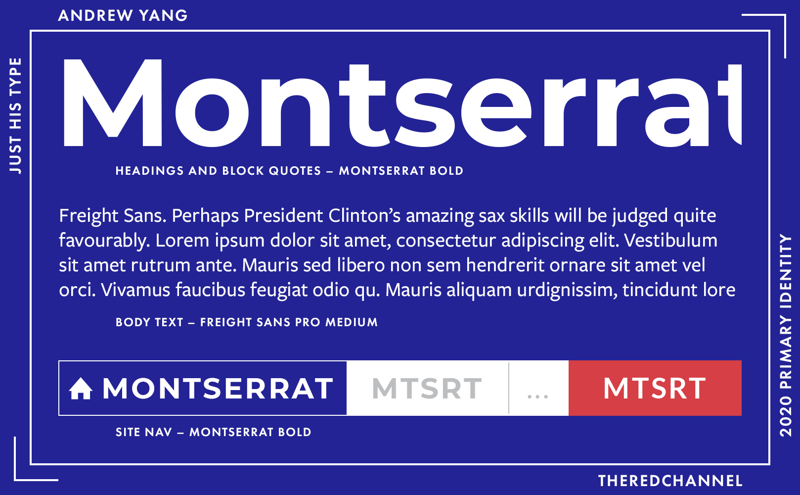
Montserrat on the heads and nav is paired with Freight Sans in the body. I will not dare utter an unkind word about the Freight suite, versatile darling of designers everywhere, only comment that Yang appears to be doing a lot of shopping with Darden between this and his logotype. Nice choices, readable, but I likely would have skipped the Montserrat and sent Darden a bit more money for the Freight license, as Freight pairs so gosh-darned well with Freight.
Andrew Yang also has some branded goodies for our consideration.
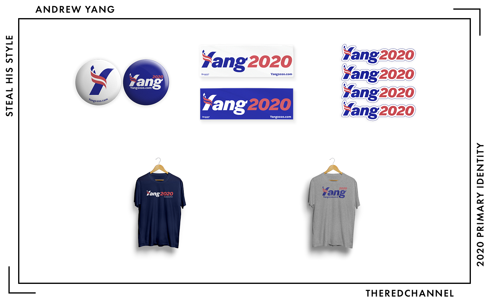
Die cut stickers for laptops, bumper stickers for everything else, buttons, and a couple t-shirts. I enjoy the extensive use of different versions of the mark across the goods, evincing exercise to the fullest of that graphics standards guide they are not letting anyone see. The darker t-shirt, which will set one back $25, is quite nice. Unfortunately, I find it nice while it is in total deviation from the brand palette. I vastly prefer this shade to the other blues on web and in the logotype.
Nothing too imaginative, but a decent complement of products. Universally basic merch. With one notable exception:
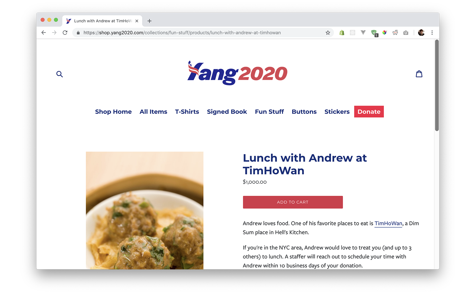
Above, the single product in the category titled “Fun Stuff,” is a dim sum lunch with Andrew Yang at a price of one thousand dollars. It is the most expensive product being featured today. Barring generous (yet, really, due) consideration from the Yang campaign, I have no further insight to share on this item today.
→ Vector copies of Yang’s logo are available as a graphics package here. ←
Who is talking about it?
- Anchored Creative wrote it up. (Their score: 5/10)
- Quillette asked him a question about the future direction of his brand, to which I will not link. Because to hell with Quillette.
Harry Braun
![]()
Date Announced: 7 December, 2017.
Slogan: Cannot find one, though I suggest “Exponential Icebergs.”
This is not a wordmark, and I will not count it amongst the wordmarks. Harry Braun will not be President of the United States. Harry Braun will not receive any delegates at convention. I am only including this because he declared candidacy and has a website, a media kit, and a mechanism for accepting donations.
The type, if we must do this, is Ascender’s Trubuchet Bold. The sub-head is Microsoft’s Verdana for which, it turns out, one can actually purchase a license! Hooray, system fonts!
His campaign site is built on WordPress. It uses a free theme called Virtue, by Ben Ritner. It is a veritable masterclass in green ink. While dense paragraphs of Malthusian nonsense are reason enough for exclusion, the exceptional length of the page itself precludes me from reproducing a screen capture. And I shall just stop right here. The point of this exercise is not to be mean to people. I will not be going any further.
Bonne chance, Harry!
Robby Wells
![]()
Date Announced: 12 May, 2018.
Slogan: “Rise Up!”
See Harry Braun, and copy-paste the comments. This candidate also offers a treatise in green ink, only this one is about something called “Eaglenomics.” There are no real managed corporate communications which would merit discussion. The location from which the campaign site loads its image assets suggests that it was produced with the GoDaddy Website Builder. Oh, and grunge fonts! Grunge fonts, how I despise you. I typed “Rise Up!” into DaFont and scrolled through twenty excruciating pages of specimens. I have got no clue. Does it really matter where it came from? No.
The website is extremely lengthy and not very good, and as such will be passed over in deference to limited attention spans.
Bonne chance, Robby!
John McAfee
![]()
Date Announced: 3 June, 2018.
Slogan: “Don’t Vote McAfee,” if slogan.png is to be believed. Solid advice.
No FEC filings, so without trudging through a Discord server full of malcontents, there is no one directly attributable for the creative work. Also, he apparently lives on a boat in international waters now. I am infinitely poorer for having learned this… but to the mark: It is hyper-aggressive, heavy, and masculine. It is everything the myth of McAfee purports to be. It is also not new. The mark is recycled from his “crypto-currency team” circa January 2018.4 Entirely eschewing blue is a very bold and atypical choice. Not only is this a point of departure from standard political branding stateside, but most brands in general do elect to incorporate blue in some fashion. In a sense, it is an honest and inspired choice. Blue represents trust, confidence, and stability, while McAfee quite plainly represents none of those things.
Also highly atypical is that neither the candidate’s given name(s), nor surname appear anywhere on – or in any construction of – the logo. It is the closest any candidate comes to a pure, visuographic symbol. With such a small type sample to parse, McAfee could be using just about any simple pixel font in there. How about we say it is Andreas Nylin’s BitDust, as it is good-n’-free?
There is a familiarity to it. If Mantus Marine were to branch out into facilitating whale sex tourism, this would be the mark for them. If the City of Melbourne started selling bath salts and murder weapons in Belize, this would be the mark for them. My own pet theory? If you take the red, segmented glyph with which his namesake computer security company formerly identified itself and add the weight and geometric sharpness of their recent rebrand… you hints in the direction of the campaign logo:
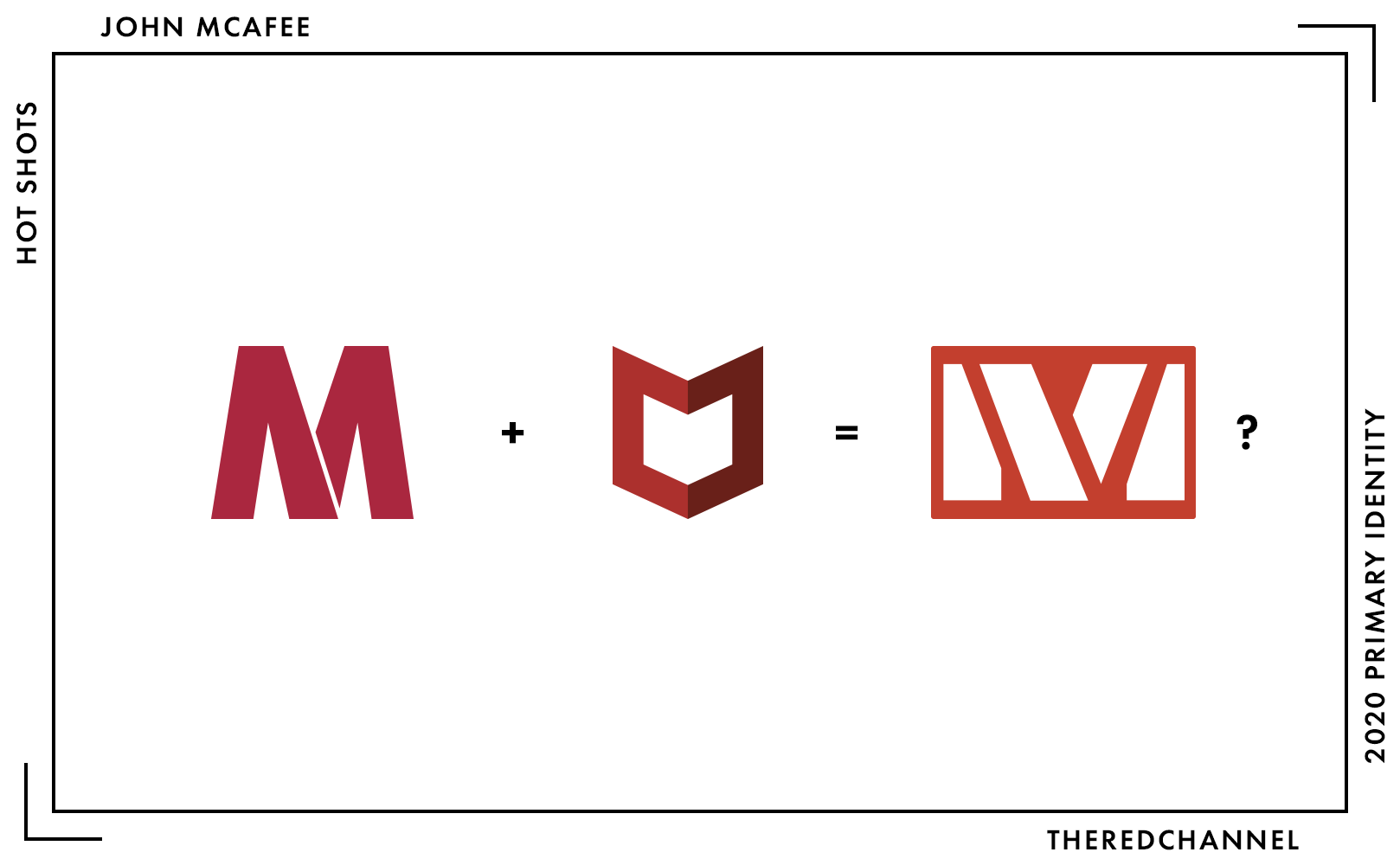
Huh. Would you look at that. Thankfully, it is not like there are any hard feelings between the two parties.
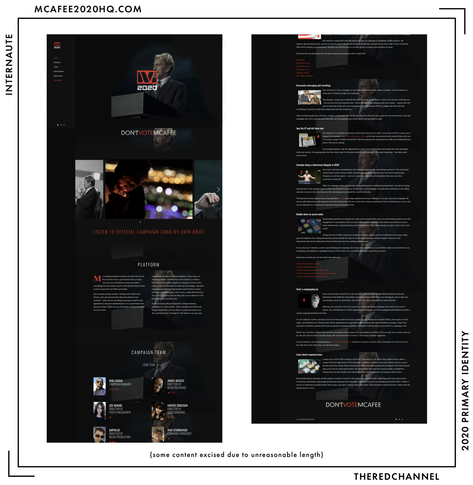
McAfee’s web presence is, as one would expect of an extremely online meme candidate, pretty darn slick. His cover slide? Lighting a cigarette, basking in naphtha glow, afore a glittering field of bokeh. Why not? His campaign theme song? Not only does he have one, it is by a duo of… Bitcoin(?)… rappers(?) under the nom de guerre “Coin Bros.” Why not? This is what McAfee feels is important to share with the reader, before even reaching his campaign platform: A platform which, in the spirit of Sartre, had Sartre copulated with whales, helpfully offers that “any attempt to address national problems, of any nature, is doomed to failure.” McAfee is not running for president, but he sure is doing… something.
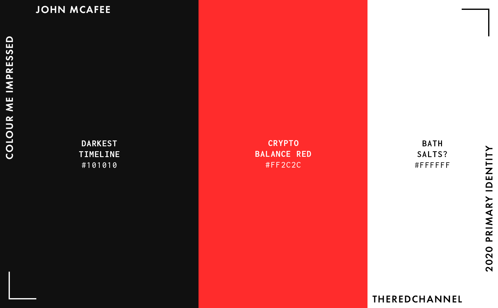
The bones of the website are not without their successes. The colour palette is simple, not at all presidential, and smart enough. The dominant colour is #101010, grey. The deepest, darkest grey. As grey as my own disposition in this dismal era of politics.
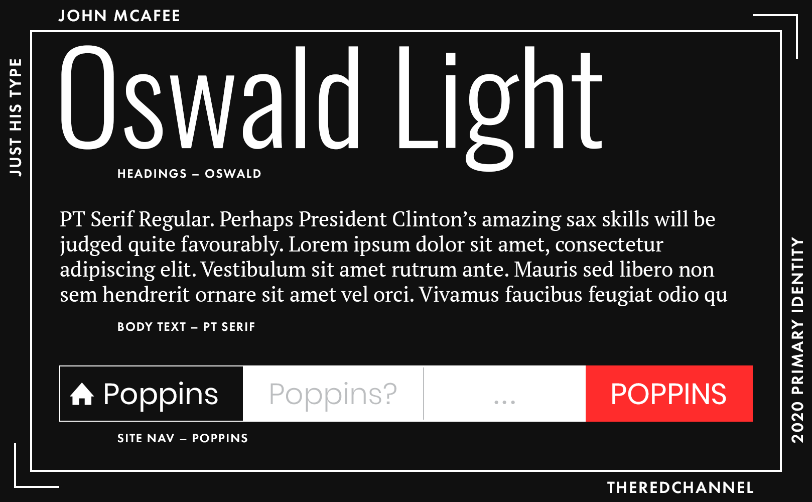
Annoyingly, at time of assessment, the site imported a full 43 weights of six different Google web fonts. The headings are Oswald by Vernon Adams, while the body is PT Serif by Paratype. The slogan is rendered as a raster image in yet another typeface. Simplification of the typographic scheme would benefit both load times and reader comprehension.
The background demands some greater degree of occlusion when the user is over body text. The experience is quite unsettling, attempting to read the two-points-too-small copy laid over the ever-reappearing, startling topography of McAfee’s face. Additionally, the page could do without the “Resources” section, which is heinously over-long and appears to be nothing more than a directly copied blog post.
A solid effort, and an unattributable one. I truly have no idea if the self-boat-exiled McAfee has any direct involvement in it, or if it is the work of irony-poisoned fellow travellers. But it is an effort exceeding my perilously low expectations, indeed.
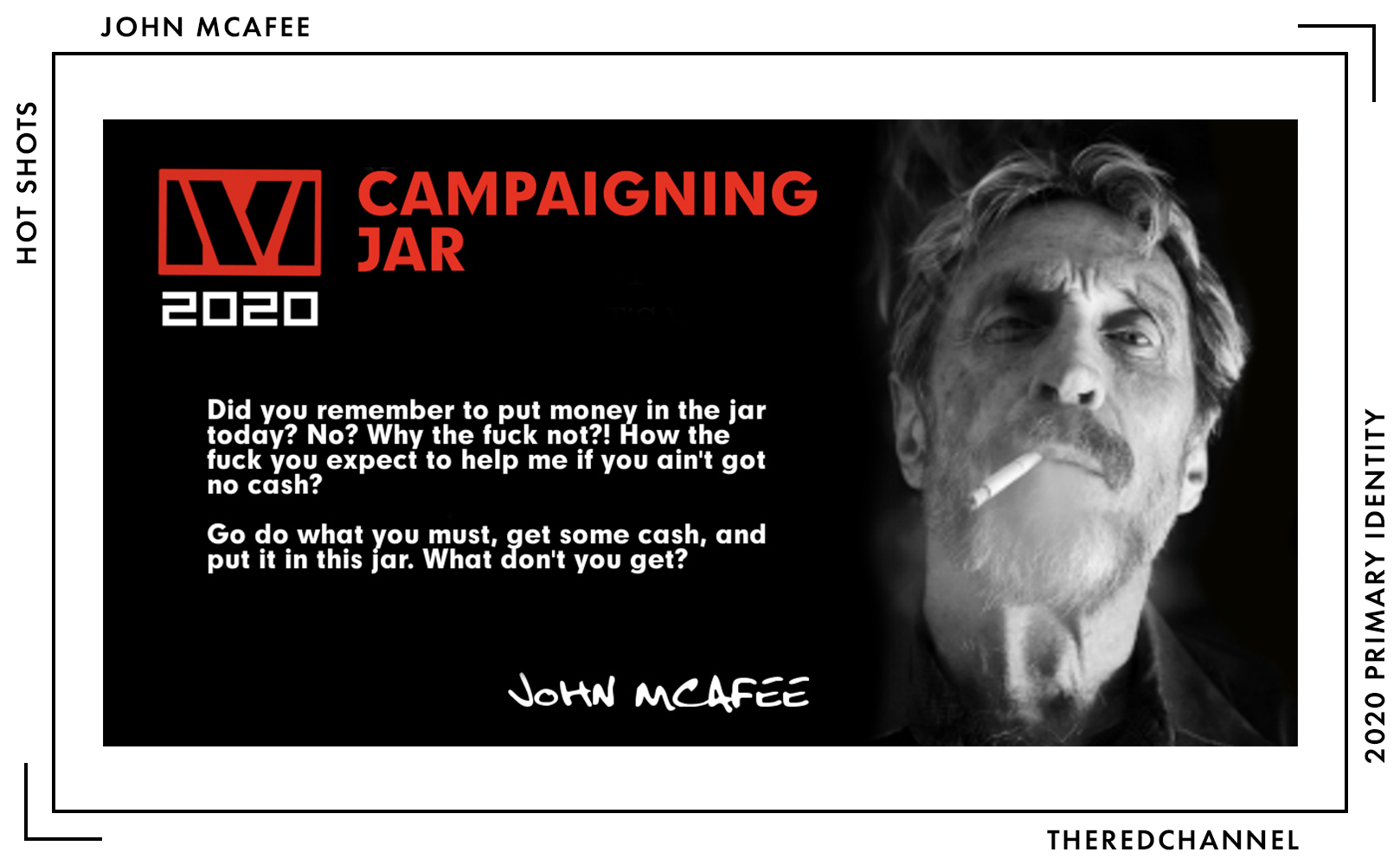
Turning to the physicals: Defying all expectations, McAfee does not appear to be monetizing this grift with branded merchandise. There is, however, a label that one is supposed to print out at home and adhere to a jar full of money one intends to contribute to his campaign. I will leave it here, without comment, for the reader’s perusal.5
→ Vector copies of McAfee’s logo are available as a graphics package here. ←
Tulsi Gabbard
![]()
Date Announced: 11 January, 2019.
Slogan: On launch, it was “Lead With Love”
I will be fair. I will not even make a tired Assad joke! I want to like this mark. It is bright, it is novel, and I have read many wonderful things about it from knowledgeable, creative people. Despite this, I am no fan of gradients in logotypes, and this treatment did not make a convert out of me. They are magnets for banding that demand rasterization before printing. They reduce poorly. They present challenges to printers and are generally ill-suited for something which must be as versatile, distinctive, and immediately recognizable as a logo.
Campaigns have a very short lifespan, which necessarily limits the amount of time and energy poured into crafting a mark, but they are also chaotic environments which demand a lot from marks. It must fashion itself well as both a symbol and in lockups. It must reproduce faithfully on buttons, bumper stickers, buses, and everything in between. It must come with standards robust enough to permit that everyone from printers in Pella, to campaign interns in Concord, to sign-makers in South Carolina are able to use it competently. Gradients complicate this. I am not a fan anywhere, but particularly not in logos.
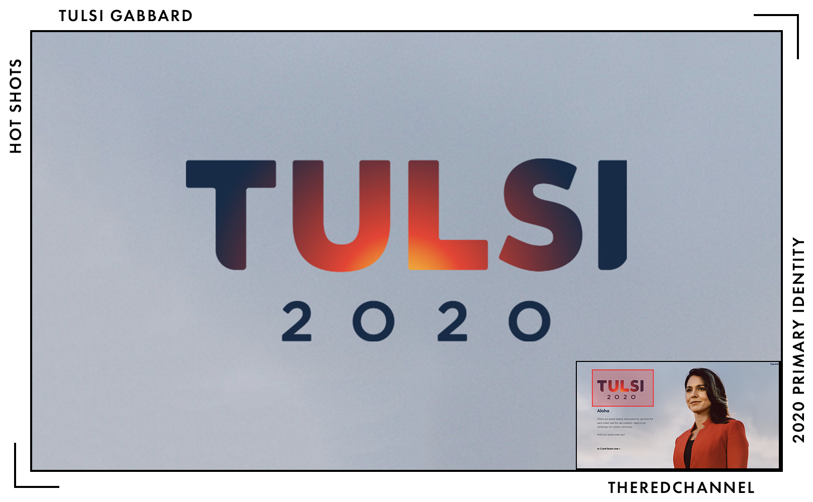
The gradient chosen here in particular, with its rather long trip around the colour wheel, poses a problem in identifying tertiary colours that pair well with it. Much is written on the hazards of relying on colour for effect when constructing a logo, counselling that designers should work in black and white and save application of colour as the final step, while comparatively little energy is expended cautioning the profligate excess of colour when it does finally come time to apply it. The full-colour mark looks quite fetching in isolation on a white background. Want to pair it with graphic elements of a third colour or set it on a non-white background? One will have to go monochrome, or make a choice similar to this example pulled from her prior web splashscreen:
Nope, not a fan of that background colour in the slightest. I could use a ray of sunlight to free me from this overcast torpor.
All that said, it is a gradient, that is a choice made, and it is a plausibly defensible one. One can argue that the concept of everlasting sunset – of Hawaii – is so central to Gabbard’s brand values as to justify its use. It is my view that there exist more successful ways to go about doing so. As a final thematic note, the sunset motif does feel a bit perplexing. The connection to Hawaii is quite easy to make. The love, admiration, and esteem in which she holds her home is clear, but having the sun set on one’s nascent campaign is a less-desirable and just as simple interpretation. (Perhaps that hits a bit close to home.)
The rounding of the first and ultimate glyphs, while I understand the intention of the artist, feels amiss. Attempts to will the viewer to believe there is balance where no balance exists is an act of confidence that will be received poorly. Of course, some of this may stem from my own personal revulsion towards the arbitrary rounding of objects which have no business being round in the first place.6
Let us agree to disagree, commentariat! Gabbard’s tasteful logo will make a very fresh, contemporary smudge in small-size applications.
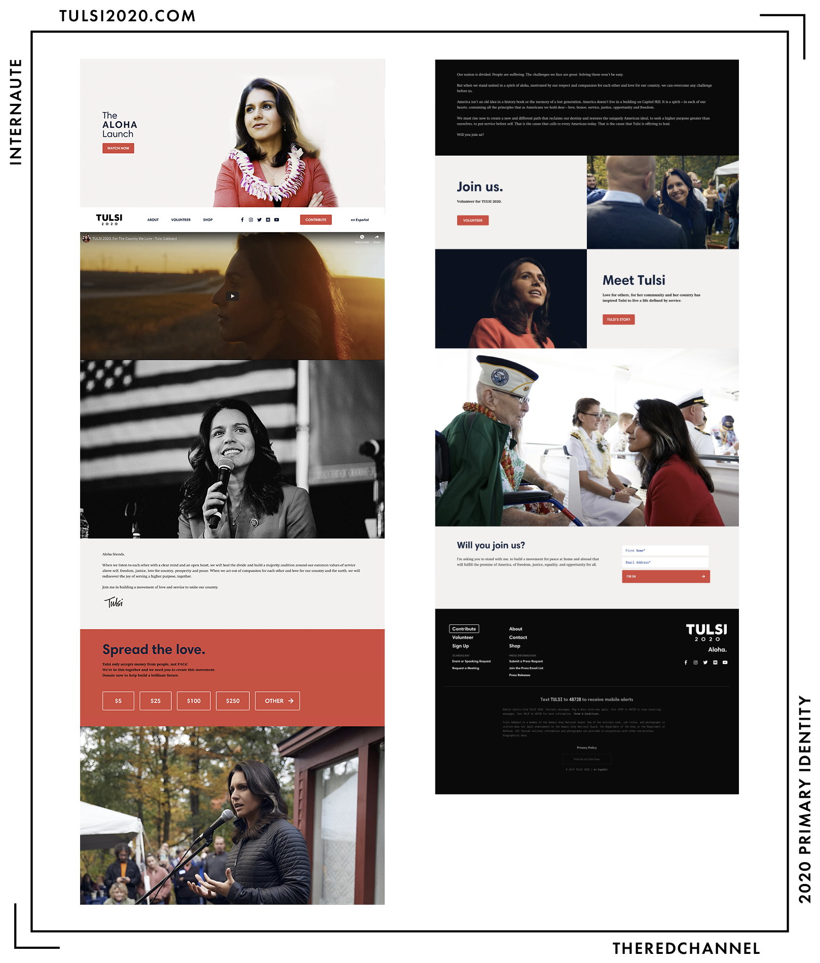
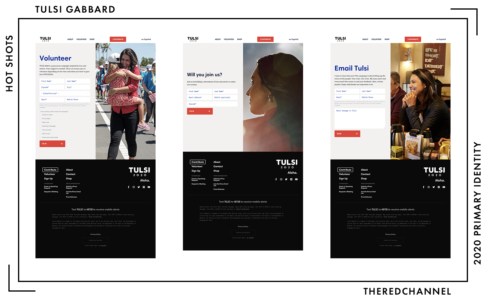
Gabbard’s web presence is a bit more fleshed-out now compared to the last time I attempted to access her site. I particularly enjoy the moves in the direction towards standardization of appearance across the different forms for submitting one’s personal data. There are talented people at work here. The photography offered by Gabbard is of excellent quality and is thematically consistent. Navigation is painless, save if one attempts to join the press email list, at which point they will lose the footer and all links to points elsewhere on her website. The footer, however, is an issue. Such a large field of black does not really comport with the Hawaiian sunset.
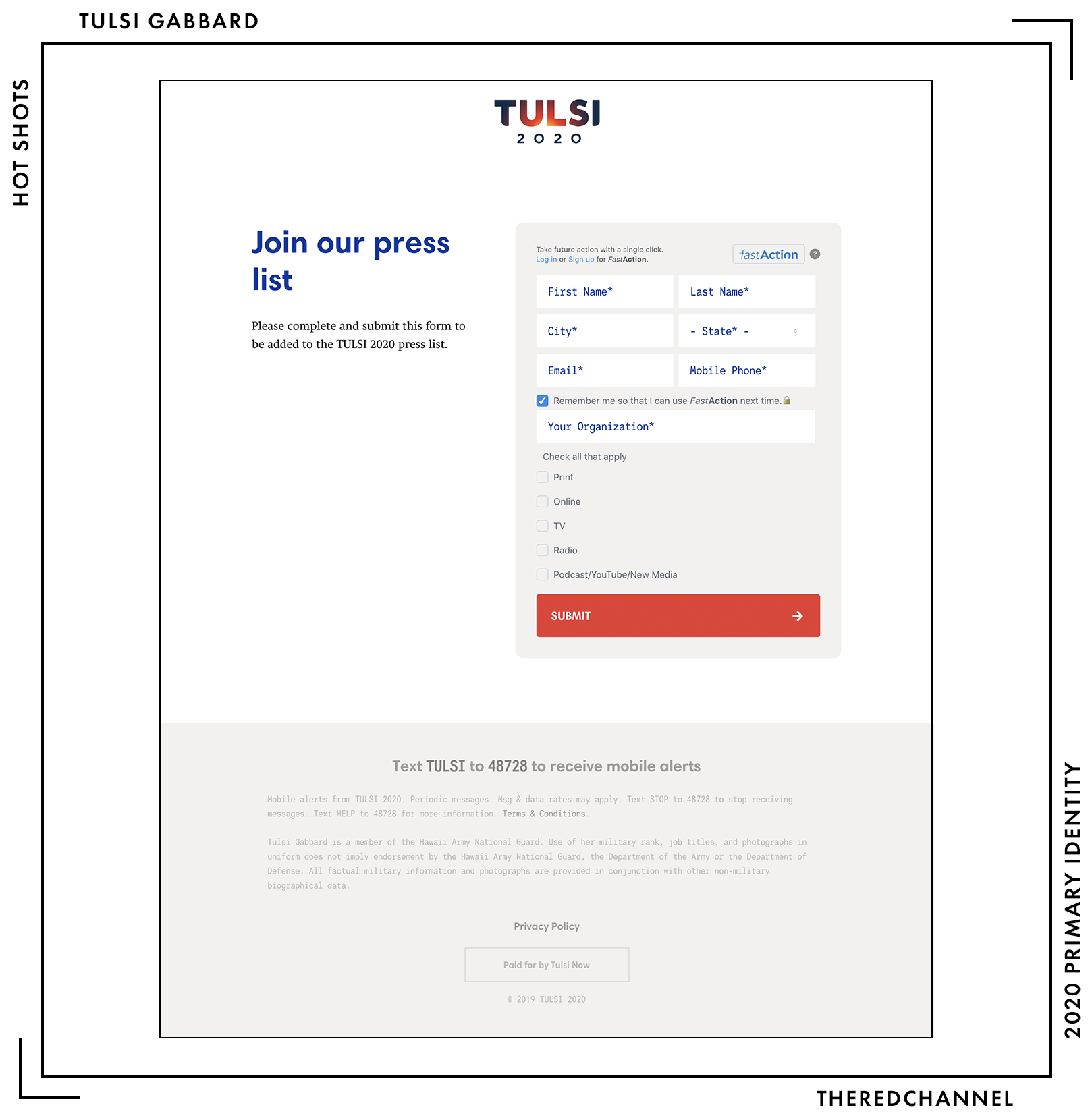
A bit of trivia: Only when joining said press email list will one see the full-colour logo in use on tulsi2020.com. Every other instance is monochromatic in either black or white. A shame, as the most distinctive thing about her brand is lost and flattened in near every application.
The colours are slick, I do not mind them one bit. (Save, it must again be stressed, for the large amount of black background throughout.)
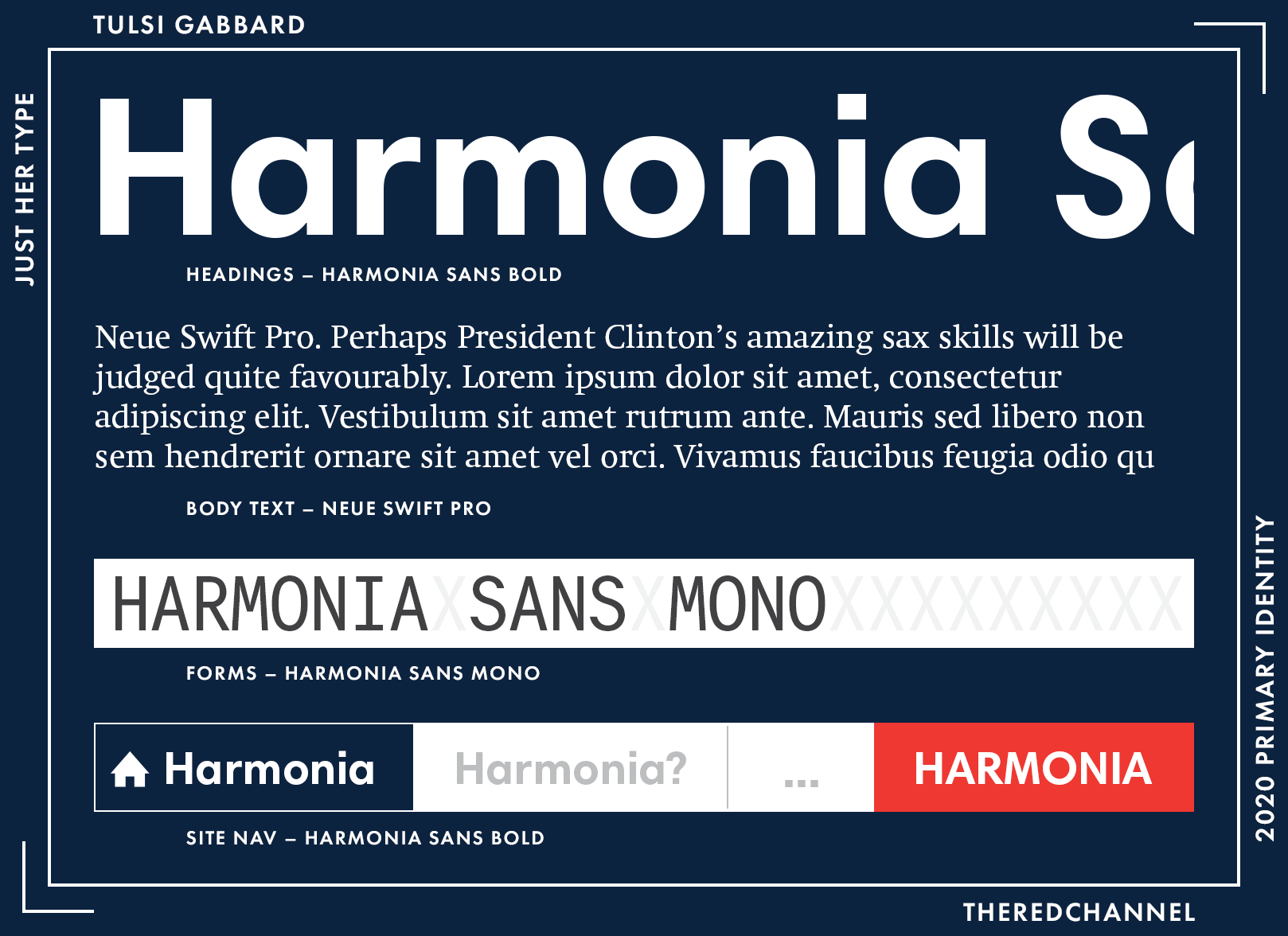
Body text is Neue Swift, a serif by Linotype. Headings are in Harmonia Sans (from Monotype), as are block quotes. All forms and the fine print in the footer are in – and this is the exciting one to me – Harmonia Sans Mono. Monospaced fonts in presidential campaigns! This is a brave, new frontier. How long before we are visited by the first web brutalist campaign?
It is smart to sample around within the same family, and all of these choices play quite well with one another. Harmonia is a nice geometric sans, and the complement of available styles and weights is luxuriously varied enough to handle pretty much any task Gabbard may throw at it over the course of a campaign. On the body copy in particular, she could stand to go up a few point sizes or set a lower maximum width on the text column, as it is quite laborious to read as-is. Characters per line clock in around a staggering 130 (80 is best practice for web).
What is in Tulsi’s swag bag?
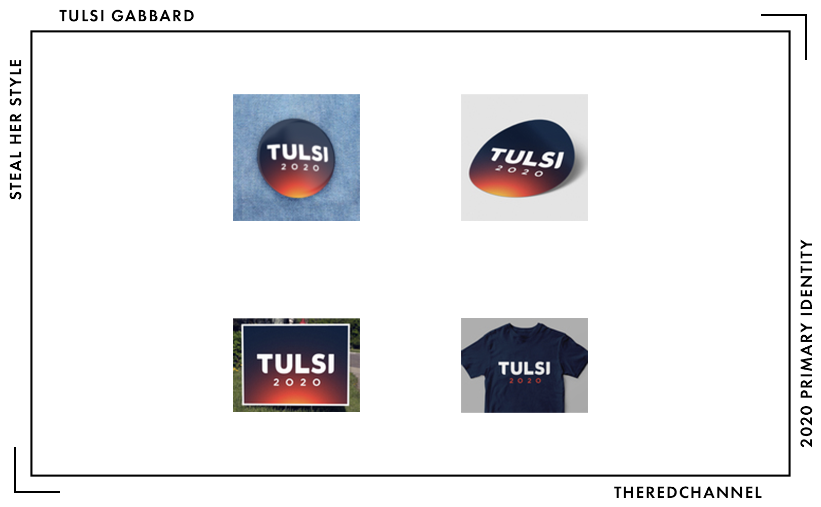
Buttons, stickers, yard signs7, shirts, oh my! No legibly-sized images of said products anywhere within the webstore, oh my! This is the first instance in which I have seen the monochromatic mark applied to a background with the full-colour gradient, and I appreciate it a good deal more. It is a smarter application, for sure. This is perfectly serviceable merchandise. Nice, but I am not running out into traffic to buy anything.
I do wonder about that solid-colour t-shirt, though. Her gradient clearly would screen quite poorly (and thus make economical production of shirts at scale a challenging proposition). Is it possible that there are further difficulties reproducing this mark, even in digital printing? It feels out-of-place to have one product so clearly lacking the vibrancy of the others. This identity is a prime candidate for dye sublimation, which one hopes the campaign will explore further in the future. Should one wish to buy one of those bland, $30 t-shirts anyways, apparently Tulsi is telepathic! At no point in time during the checkout procedure is one asked which size of t-shirt they would like to order.
Aloha, Senator Gabbard (D-Amascus)!8 Until next time.
→ Vector copies of Gabbard’s logo are available as a graphics package here. ←
Who is talking about it?
- Want to hear from a gradient convert? Anchored Creative gave it a rave! (Their score: Perfect 10/10)
- Per BuzzFeed, we are looking at “the glowing core of the Earth.”
- Election Season wrote it up without passing judgement.
- Greenhead Design digs the mark, but not Tulsi.
- An anonymous branding expert (we grant anonymity for graphics criticism now?) in The Washingtonian dwells on its “apocalyptic” qualities.
Julián Castro
![]()
Date Announced: 12 January, 2019.
Slogan: “One Nation. One Destiny.”
Emphasis on the given name, for obvious reasons depending on the viewer’s particular familiarity with U.S. politics. Though even given the contributing factors, it is welcome a welcome change to see men running for office not shy from identifying by their given names.
There are many different constructions of this mark, all dark navy, all boxed. Some are defaced with the candidates surname, some with the date of the elections, and some with both. I happen to most enjoy the examples defaced with neither. The display face used to render Castro’s given name works best in large sizes and with room to breathe. Setting smaller bits in the same type merely detracts from both of those qualities.
It is a nice, strong typeface. It works great in the mark. It works less-great when used on teeny-tiny headings throughout the website. A vibrant blue, while this specific hue verges on Democratic cliché, is necessary to break up the very dark navy which makes up the bulk of the mark. I enjoy it. This is a well-executed monochromatic palette.
Putting a broken box around one’s name feels like an unusual choice given that it is a hallmark choice of the anti-design featured by the recent unpleasantness the very stable genius. Frankly, if there is anything that I wish to see breaking up a boxed-in name these days, it is an acute diacritic mark on a Spanish name. Nice work.
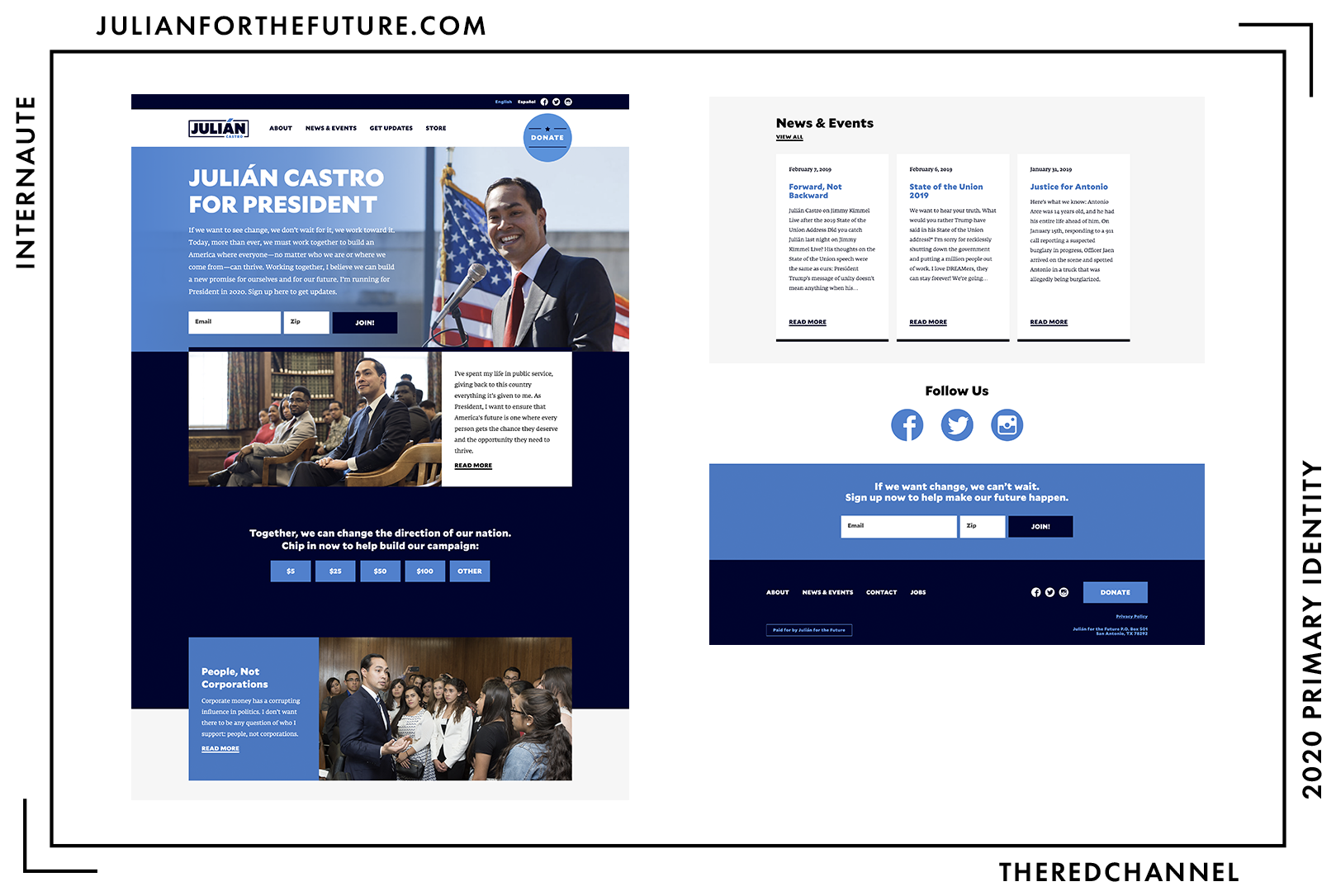
The web presence is a custom WordPress theme titled “Castro for the Future.” My qualms with the presentation of information here lie in the sheer density of it all, particularly towards the top of the page, and particularly when compared to other candidates. There is a lot more text to process, and it is there at once upon loading the page. The heavier type (Mallory) performs at its best when it is really big – used as a display font. At the smaller sizes on this page, it becomes less successful. Castro should not fear making the page a bit longer, encouraging the surfer to linger a while.
Monochromatic blue! How refreshing.
💡 Did you know: Castro sits alone with Klobuchar among candidates eschewing a tint or shade of red on their donation buttons. The cool table!
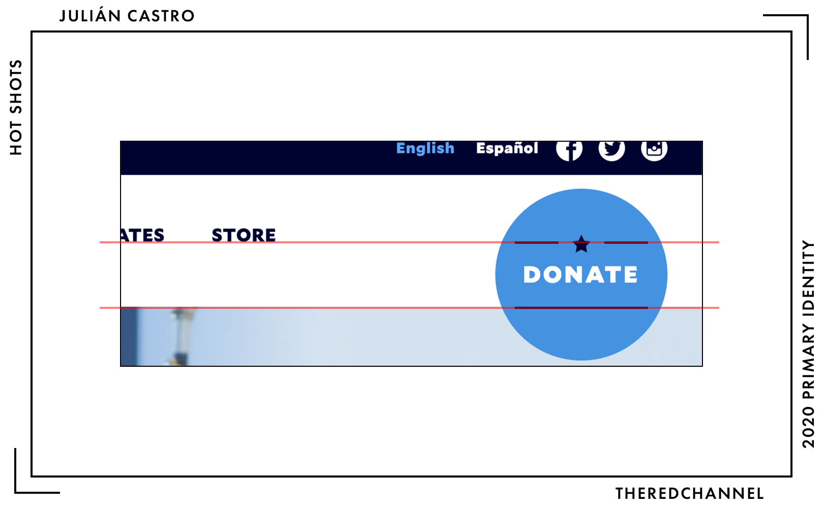
I did, upon noticing that the lines in the “Donate” button align with the top of the hero image and baseline of the nav text, rise from my seat and shout “YES!” at my computer. Your mileage may vary.
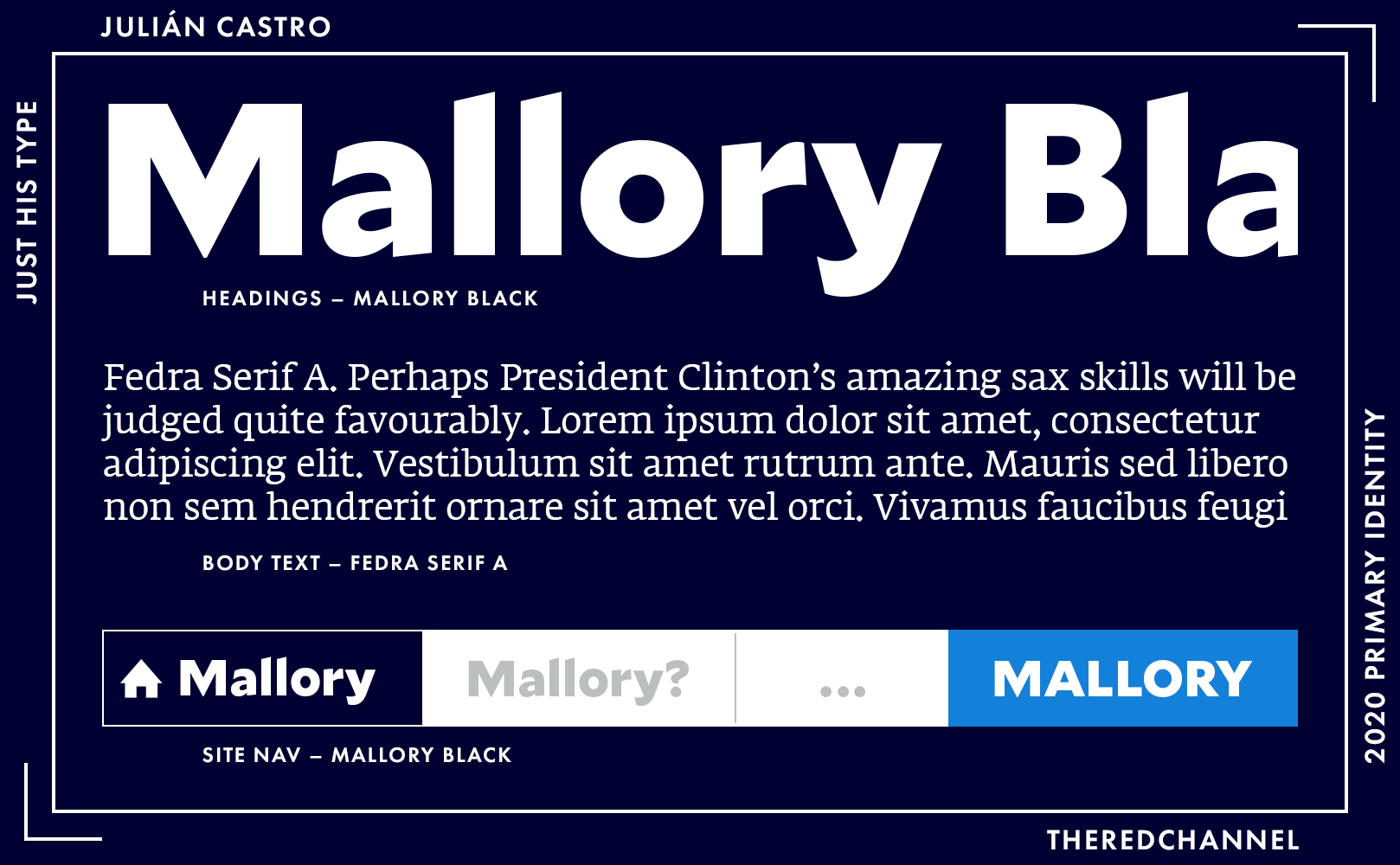
The headings match the typeface in the logo, Mallory Black by Frere-Jones. Mallory is my favourite family from the independent era of Tobias Frere-Jones, and that is almost entirely thanks to the character of the heavier weights (oh my, those slightly angled cuts!). It is indeed the font of transatlanticism, a rigid-yet-playful love-child of the British and U.S. traditions. The body text is Typotheque’s Fedra Serif. An astute reader recently out of school may note that Fedra Serif is the face of choice in the web version of Ellen Lupton’s Thinking With Type. A unifying trait between the two is that they are many orders more synthetic and fun than they appear at first blush. Competence and well-veiled exuberance. If that energy is what one can expect of Castro as the country’s executive, then he might be worth a shot.
There is a bit of merch, as well…
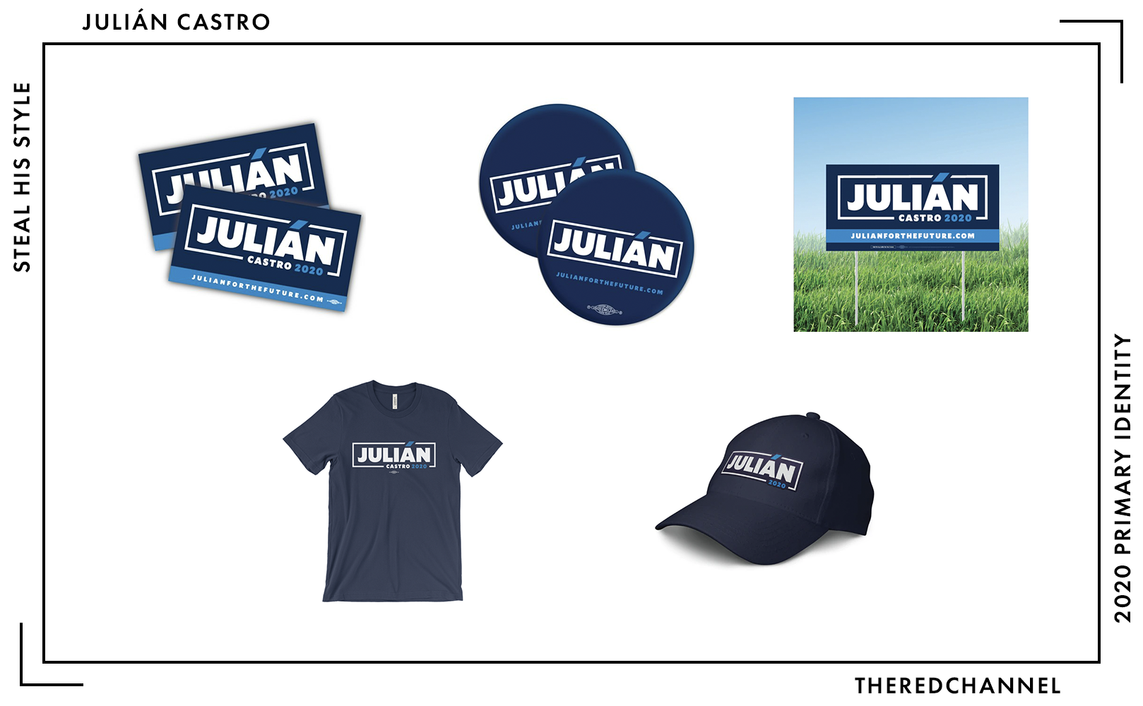
You can proclaim your love for Julián on your car, on your person, and on your lawn.9 Deep navy is a safe colour to work with, so it is hard to make any of this look bad, per se. The buttons would benefit from some text or graphic elements above the logo to provide a balance to the URL displayed below, though I have the same problem with the heavy weights of Mallory being less-successful in small-size applications. Even better, the campaign could consider close-cropped, rectangular buttons (a higher unit cost likely precludes this). I do wish the shade of navy had been matched across all merchandise, as the apparel does feel slightly disjoint. That t-shirt, in the slightly-off navy, will run the buyer $25.
→ Vector copies of Castro’s logo are available as a graphics package here. ←
Who is talking about it?
- “Clean without being forgettable,” says Anchored Creative.
- Logo Deep Throat, The Washingtonian’s anonymous branding expert.
- Election Season has all the details on the massive miss of Castro’s exploratory committee webpage. (Hope you like yellow!)
- Greenhead Design is a fan.
- Hunter Schwarz does the mark justice in Cover/Line.
Kamala Harris
![]()
Date Announced: 21 January, 2019.
Slogan: “For the People”10
This mark is beset with the tremendous misfortune of echoing back to a recent, high-profile, disastrous type lockup. I am still reeling from the trauma! That said, Wide Eye has executed the whole-bunch-o’-type logo much more successfully than the National Endowment for the Arts.
I discovered the most pleasing thing while setting this mark for publication:
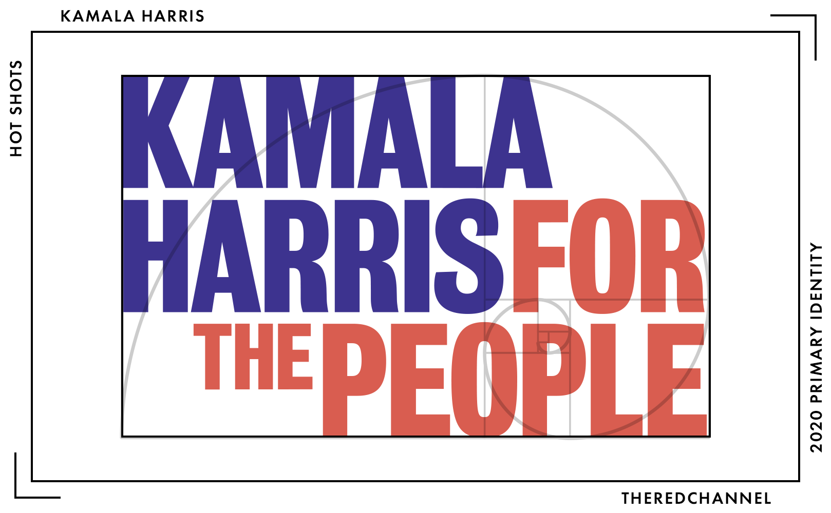
Come through, golden rectangle!
It is non-traditional historically, but it is also unlike anything else seen in the field. It does not appear anything like a presidential logo. It leans quite heavily on the strength of its typography. It is a warm-yet-forceful font, and the colours selected are quite warm, as well. For eschewing all the trappings of traditional political design, with its slavish devotion for the U.S. flag, this mark (particularly in the variant above) sure does resemble the U.S. flag. This would make Kamala Harris the canton. The canton on that flag symbolizes national unity, and is certainly is not a bad place to be.
I will echo the concerns of Anchored Creative and say that, in monochrome, this logo does underperform. It relies on colour for the intersecting-blocks effect, and in monochrome, such a look necessitates transparency.
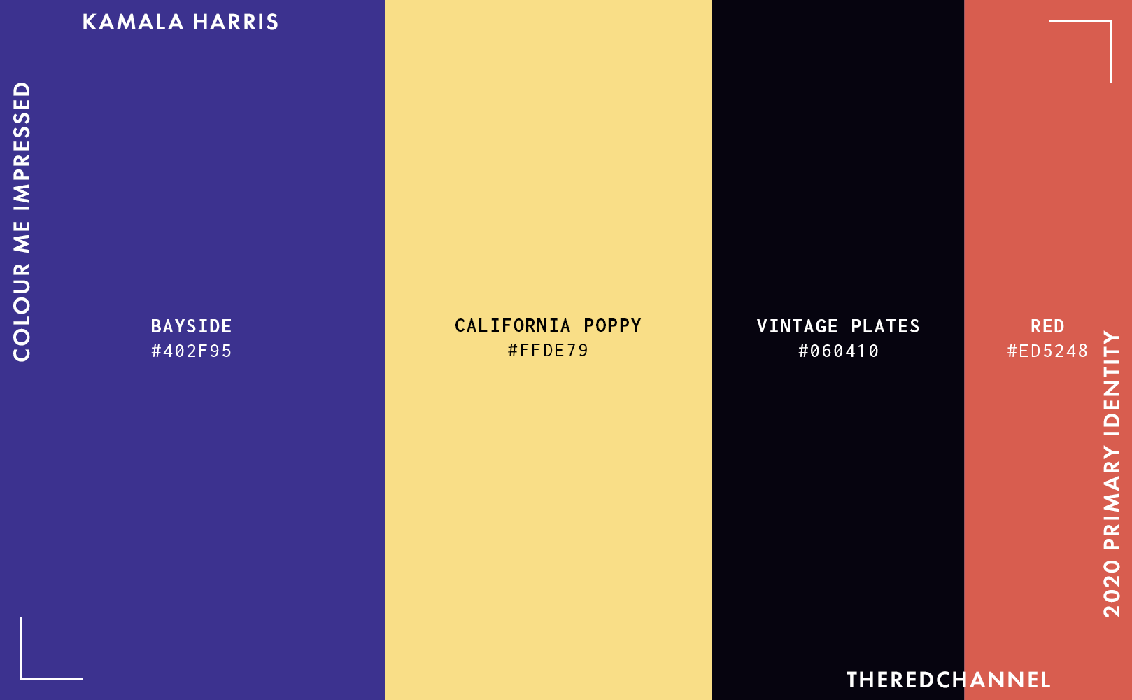
There is much hay to make of the non-traditional colours. Purple and yellow are not my mind’s immediate destinations when envisaging a presidential campaign, but it is not a bad choice. They are warm, they are inviting, they are quite unlike anything seen prior. The yellow is a fitting nod to Shirley Chisholm, but I see something more:
Pure, unadulterated, vintage California sunshine. What an inspired choice.
Wide Eye puts this all together in a real winner of a website:
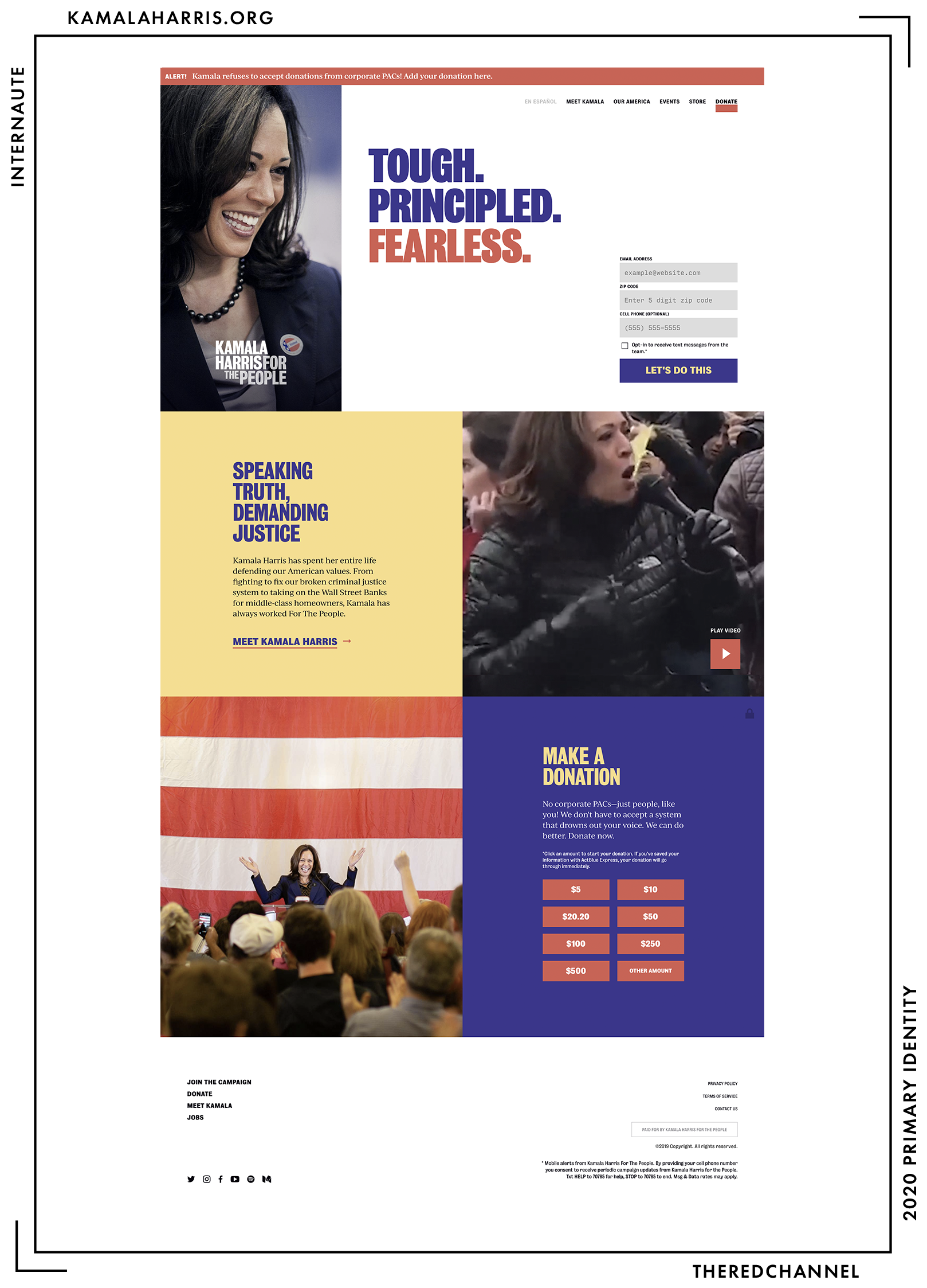
Style is via a custom WordPress theme named Purple. The colours in use on the branding assets continue through to the website. The hierarchy of content is clear. Organization is good, and content is short and to-the-point. Everything is clean, modern, and unfussy.
If I must be critical, the underline beneath the donate button is far, far too thick. I would prefer an actual navbar to the shadowy gradient provided when scrolling down the page at present. And, as previously noted, monochrome applications of this mark suffer from the transparency required to differentiate between Harris’s name and slogan.
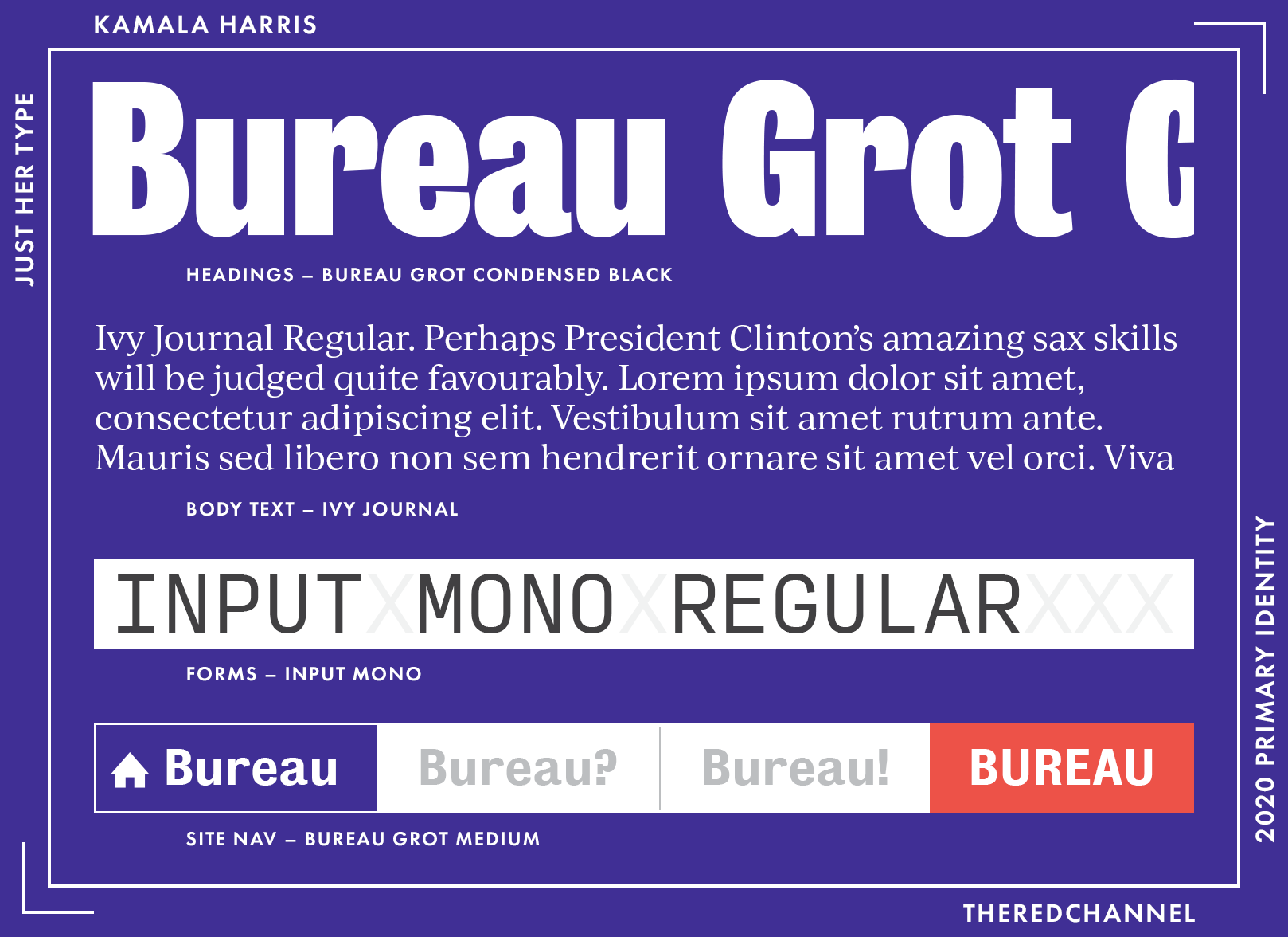
Headings, identical to the logo, are set with Font Bureau’s Bureau Grot, an exciting family inspired by the Stephenson Blake Grotesques and ideal for headlines. It works well with a rational serif in the body, such as The Ivy Foundry’s Ivy Journal. These are, in a sea of ubiquitous, free webfonts, unexpected and harmonious choices.
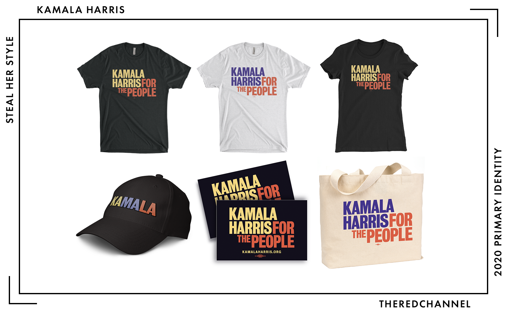
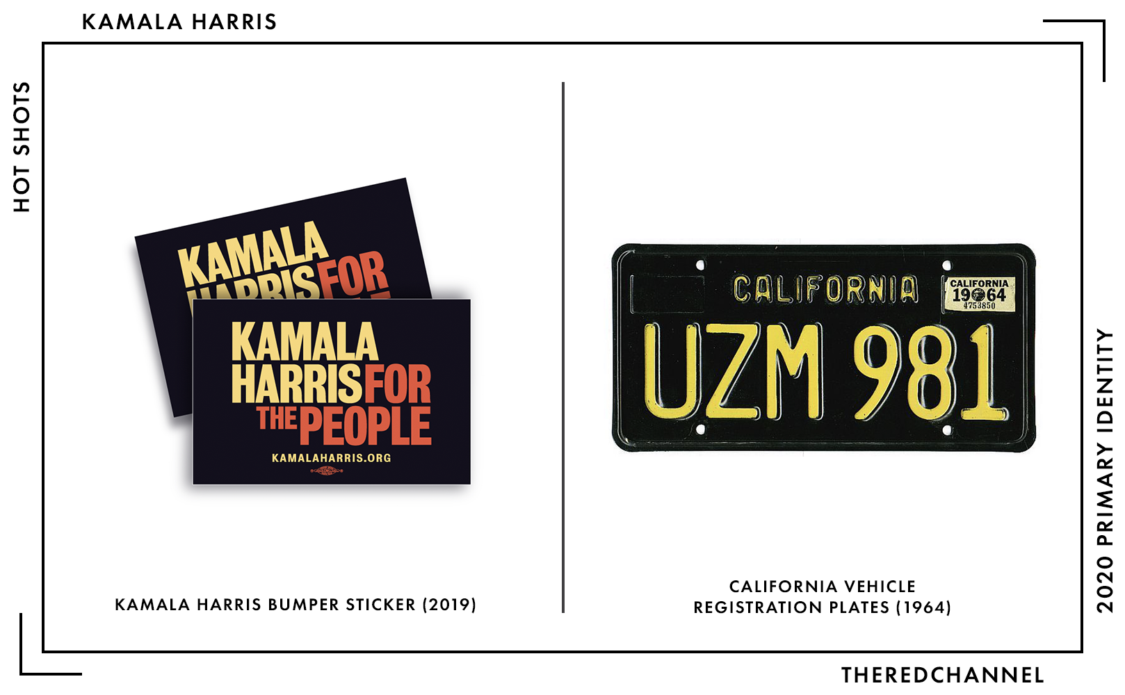
Harris is selling some stuff, as well. A couple t-shirts, a ball cap, tote bag, and some sharp bumper stickers which would look great next to 1964 California plates. The tote would benefit from a black dye job and a switch over to the yellow and red logo, as raw canvas is not among the colours sanctioned in the campaign palette. At $30, the t-shirts are among the pricier examples from the candidates. The light-coloured t-shirt, it must be noted, is either out of stock or otherwise removed from sale.
→ Vector copies of Harris’s logo are available as a graphics package here. ←
Who is talking about it?
- You know that you have hit on something special when AIGA writes you up.
- Anchored Creative fawned over it, save some misgivings on the transparency. (Their score: 9.5/10)
- Broadcast and print media picked up on this one. See CBS, Fox, and The Guardian.
- BuzzFeed calls it “jazzy.”
- Deroy Peraza has a gem of an article over at Fast Company in which Harris’s design choices figure prominently.
- In fact, Fast Company found it so nice, they wrote it up twice! See this interview with Susan Merriam of the Center for American Politics and Design.
- The Unbreakable Greenhead Design took a whack at it, of course!
- TypeNetwork can speak to the letter-y bits much more competently than I did.
- Jonathan Last over at NeverTrump cloister The Bulwark has a different take entirely.
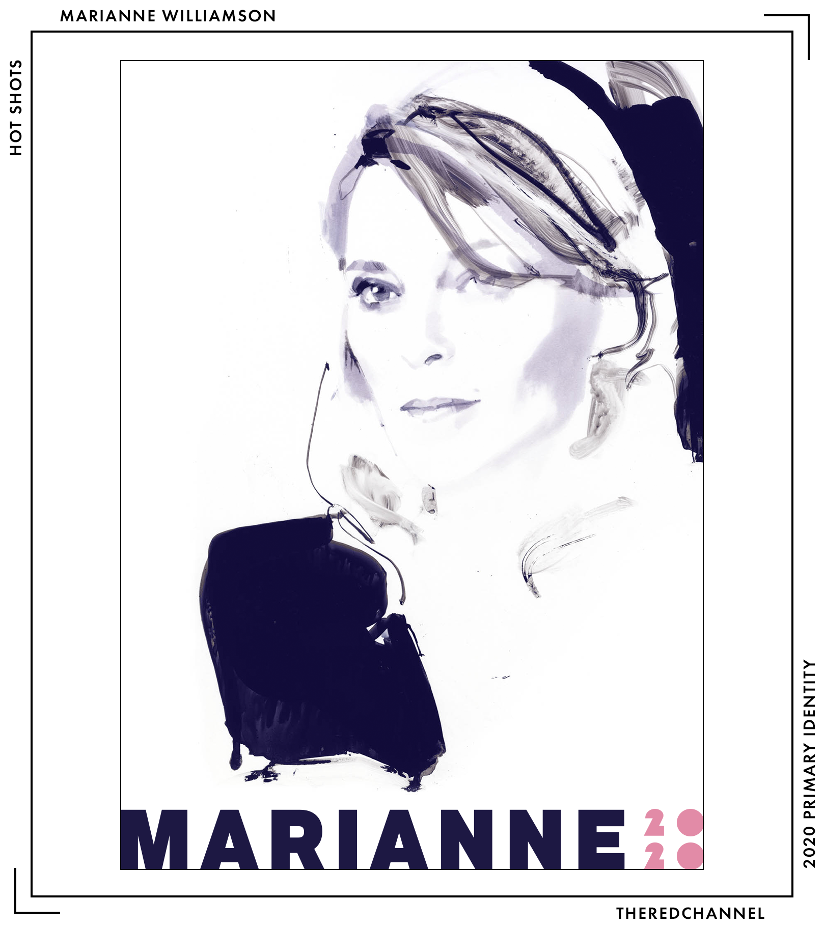
Marianne Williamson
![]()
Date Announced: 28 January, 2019.
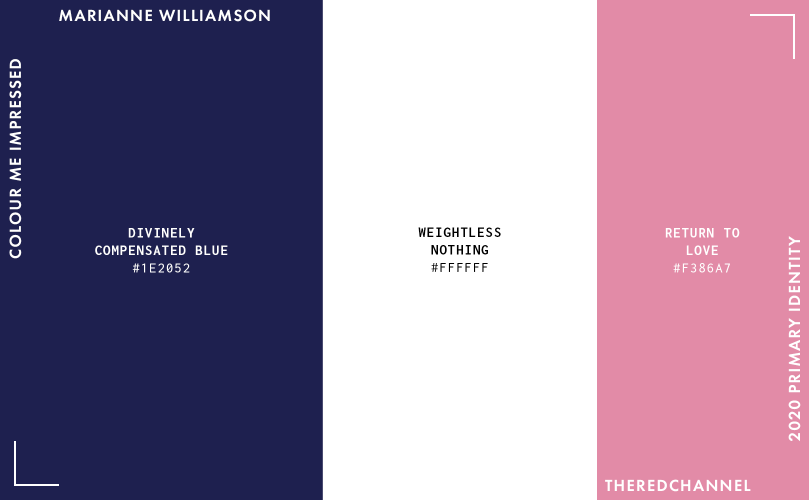
This confuses me. It is by no means a bad wordmark, but it is not Marianne. The blue is rather pedestrian. The choice of type, I do not mind. It is a solid, neutral grotesque. Marianne Williamson… neutral? Toss the mark into reverse image search, and it suggests “gadget” as a search term.11 Click on over to “Visually similar images,” and one can scroll through a mind-numbing, endless sea of dark blue wordmarks in dark blue, neutral typefaces. That does not make it bad, but that does make it far from original. And a world away from the new-age-saturated, self-help and spiritual avatar that is Marianne.
Light pink as the secondary colour, on the other hand, is a quite stylish choice. The complementing type is FattiPatti, from the very-extinct type foundry Casady & Greene. It is not too dissimilar from Milton Glaser’s famed Baby Teeth. See, now that is the ridiculously obscure, this-is-a-display-font-with-truly-limited-use-cases kind of selection I expect!
…and the sheer strangeness of that choice, I must admit, does make me feel a bit of affection. Thus concludes the Era of Good Feelings regarding type in this review:
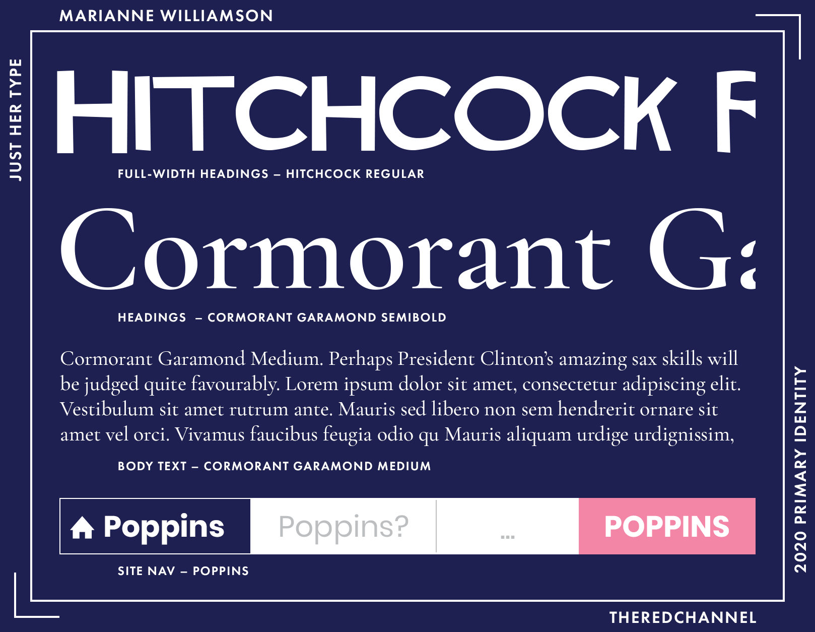
A handful of full width headings and certain pieces of text used more as graphic art pieces than any kind of textual information are set in Saul-Bass-via-Matt-Terich’s Hitchcock. How fun is that?! Less fun when one, for some reason, pairs it with a Garamond-alike.
The majority of the headings are in Christian Thalmann’s Cormorant Garamond. Cormorant is downright elegant and extravagant type. It is a re-interpretation of Garamond for use as a display font. The style called “Cormorant Garamond” is intended to be its body-friendly counterpart, dialling the flamboyance down to eleven (from, y’know, thirty-six). I have tried and failed many times to use it intelligently as a text face. Certain pages on Williamson’s website try to do so anyways. It is a beautiful (and free!) font, but do not try to make it perform a role for which it is not suited. Get it out of the text entirely, and put the headings into Cormorant Regular so they will really shine. If you are writing body text, spring for a Garamond licence. (Or, even better yet, use something safer for the web than Garamond.)
Paired with Cormorant in the body and nav is ITF’s ubiquitous Poppins, a lively geometric sans-serif. Cheap and cheerful (free!). I like it when paired with other weights in the same family, and find it gets along best with itself. I fear that this choice does not play nicely with Cormorant, and would prefer to see a rethink here, or at least keeping the geometrics relegated entirely to the nav buttons.
These are, individually, all pretty okay (and free!) fonts for, y’know, other roles. Given the value proposition, they are used by cumulatively millions of websites. But rarely together, and for good reason. Pairing all three, there is personality to the point where the type is detracting from what is typed. While I am no crystal gobleteer, even I could stand for the choices in type to become a touch less… visible.
All the more shocking, we must remember that the logotype is a neutral grotesque! The keystone of this identity is fundamentally misaligned with the surfeit of eclectic character in all of the supporting assets.
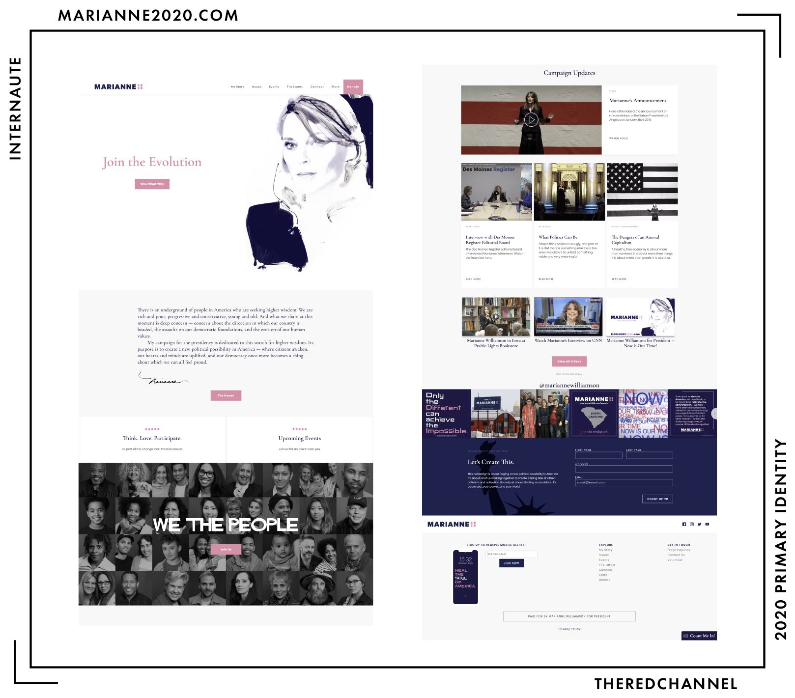
The site is otherwise fine. Just fine. By no means a triumph, but the card-based construction is eminently bearable. There is a surprisingly large amount of content and, thank goddess, it is not attempted as a one-pager. For what it is, the site is fairly competently put together, aside from some truly head-scratching type choices. Of note, it is the only website of those assessed which deliberately uses a serif as the heading font. I dearly regret that Williamson announced in front of a U.S. flag, as that pop of red stripes does not really fit well with anything else. Consider that colour-matching to one’s brand identity may deserve priority over patriotism.
The uppermost pair of cards on the homepage, intended to direct visitors to upcoming events, are crowned with five stars as a decorative element. Their style reads far more like product reviews than anything else. The Instagram feed is disruptive and unnecessary, particularly as there are icons linking to Instagram and all manner of social media sundry just below it.
Enough. On to the store…
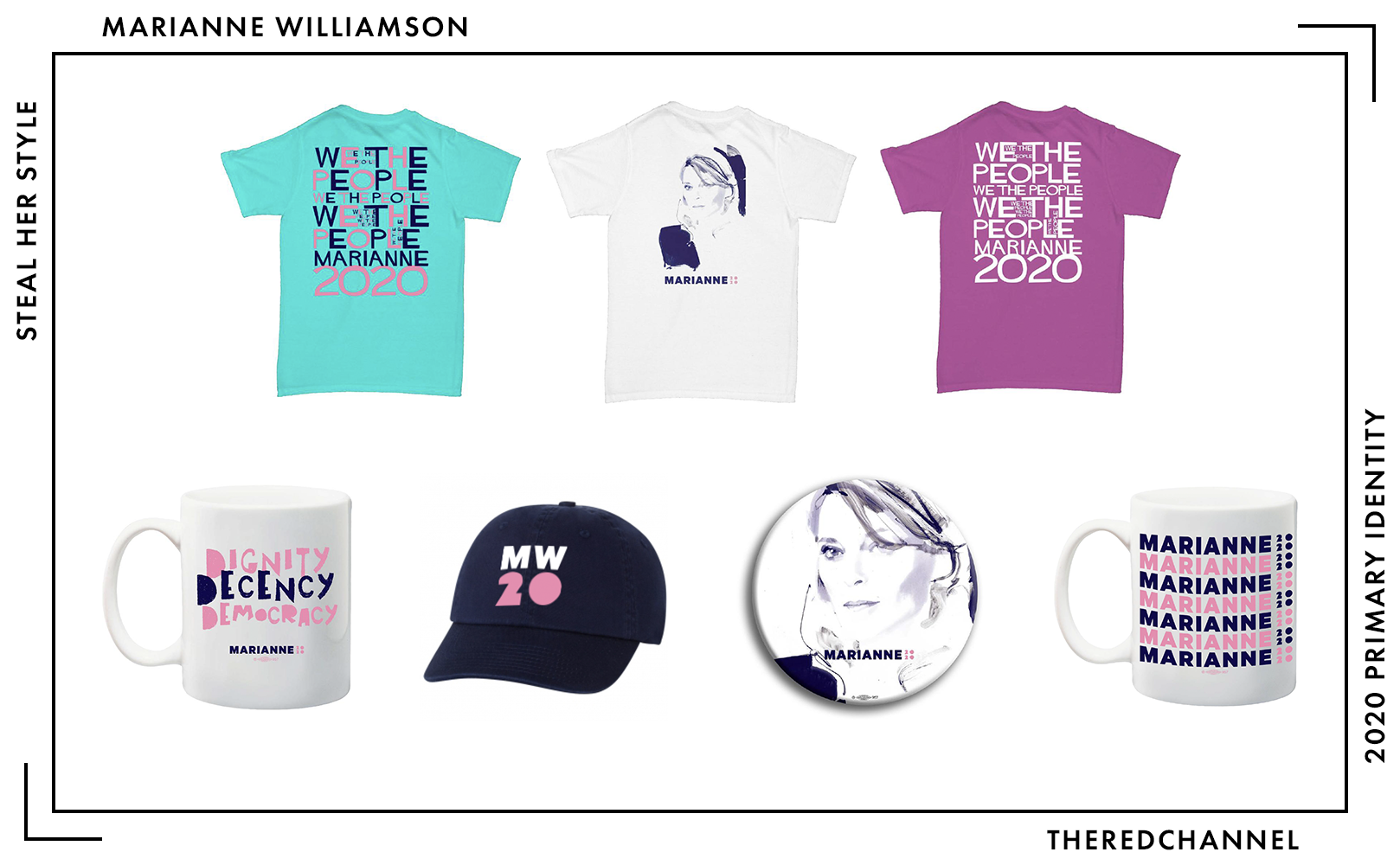
Yikes. The mockups used to represent the physical products have some obvious issues, so I will withhold comment on the fact that most of these items look more like creations of Photoshop than anything which exists in a physical universe, but I cannot remain silent on the shirts. Because – oh my word – there are some problems with those shirts. While there is pink in Marianne’s campaign identity, it most emphatically does not match the shade available for $25 in her webstore. The teal (cheerfully described as “scuba blue”) example with hot pink printing is a visual calamity. It is physically painful to look at. The word collage rendered in Hitchcock is a jumbled and unparseable disaster. I mean absolutely no disrespect to the late Saul Bass in denigrating this application of type. He would take no disrespect, as Bass would never abide by anything like this, either. The painted shirt, on the other hand, is quite delightful:
What a treat! This is an work by former Vogue illustrator David Downton, and I can think of no kinder thing to leave Marianne (or the reader) with than this image. Without a doubt, the single most successful piece of artwork in this young campaign.
Marianne, I am sympathetic to your views on human capital mobility. Everything except your position on e-Verify, your befuddling demand to inquire about habits of remittance, your perpetuation of the myth that non-status Americans do not pay into federal coffers, and the line of your platform discussing “illegible aspiring citizens.” When you correct this policy plank, why not mend the visual identity, as well?
→ Vector copies of Williamson’s logo are available as a graphics package here. ←
Cory Booker
![]()
Date Announced: 1 February, 2019.
Slogan: “We Rise,” I think?
Observe that Booker has made the same choice as Buttigieg and Castro in identifying himself by given name. Cory’s mark is available in two lockups: a vertical construction with the two blocks of type shunted together, and the variant with the blocks stacked atop one another. It is the latter that is shown above.
This is an extremely energetic, uncompromising, and polarizing graphic. It elicits immediate and strong responses from everyone who views it. Close-cropped, bright, and crowded, it definitely draws inspiration from contemporary sources outside of the political design canon. It feels youthful and, as I am sure the youths no longer say, edgy. The selection of red and blue is traditional, but that just about expends its orthodoxy.
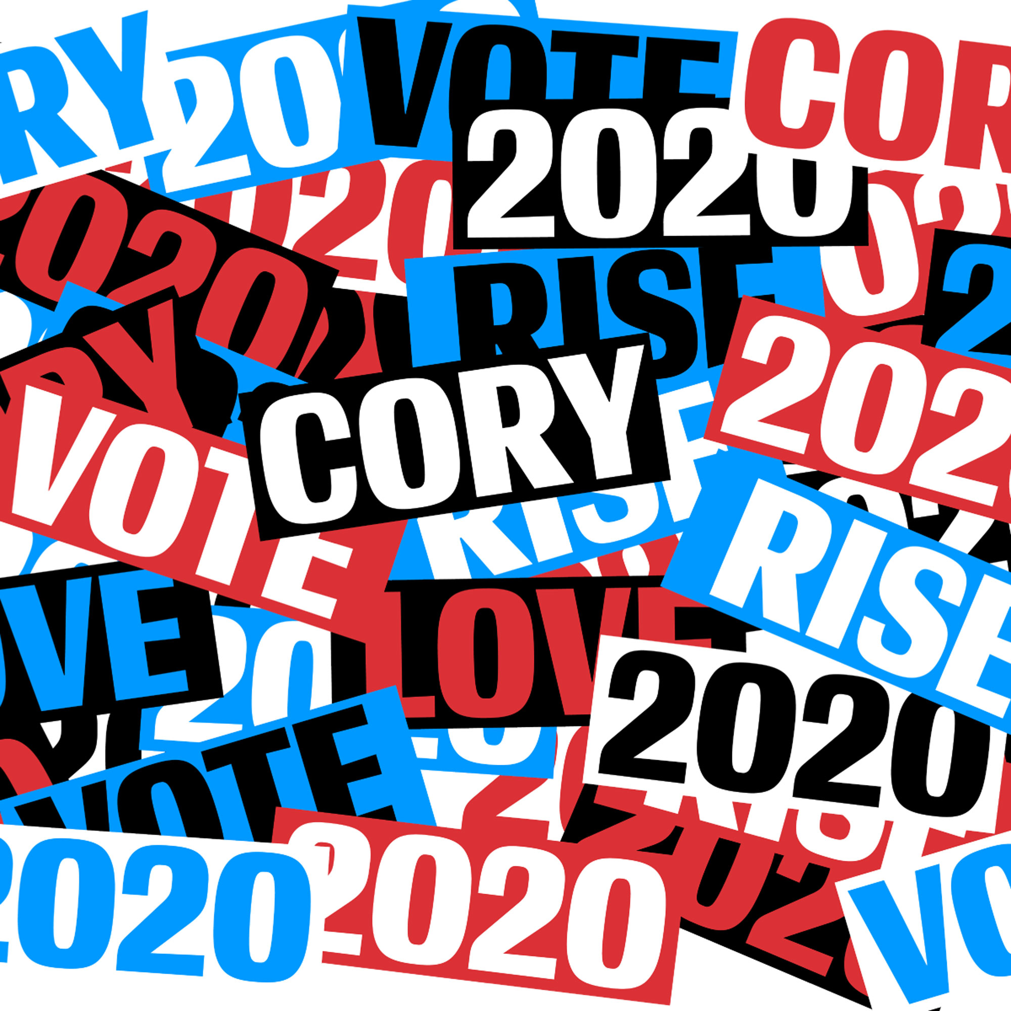
I am excited to see where this one goes. With a mark that is so simple and modular, there are near-infinite opportunities for highly creative applications. The urgency of the colours, type, and construction are natural prerequisites to a fantastic guerrilla campaign. I want to see this in unexpected places, and ideally taking unexpected forms.
This is a free idea, by the way.
Exciting and unique for this go-around, Booker’s team is springing for a custom typeface. (Oh, that worked out so well for everybody the last time around.) This one is based on Conductor from Frere-Jones. Helen Rosner, the New Yorker food correspondent who has an excellent Twitter account, wrote on this typeface’s humble beginnings from, of all places, numerals on Bulgarian lottery tickets.
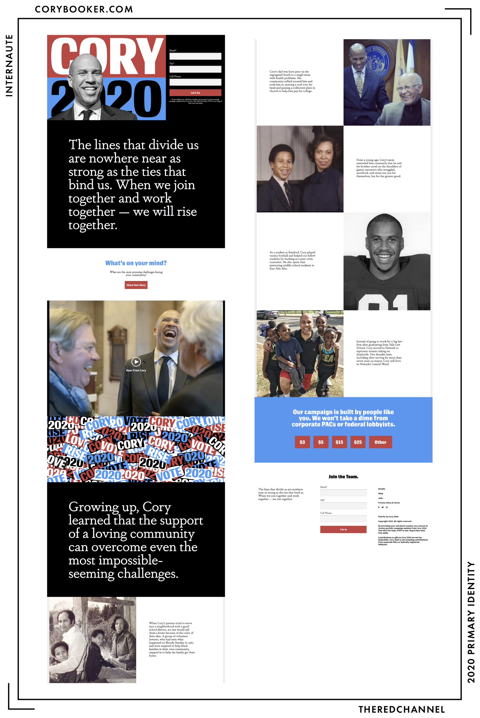
Onto the web presence. It is high crime to deface one’s own logotype. It is high narcissism to deface one’s own logotype with a selfie. Why, that is as outlandish as overlaying a logotype with a signature. It does nothing but titrate down brand value and, in this case, consume an awful lot of prime real estate at the top of the page.
I love that Cory wishes to communicate with us the story of his upbringing. I love that before doing so, before even sharing his video ad, he solicits input on challenges facing the viewer’s community. He is listening and sharing, but this website – it shouts. Cory, you are cool as a cucumber, but this webpage is too trendy by half and does a disservice in drowning out its own message.
Oh, and the fact that two examples of the logotype, visible at the same time, use different shades of red:
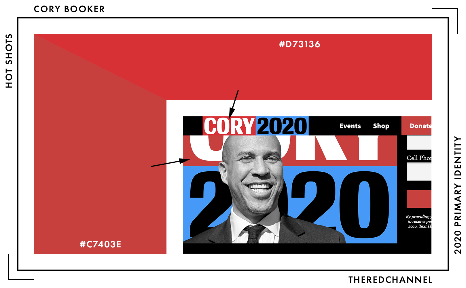
…really, really bothers me. That is a rookie mistake! On the very important subject of red, let us talk colour:
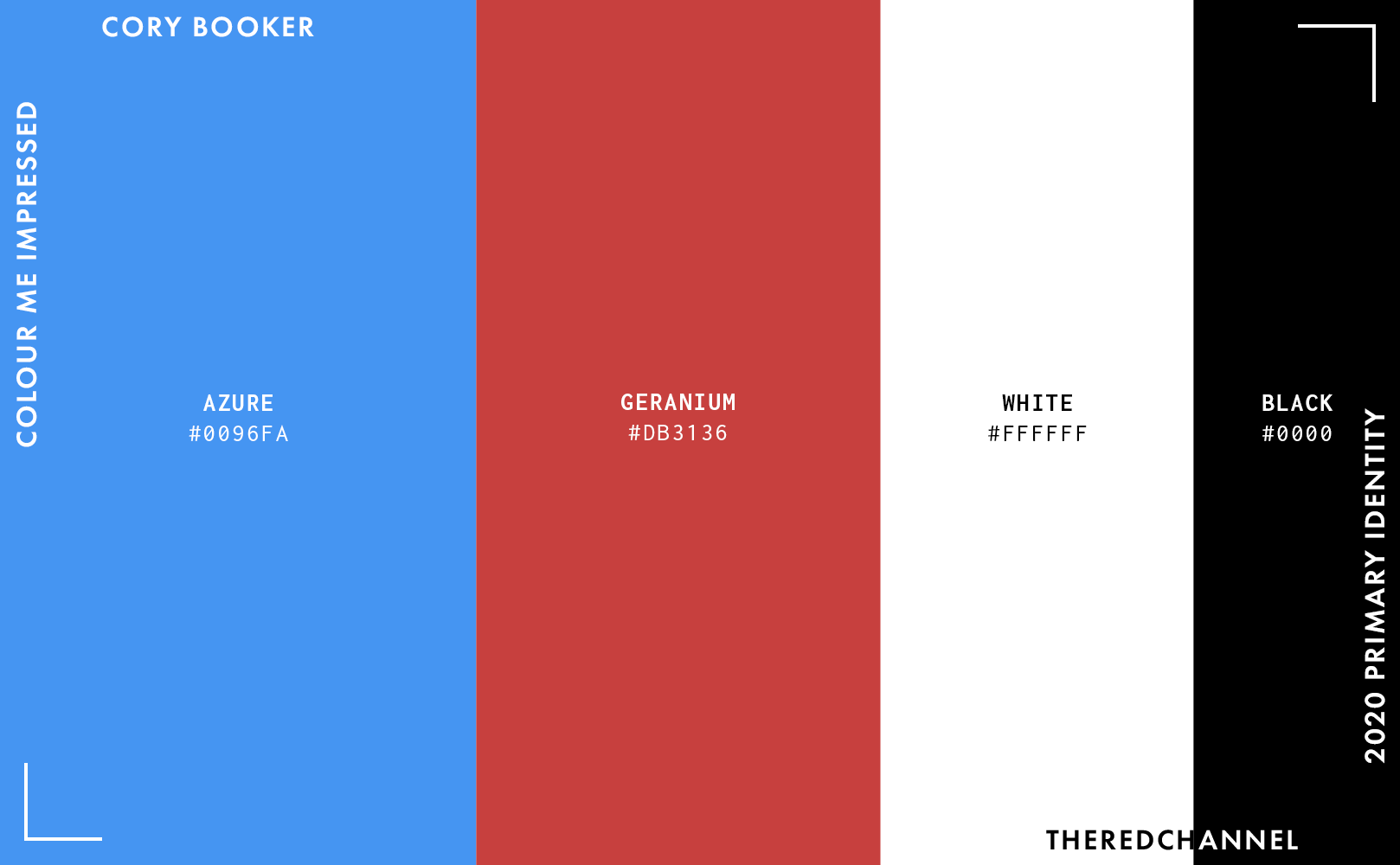
This is a conventional colourway, but the specific shades are a bit atypical and quite nice. I would love to be ensconced in that blue. I would say yes to that colour, should it ever pop up in a ring-set paraiba tourmaline. It bears repeating that I wish for the reds to be standardized between the mark itself and the website. The heavy incorporation of black into the mark (as text) and into the webpage (as a background colour) is itself a divergent choice.
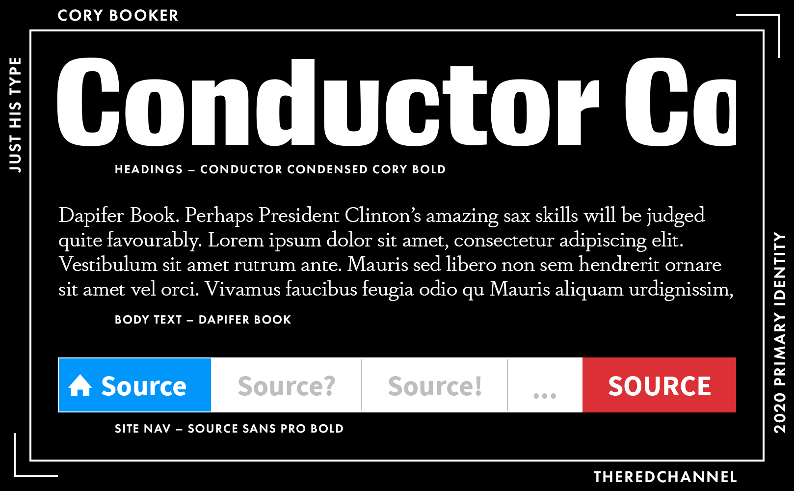
The custom typeface, Conductor Condensed Cory, dominates the headings. Forgive me, it is not my favourite face. The extreme contrast of weights feels more awkward and unbalanced than it does striking. The triangular grid in the italics is quite interesting, but I could not see myself using it. (Its absence from the campaign materials I have viewed give the sense that neither can Cory.) There are other options at Frere-Jones I would reach for first. My apologies to the Bulgarian lottery.
Darden’s Dapifer, a slabbish old-style, sits as Player Two to Conductor in the body and the block quotes. I am afraid that I find it quite dated, and will bow out to allow Thomas Phinney explain the magic that motivates it over at Typographica. To my eye, it is as dusty and out-of-place as Conductor on this webpage which otherwise aims for the contemporary, bleeding edge.
The type, like much of the website itself, could use some levity. Heavy, heavy, heavy choices.
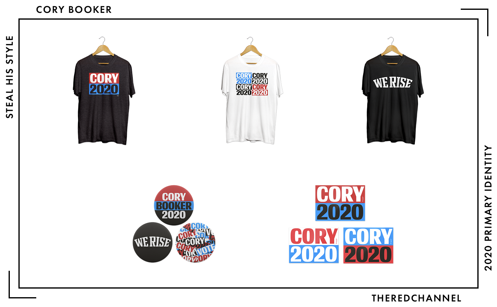
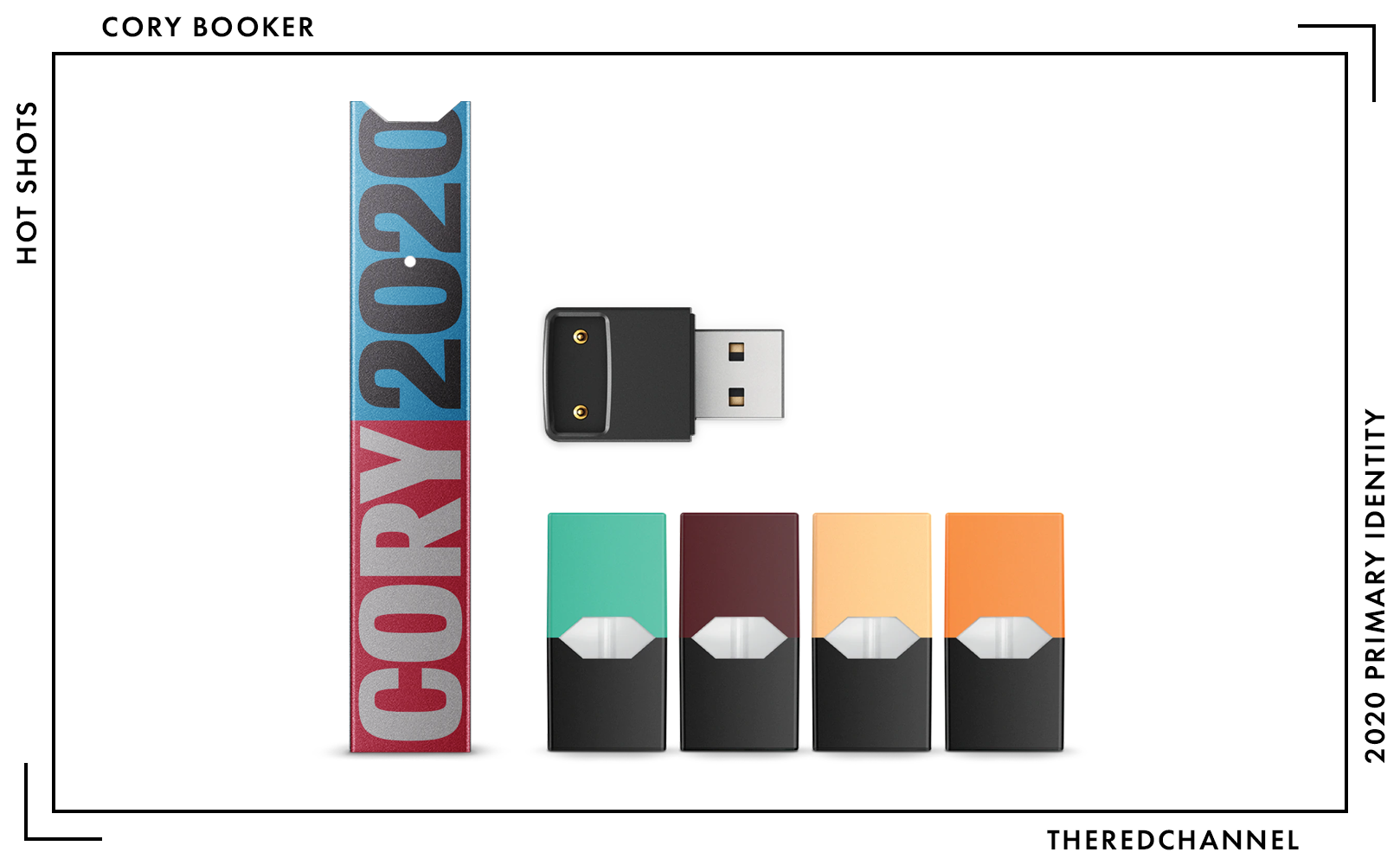
The merchandise is interesting. I hold as an article of faith that the modularity of this brand identity will take it in some creative directions. The objects emblazoned “WE RISE,” with what appears to be an envelope distort applied to a different typeface entirely, make no sense. One would hope that these are not aberrant pieces, and that they are constituent parts of an overall look which will become more fleshed-out and revealed over time. Until then, the “We Rise” shirt which looks nothing like the rest of the campaign’s identity can grace your postal box for $30. Everything is loud and edgy and, as I said, I would like to bathe in that blue.
→ Vector copies of Booker’s logo are available as a graphics package here. ←
Who is talking about it?
- Anchored Creative has an excellent point on the massive disconnect between the typefaces chosen and the message conveyed by the actual text.
- “How can we trust you to be president when we can’t even trust you to pick one good typeface!?” Indeed.
Elizabeth Warren
![]()
Date Announced: 9 February, 2019.
Unadulterated excellence. I adore Warren’s style, and here is why: It slots so well into the image she has already cultivated. It echoes New Deal programmes, it calls to mind 20th century reformers and revolutionaries with long-term vision. It is all business. It challenges and compels the viewer. The tremendous underscore beneath her name – her surname, standing alone – feels serious and important. This identity is not that of someone here to waffle and waste my time, this is someone who came to fight. And win.
In the logotype, I noticed an immediate similarity to Jeff Levine’s Public Works. A different face, to be sure, but there is a subtle nod to the hand-painted, government letterforms of years prior.
This is a senator actively shaping and defining how others will view her political legacy while that book is still open. Warren is the master of her own identity. The 21st century firebrand with a knack for virality unlike any other. The wizard who converts epithets hurled from her opponents into nation-wide fundraising efforts. She has staked a career upon being uncowed, an unassailable force. This mark itself lays bare an expression of its own unassailable force: She’s Liz Warren. She’s in. And she means business.
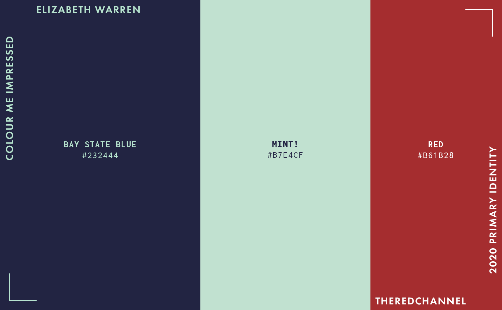
These colours are so confident and expensive. The palette is as rich as it is commanding, but I must interrupt this programme to bring you – Mint! Can you dig the mint? This is my favourite colour choice in the entire field. Warren’s people are calling it “Liberty green.” I am not going to call it that, as I am not on her communications team and thus do not have to, but there is indeed a perceptible similarity to the oxidized copper of the Statue of Liberty. There is not a bold bold enough to accurately convey my feelings for this mint.
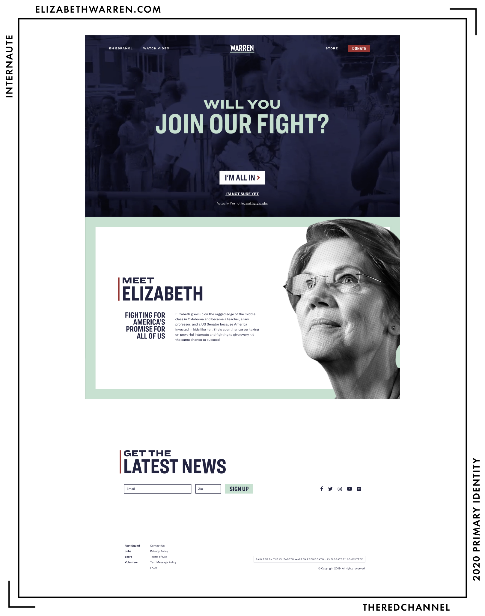
This little site is really well done. It is clean, modern, and cuts all the cruft. Nothing is superfluous. Every sentence and every heading stays on-message and provides new information. No repeated begging for an e-mail address, no distracting social media carousels, no veritable scrapbook of extraneous photography. Concise and to-the-point. A two-sentence bio, in fact, is quite refreshing. The spartan use of red as a spot colour maximizes its impact.
As an aside, it takes guts and guile to place a complaint form on your own campaign homepage. Some other links off the homepage, however…
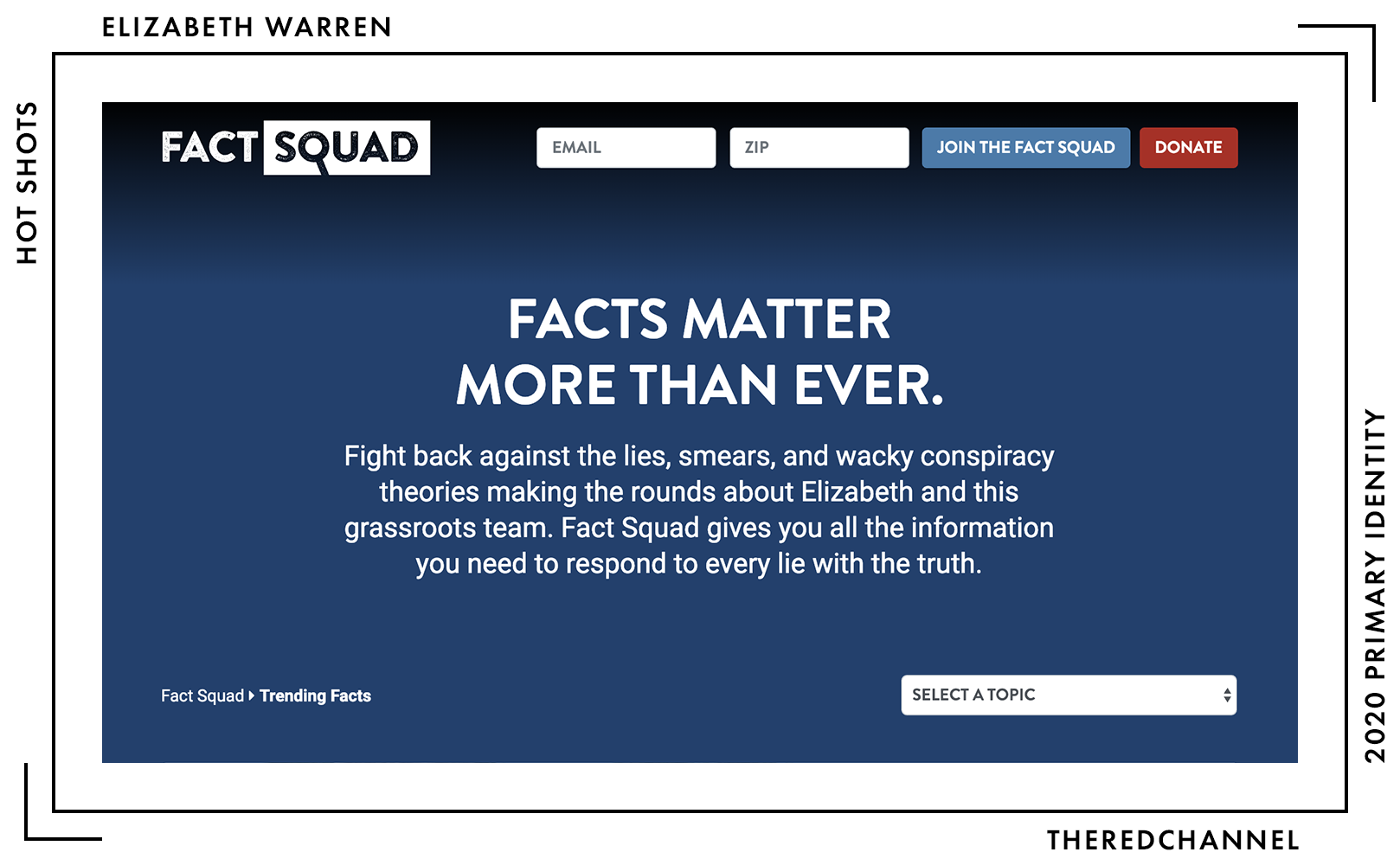
Ugh, I suppose, to fully assess the website, one must consider the Elizabeth Warren Fact Squad portal. It is cute that the Q in the wordmark doubles as a magnifier, but the look of the project otherwise falls flat on its face. What is the deal with the distressed type? Have I not suffered enough?
Far be it from me to critique the premise of this page, running out in front of right-wing conspiracy theories and pre-emptively proffering campaign talking points. I can only remark that if it is to be done in a visual language matching nothing else on one’s campaign site, with rounded corners and gradients, with a blue not in use anywhere else in the brand identity, and with distressed, grunge-y type, then that task may be best left to independent fact checkers.
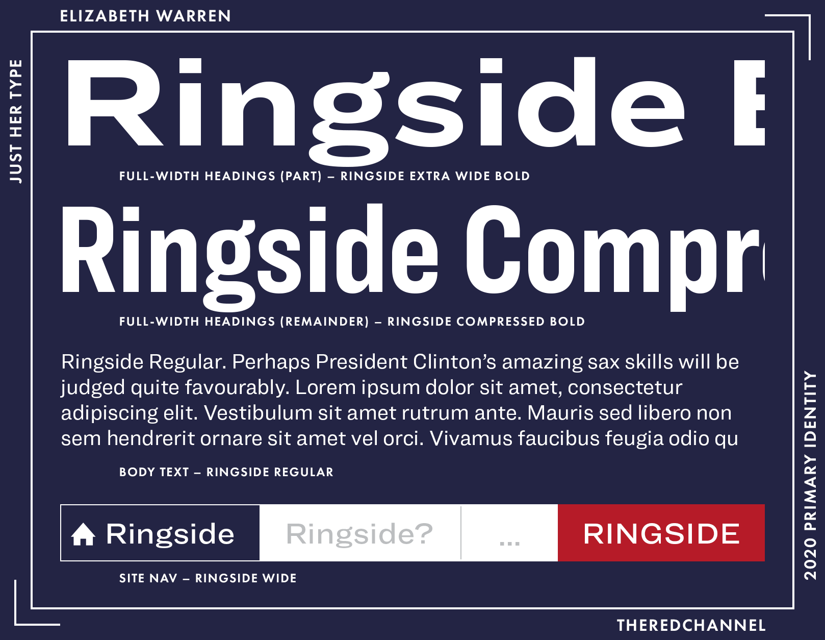
The typography is all in the family: Hoefler’s Ringside family, that is. Picking type from within a single family is an smart way to make good type pairings quickly. The strong family resemblance aids cohesion between text elements on the page. But this is no zestless monotony: The diversity within the suite (32 styles!) maintains interest and keeps the end result from feeling like a banal, beyond-homogeneous product. Tactfully combining wide and condensed typefaces in the headings provides ample opportunity to inject flair into this project.
The choice of Ringside is smart for another reason, in that it is deeply endearing to the Democratic faithful. Hoefler is best known for Gotham, and Democratic loyalty has not strayed far in the years intervening since ‘08. Case in point: The first example that came to my mind, when thinking of any other page using Ringside, was none other than The Office of Barack and Michelle Obama.
Let’s go shopping…
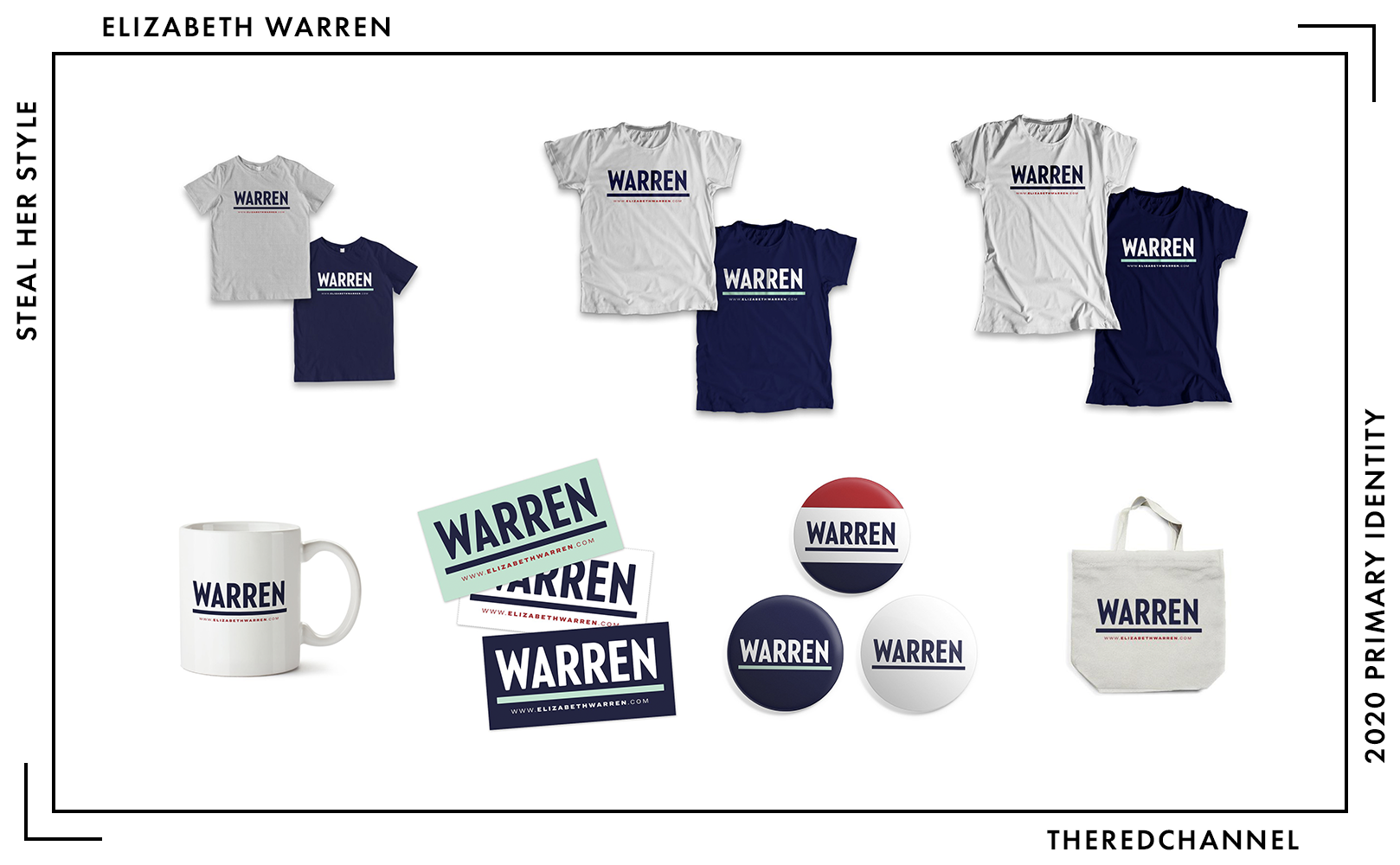
A whole smattering of t-shirts, each of which will set the browser back $25. Oh, and everything needs more mint. Glorious, glorious mint. If past performance is indicative of future results, the selection will become more enticing.
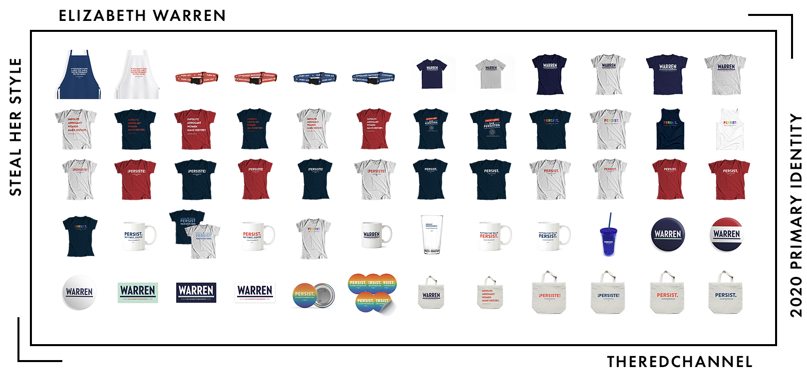
At press time, there are an impressive 163 SKUs on offer in Warren’s webstore, far more than everyone else reviewed today combined. I got so tired, I left 104 of them off of this graphic. Warren enters this race with a pre-existing and formidable fundraising machine. She intuitively understands how to market her own image, or at least listen to those who do. Going forward, her merchandise assortment is the one to watch for both volume and variety.
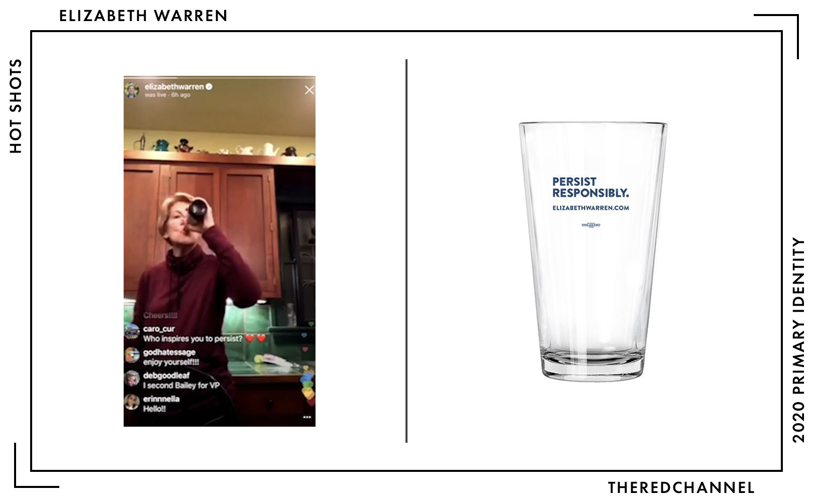
Oh, and your author is from the drinky wing of the adult-beverage party. More branded barware, please!
I have more questions than answers about attribution. Being that she was running for all of half a day in 2018, the latest (year-end) reports to the FEC do not tell us much about who is doing Warren’s communications. There are $500,000 in debts reported, $240,000 went to the strategists at Bully Pulpit Interactive for advertising. Chi/Donahoe, which handled her creative work related to her time in the Senate, has been mum about it. Blue State Digital’s Joe Rospars appears to have been scooped up by Warren’s exploratory committee. Expect big things to match the big names milling about.
→ Vector copies of Warren’s logo are available as a graphics package here. ←
Who is talking about it?
- Anchored Creative likes the mint. Yay, mint! Everybody loves mint!
- BuzzFeed is digging the mint, too.
- Election Season also noticed the complaint form.
- Washingtonian Anon pegs it as ’40s design.
Amy Klobuchar
![]()
Date Announced: 10 February, 2019.
Slogan: “Let’s Get to Work” is her homepage subtitle, and I think that would fit just fine.
I held off on hitting print until Klobuchar entered the race. Apparently she did not opt to go with that design college assignment left abandoned in a café. Her unveiling very neatly scuppered my brimstone-laden conclusion on the scorched-earth triumph of the geometric sans, but that it okay! It is nice to have a serif to look at, and it immediately differentiates Klobuchar from the rest of the field, positively dripping in Futura descendants.12
The serif is not the only point of divergence in identity here. While other women in the 2020 race are identifying by surname, Amy is branding herself with her given name. Klobuchar also subverts the use of all caps, opting for a wordmark set in initial caps. Contrary to her Senate campaign and the other presidential candidates, Amy shies from compressed or condensed styles. She instead opts for a wider and relaxed typographic treatment.
The big, fat serif at the centre of this production, the one which will suck up all of the media attention, is René Bieder’s Mackay. And for good reason – distinctive choice that it is, it deserves an article or two. Concerning to me, however, is that there is a whole lot of type going on, particularly in the full lockup with URL. That is four typefaces in a single logo. This problem manifests even in the simplified lockup. Mackay, Freight, and Avenir battle to the death against one another for the viewer’s attention. Three typefaces. Amy.
The “Amy for America” as a whole is somewhat unbalanced. Either “Amy” needs to be scaled up, or the sub-head needs a shrink down. As it stands, the overall lean feels precarious. I am absolutely giddy over the form of Mackay’s terminals. The little canine bit on the Y bowled me over. Why not make the primary part of the mark more prominent so that there is more to enjoy?
In a way, this work distinguishes itself in its appeal to tradition. Be that through the serif, eschewing tall-and-compressed all caps, or identifying by her given name. It is successful in that respect. It looks like nothing else in the 2020 announced field. There are, however, judicious deviations from the old orthodoxy. The green is refreshing, I am not sure that it works the best with the secondary (vivid, cyan-approaching) blue. In fact, I am not sure if that blue works with anything.
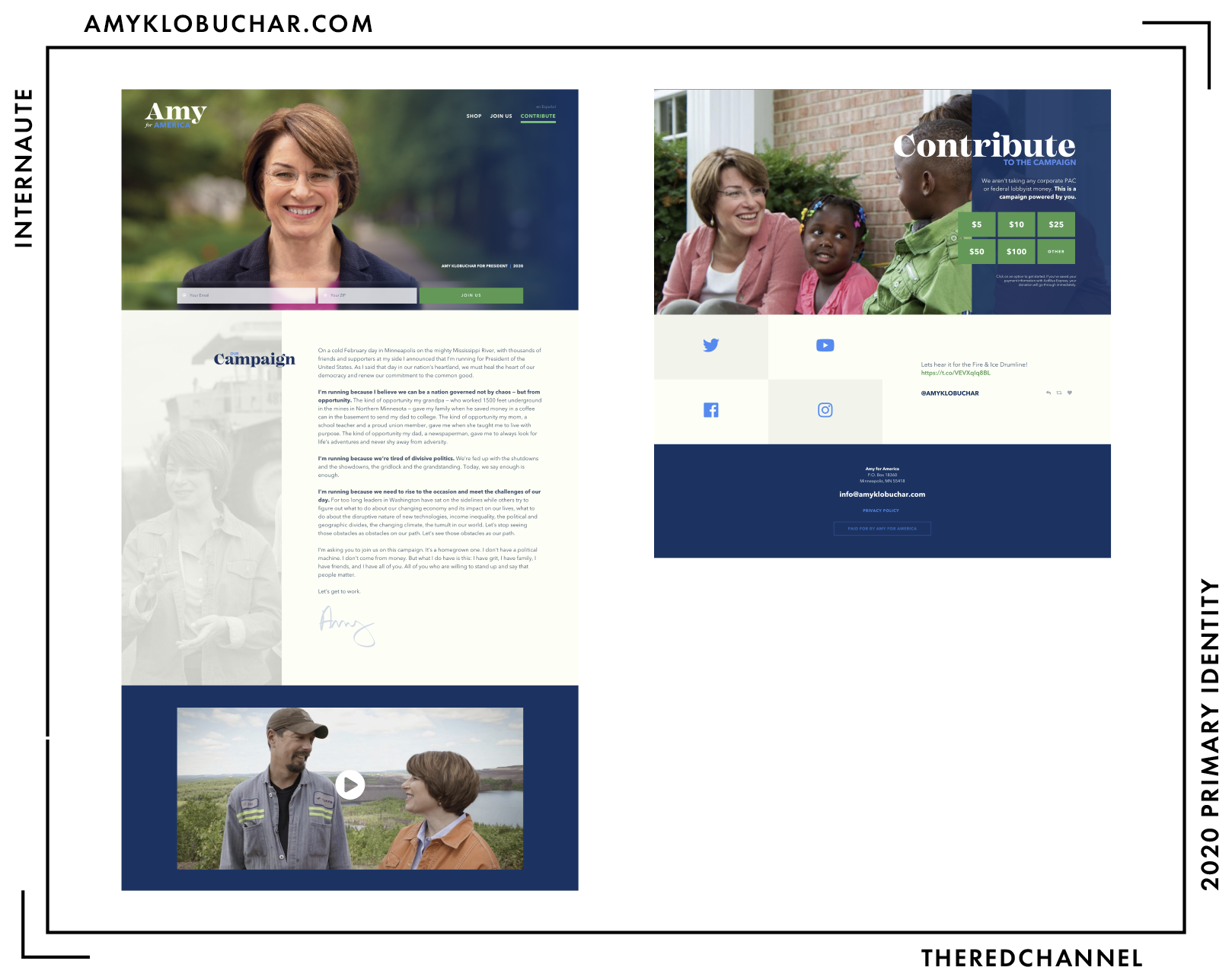
The website is WordPress, with a theme titled ScotchPress by Scotch.io. (It must be noted that Scotch appears to be doing work for Sherrod Brown!) The site loads five font files, and then another four icon font files. It is unflinchingly respectful. It only begs for my e-mail address once. The off-kilter alignment of the body text makes for an enjoyable read on desktop. It is less successful on mobile: The word-wrapped placement of the heading is very awkward, though the on-click animation for the hamburger button on the mobile site is refreshing. The photography incorporates a whole bunch of bonus green and is used sparingly. There is no real secret to the glorified brochures that are early-stage campaign websites. Keep them short, and keep them consistent. Nice development work.
The welcome screen on pageload, however, I do not share any warm feelings for:
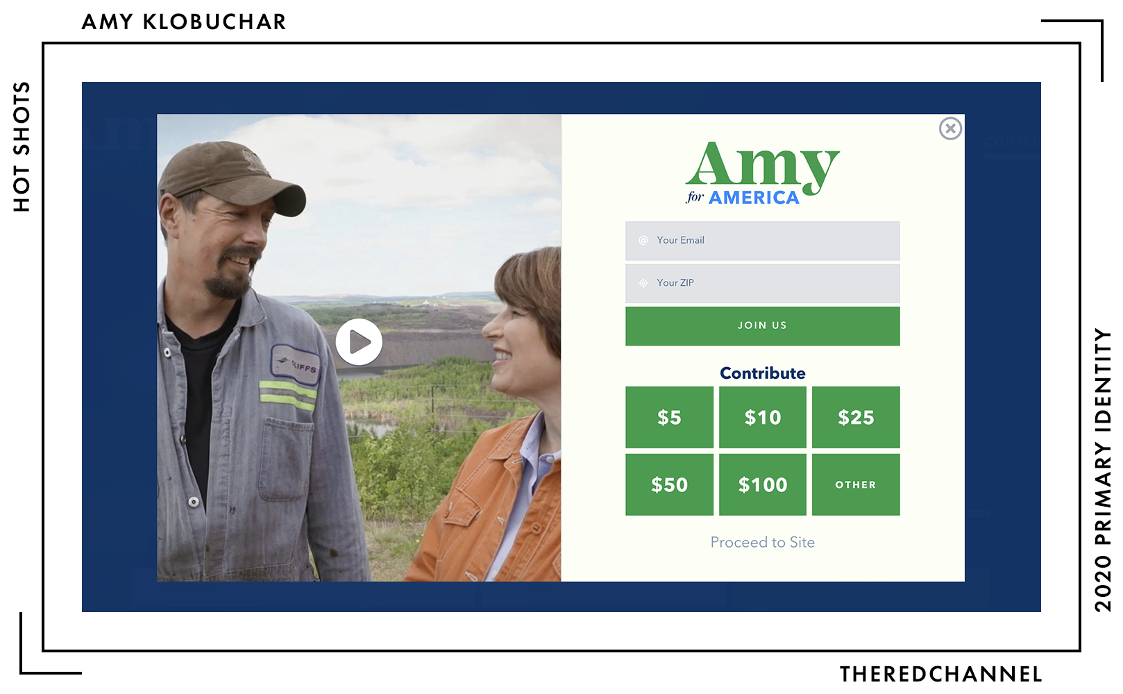
The dialogue floating in a sea of navy turned me sour on the colour choices. This feels vintage, and not in a good way. The green, on ivory, with a side of vivid blue is a miss and shouts its dissent from the modern, flat design of the form itself.
And change up that close button! It is far too near to the edge, and the circle makes no sense when everything else on the modal is square. Heavens above, make the thing that viewers are most likely to click on comport with the rest of the design.
The site generally strays little from its palette, and there is continuity of colour between the wordmark and the page itself, though I question the amount of concord between the selections as a group. Colours fall out of balance with aplomb, and things can go real haywire, real fast. Neither of the blues is particularly groundbreaking, and I could take or leave the ivory. The green is obviously the main attraction here, and it (as well as the use of a serif) has a notable precedent in Minnesota politics:
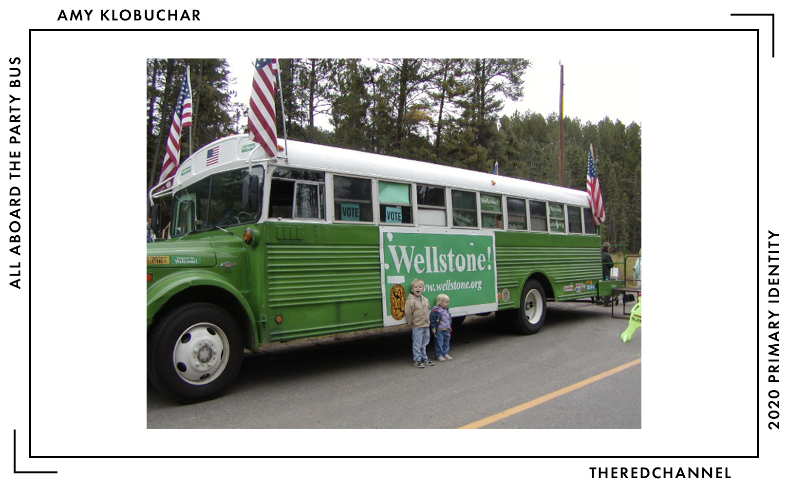
What a nice little hat tip to the DFL’s late, great Paul Wellstone. The homage is not a direct knock-off, and that is extremely smart. A serif terminating in an exclamation mark carries significant presidential baggage.
While I am excited about the green, I am simultaneously wary of it. It is very, very close to a true green. Klobuchar is running for president, not selling me a tractor. A fresh and interesting choice, though demanding of both sparing and smart application. Do not leave the viewer awash in it. The line between verdure and véreux is quite thin, indeed. Let us hope this campaign does not reach its terminus in merely looking green around the gills.
💡 Did You Know: On the subject of green, Klobuchar joins Castro in styling a donation button in a colour other than red. Neat! The “Contribute” button in the site nav is in a different shade of green than as used on the rest of the site and in the mark. Less neat!
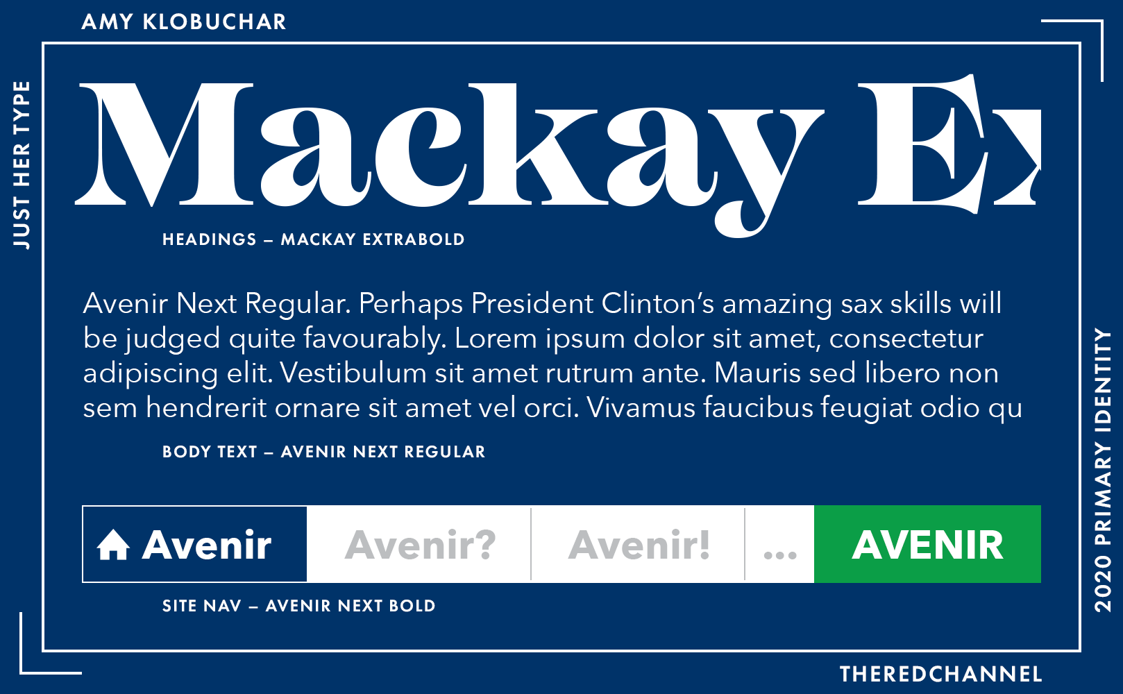
Type is consistent between Amy’s logo and website. Despite the avalanche of webfonts upon pageload, it does not load the heading font, Mackay, as headings are constructed as SVGs and then uploaded as assets. Each heading is also partly set in cyan-blue Avenir Next Bold, mirroring the wordmark and joining the Avenir in the body.
The text on the website is much more successful than in the logo, in no small part thanks to the absence of Freight italics as a confounding variable. I may also interpret the web type favourably due to Avenir Next’s affinity for use in light body copy, even as many designers shy away from such an application. (See the City of Amsterdam for a triumph of Avenir as a text face.)
I would love to assess the merchandise, but links to the store are dead.
Oops.
→ Vector copies of Klobuchar’s logo are available as a graphics package here. ←
They’re Basically Running
Kirsten Gillibrand
![]()
Exploratory Committee Date: 15 January, 2019.
I do hope that Gillibrand goes far. More than anything, what the people of this country (or, more specifically, my entire hair colour and I) need is a renewed confidence in blondes seeking elected office. This mark, however, may not be the best vehicle with which to do so. The overall construction is quite simple, there are some serious faults with the spacing on the type, and the typeface itself, while bold and clean, also happens to be rather humdrum and common. Perhaps it feels that way as this year is replete with more successful examples of similar type. A compressed sans-serif in all caps sure seems to be the defining characteristic of many a candidate in the 2020 field.
The pink is the hero of this logo. The pink is what holds me back from utterly panning it. An arresting choice, a stand-out choice, and a really smart way to move forward as a progressive option in this primary. Had she elected for a more conventional red or blue, the whole endeavour would be an order of magnitude more boring, and the structural faults of the logo become more difficult to forgive.
Gillibrand is still in the exploratory committee days. There is a lot of room to grow Gillibrand’s brand new brand, and there are the seeds of something excellent scattered on this fallow field. New York is not exactly a state impoverished for creative talent.
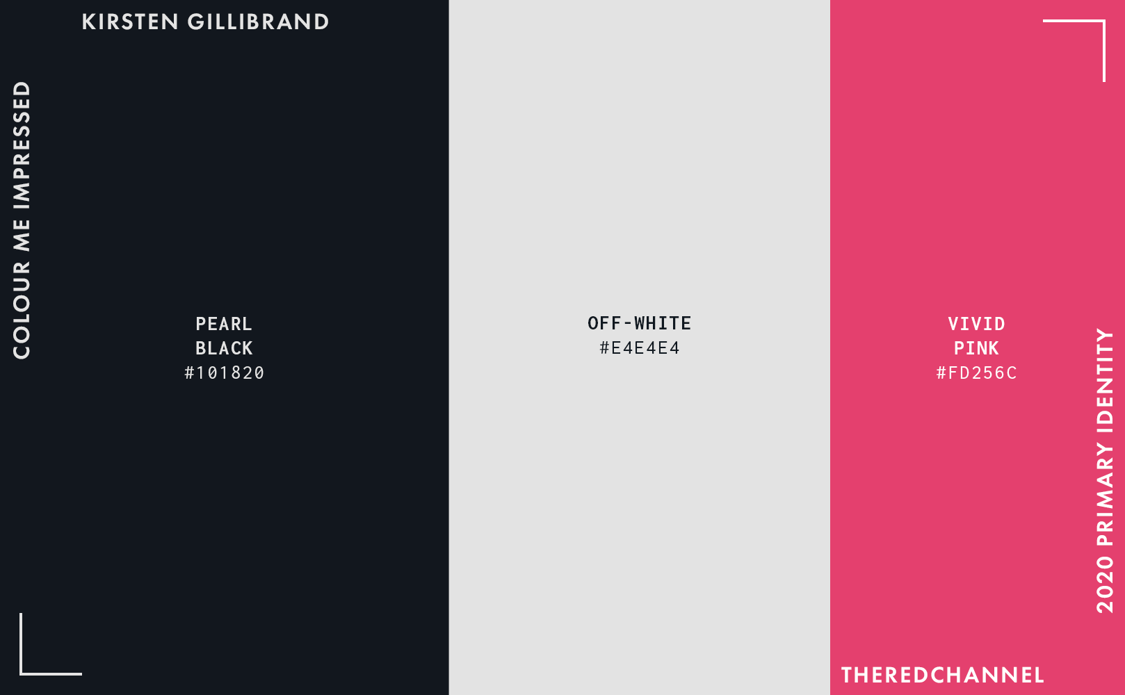
To reiterate, the splash of pink is great. It makes for a really distinctive spot colour. The blue – and if one inspects the RGB values, it is very technically a blue – borrows from the Marianas Trench at the darkest end of the spectrum. I like it better than yet another navy.
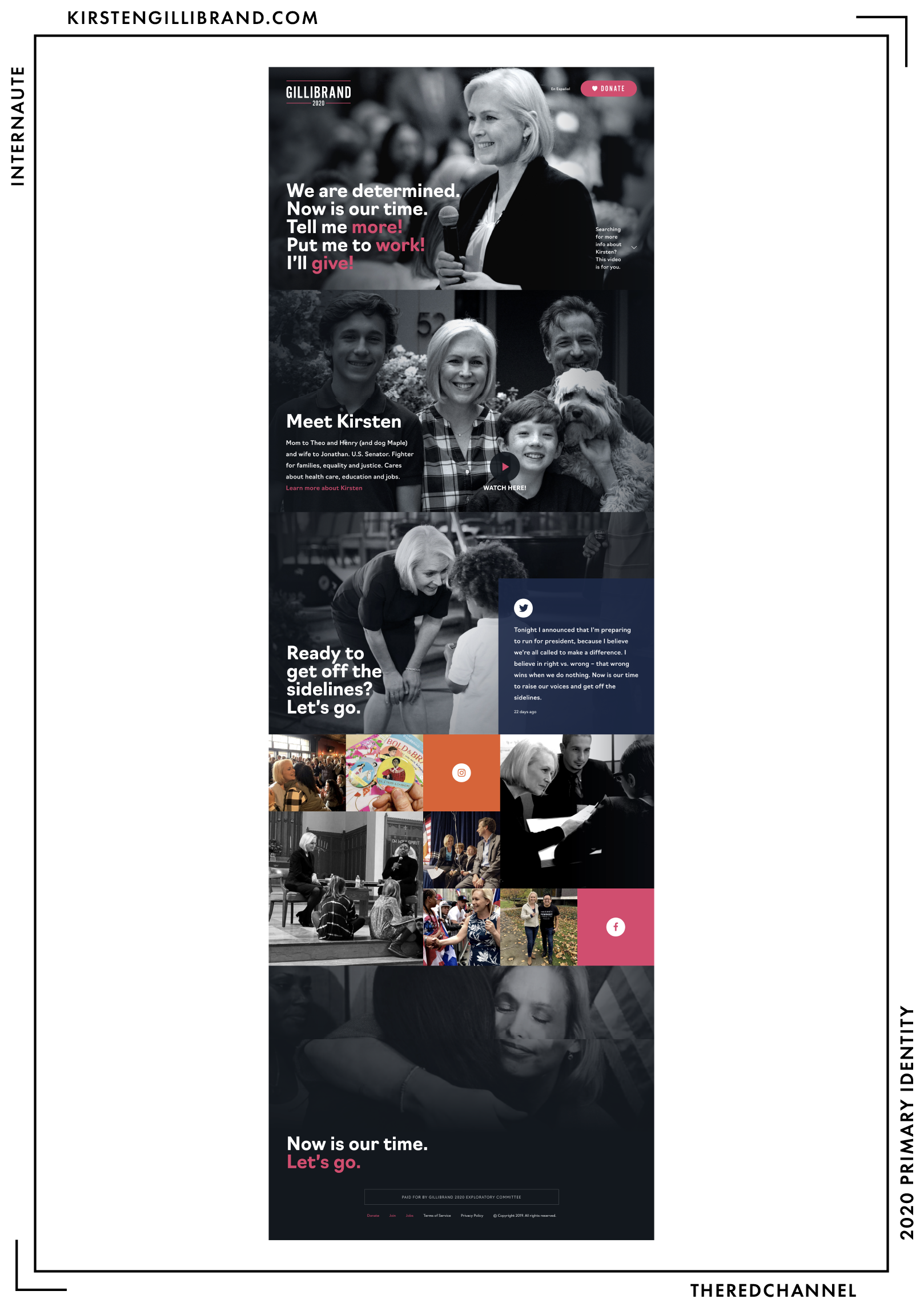
I think this is a really sharp website for an exploratory committee, and I cannot wait to see what it metamorphoses into. The continued use of pink as a spot colour really did help endear me to the logo. Nonetheless, it is readily apparent that it was constructed under a time and/or budget constraint. The disconnect with the logo is severe, as if the two were constructed by spurned agencies which no longer speak to one another. The multicoloured social media panels, far from breaking up any perceived monotony, create a cacophonous air in the middle of the page. Fear not continuing the monochromatic palette through the page; fulfill its manifest destiny from header to footer! Be bold!
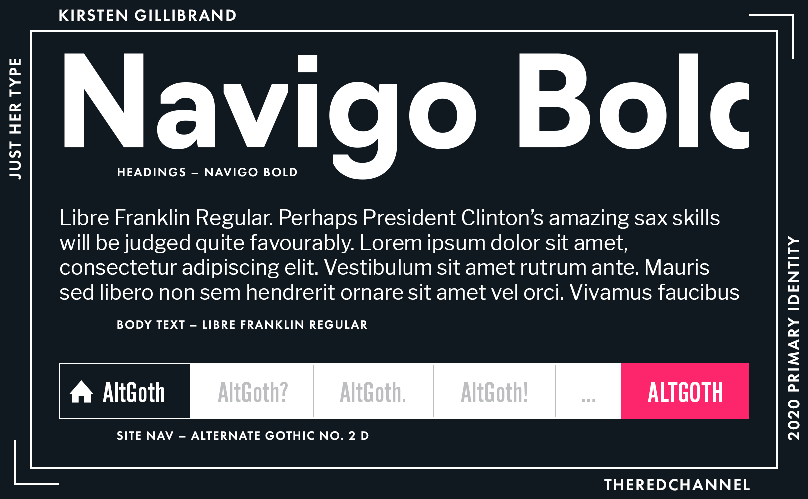
CSTM’s Navigo is a good choice for the headings. Its original purpose was as a font for wayfinding signs in Moscow, and there is a very-in-Russian presentation about that for anyone interested.
The text face is the very free Libre Franklin. It does the job.
More disappointing is that save for the donate button, the Alternate Gothic used in the logo is not visible elsewhere on the page. Hot pink is not Atlas. It can not be relied upon to uphold the stylistic linkage between logotype and webpage on its own.
→ Vector copies of Gillibrand’s logo are available as a graphics package here. ←
Who is talking about it?
- “Very OK” - Anchored Creative
- BuzzFeed spotted the pink.
- Election Season wrote up the website pretty thoroughly and produced a video with some cheerful music.
- Greenhead Design goes thermonuclear, deems it “somehow worse than Ojeda’s.”
- Natalya Jaime covered the pink for The Hollywood Reporter.
- See Hunter Schwarz in Cover/Line on what a difference ten years can make.
- Washingtonian Anon digs the surname, is cold on the choice of type.
Dario Hunter
![]()
Exploratory Committee Date: 21 January, 2019.
Oh, Dario. An openly gay man from Jersey who the very fine people at Wikipedia tell me is the first Muslim-born individual to be ordained as a rabbi. He is amazing, and I dig his energy. On a personal level. I do not dig anything about his mark, however. Undulating slices of flag are over. Electing to use three faces of Palatino in the wordmark (I see Roman, Italic, and Bold) makes no sense. While beating Klobuchar to the punch on green, I must understandably award fewer points for that, as Hunter is seeking the Green Party nomination, where such a choice is horrendously unoriginal. The green stars are of egregiously poor construction. To my eye, they appear to be drawn freehand with a mouse, and not exceptionally well even by those standards. If the Green Party ever gets a budget, Hunter should consider hiring a branding agency.
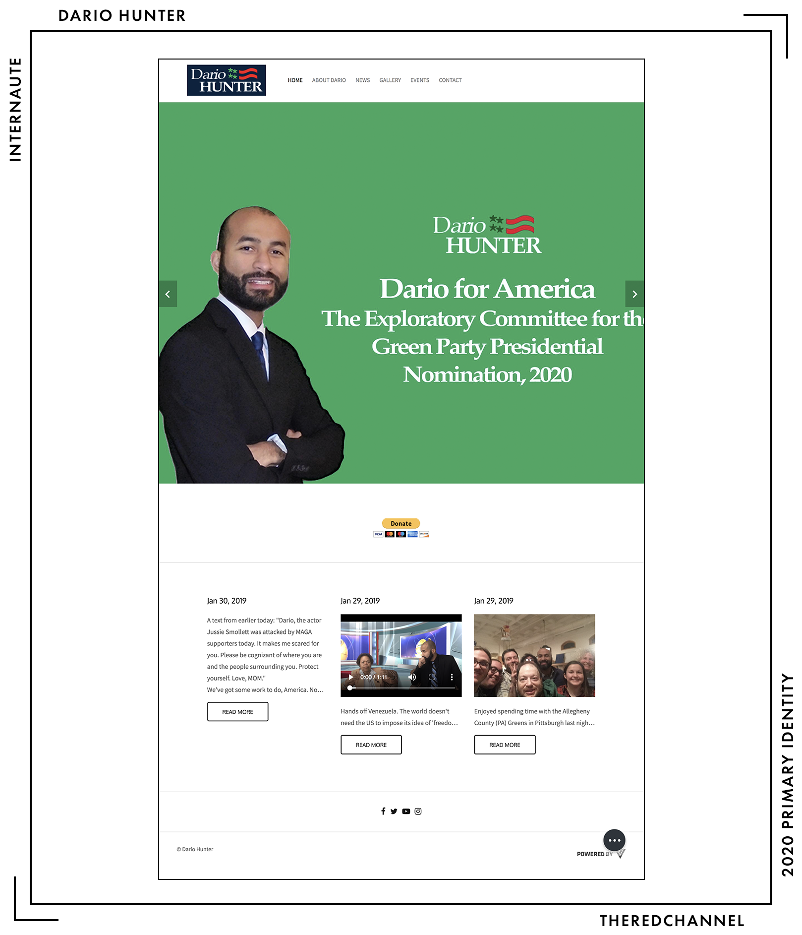
…because I cannot assess this. The site is built in something called PageVamp, which promises to turn a Facebook Page into a website “in seconds.” Seconds of work completed, most definitely.
Cannot see how it matters what type is in use (Oxygen and Source Sans), being that the pairing was likely divined by software in the first place.
Bonne chance, Dario!
→ Vector copies of Hunter’s logo are available as a graph–haaa, I am kidding. ←
Pete Buttigieg
![]()
Exploratory Committee Date: 23 January, 2019.
Oh hey, another guy going by his given name! Oh hey, another condensed sans-serif! Welcome to the show, Pete. You will fit right in, and that is a problem.
Here is Gillibrand’s mark without the visual interest of pink. Instead, for reasons that elude me, the team opts for a shade of grey. Swapping out the grey entirely, even just to lump it in with the white, would immediately strengthen the logo.
The blue, red, white, and star all remind me of Texas. Confusing, as Indiana is extremely not-in-Texas. Apparently the star is there as a nod to his military service, though a star impaled on a horizontal bar will invariably remind viewers of a different veteran entirely.
Obama fêtes Buttigieg as a star ascendant in the party. For everyone’s sake, let us hope that the star which is ascending is not the one we see in his logo.
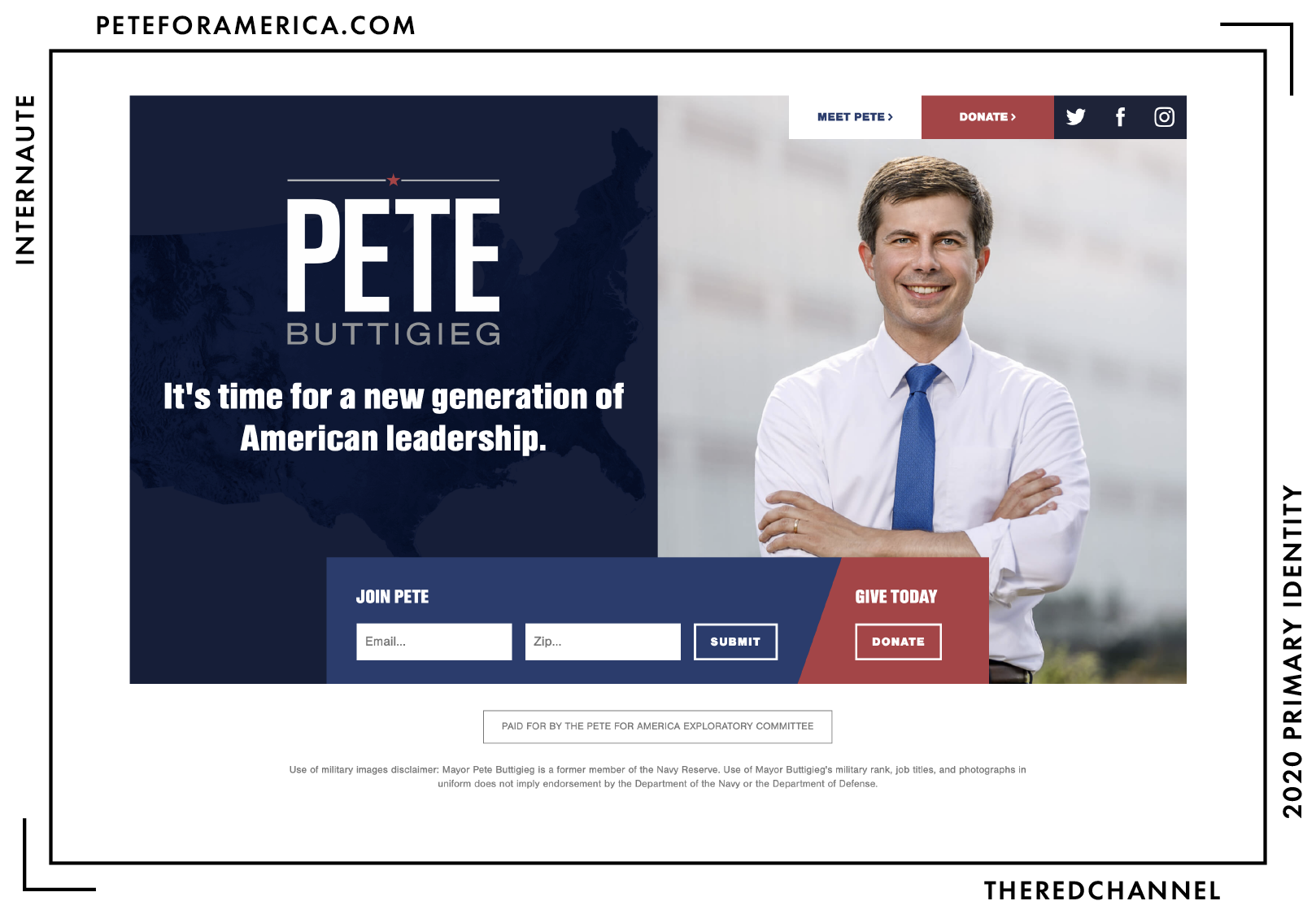
Even as an exploratory committee webpage, the site is quite small. There is not much on which to mark. While small, it is not under-developed. The colour-blocking is quite nice, though I would appreciate one fewer shades of blue. Simple and modern …enough. (Modern-adjacent?)
The site is WordPress, and the custom theme is titled “nmc_peteforamerica.” This clues me in that it is likely Chapel Hill’s New Media Campaigns behind his 2020 bid. This comes as no real surprise, being that New Media Campaigns did the design work in his mayoral race. If this proves to be an accurate hunch, it would be NMC’s first presidential campaign. What fun!
Small quarrel, but the site starts to fall apart at viewports between 600 and 1024 pixels wide. There are some wonky padding issues on the main image, the navbar breaks, and the text on the left of the screen becomes unbearably crowded.
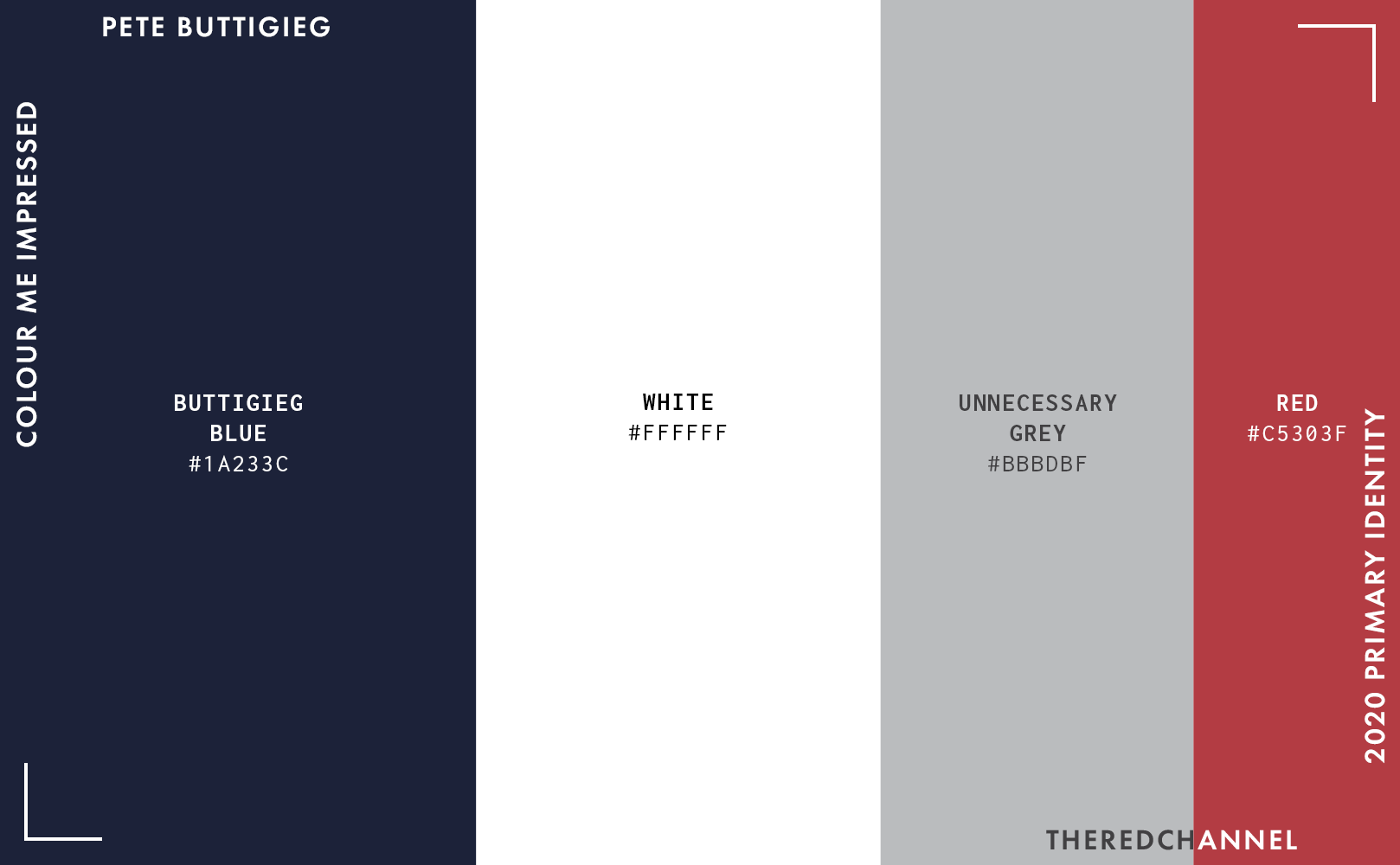
What ails the colour palette very much mirrors what ails the identity as a whole, in that it is tremendously conventional. Pete has all-American, pan-regional and pan-demographic appeal, but the only way to cash in on that is to be appealing in the first place. The only thing that grabs my attention, and by no means in a positive way, is the grey. Should any relevant authorities happen to read this, I implore you: Fix the grey. Find an intelligent use for it, or get rid of it entirely.
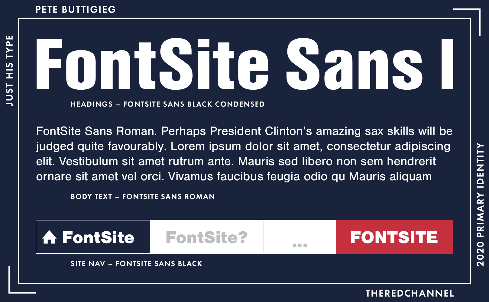
The type is a cute little assortment of FontSite Sans. I do not mind at all a designer who plays it safe and stays within the same family. The selection of typefaces will not grievously wound anyone, but it will not have them jumping from their chairs, either.
Pete has an interesting story, and I would love to see it reflected in a coherent and distinctive identity. It is not there yet. Perhaps grey indeed is the most fitting accent colour, as everything about this look is insipid, safe, and flat. I am encouraged by the drive towards simplicity – this is by no means a clarion call for something rococo – but redoubled effort in both intention and execution are necessary before this exploratory committee graduates into a full-fledged campaign.
I have had my fill. Feel free to read about Pete feeding his husband a scotch egg.
→ Vector copies of Buttigieg’s logo are available as a graphics package here. ←
Who is talking about it?
- Anchored Creative drops the plaudits “wholesome,” “safe,” and “not boring.”
- Greenhead Design has some long-form thoughts on sexual preferences and aesthetic sensibilities that may not be overly kind.
Sherrod Brown
![]()
Exploratory Committee Date: Not yet
This is not really a bid for the presidency, but it kind of is? Y’know, because people going on totally normal national speaking tours tend to schedule all of their appearances exclusively in New Hampshire and Iowa.
This logo does it all: It is a jumble-o’-type like Harris and boxed-in like Castro, and yet rises to the competence level of neither. The type spacing is highly distracting. I find it befuddling that it even got out the door in such a condition. The scaling of the “THE” set on the vertical is awkward and arbitrary, to say the least. The canary at right carries tremendous symbolism for Brown and the issues which define his career as a legislator, so that symbol is a natural, expressive choice. Use of songbird iconography will invariably draw comparisons to a particular factional loyalty in the unending, waking nightmare that is the 2016 primary season. Is this an asset or a liability? I will leave that question to Brown.
Naturally, not everyone sees a canary. Twitter sees a turkey drumstick. Whatever one sees, the stroke around it that uncages the bird from the box is uneven in thickness. On my part, I question the wisdom of the entire exercise on the same grounds that I question Gabbard’s. An imperilled canary in a coal mine is not the allegory anyone wishes to transpose upon a presidential campaign. Far be it from me to make such a proclamation on behalf of a campaign with which I am not affiliated, but noxious gases are no one’s idea of a fun time, and one should take great pains in assuring not to associate their speeches with the sensation of carbon monoxide poisoning.
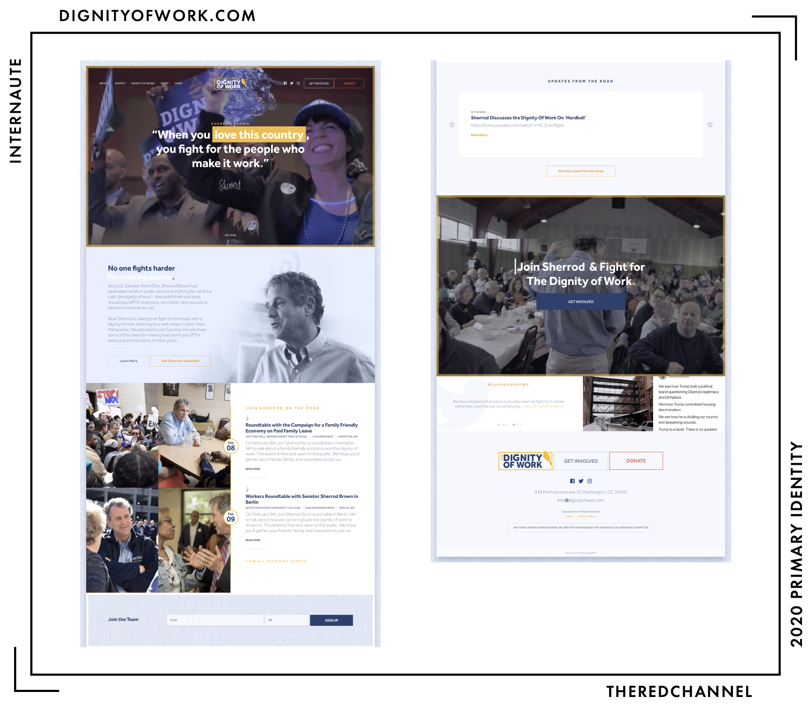
There are some competent people backing up this web presence. There is a lot to like, even if I am not entirely sold on the textured, powder blue background. The animations are slick, and the colours match the logo. While I feel the headings, particularly in the event calendar, would benefit from an upsize to distinguish them from the body text, the light weight chosen for the body does cut down on that confusion. Brown also has a custom text highlight colour set on his website, a touch I really enjoy. Scotch Digital does great work.
I like the yellow. It is unique among the Democratic candidates. This may be an uncomfortable side-effect of its widespread association with libertarian politics. The yellow reminds me of that low-quality, turmeric-laden stuff which Americans call mustard. But in a good way. Oooooh, that bird sure would be a succulent treat with a bit of dijonnaise on the side.
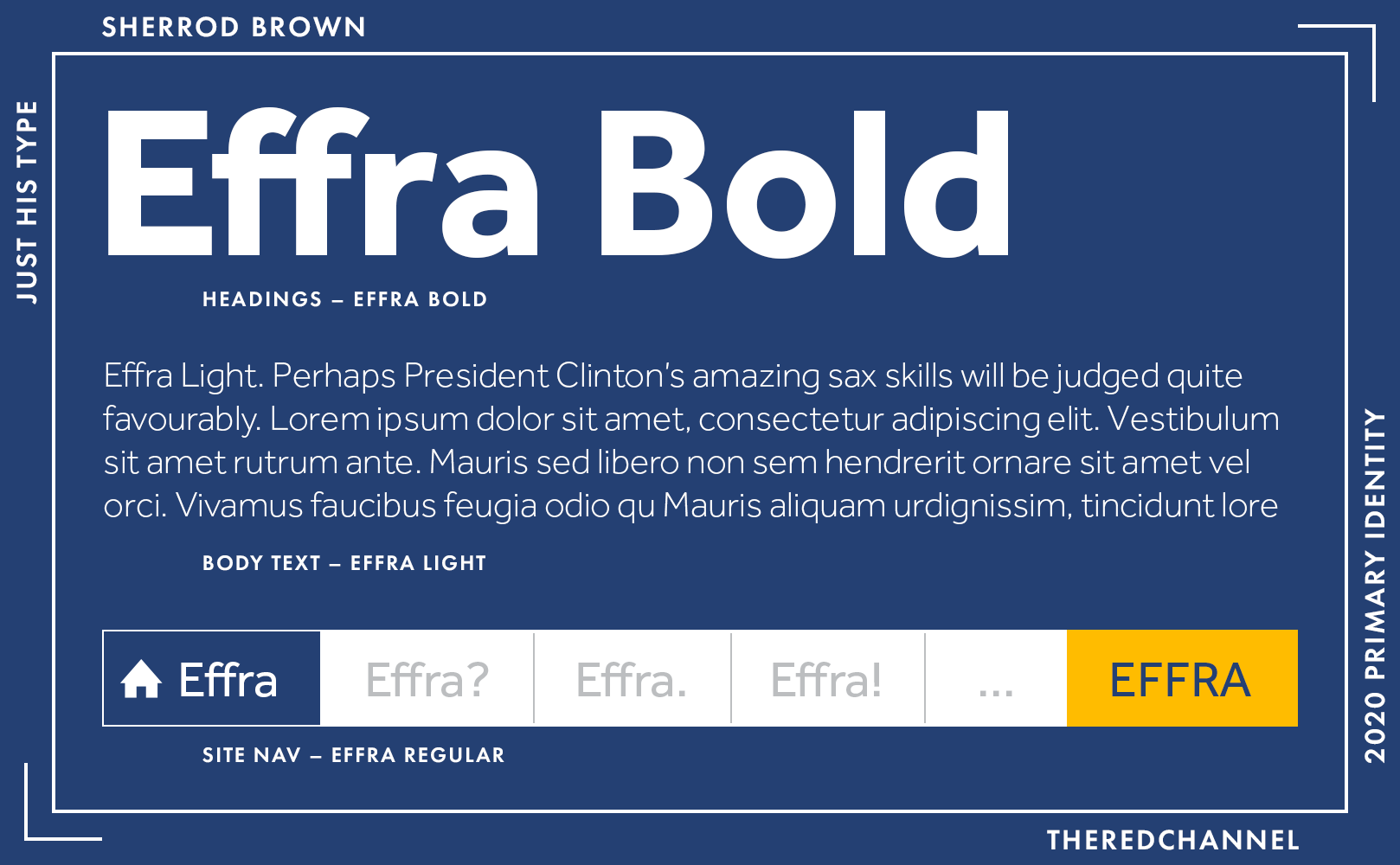
Type throughout the site is yet-another-geometric-sans, Dalton Maag’s Effra. It is not devoid of character, and managed to hold my interest while browsing the site. Of course, the type does work best when, contrary to the logo, it is set properly.
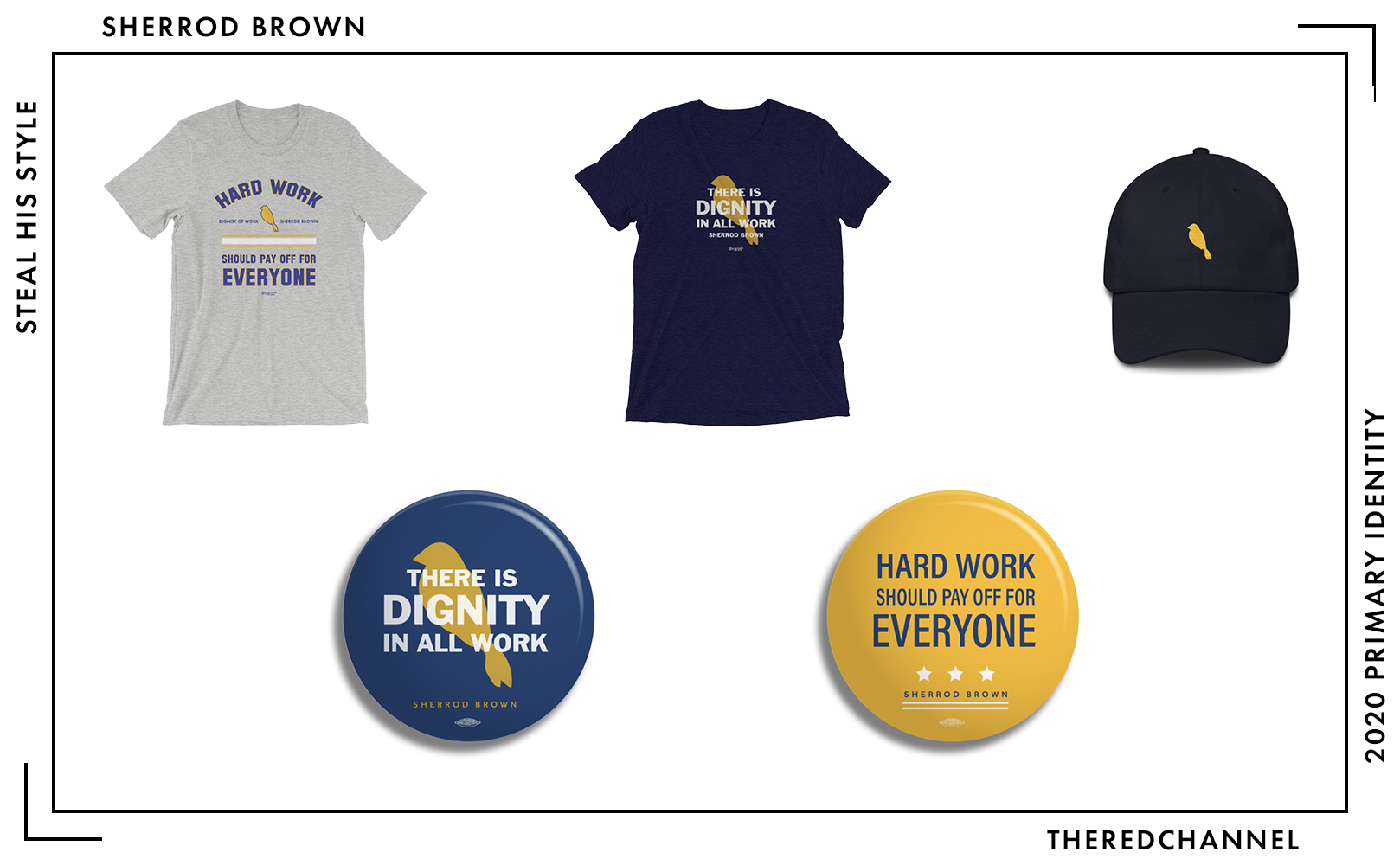
Richard Ojeda could take a page from Brown on merchandising what I assume is the Middle American aesthetic. The goods, from the buttons, to the $26–28 shirts, to what is sold as a “Dad Hat” are relaxed, but well-produced. The t-shirts even make use of lightly distressed graphics and fonts, and yet I am not raining hellfire down upon them! I would greatly simplify the buttons, as there is too much text and everything is a bit crowded. Of course, the dead obvious next step is to sell a canary lapel pin matching the one Brown wears to all of his speaking engagements. I know why the caged bird sings, it is calling sweetly for mass production and bursting campaign coffers.
→ Vector copies of Brown’s logo are available as a graphics package here. ←
Who is talking about it?
- BuzzFeed threw it on their colour wheel of 2020 candidates.
Howard Schultz
![]()
Date of announcement: Not yet, but one would not know that from TV.
It is important to remember that Schultz’s independent centrist billionaire person of means campaign is a vapourware political project designed to sell a book. This book:
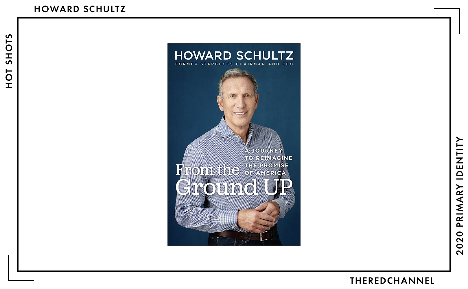
It is odd, then, that neither the colour, nor the type match anything on the book cover. Howard Schultz, person of means that he is, surely could spring for an enhanced FF DIN licence.
In fact, odd describes everything about the look of this quasi-campaign. Defacing one’s own wordmark in a self-aggrandizing manner is a choice. I mean, it is a terrible choice, but it is a choice nonetheless.13 What a shame, then, that these confused scribbles are the only source of visual interest in a positively insipid mark. FF DIN is typically chosen when prizing technical legibility. DIN is the family of constructivist design, from Thuringia to Thunder Bay, the family of stencils and wayfinding, the family of German cities branding themselves with orderly towers of barnyard animals. It defies all comprehension that the creative team supporting Schultz would so spectacularly detract from that. It is not in the spirit of the type chosen (the Germans, I am sure, are going through conniptions), and it is not a successful execution in the slightest.
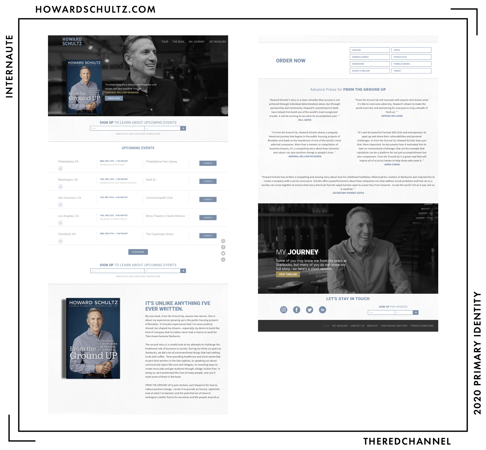
His site is built with GatsbyJS, a site generator I actually really enjoy. Gatsby is quite powerful and can make a lot of cool stuff. In addition to cool stuff, it can make things like Howard Schultz’s webpage. The textured background imparts an unappreciated, paperboard quality to the entire experience. For a person of means, the effect appears cheap. The multiple requests for the reader’s email and ZIP code, three occasions on this relatively short home page, come across as over-eager.
The aqua, at least, is shared between the logo and the web style. (But not, it must be stressed, with the product Schultz is attempting to sell!) The accent colour is not my favourite, but it is my least favourite of the candidates up for review today.
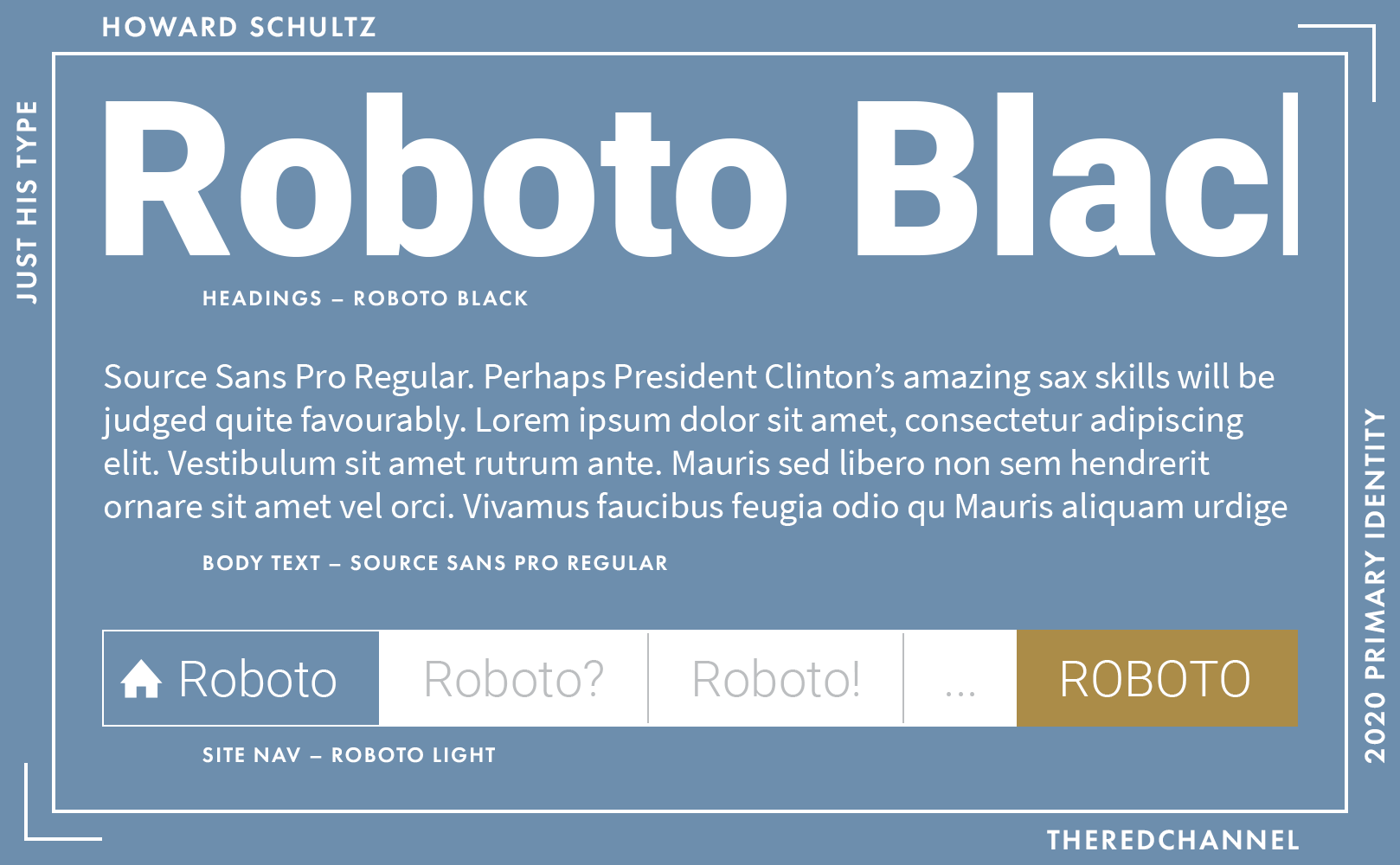
Headings and nav are Google’s Roboto. My own bugbear is with Roboto used as a text face, which this example avoids, so I will leave the in-depth commentary to the passionate Stephen Coles at Typographica. The body is Adobe’s Source Sans, a decent and versatile grotesque. One can see Open Sans in top form over at Stanford.
These are milquetoast type choices. The application is devoid of thought and personality, with selections made because they are a) safe and b) free of charge. To be blunt, I expect more from a person of means.
→ Vector copies of Schultz’s logo are available as a graphics package here. ←
Who is talking about it?
- Washingtonian Anon does what must be done and makes the Gavin Belson comparison.
They Ran
Richard Ojeda
![]()
Date of Suspension: 25 January, 2019.
Dearly departed Richard Ojeda, your time with us was too long. This mark, much like Delaney’s, pinches Sol Sender with its defaced O.14 Note that while Obama ‘08 did indeed substitute a branded “O” letterform in lines of text (the work of Christopher Cox is a fine example that makes frequent use of this), they would never make those letterform substitutions in lockup beneath a large rendering of the symbol itself. Ojeda feels unencumbered by this restraint, and freely replaces the “O” in his name with a branded letterform despite being situated just beneath the very same symbol. The result is a muddle. Far too much is happening.
Speaking of far too much happening, oh goodness, everything else about the mark. The stylized, tricolour wings of the eagle within the “O” have themselves sprouted wings. Big, garish wings that would not be out-of-place on a lower-back tattoo. It is an omni-winged beast! The whole affair is be-speckled with distressed splotches to, I do not know, make it cooler. The fitting choice of colour in which to render all of this awesomeness is, of course, dark grey. Nothing says “excitement” quite like a preponderance of neutral grey. If only the creative team had found a place upon which to stick flames. You know, to make it go faster.
Fly, fly away! Fly off of my computer screen! Are we done yet?
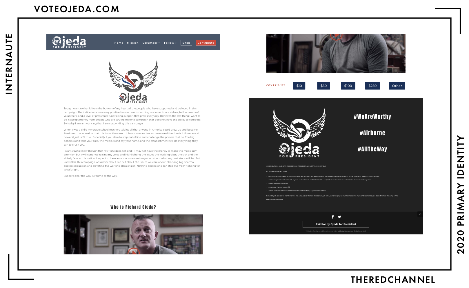
Is the web presence any cleaner? The answer will not surprise you! The blues do not match, the reds do not match, there are a whole bunch of typefaces, some of them only used for single words. There is a big, honking footer with two different greys in it… because why stick to a single footer colour? Matching either grey in the footer to the one in the logo, as well, appears too great a task.
Given the cavalier handling of colour on this webpage, I have decided to forego constructing a palette for the very valid reason of my own well-being.
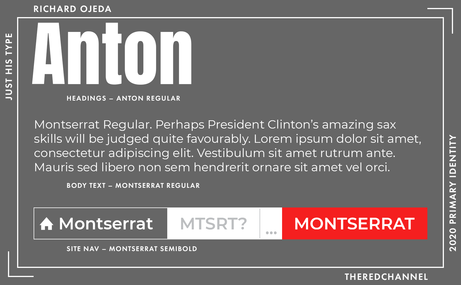
Headings are in Anton, a typeface to which I can accord sterling praise: At least it is not Impact. Though, if we are being honest, there is greater affinity in my heart for the geometry of Impact than for its free alternative.
Body and nav are Montserrat, which is fine. Just fine. Best choice the site makes.
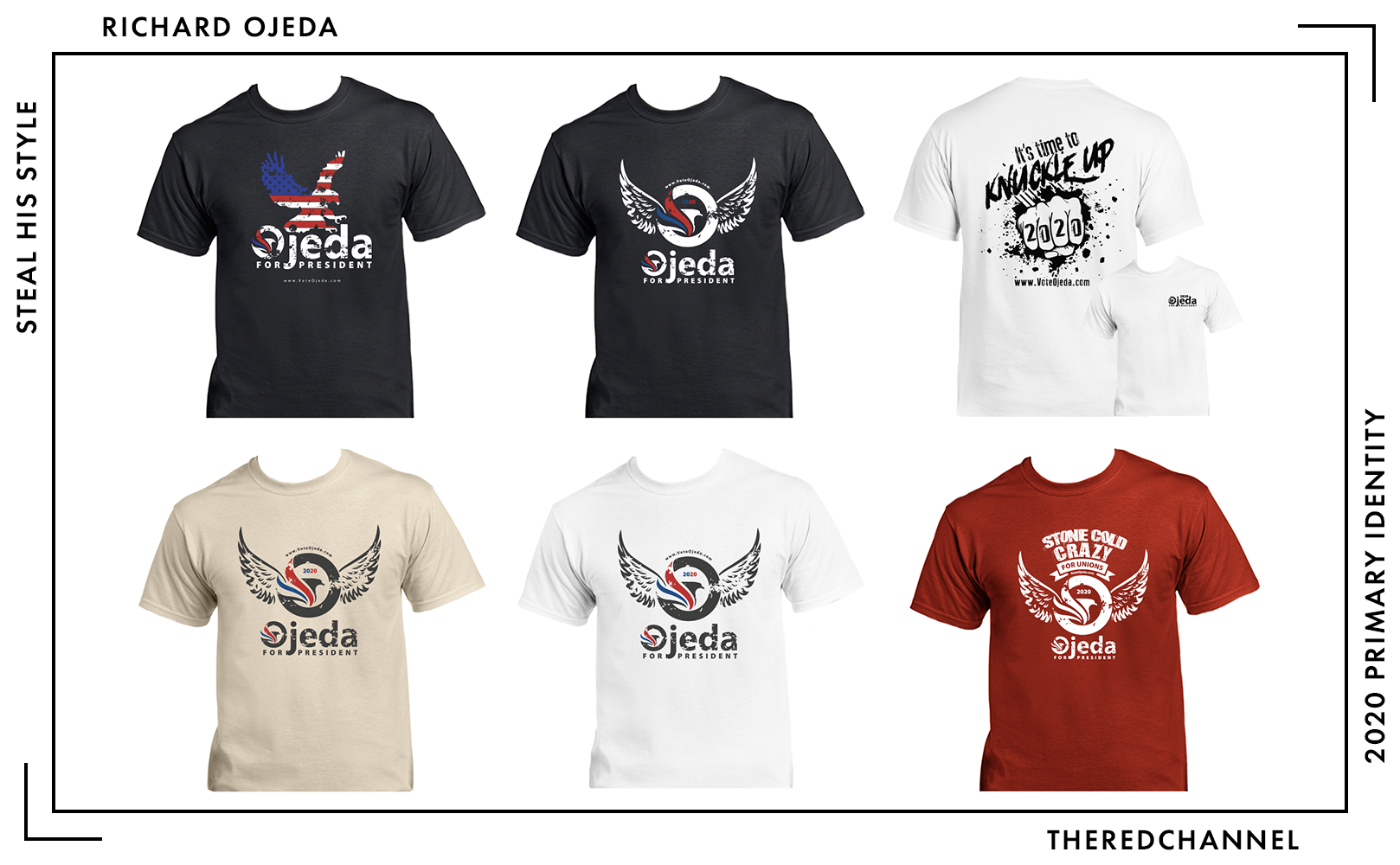
As far as physical branded bits go, congratulations to Mr. Ojeda on producing the shirts I would be least likely to wear. Not an item is free of distressed grunge, and not one t-shirt is of a colour comporting with the rest of the brand identity. I doubt that I would refer to myself – or anyone, ever – as “stone cold crazy,” which one of these shining sartorial samples helpfully suggests of the bearer. Bog standard shopping mall kiosk-grade material. At $30 a pop in his webstore, the tasteless kiosks in the mall appear relative bargains.
This campaign may be over, but there is no way I could possibly forget the time that we shared together, Richard. Perhaps I am over-stepping here, but I take it this bid was not tailored to the “urbanites who departed the country” wing of the party.
Who is talking about it?
- Anchored Creative reviewed this while he was still running for president, while I reviewed the concession webpage. It is worth a look.
- Greenhead Design wanted this bird shot down. Greenhead Design gets results, I guess.
Conclusions
This is a diverse and heterogeneous field of people. It is a delight to see real diversity of visual identity within it, as well. The candidates and their creative teams are pushing the limits of the erstwhile shallow and unimaginative pool of political branding. There will be re-thinks and revisions, of that I am certain. There are also many more (seriously? more??) faces to welcome into the candidate pool that will bring their own distinctive styles.
There is some continuity and some divergence between this year’s efforts and prior works. Near-abandoned is the use of initial caps, with most candidates opting for an all caps construction conveying the absolute urgency of the current moment. Also on the outs are symbolic representations, with most candidates (save a small handful including Delaney and Yang) opting for pure wordmarks. Hunter Schwarz makes the case that this change is a result of symbol defacement by the opposition party.
No one is using Gotham this time around, but there are serious efforts to recapture the Obama-era magic. The field is bathing in geometric sans-serifs as far as the eye can see. While the foundry responsible for Gotham has folded, multiple marquee candidates have flocked to the successor firms of Frere-Jones (Booker, Castro) and Hoefler & Co. (Warren) for their 2020 campaigns.
Things are also looking awfully compressed on the typographic front. Campaigns are bringing in blocky, yet spindly type at a rate that would make Matt Willey blush. Personally, I lay fault with the endearing case study that is El Paso’s very own, Beto.
With Klobuchar’s entrance, I am excited to see a serif or two more. Any timidness is unwarranted. In 2020, Kerry will be sixteen years in the past. Screens, such as they are, have progressed some deal beyond the CRT. A serif can look a significant deal impactful and beautiful, even on the monitor, and such a choice would offer the fringe benefit of immediate and apparent distinction from the entire announced field. Prove to us that millennials have not quite licked the serif yet.
The bright, divergent, personally meaningful colour palettes represent another departure from the dismal, red-white-and-blue affair of years past. (Is AOC a proximate cause, or merely a prominent symptom?) Here too, however, there is constancy. Most candidates elect to retain a shade of blue somewhere in their identities, either out of admiration for our party or good, old-fashioned, corporate branding common sense. The field of blues runs a much wider gamut than in years past, and also tends a bit darker. The sky blues of hope and change could very well be blotted out by Gillibrand’s pearl black (which, I must stress, is technically a blue). Does the diversity of shades on offer mirror the diversity of agendas and opinions welcomed under the Democratic banner? One can only hope. Or, possibly, change.
An impressive none of these candidates make their brand guidelines publicly available. This is not the most shocking news. For reasons that elude me, campaigns generally like to keep such things rather closely held. We only have a copy of Hillary’s (via DCLeaks) because Russia stole them.15 One cannot view Obama’s without schlepping to Chicago. Particularly in light of all the other stodgy norms transgressed by this candidate field, an enhanced degree of openness surrounding the branding process would be a welcome addition. Candidates should make at least a portion of their identity system construction documents public-facing, particularly in light of the proliferation and significance of user-generated content. Also, just putting this out there, I tend to assess in a more favourable light when I at the very least understand the premise underlying what one is attempting to do. Brand Books 2020, let’s make this happen!
I am pleased to announce that I will support whichever candidate pledges to place a formal proscription on the use of eroded typefaces into the U.S. Code.
![]()
While you are down here, a small entreaty: I write TheRedChannel because I love states and I love the visual arts. I want everyone to have logos to study. All of this work is available to the end user without advertisements and free-of-charge. If you saw something here that made you happy today, please do consider helping to keep the lights on and the servers running.
If you saw something that made you unhappy today, please flame me on Twitter!
-
Per the FEC, there are 518 Statements of Candidacy for the office of President, of varying levels of seriousness. I picked the ones who think they have enough of a shot to throw real money at it. ↩︎
-
That may be for the best, as nowhere else on Wadike’s site even attempts to collect your email address. ↩︎
-
I am not a video person. YouTube is a parasite bent on devouring its host. I will let someone else unpack that area for you. ↩︎
-
This team is most notable for the occasion on which an ex-con accountant, owing to the irreversible nature of transactions with these unregulated securities that some have likened to currency, stole between 50 and 100 million U.S. dollars. [Link.] ↩︎
-
This is a kinder way of saying “I have to look at this thing, and now so do you.” ↩︎
-
A well-documented and extensively-tested flaw in my own personal programming. ↩︎
-
Please, I beg of you as a citizen and a neighbour, do NOT put your 2020 yard signs up in February of 2019. ↩︎
-
Noooooo, I came so close! ↩︎
-
Please, I beg of you as a citizen and a neighbour, do NOT put your 2020 yard signs up in February of 2019. ↩︎
-
Hello from Canada, Senator Harris! Please pick any other slogan. Literally anything else. And we will be chill. ↩︎
-
Klobuchar’s use of Avenir as a secondary does, however, imply some fondness for the Futur-alikes. ↩︎
-
My own theory here is that Schultz signed off in the incorrect place on some graphics proofs and enjoyed the effect far too much. ↩︎
-
I do not mind a D or an O, to be quite honest. ↩︎
-
Incidentally, that I know the provenance of this design manual makes me extremely apprehensive to cite it or excerpt pages. ↩︎

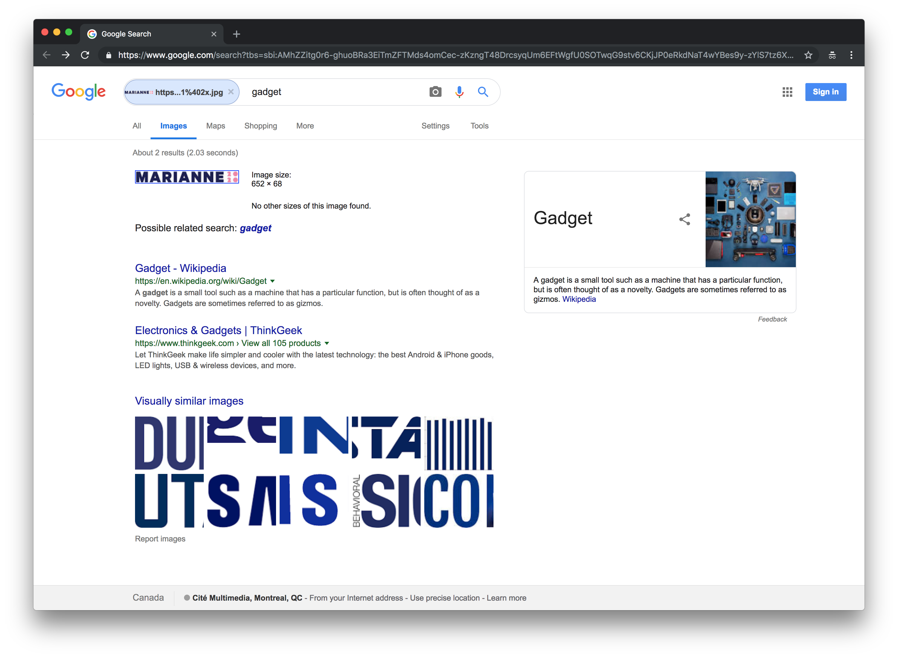