Visual Style Guide to the 2019 Federal Election
by Andrew Papenheim · 22 October 2019

Which of the candidates have eyes for style?
It’s a Liberal minority government. This has been an emotional campaign period. The preceding forty days have been described alternately as “uniquely nasty,” marred by disinformation, “a vote for nothing,” and an exercise in “low-value scrapping.” It’s over. The cosmic Sun rose today, the other Sun melted down today. You are alive. We made it. I decided that the best way to celebrate that fact was to share with you all, as a souvenir of the campaign that was, a light aide-mémoire of visual language: the trade-marks, slogan devices, directed videos, and digital ad campaigns that made it happen.
Why visual language? First, because this is a graphics site and of course I am going to talk about brand identity. Second, this campaign has been derided with the oft-repeated bromide that substance was scuppered for superficiality, spin, scandal, and smears. I share the lament that certain inopportune venues, such as the debates, turned into spaces of sloganeering, shouting, and rather uncreative re-presentations of policy and personality that both constituted pretty unremarkable spin and crowded out matters many Canadians care about. But I will not use creative communication done badly to indict message management itself. This article could alternately be titled “In defence of the marketing arts.” This is an attempt to take that which is “superficial,” image management and message discipline, and explore both how it works and why it matters.
The candidates clearly care about image management. No one digitally inserts a re-useable tumbler into their hands because the atmospherics don’t matter. But for all the candidates care about it, save set piece incidents such as Water-Bottle-a-Lago, the topic has gone without sustained and serious attention in print this writ period. That changes now.
And – get any groans out now – it is going to essentialize lawn signs.
It is a matter of open discussion for political people – and a topic which, with a sufficient quantity of adult beverages, is sure to arouse passion among a gathering of campaign operatives – as to whether branded visual outreach tools do indeed help campaigns. Most of the attention/ire is heaped on that most quotidian of devices, the humble lawn sign. If you ask a marketing flack or graphic artist (hello and hello), they will extol the virtues of politics-via-promotion from the rooftops. No wonder – they are trying to sell you lawn signs. You ask a certain breed of pundit, you get fiery invective along the lines of “signs don’t vote.” A thin scholarly literature suggests that campaign placards do have turnout effects, but the magnitude is small enough that, dollar-for-dollar, they may not be the most effective allocation of scarce funds.
Now, we all have lawns on the internet. Platforms such as Facebook are incredibly powerful, and the social ad line item has done nothing but swell in campaign budgets. With its low CPM and highly granular audience-selecting capabilities, it has proven alluring. Here, too, there are real debates about efficacy. Folk wisdom (less wisdom, more a sense of creeping dread) and some very early academic articles suggest yes, bespoke shape charges of messages directed to a properly sliced-and-diced portion of the electorate can drive turnout. But many people have gone broke providing us with a rich complement of counterexamples. Its local capabilities are under heavy questioning. As powerful as targeting may be, even the narrowest of campaigns seem to stretch far beyond the boundaries of a single riding. There is something we do not understand yet about outreach – particularly targeted outreach – through Facebook, and the company’s willingness to goose metrics in their own favour is not helping things.
I kept my sanity during this campaign, under this barrage of advertisements and Twitter insults, by attempting to understand why and how those communications worked (or did not). I wrote this as I saw them. It is an extemporaneous journal of what I saw from the cheap seats, one perspective from someone who thinks a lot about this matter. As it turns out, the soothing curative for a case of too-much-politics is a whole lot more politics. Let’s dive in.
Note: This article contains trade-marks and other non-free graphics, used for the purposes of criticism and review. It is never a good idea to re-use someone else's work without checking the licence, but lifting the graphic assets attached here for other purposes and without clearing use with the parties-on-high may invite particularly nasty letters from people more important and lawyer-having than I.
Oh, and it is pretty long. The menu to the right is a navigation bar, and below are direct links.
Jump To: Liberals, Conservatives, New Democrats, Greens, Bloquistes
LPC
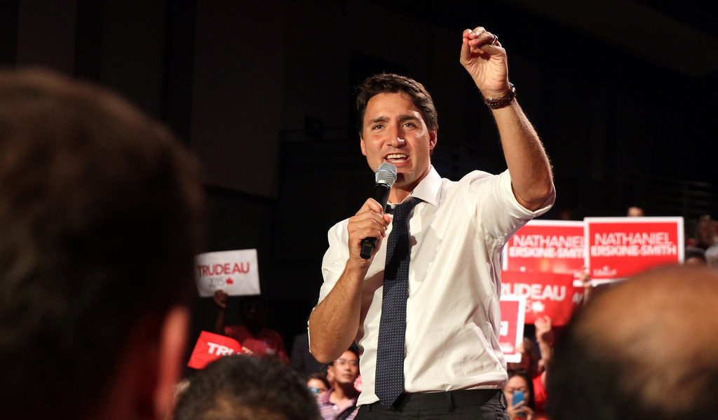
Photo: Alex Guibord
Leader: Justin Trudeau (Papineau – Montréal, Québec)
Slogan: “Choose Forward” / « Choisir d’avancer »
By all accounts, the Liberal Party of Canada was to enter this election with a leg up on the branding front. The Grits have had the luxury of forming government for the preceding term, they presided over a period of respectable economic growth, and are one of two federal parties entering this election period with incumbent leadership (here’s lookin’ at you, Elizabeth May!). Oh, and it is particularly charismatic, magnetic, and attractive leadership, at that. One cannot tell the story of the Liberal party’s ascendancy without mention of the metres and metres of newsprint expended over Trudeau the Younger’s branding je ne sais quoi. He is a known quantity in Québec, he polls well in the ROC, Melania gets lost in his eyes, he is – objectively, this is an objective article – a snack.
It was a shock to all of Canada, then, to see this campaign enter damage control mode within a week of the writ period commencing. Brown- and blackface, no matter how one slices, dices, or spins it (unless one is The Onion) do not comport with the Liberal brand. Or the Canada brand. Or any brand worth its salt and that wishes to form government.
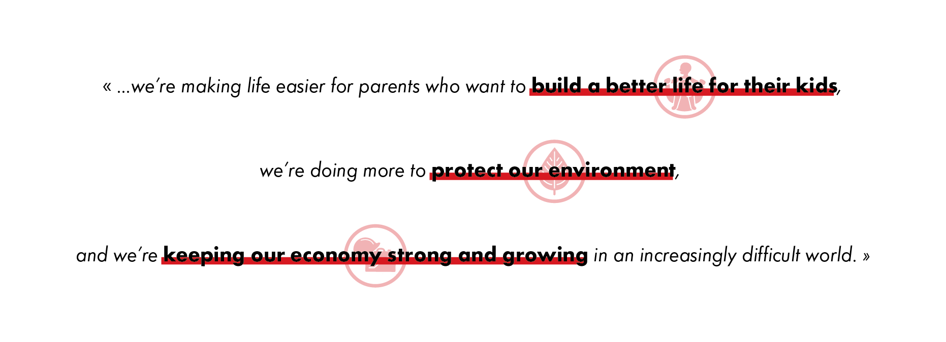
The LPC has released a platform for the 2019 campaign, and the opening statement is as follows (emphasis mine):
Thanks to the trust you placed in us, and driven by your hard work, we’re helping more people make ends meet, we’re making life easier for parents who want to build a better life for their kids, we’re doing more to protect our environment, and we’re keeping our economy strong and growing in an increasingly difficult world.
As the Liberal platform foreword hints, 2019 finds Canada soaking in a very different global context than the 2015 environment in which the Grits managed a clean sweep. Has their message changed with it? Let’s find out.
During the writ period, coroplast1 placards are fruitful and multiply across our acre of snow, on public and private lands, and are for many a Canadian the most present, persistent, party-directed visual reminder that an election is, in fact, currently happening. They must be both visually arresting and substantively succinct enough to be absorbed by a driver or disinterested pedestrian. As Elections Canada does not regulate the content of a campaign sign beyond an authorized agent disclosure, parties have broad liberties to construct these visual systems as they see fit. Their universality over time and across the Canadian landscape makes them an ideal starting point for comparative works interrogating campaign visual style.
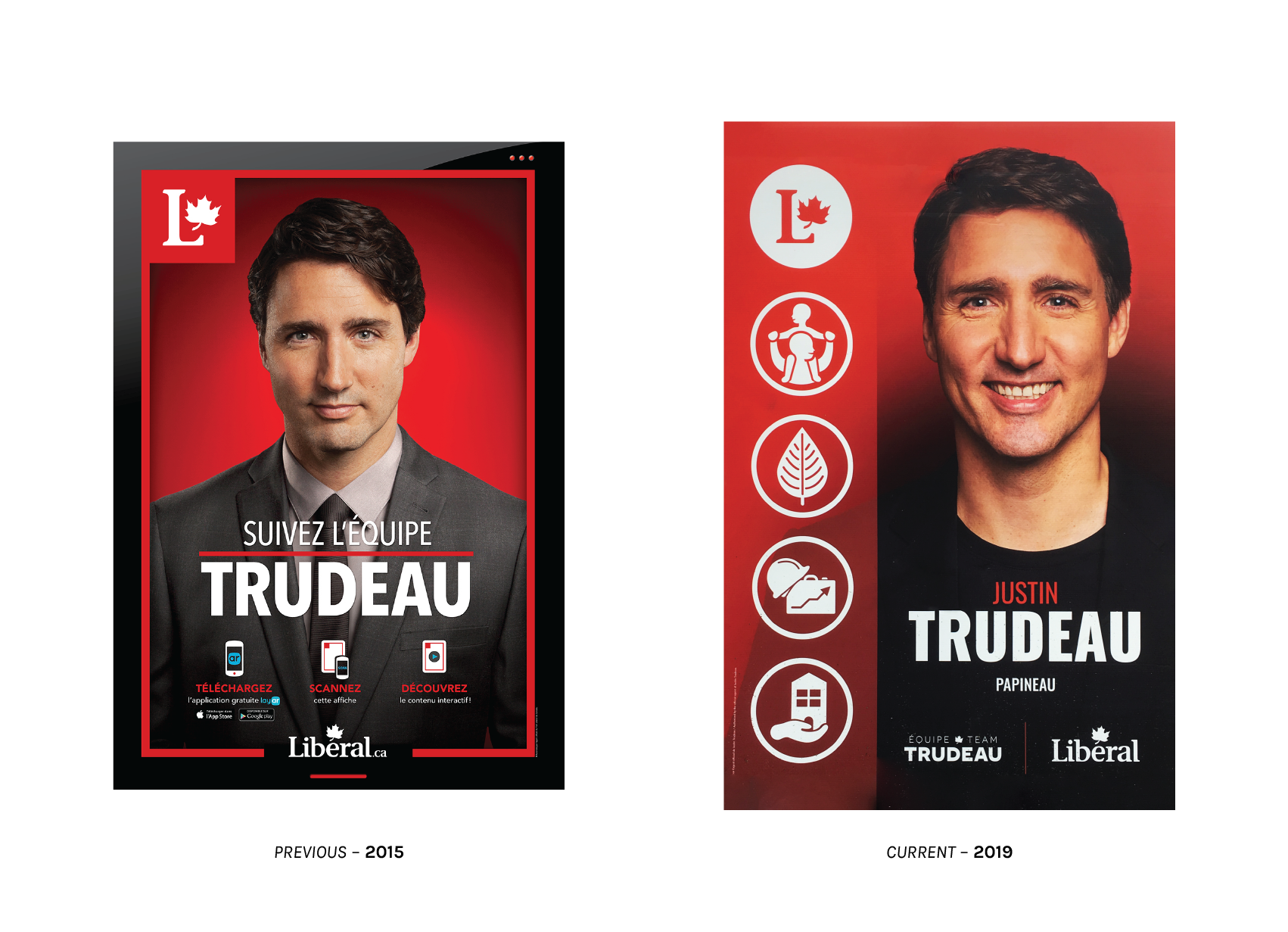
Pictured above is the party’s marquee placard – the ne plus ultra of Liberal lawn signs – for their leadership candidate: Justin Trudeau, the Right Honourable Member for Papineau. One immediate and perceptible difference (perceived primarily in my calves) this election cycle was that it was much harder to physically locate one. In 2015, they were sprinkled liberally around the city of Montréal, mixed in with placards pitching candidates for each particular riding. This time… reader, I had to actually go to Papineau. There are broad stylistic similarities between the current placard and the 2015 work by Clan Créatif. Black and red dominate, the Liberal identifier is perched in the upper left, and the candidate is in a sharp suit – though this year, that suit is a bit darker and is paired with a wider smile. I understand that the all-black dress code and general sobriety of the layout is meant to evoke sentiments of trust and professionalism, but I cannot shake the downright funerary air of the effort.
The 2019 colour treatment is stripped down and austere, austere as one can be when working with red, when juxtaposed with the 2015 example. Gone is the glossy black background, abundance of urgent red strokes and underlines, and the three red baubles in the upper right. The latter were presumably meant to suggest a computer application on the decidedly analogue signs from the hip, young, techy leader. The 2015 posters were indeed technologically advanced, with the text on the lower third requesting that the viewer download an augmented reality app and interact with them. The reward for one’s troubles, installing an app being a practically herculean imposition, was a Liberal Party ad that played whenever one pointed their phone in the sign’s general direction. I follow the intersection of marketing, politics, and tech quite obsessively, and I never bothered to do this.
Trudeau may no longer be trying to leap into your pantsphone, but he is still getting closer. The portraits on the new campaign signs are arrestingly magnified, shortening the distance between the viewer and the candidate. Type is centre-aligned over the candidate’s close-up. The text on the sign is impactful and follows the 2016 Liberal Party style guide, a prominent application of the open-source powerhouse Oswald Regular (from dearly-departed Vernon Adams) for circonscriptions and given names, printed in white and Liberal Red, respectively. Surnames are displayed with Oswald Heavy in a highly-legible white against the candidate’s all-black dress. Oswald is an unbelievably popular font with over a trillion pageviews. I was not aware that there existed an extra-bold weight of Oswald, so I quite appreciated the education. It is not my favourite gothic face, but this is not Typewolf and it is not bad, particularly for headings, and doubly so in this application of immense verticality which calls for something tall and condensed. I appreciate free fonts, much as I appreciate adhesion to existing style guides, so I am inclined to offer a pass to the fact that the given name is quite difficult to read.
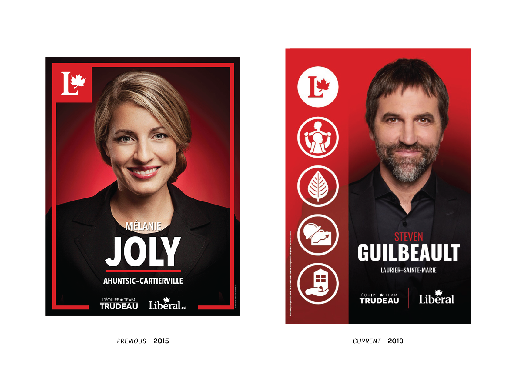
The campaign placard is also a space in which a party can choose to exert centralized control over messaging and appearance, achieved through rigid standardization of form among candidates. The Liberals, at least in Québec, are keen on this. In both 2015 and 2019, Québec candidates all advertised themselves with pancartes of identical dimension, design, standard of dress, and portraiture. The highly regional nature of these top-flight ads is why there was such a brouhaha made over examples printed in a non-official language of Québec. (The LPC seems to have avoided this – or any words, in any language – for 2019.) It must be noted that candidates in the ROC are exempt from the portrait studio mandate and are given or at least take substantial liberties in producing their own signs. I find that the Québec signage offers a whole lot more to talk about, is located where the Liberal leader is running, and is in close enough physical proximity to me that I can observe and discuss it at length. In short, more graphically important. And convenient.
Without the overpriced and underutilized hassle of a bespoke app, the Liberals have this time around opted to communicate their ideas through a series of pictogrammes.

Recalling the elaborate systematization of Dreyfuss and polemical dictionary of Thompson and Davenport, graphic symbols optimize our communication for speed and efficacy. They are a perfect choice for a visual artefact meant to be interacted with for, at most, seconds. Graphics are not a shorthand, but a language unto themselves, allowing the LPC to communicate core values of their platform to anglophones, francophones, and allophones simultaneously without crowding their placard. This country loves pictogrammes, which really ought to be a third official language, and is always finding creative new things best described through visual language.
The first, a Liberal identifier, is simultaneously the most important and least interesting. It is the most prominent device signifying that this ad is a communication of the Liberal Party of Canada.
A symbolic representation of a child on an adult’s shoulders, with the adult’s arms raised skywards in what can only be described as a woo-hoo position, alludes to an expanded Canada Child Benefit.
A stylized broadleaf symbolizes a desire to further build upon the Liberal climate plan, perhaps with some of those two billion trees(?!) they have been talking about.
The symbolic representation of economic development, a hard hat perched atop a briefcase which has transmogrified into a chart showing a general upward trend, is the most confusing of the lot. Does it refer to slashing corporate tax rates on clean tech? Web development bursaries and the elimination of swipe fees? Perhaps the hard hat and briefcase are a more general reminder of strong, multi-sectoral economic growth? It is not clear to me. I do wish the white-collar construction worker drawing charts on her briefcase well, however.
Finally: The hand, palm upturned, offering the viewer up what appears to be a pitched-roof townhouse with a mouse hole for a door, alludes to the raft of planned incentives for immovable ownership in expensive markets and punitive levies on non-resident real property owners floated in September.
Huh, fancy that. The pictogrammes do, for the most part, call to mind key planks of the Liberal platform for the coming election. By that measure, they are successful. It is a gamble as to whether the symbols will be readily parsed by lay Canadians, but I appreciate the approach a whole lot more than I do the awkward and unrealistic attempt to deliver supplementary advertising via augmented reality.
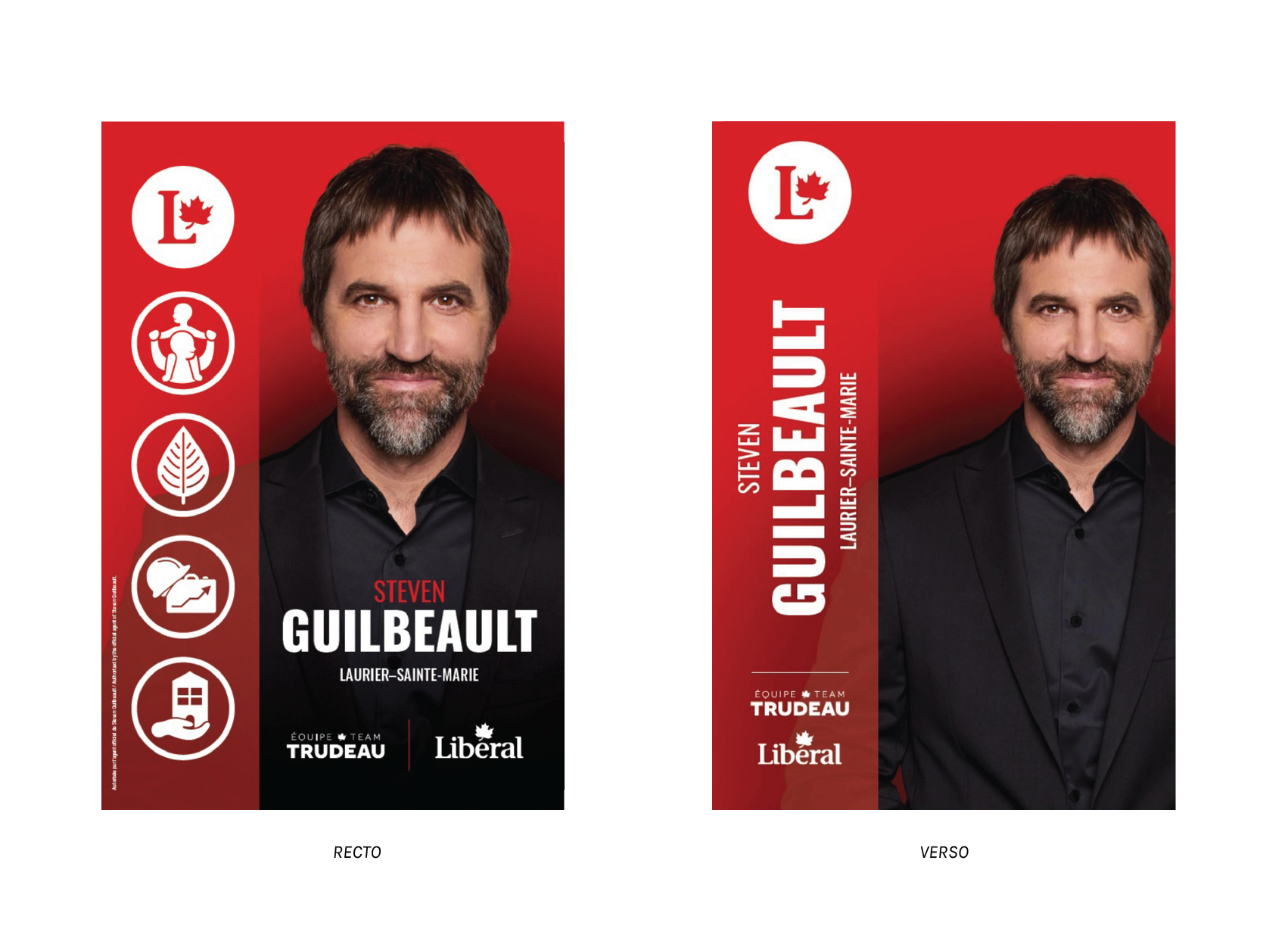
The vertical, dual-column construction of the placard is quite clever. This is one of the few examples of campaign signage I have seen with a definite front and back side. In the rear, the pictograms are eschewed, shunting the candidate’s name and riding into the left column. In this format, a campaign sign bisected by a lamp post (a quite common application in urbanized areas) can still be parsed from the rear, eliminating the need to apply multiple placards for a single installation.
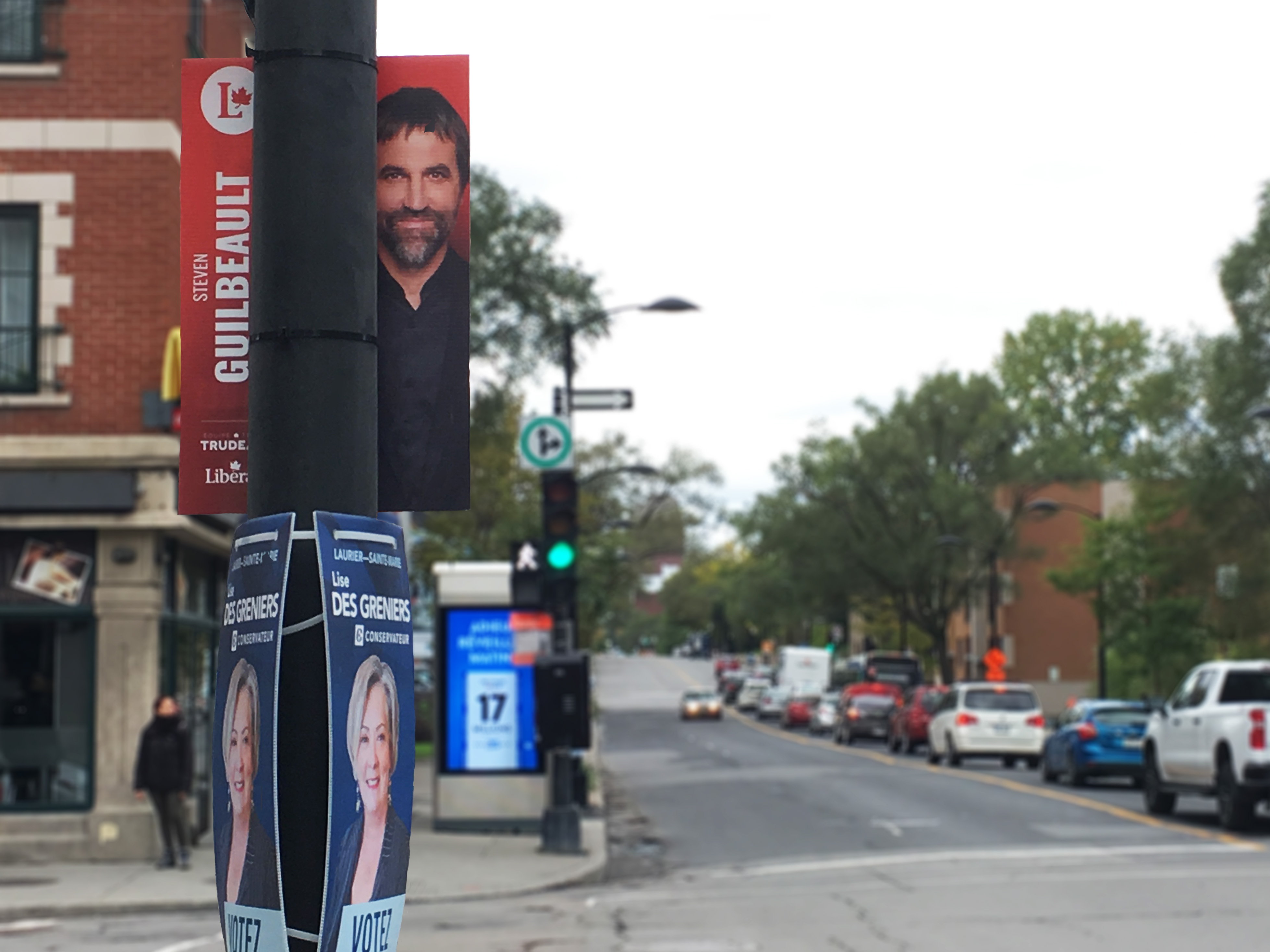
Even the smallest placards, such as this example noted in the Village, are formatted in such a way as to be readable from two frontages. This is laudable. It saves installation time, slashes print runs (and a little bit of the associated cost, though the recto-verso printing itself is not cost-free), and reduces the total amount of corrugated plastic that campaigners will ultimately sicc upon the world. Speaking to Québec’s Le Soleil, MP Joël Lightbound suggests that this change was indeed made primarily to minimize environmental impact. This is fantastic. Everyone, please steal this idea.
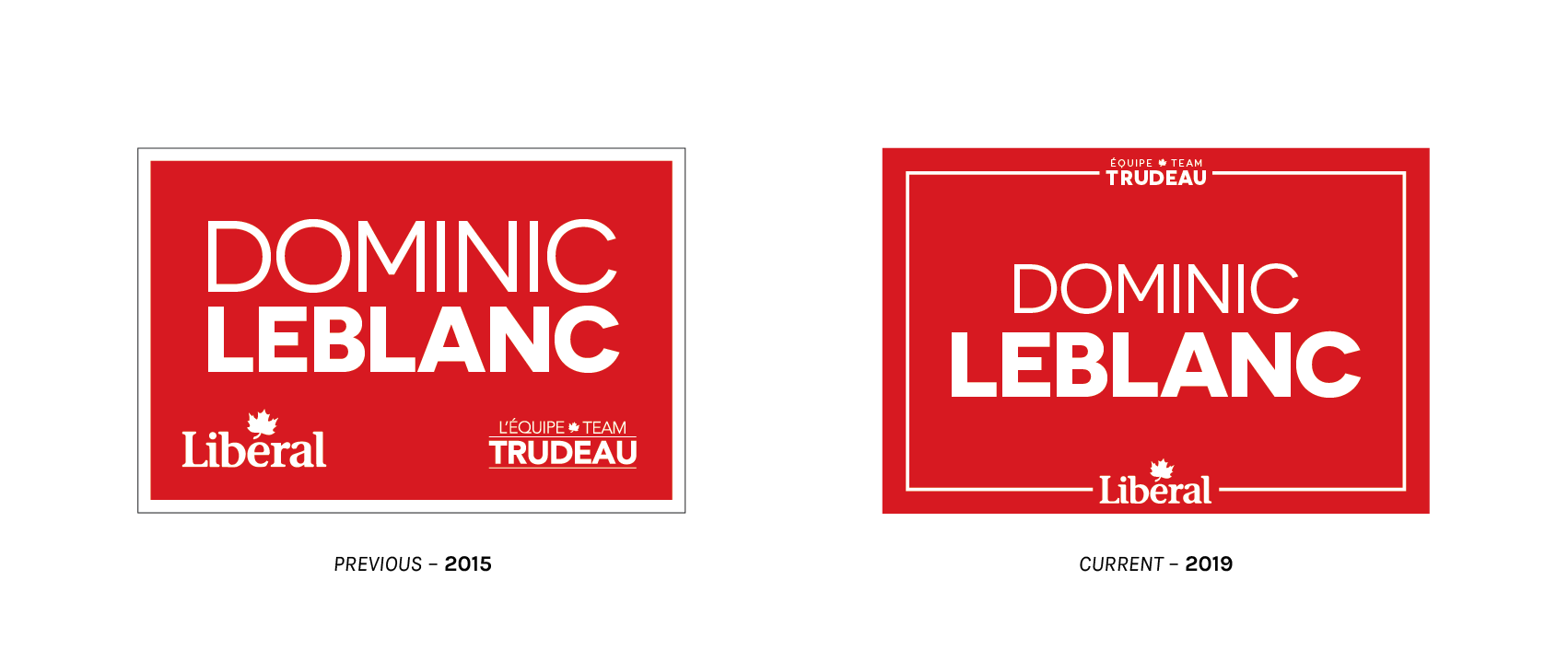
Of course, not every bit of signage gets the deluxe treatment. The placards above are likely more familiar to those unlucky souls outside of Québec. (When here exists, why live anywhere else?!) The more proletarian lawn signs for the Liberals are simple, but follow some definite rules. These signs are generally silkscreened at volume, and come as close to Liberal Red as is feasible under signmaking conditions. There are two partisan identifiers, a Liberal wordmark and an unreadably small, stacked Team Trudeau lockup, the latter being the only nod to Liberal leadership made on these coroplasts. The current typeface is Synthview’s Novecento Wide, with the surname in a bold weight and given names (and, for some candidates, middle initial) at normal. Interestingly, this face is nowhere to be found in the identity guidelines.
I find the 2019 version, with wordmarks piercing the poles of a bounding box around centred text, a more successful application. In 2015, the candidate’s particulars competed for prominence with the (larger) partisan identifiers. By scaling those down (which, importantly, somewhat diminishes the importance of Justin Trudeau) and moving the clutter off to the periphery, the name of each candidate – what voters will be looking for with a ballot in front of them – is more legible and salient. My only wish is for a different layout tool than the pierced bounding box, which is inescapably Trumpian.
Lawn signs are the most prominent application of a broader system of visual style. Luckily for us, the Liberals make the documents governing their language of visual communication publicly available. The full document, dated April 2016, is available on my filesystem.
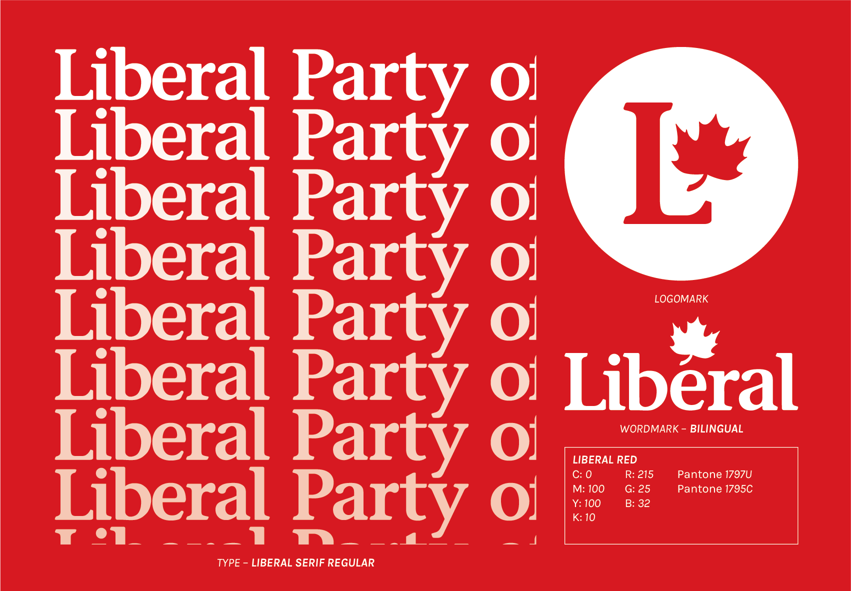
I frequently say that the Liberals are blessed by their visual system and the official languages of our great country. To understand why, let’s take a closer look at the wordmark.

The clever placement of a stylized maple leaf over the E obviates the need for a diacritic and makes the party name readable in both official languages. It is compact. Other parties opt for quite dreadfully awkward and complex bilingual constructions, or make the conscious decision to adopt segregated tranches of unilingual branding in a country with two official languages. Yikes.
The LPC also lucked upon the colour red. Liberal Red – FIP Red with an additional 10 per cent of black – is remarkably close to the red defined as a national colour of Canada. The Liberals can then take greater stylistic liberties with the maple leaf, as they have done to produce a bilingual wordmark, without losing the essential Canadian-ness of the composition.
The arrangement, in addtion to the colour, persuades through appeal-to-Canada. The 11-point maple leaf is in the centre of the whole construction, much as it is on the Canadian flag.
The text of the wordmark is in a custom face titled Liberal Serif, bunched up tight with -50 tracking. It comes in one weight, it is not free, there is no such thing as a licence for it, I cannot think of a legitimate reason to share it, and one should generally avoid using it. It is similar, but not identical to, Stone Informal Semibold. This is the only serif typeface used in the Liberal brand, which makes the wordmark’s position in branded assets particularly prominent and distinctive. There is a sober air of history and classicism about it, much what one would expect of a “natural governing party.”
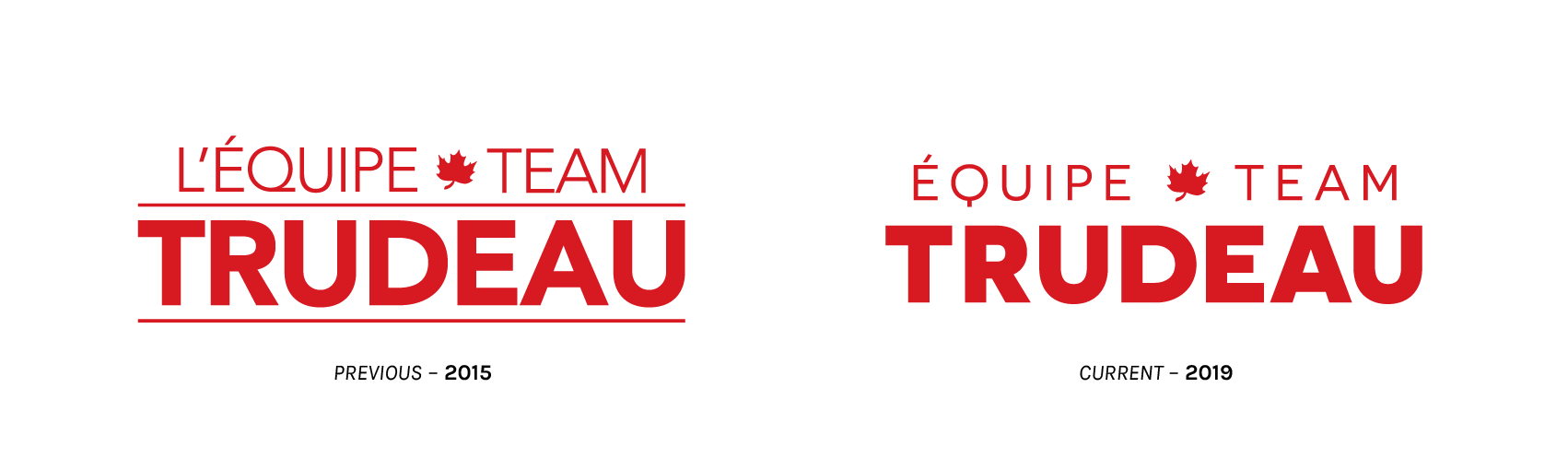
While the Liberal wordmark is common to the party and has a history stretching beyond the current leadership, Trudeau does have an identifier of his own which remains relatively consistent over time. This is offered to candidates as a sort of branding apostille, a tool with which to demonstrate that they are official candidates backing Justin Trudeau’s leadership. The switch from Avenir (evident from the distinctive tail on the Q) to Novecento Wide makes the stacked composition feel looser, as does removing those particularly horrendous horizontal rules. Novecento is available in a single case with small capitals, so I applaud the LPC designers for resisting that particular temptation. Both are thoroughly professional faces and, while neither application is particularly inspiring, I have no bone to pick with either. …aside from those nonsense, rigid horizontal rules, a choice which sucked all the levity of Avenir straight out of the room.
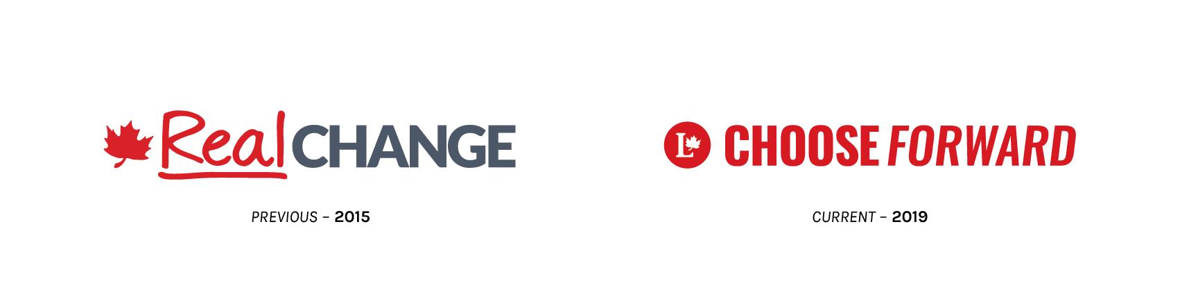
In addition to the “Team Trudeau” logo which is constant over time, there is a branded element made unique to each electoral campaign. In 2015, that was “Real Change.” This year, we are to “Choose Forward.” Apparently, incumbents are not so keen to be campaigning on a theme of “change.” The 2015 logo pairs Łukasz Dziedzic’s Lato – rendered all-caps in grey… but using a black weight – with a handwritten script in Liberal Red, underlined to convey urgency. The text carries alongside it a stylized maple leaf to hint at the connection to the Liberal Party. The choice of the heaviest possible weight of Lato, the profusion of capital letters, and the thick red underline all compel the viewer to give thought to the gravity of the proposition – the realness of the change the Trudeau Liberals promise. The addition of a hand script, meanwhile, humanizes the endeavour. It feels simultaneously like personalization and an exasperated correction. Trudeau, a former teacher, will take stewardship of government and be unabashed in tinkering with the marginalia to deliver the revisions Canadians seek.
The Grits, in this proposal, set up a binary choice to the viewer. An LPC vote is choosing forward. Not choosing forward, it is inferred, is electing for backwardness.
The logo of the 2019 campaign is much more red and, as a whole, much more explicitly Liberal. A stylized maple leaf is not enough. This time around, the construction is anchored by a party logomark. Again, there is an urgency to the affair, conveyed through a bold weight of the condensed face Oswald. The text “Forward” is in obliques, as if rushing to get out of this wordmark and back to the important task of governing.

If heading in a vaguely front-facing direction is not really your thing, worry no more! The LPC offers a litany of other options for one’s “choosing” delight. The open-ended nature of this brand grants the party considerable flexibility through the vagaries of a confusing electoral period. For instance: If “Choose Candidates Who Have Not Worn Blackface” no longer passes muster, it is a short jump and a text-line change away from “Choose a Red-Orange Coalition.”
The locus of control embedded within these slogan devices has changed completely. In 2015, the party makes a brand promise to the viewer: We (as government) will change things in a concrete manner. Now, the LPC makes their own actions secondary. The Liberals of 2019 are asking for the viewer to choose, and for that choice to be favourable to the party. The demand reflected is no longer one made by constituents upon the party, but by the party on constituents.
These bits of visual furniture, of course, do not exist in isolation. It is pretty much only here, in articles like this, that anyone will agonize over a be-hard-hatted-briefcase-chart. Graphics thrive when they are applied, so let’s take a look at a few managed campaign communications that use visuals to persuade.
Something quite remarkable has shifted in the way we consume advertising. Digital advertising, a sideshow when Layton and Ignatieff sought to unseat Harper, became the game-changing advantage when Harper finally did sashay away in the subsequent cycle. Now, with Trudeau seeking to hang on to his majority, digital advertising has become the game itself. In the leadership contest to our south, 2020 US presidential campaigns have dropped over US$60 million on digital advertising, roughly six times their total spending on television. This despite the fact that television ad rates continue to rise. The situation is the same in Canada. A plurality of federal ad dollars now go to digital platforms, with the largest single line item of that digital spend being social media. Elections Canada is relying more heavily than ever before – about twice as heavily – on digital platforms for their own non-partisan outreach. It would be an error to assume that this change has been coupled with a proliferation of providers: A majority of total digital ad spend goes to just two companies: Facebook and Google.
Google’s YouTube, as well as Facebook’s namesake property and affiliated platforms (including Instagram) have emerged as major and murky destinations for advocacy ad dollars, to the consternation of elections officials everywhere. Facebook, under legal scrutiny for electoral disruption, has enhanced transparency around advocacy ads placed on their platform. Google, weighing the compliance costs of Bill C-76, opted not to run political ads during the writ period. So, that just leaves Facebook.2
And if one thing should be made clear, it is that the Liberals really, really like Facebook. The observation period for this article is the seven-day period running 7 to 13 October. Why this date range? It covers two debates, one French and one English, and ends just as Thanksgiving – joyous occasion of binge eating and shouting at loved ones about politics – begins. Parties may wish to promote materials which re-inforce particularly strong points from debates, or they may wish to front-run talking points to sympathetic partisans ahead of the turkey carving. The Liberal Party of Canada profile and Justin Trudeau’s leadership page together spent $300,630 on a staggering 3,489 ads that week alone.
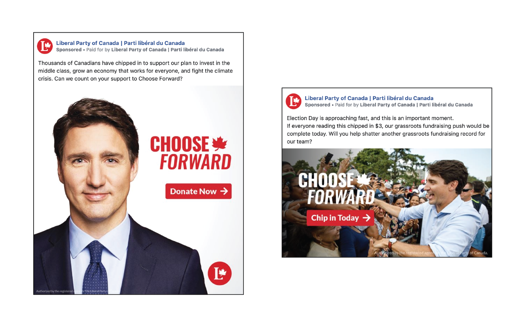
I cannot and, on principle, will not review 3,500 individual ads. That is over 2,500 more than put out by all other federal parties combined. There are two very broad genres of social media post: Appeals for donation and offers of information. Visually, the LPC solicitations follow a simple, standard formula. A photo of the leader is overlaid with the 2019 “Choose Forward” branding and, optionally, an LPC identifier (redundant, as there is already one present in the profile picture). The calls-to-action are in attention-grabbing Liberal Red, and there is no other text, save the obligatory authorization message from the financial agent, cluttering the ad creative. The copy packaged alongside the graphic is subject to endless tinkering, targeting, and testing that results in dozens upon dozens of individual ad postings associated with each marketing blast.
There are Wikipedia-style appeals with suggested small-dollar donations:
Our final quarterly deadline before Canadians head to the polls is approaching right now. If everyone reading this chipped in $3, our grassroots fundraising push would be complete today. Will you Choose Forward and help shatter another grassroots fundraising record for our movement? [link.]
People in vote-rich, swingy areas of Ontario and British Columbia with tight real property markets see a message on housing affordability:
Thousands of Canadians have chipped in to support our plan to make it easier to afford a home. Can we count on your support? [link.]
Older voters, particularly women, appear to be receiving a message about action on firearms:
Thousands of Canadians have chipped in to support our plan to take serious, common-sense action to strengthen gun control. Can we count on your support? [link.]
Environmental policy gets its own bespoke appeal:
Thousands of Canadians have chipped in to support our plan to fight the climate crisis and protect a clean environment. Can we count on your support? [link.]
“Thousands of Canadians,” it seems, is the LPC’s variation on the nondescript “many people are saying.” I do not know precisely how audiences are parcelled into these thousands of targeted micro-buys, both because the party is hesitant to divulge strategy (no surprise) and Facebook’s Ad Library may be transparent, but it is not very useful.
Informative posts are a bit different than donor appeals. These are liable to be videos rather than static images. Above are a half dozen 10-second GOTV spots released at the beginning of advance polling. Opening with black text on a yellow background, one could be forgiven for thinking they are communications from Elections Canada. Trudeau’s leadership is de-emphasized and, indeed, neither a photo of the Liberal leader, nor even the word “Trudeau” appear anywhere within them. These shorts are intended for a younger audience, as the LPC discusses the finer points of “adulting,” makes epilepsy-inducing ballot box animations, intersperses copy with facepalm GIFs, and cloaks itself in all manner of how-do-you-do-fellow-kids Millennialspeak.
Other shorts published later in the writ period (16 October) . This pair, “Stop Scheer Together” and “Stop Conservative Cuts,” were published together and make the most sense when viewed together. The first attempts to establish Trudeau’s progressive bona fides by listing off accomplishments of the first term to upbeat music. Only towards the end is the situation made clear to the viewer:
Andrew Scheer could become Prime Minister.
And, for a voter impressed by the prior talking points, that is a revolting prospect. The solution, per the Liberals?
Let’s stop Scheer together. Vote Liberal.
A clear attempt to poach the Green and NDP vote becomes even more explicit in the second. It opens on a blue duotone of Scheer and Harper yukking it up together and makes clear the state of play:
Conservatives could win this election.
This ad does not elaborate to the progressive voter what has been done, but what they have to lose, through making clear the threats of government and climate inaction. The hard sell:
Only the Liberal Party can stop Conservative cuts. STOP CONSERVATIVE CUTS. CHOOSE FORWARD.
Here, the campaign visual identity is freed from being analyzed in isolation, and we see it used in conjunction with a broader effort to frame this election as a binary choice. Those reading along in the province of trilliums may take an interest in an Ontario-specific variant of the “Stop Conservative Cuts” spot, which swaps out Stephen Harper for Doug Ford.
While the federal parties may not be allowed to purchase advertising on YouTube, nothing prevents them from uploading video spots to their own accounts.
The marquee, 1-minute video spot of the Liberal campaign (titled “Choose Forward”) opens on an STM bus. From that mise-en-scène of the everyman, Trudeau travels around his fabulously multicultural riding of Papineau3, and the camera stays with him: Smiling, respectfully listening, and observing various babies. While the visuals are a gauzy highlight reel of the Prime Minister’s soft skills, the ad copy is an altogether different beast. From the 20 second mark onward (i.e., two-thirds of the advert), the voice track, through both reductio-ad-Harper and name-checking Doug Ford’s “For the People,” establishes the backwardness that plays foil to the Liberal Forword.
The nameplate advertisement, however, is not the work I found most significant. The above was the first spot of the campaign, released 25 August, well in advance of the writ actually dropping.
This spot, titled “Your Choice,” gets at the heart of Liberal messaging this electoral period. It is a late-period ad, making its first appearance on 10 October. We see Justin Trudeau for all of seven seconds, at which point he promptly vanishes until the closing tagline. What he has to say in those seven seconds is illuminating.
The Conservatives want you to think this election is about me. I think it’s about you. This is your country, and your choice.
They have calculated that it is not in their interest for this election to be a referendum on Trudeau. What we see here is a conscious and explicit de-centring of party leadership. The Liberals, through the Prime Minister himself, posit to the viewer that the “ballot question” faced on election day is not the personal merit of the Prime Minister. It is hard to get any more direct than that. This preface is followed by four personal vignettes – not in Papineau, but around the country. Trudeau is absent, but the policy trade-offs between the Liberal and Conservative platforms are stressed by the actors in both audio and captions4 in the lower-third.
It is quite a contrast from the ad spots of 2015.
The subject of Trudeau’s luscious mane is not arbitrary. This spot is one parry of many against a throwaway line in a particularly infamous and over-played Conservative attack ad. A fascination with follicles, however, would not be not out-of-character for a 2015 campaign which produced promotional clips of the Liberal leader boxing, slinging donuts in a drive-thru, riding a dogsled under the midnight sun, and (much like Trudeau the Elder) paddling off into the sunrise. This ad campaign was soft, gauzy, and personal. If one has a magnetic personality and objectively excellent head of hair, look, it would be malpractice not to run on that. A leader with youthful verve and undeniably impressive height is free to campaign as if they are floating above the thousand dirty morasses that together are federal party politics. There is a reason that spots of cheering and laughter at energetic rallies figured heavily the 2015 campaign.
It seems that the sheen wore through. The racialized makeup is off. From promising “Real Change,” the Liberals would now very much appreciate that voters do not cast change votes. There is a binary: Forward (Liberal) and backward (Conservative). This is not to say that the Canadian Left is altogether ignored – no, they were campaigned to quite heavily. Efforts to persuade CPC voters are largely absent, while efforts to keep a diffuse left flank from scurrying to the other federal parties in line – either by asserting the progressiveness of their own record, or laying bare the dire threat posed by a Conservative majority – went into full-tilt.
Disclosure: I have directed no material support to and accrue no gains from the electoral success of any political party mentioned, and have no plans to initiate any material support within the next 72 hours. I do, however, have a bottle of pretty decent liquor riding on the net change in seats for the Liberal Party of Canada in the upcoming Federal Election. The magnitude and direction, that is yours to guess. This commentary is of my own authorship and expresses my own opinions.
CPC
Photo: Andrew Scheer
Leader: Andrew Scheer (Regina—Qu’Appelle – Saskatchewan)
Slogan: “It’s time for you to get ahead.” / « Plus. Pour vous. Dès maintenant. »
It is to the detriment of the Tories that I cannot open such a section without mention of Stephen Harper. Theorizing about the polished and partisan image management of the Conservative Party of Canada became something of a national hobby during the Harper years. The PMO’s tight grip over government communications further centralized and enlarged a “publicity state” apparatus, leaving Canada in a state of permanent campaign. There is a small academic literature, within which the chapter by Cosgrove and article by Marland are particularly valuable reading. Stephen Harper was born, lived, and lost on his image, which had by 2015 become a caustic slurry of niqab bans and “barbaric cultural practices” snitch lines that proved unpalatable to just a few too many Canadians. Interim leader Rona Ambrose ought to be canonized by the party faithful. She shed the dour paternalism of her predecessor and hemmed in riven factions with a dignity and optimism that, per L. Ian MacDonald, singehandedly “saved the Conservative party.”
But what do we know about (non-interim) leader Andrew Scheer? It is, after all, now his ship to run. We know he is a soft-spoken family man who drives a Chrysler Pacifica, likes The Simpsons, and makes innuendos in a second language while attempting to like The Simpsons. Oh, and he tweets about popcorn, a lot. It is so painfully demonstrative of undeniable, raw sexual charisma on-message – and not a particularly inspiring message – for the Leader of the Official Opposition’s cheat food to be noncaloric puffs of edible polystyrene and sadness. Is there, to be stitched from this gentle mire, a viable image projected from the head of the Conservative Party? Would Scheer be wise to take the advice of Dennis Matthews and distinguish himself as non-distinguished, or pay heed to the imploring of Nik Nanos and construct some sort of image to pre-empt the Liberal messaging machine – and fast?
No matter. We’re here, it’s election time. The monumental task of self-discovery is one for Scheer to busy himself with when and if he continues in Conservative leadership.
The value proposition of the Conservatives coming into this election is made quite clear. From the platform:
You and your family are working hard, but you are not getting ahead. Everything is getting more expensive, there is less money available at the end of the month, and Justin Trudeau is only making things worse.
The opening statement of the platform identifies a problem, unaffordability of everyday life, as well as a proximate cause, the Trudeau government. This exposition leaves the platform to present itself as a solution, though stump speeches and the like often develop a bit of a fixation on base-frothing attacks, particularly on pollution pricing. Leaping into the breach over primary extractive industry plays well in the Prairies, already a solid sea of blue, but the CPC is doubtlessly aware that their path to a majority runs through Ontario, where they must carefully elaborate a promise of affordability while dodging partisan communications apparatus positively champing at the bit to mentally couple the party with the spectacularly unpopular Premier of Ontario and even more profoundly despised U.S. President.5 Dodge, weave, hammer home affordability – given circumstances, it was not a bad Conservative game plan heading into the writ period.
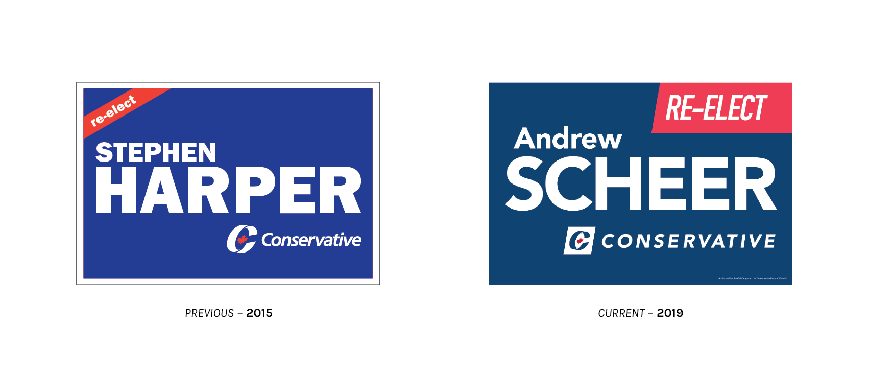
The Tories have done a better job than most of standardizing appearance on their electoral placards across the country. In both 2015 and 2019, signage follows a rigidly prescribed form: A blue background (matched to a reference colour), a standard typeface, the Conservative wordmark, and a red “Elect / Re-elect” (2015) or “Vote / Re-elect” (2019) call-to-action ribbon in the corner. While we may say that we are an officially bilingual country, the CPC acknowledges that Canada is, in fact, quadrilingual – there are four different layout localizations: English, French, Bilingual (English First), and Bilingual (French First).

For all of the stylistic similarity, there are some key differences. Between 2015 and 2019, the definition for Conservative Blue changed from Pantone 286C to the darker Pantone 541C. Alarmingly, this exact spot colour was already claimed by the Bloc Québécois. While the blue got darker, the red ribbon got lighter: Pantone 485C to Pantone 032C. (The tiny 11-point maple leaf in the logo, meanwhile, shifted darker from Pantone 485C to Pantone 187C, making this a three-colour sign.) URW’s Franklin Gothic Heavy is exchanged for Linotype’s Avenir as the primary face, joined by a DIN font playing secondary on the call-to-action.
Political design in red, white, and blue is not exactly furrowing new ground. Of all the Canadian electoral signage, these examples are the most similar to work that would be typical of the United States. The re-design, however, was thoughtful. There are serious legibility issues with the deprecated, diagonal call-to-action ribbon which are solved through re-orientation, enlargement, and selection of a legible DIN font. It also evinces real consideration that the quadrilateral of the ribbon follows the form of the parallelogram enclosing the CPC logomark. Space is utilized judiciously, and any ground gained is used to make the candidate’s surname, already quite large in 2015, more prominent. Giving more space to the surname establishes a clearer hierarchy of importance and aids the viewer in recall come election day. It is one of the things I find most successful about Conservative placards.
As usual, in Québec, we do things a little bit different.
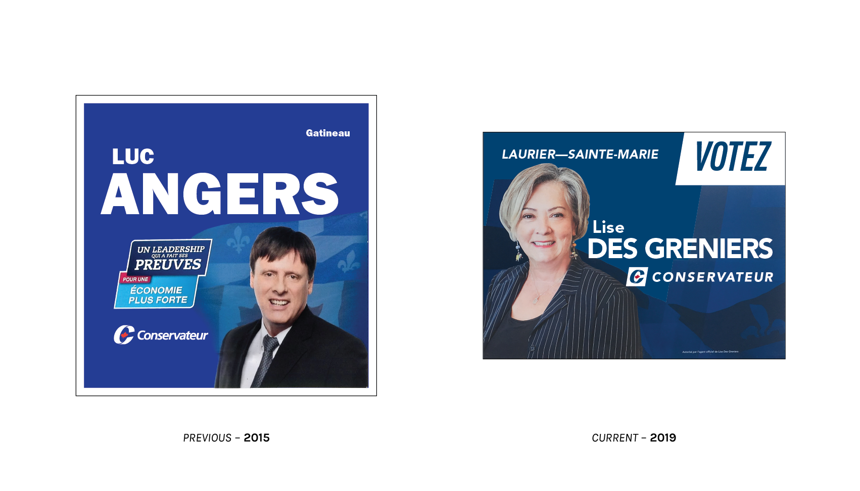
Local placards have changed from a 1:1 to 4:3 aspect ratio, although neither of these matches the 4:6 format which predominates in the ROC. This is not to say there is no alignment with the federal style guide: The signs use their respective standard Conservative Blue(s), though the call-to-action on the 2019 sign is in white, not red. With the Tories making an electoral appeal to Québec nationalists in the Regions, and with Liberal Red dominating much of the island of Montréal, one supposes they figured there was good reason to pursue a design containing as much blue and as little red as absolutely possible. Both examples feature graphic-overlaid backdrops. In 2015, the flags of Québec and Canada fly behind a portrait of the candidate. This year, the Québec Conservatives have decided that a faint suggestion of a waving fleurdelisé is sufficient.
Similar to the Liberals, I could find no out-of-riding signage for the party leadership. Is the situation different in your part of Canada? Please drop me a line, I would love to know!
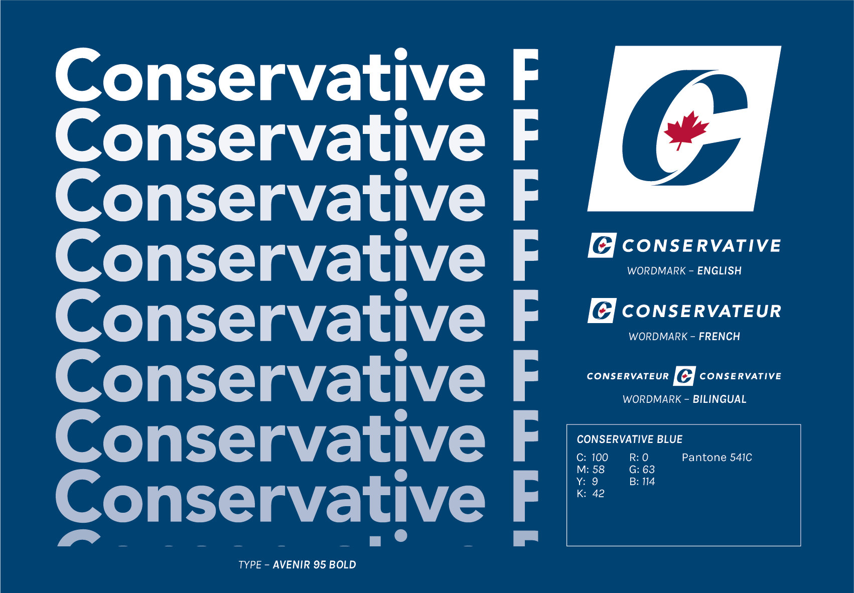
The CPC undertook a visual identity update in early 2019. This was an attempt to whip some formality into the appearance of their managed communications – which had become a heterogeneous mélange of rounded corners, old lockups, and drop shadows – in advance of the federal election. The fruit of their labours is a brand new set of graphic standards, which is reasonably thorough. Wondering how many maple leaves of clearspace to leave around their logo? That will be page seven. A schematic for a lawn sign in a bilingual riding? Page thirty-three. The intangible qualities positioning the rebrand are, per page two and orthography theirs, “Fresh. Familiar.” This is a contradiction in terms. Say I buy a used Honda Civic, and the interior smells like smoke, so I have it re-finished in a new upholstery: Fresh. Next, I chain-smoke my way through a carton of Newports in it: Familiar. It does not solve the principal problem, which is that this clunker reeked of cigarettes. Freshness and novelty depend upon breaking the chains of historical memory, not recalling what was deservedly replaced. I do not find that bit of brand-speak very impressive, but I also must accept that brand-speak is, well, brand-speak. Contradictions in terms come with the territory.
How about we just see what changed?

The core figures of the Conservative logo, a stylized C containing an oblique 11-point maple leaf, remain unchanged. The work of strategists at Calgary-based Watermark Advertising Design (now, through mergers and leadership shuffles, a part of Cult Collective), this visual device has been in place since the merger of the Canadian Alliance and Progressive Conservatives in 2003. Blue was chosen to predominate as it is a naturally calming, stable colour – of course, it also helped things along that blue was a common colour shared between the visual identities of the Alliance, PCs, and former Reform Party.
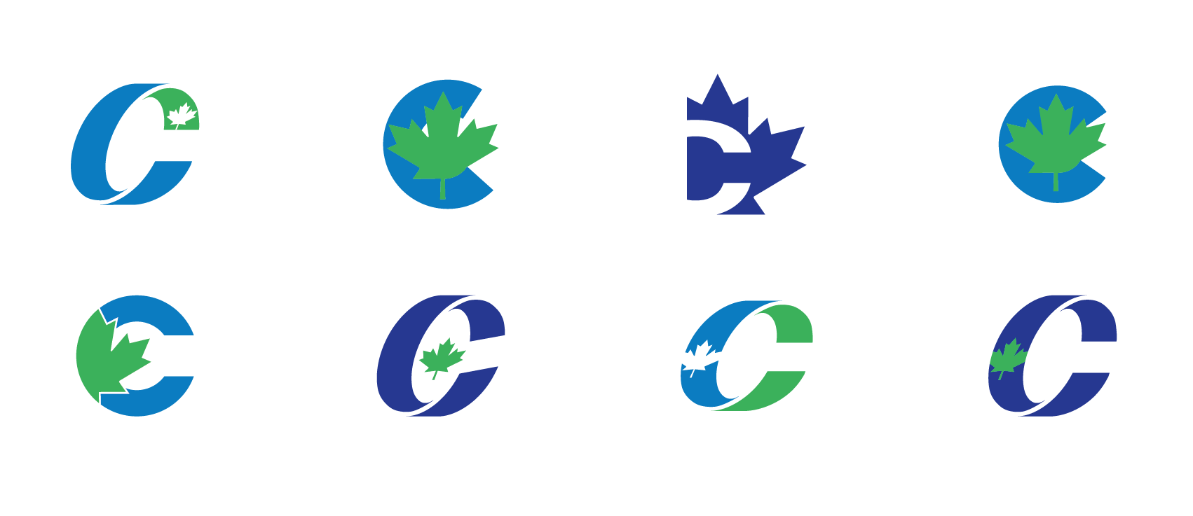
Rejected Conservative Party of Canada concept logos. (2003)
The colour of the tiny maple leaf resting inside the C quite nearly scuppered the merger negotiations. The Alliance (ex-Reformers) favoured a green leaf recalling the visual history of their populist party, simultaneously concerned that the red would lead to an association in the minds of voters with the “socialist” Liberals. The PCs, for their part, feared that use of green would associate the nascent party too closely with Reform, relegating it to the status of Western regional interest party. The argument allegedly winning Harper (and hence the Alliance) over to the red leaf was one of pan-Canadian marketing appeal, reclaiming a strong patriotic symbol that had been left to the Liberals. A compromise had been reached: Reformers shifting left by ceding their green visual identity, while the PCs inched right by conceding rhetorical nods to progressivism. But this is just a taste – Marland and Flanagan have published an in-depth account of Conservative Party brand positioning during the merger, which is a worthy read for the obsessives.
Why bring this up? Because in 2019, the Conservatives managed to change their colours without fanfare and without incident. True blue gave way to navy, and the maple leaf – while blessedly not slime green – is now much darker than the red of the Federal Identity Program. Can this be interpreted as the Conservatives, now assured that they are seen in the minds of Canadians as a patriotic option, no longer feeling the need to overtly assert as such?
Just as the (still red) maple leaf is nested inside the stylized C, the logomark itself is now rested within a parallelogram box. It leans to the right, just like the party. The shape is sharp, edgy, and daring, just as the top minds of Twitter insist to me is true of modern conservatism.
The type in the wordmark has changed, as well. Linotype’s Frutiger 66 Bold Italic in tight-tracked initial caps is out, and all caps Avenir 95 Black with room to breathe is in. It is a bit of a lateral move, really, as they are both Adrian Frutiger typefaces – both well-known, well-designed, sufficiently Swiss, and expensive. On small applications such as doorknockers, I applaud the switch. Frutiger is a wonderful and legible font, even at small sizes, but not when tracked so obnoxiously and printed in environments which favour speed over technical excellence. The tracking absolutely did need a fix, but they have swung too far in the opposite direction. The over-relaxed tracking poses some interesting dimensional puzzles…

…particularly in situations where one must recognize both official languages. Remember when I said that the Liberals were particularly creative in their approach to this puzzle? This is why. The bilingual CPC wordmark is rail-thin and emaciated. Can it be put into lockup with other logos? Probably, but I do not want to be the one to try. It almost certainly has unique artistic potential as a long-and-skinny graphic artefact (splayed out across the top of a letterhead, one can fit the English and French body copy columns right underneath of it!), but it is tough to see it as a logo intended for serious and sustained use in more quotidian applications without incursion into the protected space of other elements or getting far too small, far too fast.

My tongue is only partly in my cheek when I say that the best thing about the new Tory campaign slogan is that there is only one slogan. True, the 2019 design work does away with a lot of things that I despise – drop shadows, mismatched fonts, gradients, all gone! – but there is a special kind of heartburn I get when a campaign does not understand its own platform well enough to encapsulate it into a single rhetorical device. To clarify: It matters not if a party opts for one slogan in French and another in English. Speaking in one official language and then saying something entirely different in the other is a time-worn national tradition. A party lacking message discipline within one language is a different beast. As a 2015 voter, am I actively tasked with “protecting our economy,” or am I to sit back and let this “proven leadership” wash over a “stronger Canada”? If those slogans are not hazy enough, try this baroque bus-filler on for size:
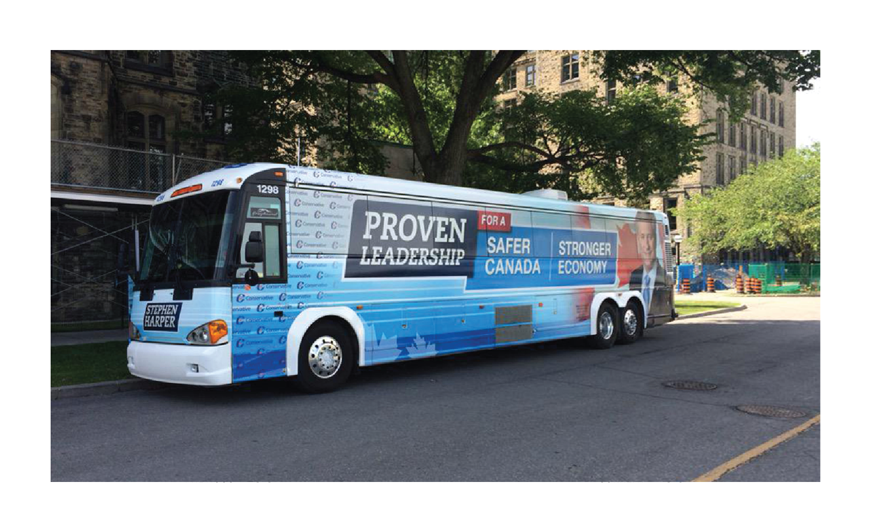
“Proven Leadership for a Safer Canada / Stronger Economy.” Is that an either/or proposition?
Andrew Scheer departs from the “Proven Leadership” motif, in no small part due to the fact that his leadership is anything but proven. The slab serifs are out, but the pairing of navy with a lighter blue is still very much in. Come to think of it, the Harper campaign’s overlapping parallelograms with a pop of red towards the top would not have been too foreign a fit to the new Conservative visual identity. Is this what they meant by “Fresh. Familiar.”? No matter, what is done is done, on to Scheer’s one slogan.
“It’s Time for You to Get Ahead,” to my ear, sounds less like a framework around which to build a campaign that seeks to form government, and more like a laboured exhortation in a stock-picks seminar at the ballroom of an airport Sheraton. Congregants at the Cathedral of Our Lord of Easy-Money-Fast, rejoice! It is time! More seriously, wrapped up within that slogan is an implication that you, reader, are not getting ahead. It is no immense logical leap to conclude that others unjustly are.
The use of a hand script in the new slogan is interesting. Fresh. Though it is also something they appear to have cribbed from the 2015 Liberal campaign. Familiar.
For the week running 7 to 13 October, the Conservative Party of Canada spent a total of $262,437 on 711 ads across three Facebook pages. That is a lot of advertising for our little country, but it is also $38,193 less and an incredible 2,778 ads fewer than the Liberals over the same week. Per Maclean’s, the Conservative strategists rely less heavily upon digital spend than do the Grits, but no one drops a quarter million dollars in a week on a trifling concern.
The simpler solicitations are on 16:9 cards. They carry a sentence or two of terse and direct text, most commonly (no matter the contents of the ad creative running beneath it):
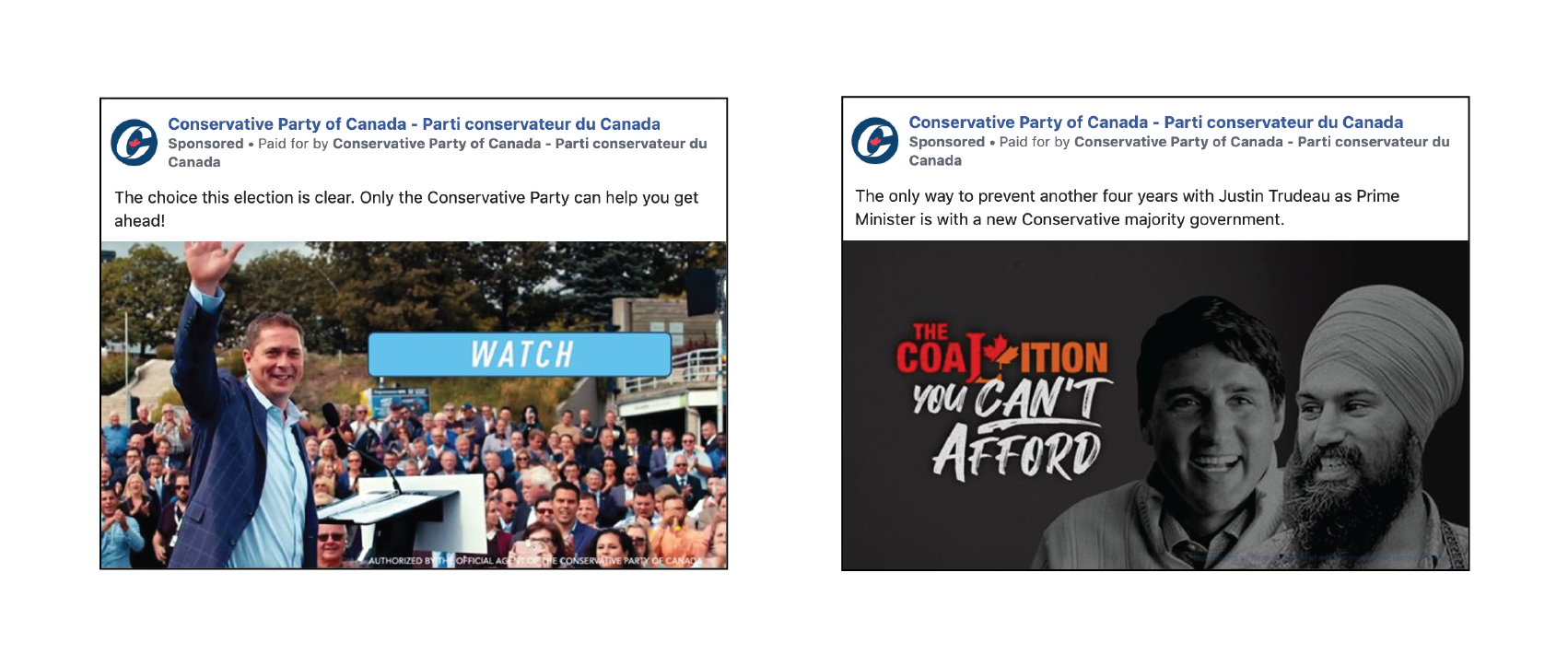
The choice this election is clear. Only the Conservative Party can help you get ahead!
In the archetypal ad that I have selected, a smiling Andrew Scheer waves to the cameras in front of an applauding crowd. The image itself is a little crowded, but I am not exactly keen to pick out the particulars of individual rally participants. The “getting ahead” alluded to in the caption is, presumably, an amorphous and unexplainable quality that, further, does not need explanation. A light blue call-to-action invites the viewer to click-through to AndrewScheer.ca… to watch a 30-second advert. This is confusing. Why not simply publish a video ad to begin with? The example to the right is a bit more interesting. These began cropping up after the NDP’s Singh, and later Trudeau, signalled an openness to forming a coalition government which would exclude the Conservatives. (What a strange writ period this has been.) On these spots, the caption reads:
Only a Conservative majority can stop this spending-crazed, tax-hiking, job-killing coalition.
Getting ahead can wait, for we have job killers to vanquish! A grimacing Trudeau and Singh glower at right on a darkened background – has one ever seen a spotlessly-lit attack ad? – while the left reads “The Coalition You Can’t Afford” in red, orange, and white. The orange-and-red composite graphic, split on the bias and combining the Liberal “L” with the NDP’s stylized maple leaf, while a clever idea, is non-distinct and appears at-a-glance to be nothing more than a Liberal logo. The textured brush script underneath is quite fun, very on trend. It actually made me a little excited for the bold, contemporary notion of a Liberal/NDP coalition!

As an incorrigible sucker for any of the thousands of inexpensive brush fonts blanketing the earth like locusts, I actually looked this one up to add to my collection. And great news, it’s free! The font is Hey August by Khurasan, and my leading theory as to how the Conservatives came to use it in an attack ad is, in all seriousness, visiting the Brush font category on DaFont and downloading the very first result.
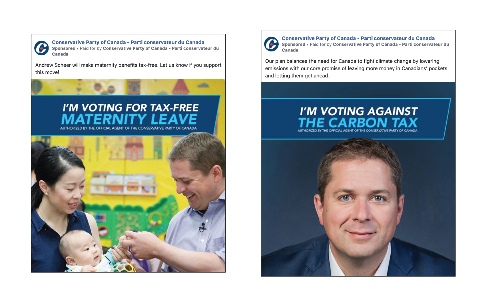
Other posts, often on larger 1:1 cards, inform the viewer of proposals within the Conservative platform. The example at left shows Scheer, mic’d up and handling a small child, in a daycare facility to tout his proposed nonrefundable tax credit for EI maternity benefits. A navy parallelogram-banner à la Conservate Party style guide floats over the scene, reading: “I’m voting for tax-free maternity leave.” There are endless variations upon this theme. One can vote for pipelines, lower taxes, “a more affordable Canada,” and so on. It is a well thought-out and executed campaign. It is participatory – gently nudging the viewer to share as an affirmation of their own vote intentions – and it is positive. Voting for something, what a novel concept! At right is an ad from the same campaign, and the only negative construction that I could find. Make no mistake, the Tories are against pollution pricing and think that you should announce that fact, as well.
There is something more delicate which I must discuss. Over the observation period, Andrew Scheer and the Conservative Party ran forty ads in a row promising to “secure the border.” These were absolutely not the only ads on this subject run by the Scheer campaign over the week. It is the only platform topic for which the Conservatives ran an ad campaign appearing so sustained and concentrated in the Facebook Library. It shook me enough, scrolling through this unending wall of advertisements, that I had to take a screen capture.
There is a lot for which the Facebook Ad Library is lacking. The targeting criteria are not made public, engagement statistics are withheld, and the interface does not support downloading or sorting data in bulk in any meaningful way. In short: I do not know enough about this campaign, because the research tools are inadequate. I will not accuse the CPC of fomenting nativist sentiment with disproportionately frequent border-mongering. But I am not exactly encouraged, either.
This video ad, published deep into the writ period (17 October), is the spot the CPC really needed to produce. A supercut of adoring rally-goers, Scheer puttering around in his campaign bus, and various handshakes, it puts some meat on the bones of the everyday affordability pitch encapsulated in their slogan. Common pain points – mortgages, post-secondary tuition, childcare, (and because this is a Conservative ad) petrochemicals – are explicitly name-checked. It is not negative, heavens no, Scheer professes to herald “hope for all.” It is an entirely different beast from the pre-writ ads, with their uneasy pacing, uninspiring backdrops, meek platitude-heavy, and detail-weak presentation. (If I were Andrew Scheer, and I made that ad, I could not muster the courage to look into the camera, either.) And the early writ period advertising…
…ouf, it is somewhat painful to even talk about. The bright colours – pink, purple, and teal – do not match anything described in the Conservative graphic standards. The acting, if it can be called such a thing, is positively wooden. Where early Scheer spots made evident a difficulty of looking into the camera, these actors cannot seem to look anywhere else. Or blink. While by no means the most upsetting thing, the child actors in the upper right quadrant are changed out twice over the course of the 30-second spot without explanation and for no clear reason. The visual presentation, ticking checkmarks down a bulleted list, outlines the Conservative platform in the driest format imaginable. A political commercial is not a PowerPoint presentation. The colours are aggressive and exciting, so why is the ad itself insipid?
The effort is most strongly reminiscent of a publicity video from 2017, quite early in Scheer’s tenure as leader:
This mild-mannered populist tirade, decrying the stranglehold of “cocktail circuits and celebrities” over Canadian politics on an awkward amble around suburbia, is a fine piece of anti-design. The outfit is unflattering, the setting uninspiring, and the ad copy largely meaningless. It bears the indicia of a low-rent regional council campaign on public-access television. Repeatedly interrupting one’s message to indelicately greet strangers on park benches, for example, betrays a complete lack of polish and discipline.
But the gawkiness does not really matter. These ad campaigns are not attempting to reach the hearts and minds of people who lounge around, be-cocktail-circuited, discussing the “indicia” of a marketing campaign. I am mocking a(n unflattering) shirt which scores of Canadians own and like. The CPC contracts brilliant media professionals, and those professionals have concluded that at times, a less-than-perfect message is effective in methods and to populations that a technical showpiece is not. What the Tories do much better than sell themselves is articulate messages about others:
A spot from May, long before the writ dropped, opens tight on Donald Trump’s face mid-bloviate. The chyron on the lower-third proclaims “Administration rocked by scandal,” while a news ticker cycles through investigations into scandals, misconduct, and questions of competence. With all the visual furniture of CNN attendant, the camera zooms out and pans over to reveal Trudeau standing next to the U.S. president. The scandals at issue are not Trump’s – they are Justin’s. It was a very smart pre-emptive strike. The Liberals (and anyone with a functioning synapse) recall that Donald Trump is beyond reviled in the court of Canadian public opinion. Every right-of-centre party in the democratic world must be vigilant against messaging tying them to the U.S. administration, lest they wind up with a Trumpian albatross around their neck. It was smart for the Tories to not only pro-actively dispel this, but aggressively retaliate.
Any explicitly Conservative branding makes itself scarce. The legal disclosure is in small, transparent text in the lower right corner, making the only real indication that this is a CPC communication nothing more than a wispy ghost. It could have just as easily come from another federal party, and it would be a smart advertisement from any party. When this clip was released, I immediately had to text my friends trapped in CPClandia. It was just that good.
The Conservative Party is most in its element when running attack spots. Negative political advertising is a devil that they and their affiliated marketing firms know well. An absolute shamelessness and will to sink as deep into the mud as necessary – how else would one explain choosing to run ISIS propaganda on national television – makes for creative content leaving the viewer on the edge of their seat. I do not know what they are going to do next.
Perhaps they will, within 24 hours of Justin Trudeau being voted into Liberal leadership, set a video of him removing his shirt to circus music. Who knows? I do not know. That is what makes it so exciting!
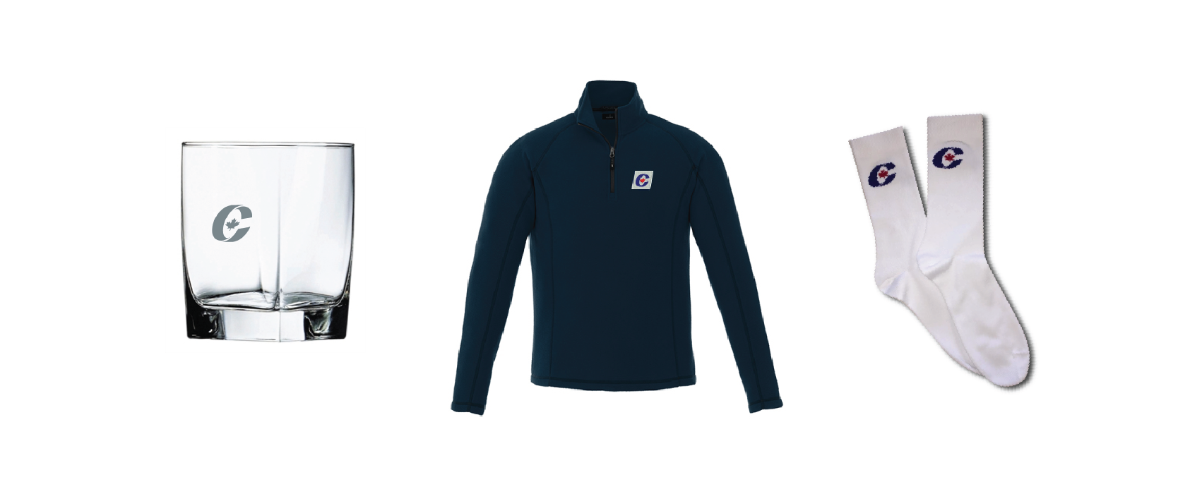
In less exciting news, the Tories would like to be your new sock supplier. That is my takeaway from their aggressively normcore store. Replete with the requisite golf shirts, cufflinks, and camouflage, the CPC brand can comfortably follow fans from the links, to the boardroom, to the, I wanna say… deer stand? Scheer’s Conservatives are not exactly reaching for the heights of personal style, but the razor’s edge is not their brand to begin with. A utilitarian fleece jacket, to give an example, looks comfortable, inoffensive, and practical above all. It is heartily encouraging to see a party tacitly acknowledge the environmental conditions that are part-and-parcel of holding an election that is in both Canada and late October. No one is divesting from their elaborate layers just to show off a branded t-shirt. The only product title bearing the imprimatur of the leader, “Andrew Scheer’s Dad Socks,” makes for an unsubtle jab at the Prime Minister’s breathlessly-reported penchant for gaudily-patterned footwear. Andrew Scheer is running to represent every schlub (I mean that as a term of endearment) who puts on their bulk-bought, all-white crew socks one foot at a time.
My personal favourite, and the one thing I would actually appreciate anyone shipping to me, is the Conservative rocks glass. Cheers to any party which recognizes that the only way I am surviving the writ period is by swimming in liquor.
NDP
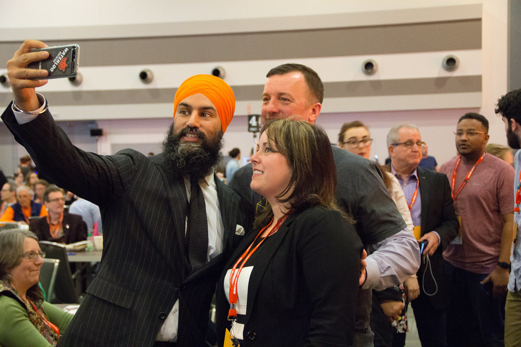
Photo: United Steelworkers
Leader: Jagmeet Singh (Burnaby South – British Columbia)
Slogan: “In it for you” / « On se bat pour vous »
Canada’s New Democratic Party entered the electoral period behind the eight-ball. They struggled to field candidates for all ridings and doubly struggled to raise money at the time they needed it most, when tasked to fend off competition for the progressive vote from a rising Green Party. The climate in Québec is quite different from 2011, and it will be tough for the Dippers to replicate their past successes in this province. The party leadership team struggled to gain their sea legs while staring down an imminent election, cash-strapped to the point where they quit advertising mid-summer and neglected to release a campaign slogan until a week before the writ dropped. All that time to develop a slogan which is, at its heart, a derivative work? “In it for you” is a clear riff on the 2017 Horgan campaign slogan of “Working for you” at the provincial level in BC, and it has gone over with the public like a leaden balloon. That slogan, per Léger, is the worst-polling of all the national parties, with even the respondents who indicate an NDP vote intention appearing to favour one from the Greens. No one went into this election expecting much from the New Democrats.
But the writ period, strange beast that it is, has delivered something remarkable… an #UpriSingh. The party has gone from losing Mulcair’s Outremont to surging in the polls. While that is good news for the party, there is some particularly good news for leadership: A Nanos survey found that Jagmeet Singh ranks second only to Trudeau in personal popularity. They are doing something right – he is doing something right.
The 2019 NDP platform, promising “A New Deal for People,” carries an unusually lengthy foreword. While the Liberals and Conservatives distill the executive summaries for their pitches down to a single (text-sparse!) page, the New Democrats have opted for a three-page letter to Canadians. The exposition identifies various problems making life harder in this country, from inadequacies in the healthcare system to housing affordability. It then, based on this set of facts, resolves:
If we want different results, we need to make different choices. And we need to do it now. Our country, and our world, has been pushed to the tipping point – with unprecedented income inequality, an out-of-control climate crisis, and a resurgence of vile intolerance and hatred.
The framing of the state-of-play is not only dire, but imbues a sort of existential character into the upcoming election. A tipping point, the platform asserts, has been reached. So why are we to trust the NDP to pull us from the precipice?
We are the party that has the courage to put people and the solutions families need first. It’s who we are. We are guided by our vision of a country that works for ordinary, hard-working people – not those at the very top. And we’ll start by doing what we, as social democrats, believe government exists to do: Work together to take care of each other so everyone benefits.
This statement lays out a value, a vision, and an action to guide social democracy. The contention is that courage, as a value, is AWOL in the other parties. Their idealized Canada, their vision should they form government, is “a country that works for [the] ordinary,” leaving the reader to assume that one’s other choices serve to benefit some shrouded ‘élite.’ And what they will do differently, their action? “Work together.” To what end, beyond the vague notion of things in this country “working,” and with whom? The introduction to the NDP campaign drapes itself over a framework of the intangible and prosaic. There is no substance to something as abstract and subjective as a principle of “courage.”
Just because the paper is more of a paper tiger does not mean that one cannot construct a brand around it. Many a successful campaign arose from billowy prose and appeals to the intangible. (What direction is “Forward,” what metric is quantified while “Getting Ahead”?) It is a quite strong platform6, and it leaves plenty of doors open as to the rhetorical direction of the campaign. This could be the opening salvo of a populist firebrand out to save the “ordinary people,” a “tipping point” climate campaign which speaks in existential terms, a social democratic barn-burner focussing on freedom from want, or, with all that talk of working together, even provide an out to form a coalition government. Like a Chrysalis Cardigan, it can be anything and go anywhere.
It is well and good to leave doors open, but one must step through a frame already for any hope of getting somewhere.
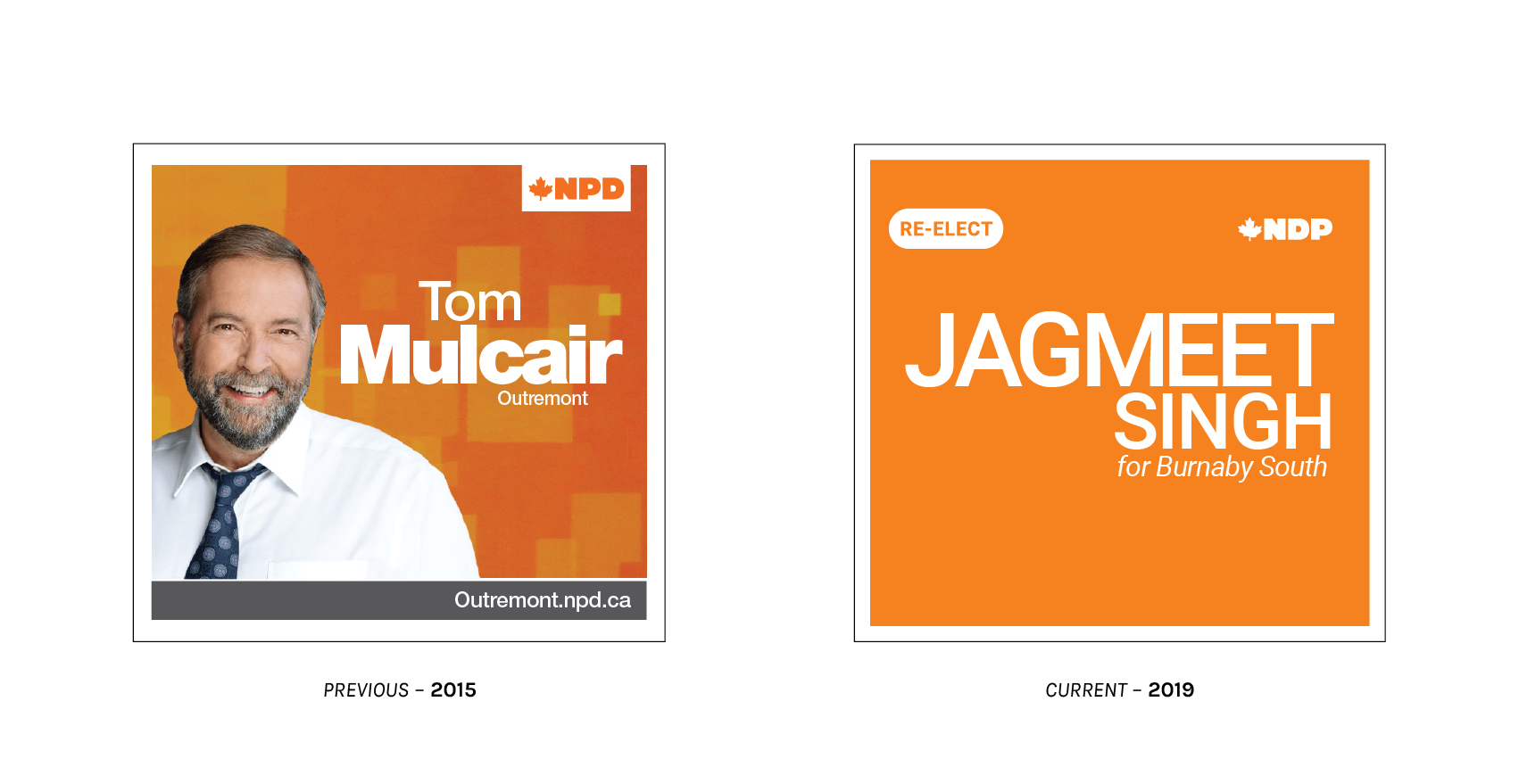
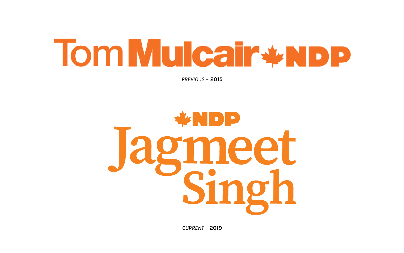
NDP signage has changed substantially between elections, and not just the face (or lack thereof, for the placard) at the head of the party. NDP Orange is now brighter, Linotype’s Neue Helvetica gives way to Google’s Roboto, and there is an addition of a specific call-to-action in that the viewer is explicitly asked to “re-elect” Jagmeet Singh. The background is radically simplified through flattening. Blessedly gone is the torrential downpour of translucent squares which appear to serve no informational or graphically functional purpose. The type treatment is markedly different, choosing to emphasize given name over surname. Despite this, maintaining a neo-grotesque face preserves some historical continuity with previous leadership under Mulcair (though not with Jack, who preferred a wide cut of the very-humanist FF Dax).
There is a distinct lack of a portrait on the new placards. This is in no small part because Tom Mulcair ran from a riding in Québec, where photography on electoral signage is ubiquitous. The explanation for this lies partly in campaign practice, and partly in historical convention. Here in Québec, there is much less of a tradition of mass distribution of lawn or window signs, and most placards sit on public property. There are consequently fewer of them, on more prominent thoroughfares, and parties feel comfortable (read: expected) to shell out for full-colour digital printing. Among political marketing professionals in Québec, it is far more bizarre for a campaign sign to lack a headshot. Jagmeet, you are forgiven, but a photo would be grand.
The new example is also, I cannot help but note, a much cheaper sign to produce. One-colour printing, with all licensed type swapped out for a free font, cuts down on production costs considerably. The result feels spartan. Space is not being utilized well, there is really no reason for Jagmeet’s sign to be as tall as it is, and placing the surname and riding in a pseudo-column to the left makes the overall layout appear lopsided. My largest bone to pick with Jagmeet is that his signage marks a departure from the standard forms of the party he leads.
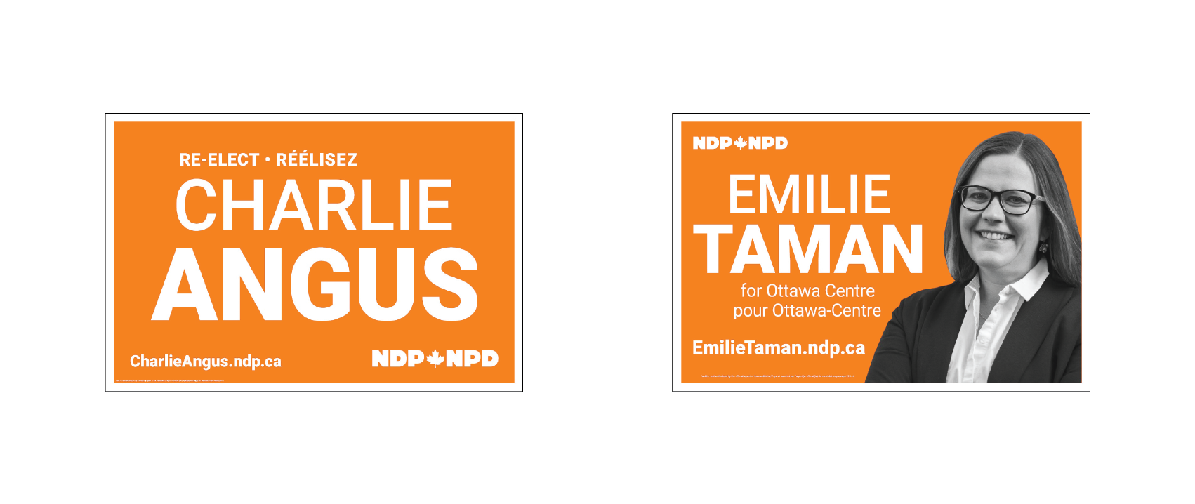
These examples are not about to take home any design prizes, but they feel more familiar as lawn signs. All-text variants are centre-aligned, none of this indented-column nonsense, and surnames are smartly emphasized with a type weight increase. It is well and good that Jagmeet wishes to deviate from this pattern and identify primarily by given name, but the lack of any weight differentiation between his given name and surname is awkward and amateurish in a party that clearly knows better.
In Québec, we flout the rules and do our own thing:
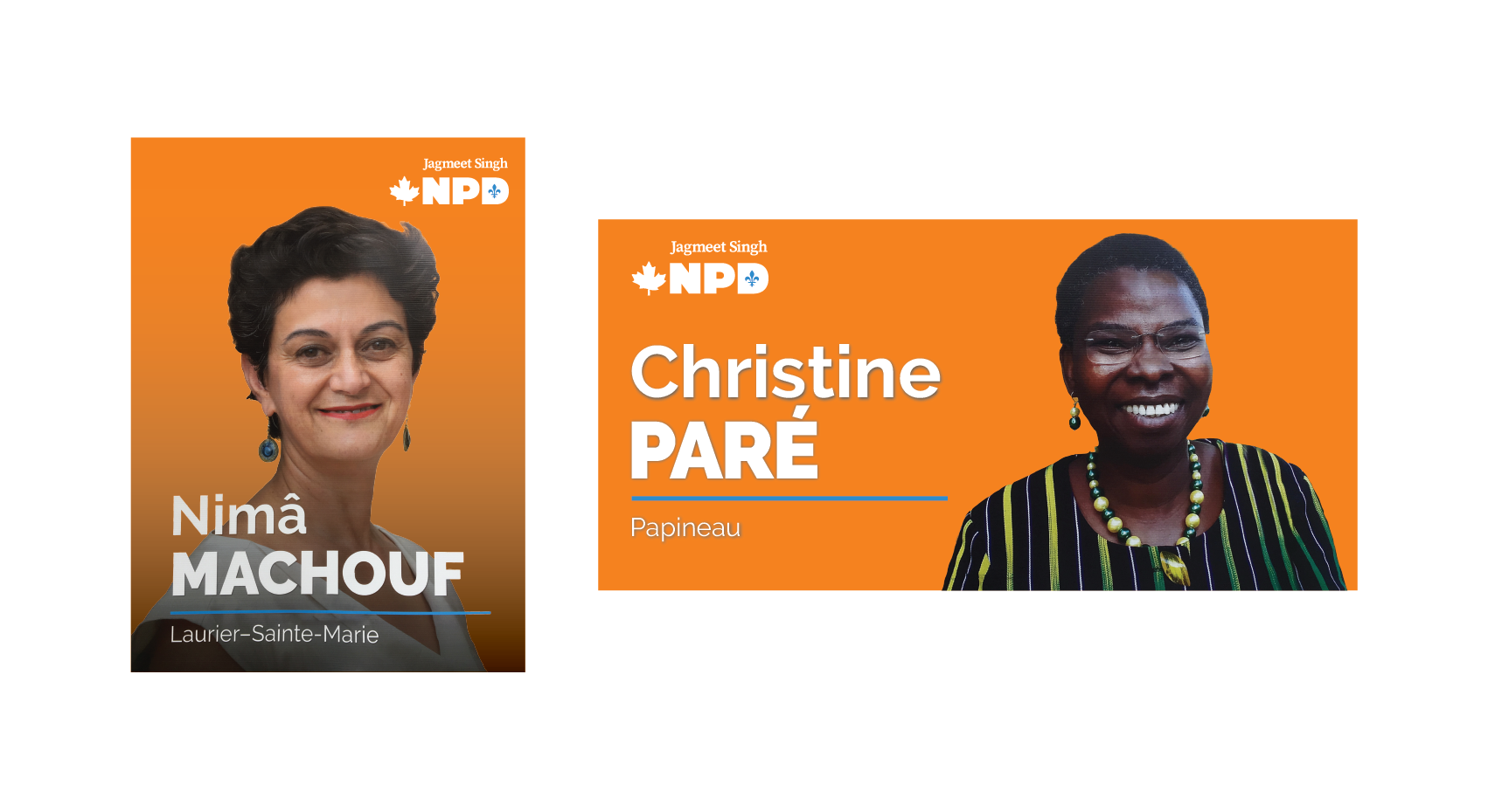
We have worked some blue into it. (Quebecers love blue.) The Québec NDP made the executive decision to ditch Roboto for the similarly free Raleway in a variety of weights. It is a Gotham-ish typeface, which places it firmly in line with recent political successes – particularly across the border. I prefer it to Roboto as a choice for NDP signage, as it seems a bit odd for the party which wants to tax Google to be using a font that is native to all of their products.
Oh, and headshots. Glorious, glorious headshots.
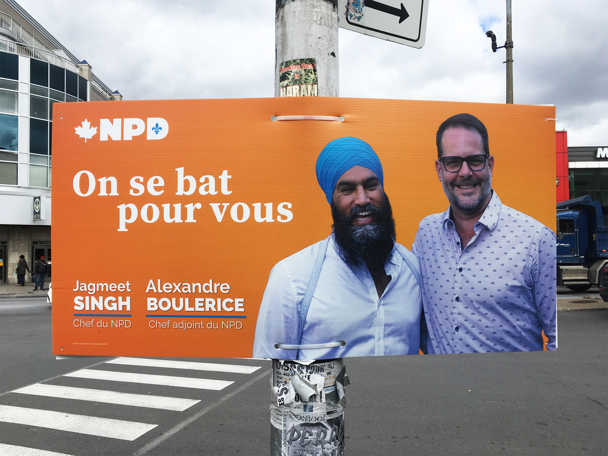
Even Jagmeet got in on the photo shoot, seen here grinning in a blue turban (again, Quebecers love blue), clearly thinking that putting headshots on placards is a fabulous idea and that he should have done it for all of his signs, alongside Québec NDP lieutenant Alexandre Boulerice.
I cannot help that our signs are better, Canada. That is just how it is and always has been.

The New Democrats do not have public-facing identity guidelines like the Liberals or Conservatives. There is a brief web page offering hex values, vector logos, and official photographs, but not much guidance beyond that. Also unlike the Tories and Grits, they do not have a symbolic representation for their party, only wordmarks. The wordmark, however, consists of little more than the initialism NDP and an undulating 11-point maple leaf, making it such a compact graphic that any further distillation into a single symbol may not offer tremendous returns on the investment of time and creative energy. The wordmark is short, but the list of style guide-approved variations is long: English initialisms, French initialisms, bilingual English-first initialisms, bilingual French-first initialisms, and a special variant of the French initialism replacing the counter of the D with a fleur-de-lis. The NDP is the only party to boast an only-in-Québec localization of their logo.7
The bilingual lockups look pretty good! “New Democratic Party” is a lot of information to get across in one official language, so the choice to identify by an initialism makes for remarkable economy. If scaling the two marks so that the text is of equal height, the NDP’s bilingual wordmark is near exactly four times shorter in length than the Conservative example.
The NDP wordmark is small in size, but the heavy-weight type treatment makes its presence nonetheless imposing. They are the only party in Canada which identifies itself within anything close to this bold of a choice (does all the bolding connote a similarly bold party?). In this way, with the competition ceding ground on the font weight front, the choice becomes as iconic and integral to the party as the colour orange itself.
I will be honest: I cannot identify the typeface used in the NDP wordmark. It may be custom, or it may be hand-lettered. The letterforms bear a passing resemblance to ultra-heavy weights of URW’s Antique Olive, and are also similar to the black weight of Typodermic’s Strenuous. I have chosen to represent it with Open Window’s fun-and-chunky display font Deco, which gets pretty close, but is most assuredly not the type they selected.
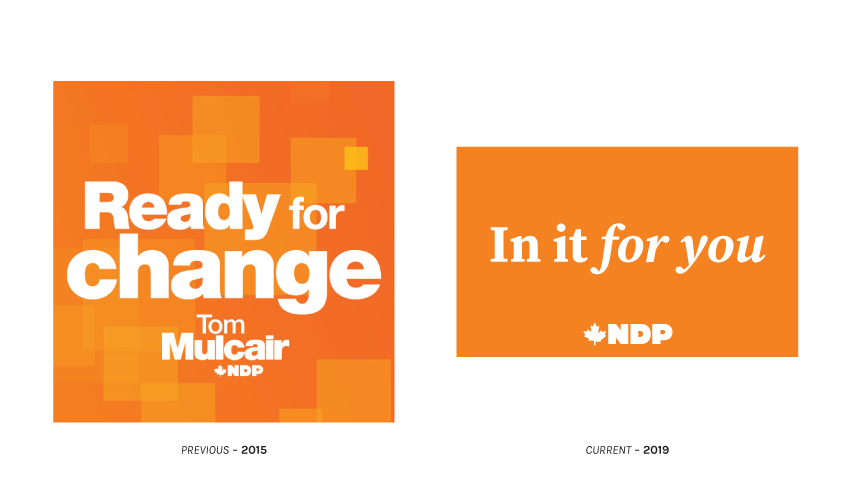
The campaign slogan signalling devices bear more similarity to leadership branding than they do the federal party style. In 2015, the NDP’s “Ready for Change” was set in various weights of Helvetica Neue splayed across a translucent-square-vomit backdrop, both of these visual cues being taken directly from Tom Mulcair’s own branding as leader. This year, “In it for you” is set in Adobe’s Source Serif Pro. The for you bit is italicized, rewarding emphasis – much like the Conservatives did – to the hypothetical “you.” The contextual situation of that “you,” however, is much different from the Conservatives. The NDP professes to act on your behalf, not merely goose the state to step aside in your bootstrapping quest for personal advancement. This is a slogan is a clarion proclaiming an active government, they are in it. There is an implicit recognition of the dichotomy first expressed in the foreword of the 2019 platform, that the NDP is the party representing your interests in government, whilst the other choices are besodden with élite cronyism and personal patronage. And they do it in a serif. How different! Source Serif also – not incidentally – also appears in Jagmeet Singh’s leadership logo:
There are a couple things to note about this effort. First, the choice of font. It is yet another example from the 2019 NDP using type released under an open-source licence. It is not a bad free font. In fact, it ranks quite high on my own list of favourites among the free serifs (behind Alegrya in the body paired with a strong geometric sans). A truly excellent example of Source Serif in use with Matt Willey’s showstopping Timmons NY (that one is on my list of absolute favourite all-caps display faces, for what it is worth) can be found in the brand identity work for this Galician club. But, as is probably evident from the gentle hints above, I really do prefer Source Serif &cie in body copy – particularly now that it is available in italic styles. Everything that makes it great for tremendous masses of text, richness and grace without feeling the need to expressively assert its own existence, makes it an iffy choice as a standalone font on, e.g. a hand-held placard or other visual device meant to grab and hold attention. It pairs excellently, and the NDP should have considered complementing it, with family member Source Sans. For a dissenting opinion, please see Carl Cossgrove in Typographica for an excellent review of this “utilitarian, but personable” type choice. Cossgrove, who works for Monotype and thus has more personal authority on this matter than the blogging laity, quite enjoys it at large point sizes.
Emphasis has shifted from surname under Mulcair to given name with Jagmeet. Where the previous leadership logo established a hierarchy of prominence with type weight, Singh opts for type size. The logo of the NDP itself, still in lockup with the name of the leader, is also much less prominent. This is not the worst move on the part of party leadership, as Singh’s own personal favourability among Canadians is markedly higher than that of his party. It is by no means an exhumation and re-animation of Jack, but the Dippers have found in Jagmeet a capable debater and uniquely charismatic individual who, through his place in the good graces of many Canadians, may restore the party to their 2011 heights. In the interim, however, until public confidence in the party grows, it may be preferable to keep the leader’s name most prominent in all branded communications.
It is unique in the field of visual messaging devices for the 2019 campaign, and that is worth something. It is the only prominent example of a serif face. It is the only slogan rendered in initial case rather than all-caps. For these reasons, it captures my attention, but fails to really hold it. Note that both this example of Source Serif and the Helvetica which preceded it are tremendously utilitarian choices. The NDP, purporting to represent the common Canadian, deliberately eschews flash in their delivery.
At least, that is one theory. The other being that this cash-strapped party massively cut their design budgets, as they reportedly did their ad spend, for the 2019 cycle. It could certainly explain the profusion of free fonts and confusing layout choices that make visual presentation feel like something of an afterthought.
Let’s talk a little more about that ad spend. While they shut the spigot entirely in July, a trickle of advertisements has resumed during the writ period. Compared to the big two, it is in actuality less of a trickle, and more of an atomized mist. Over the seven days preceding Thanksgiving, the NDP spent $47,398 on 62 individual Facebook ads. Unlike the Liberals and Conservatives, they have not purchased a single ad on Twitter during the writ period. While that may seem like an odd choice at-surface, being that Twitter users tend to be more likely to endorse progressive politics, the NDP may have found that they get sufficient engagements through their account (and Singh’s own account, which actually has a larger following) such that purchasing promotion is largely perfunctory. We tend to share and discuss marketing materials for free, us Twitter users.

The NDP’s Facebook ad buying strategy overwhelmingly relies upon video ads. There are not many static appeals that ran during the observation period. Further, most of them are negative messaging – attack ads aimed at the Liberal, Conservative, or Green parties. There are scant examples of promotional copy primarily devoted to NDP policy planks. And the attack ads they did pay to run on Facebook are 15 second cuts of examples akin to something made for broadcast and available on YouTube. The NDP, then, did not consider the formatting demands of Facebook, where shorter ad durations, large-text captions to convey messages even when the audiovisual content itself is muted, and bright colours plus some quick pacing work together to command/demand attention in an environment where viewers passively scroll, in a way that is worth in-depth examination.
Above are two examples of NDP negative messaging promoted on Facebook. At right, a message suggesting that the Liberal Party of Canada does not represent the interests of everyday Canadians and alleging a cronyistic culture of government:
Justin Trudeau just isn’t listening to you – and what matters in your life. He’s too busy working for his corporate friends.
No one would dare accuse Elizabeth May (peace be upon her) of governmental impropriety, and the Green platform aligns with the NDP in some key areas voters care about (climate action), so the content aimed at Green voters goes the route of claiming single-minded issue specificity and, following May’s statements about confidence and supply arrangements, letting perfect be the enemy of good:
The Green Party has some good ideas on the environment, but what else do they stand for? Health care? Not a priority. Affordability? Not on their radar. A person’s right to choose? Who knows. And Elizabeth May says she’d help the Conservatives get back into power. It makes you wonder, doesn’t it?
It does make me wonder, yes. Namely, it makes me wonder why they thought it would be a good idea to close out their copy by Just Asking Questions. JAQing off is a bad look. Close with a strong statement and do not leave the viewer to infer their own position. “It makes you wonder, eh?” is not the sort of statement I would expect from a party which lays claim to the value of courage in their platform. I do not envy the position of the NDP, who face a sustained and serious challenge for the progressive vote from the Greens, but I am not positive this is the style of rebuttal which will manage to firmly flip any wafflers.
Watch both of these spots below.
I recommend doing so with the sound off, to fully capture the experience of a passive scroller and understand why this audiovisual content may not meet the threshold of viewer engagement necessary to get one to pay it any heed.
There are also a few interestingly direct advertisements touching on the sensitive matter of strategic voting:
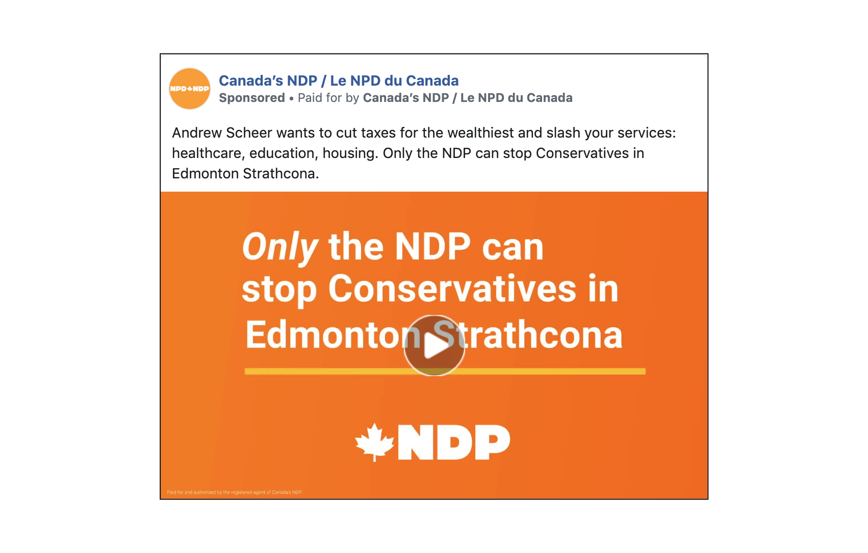
These ads target as best they can the specific ridings where an NDP candidate runs within striking distance of a Conservative. The challenge is that Facebook, while it offers a tremendous suite of targeting features, is really not an optimal tool for local engagement. The post above most assuredly went far beyond the bounds of Edmonton Strathcona and into areas where viewers, even if they would like to assist, are not really in a position to alter their vote intention. It is an interesting strategy to be so direct about the reality of strategic voting in this country and so specific as to which ridings will realize one’s party a benefit from the strategic vote, but it feels a mis-application of quite scarce campaign funds to be doing so through Facebook. It would be interesting to see the (withheld) engagement data for this ad. In the author’s humble and quite possibly archaic opinion, phone banking and shoe leather GOTV remain the best strategies for extremely granular and regional mobilization.
I would like to close out discussing the audiovisuals with what I found to be the very best work of the NDP during the 2019 campaign, a 30-second French-language ad specific to Québec published 3 September, just prior to commencement of the formal writ period. It’s good. As in, adapt-the-script-and-broadcast-country-wide good.
The spot opens « Je ne suis pas comme les autres. Comme vous, mon identité c’est ma fierté. » This is extremely tactful centring of identity for Singh, in a place that is indeed far unlike others in Canada and incredibly proud of itself and its unique patrimoine. Singh, whose very identity would preclude him from certain categories of government work in Québec, has a very tough pitch to square away. The NDP leader struggles to articulate a clear party stance and governmental response8 to a law which is odious, discriminatory – and quite popular. That he has a very personal nexus with it, as the only federal leader wearing a conspicuous religious symbol, is a complicating circumstance. Cynical and fatalistic comments from his own Québec députés have certainly not helped matters.
Singh opening his appeal to this place by framing his own life in a way which Quebecers readily understand, a matter of pride in one’s distinctiveness and a fight to survive and thrive through preservation of personal identity, is quite smart. Survive and thrive, he absolutely does – the balance of the ad features Singh gearing up to fight in the boxing ring, cycling past the refineries of Montréal-Est while demanding climate and economic justice, and having a grand old time with (locally known quantity) Alexandre Boulerice during downtown Montréal’s Pride Parade. The ending snippet « C’est simple: Vous connaissez le NPD. Maintenant, vous savez de quel bois je me chauffe. », in addition to containing a brilliant bit of colloquial French (“knowing the wood one heats with” is, roughly, “knowing what one is made of”), encapsulates the purpose of the ad. The camera stays with Jagmeet for the vast majority of the advert, he tells a compelling personal narrative, and introduces himself – as a popular and capable leader – to Quebecers, not a stock rehash of party principles. It is all about Jagmeet, and Jagmeet is a person with remarkable gifts, so that is not a bad thing.
The English complement to this advert is by no means bad, but a rather different animal. Not dissimilar to the Liberal intro video, this spot is a smiling, laughing, baby-holding exercise in conventionality. It folds in a couple platform planks towards the end, but makes most extensive use of the time allotted by framing the NDP as an oasis of respite from a government which they purport solely serves the purpose of élite enrichment “like [governments have] for decades.” That is to say, while the opening of the video claims that Jagmeet is “different,” the substance of the ad seeks to explain the party’s difference. It is a passable work, but not quite visionary.
GPC
Photo: Barrie Greens
Leader: Elizabeth May (Saanich—Gulf Islands – British Columbia)
Slogan: “Not left. Not right. Forward together.” / « Ni à droite ni à gauche. Vers l’avant ensemble. »
Slogan (French, revised): « L’urgence d’agir »
The Green Party of Canada entered this election with a quite simple task: Expand the mental definition of their party, for everyday Canadians with progressive inclinations, to that of one offering a programmatic, whole-of-government plan of action. This entails divestiture of any notions regarding a single-minded focus on environmental stewardship (no matter how deeply interrelated climate is to many other policy areas) and the singular personalism surrounding a particularly prominent MP (no matter how endearing and authentic she may be). And the wind was rushing into their sails. Recent history going into the writ period was defined by an electoral victory and spate of prominent defections to the Greens. Polling indicated that Green-accessible voters, particularly from the NDP, grew and grew. The party not only managed to nominate a full slate of candidates, but did it with a lightning speed surpassed only by the Tories. If not precisely easy being Green, the pre-writ period was certainly an exciting time to be so.
The performance in the writ period has been exciting, as well. They were the first party to manage a fully-costed platform, and whoa nelson, it is a bold one: Carbon neutrality by 2050, an autarky in hydrocarbon markets (?), and structural reformation of the Canadian economy. Elizabeth May’s opening salvo of the platform, which you may browse here, is… the work of a real oiseaux rare if there ever was one. A full page of her three-page foreword, as well as the closing epigram, wax poetically about Winston Churchill. This choice is something, I will easily admit, I have never seen come from a progressive party. Calling to mind a great hero of large-c Conservative thought from across the pond, however, does serve a purpose. Recounting the story of the Dunkirk evacuation is to frame a governmental response to the climate crisis as similarly requiring the marshalling of truly exceptional resources even when the soothsayers see failure as a foregone conclusion. She may be a bit of a Second World War buff, that Elizabeth May. Her value proposition is “unwavering” (uncharitable folk may say obstinate) leadership:
One of the most important things you can do is vote for the kind of unwavering leadership that the climate emergency requires.
It helpfully offers, slap-dashed off in the letter’s closing, that it “is not a one issue platform,” but also seeks justice for Indigenous Peoples, reforms in education and the real property markets, a pharmacare system, and a tonic for inter-provincial discord picking at the seams of the federation. That is an awful lot to cram into a single graf, don’t you think? What May and the Greens hope to arouse in voters from sea-to-sea is
…a call to be inspired, to answer the call of the species without voices, of children without votes. With your help, we can be the heroes in our own story.
A tad cloying for my personal taste, to be sketched in as the beau idéal of my own graphic novel, but it does offer some guidance as to what one would hope to find in subsequent Green Party messaging: Rousing inspiration, due consideration to those excluded from our electoral politics, and a general “unwavering” quality.
Do the goods fit the waybill?
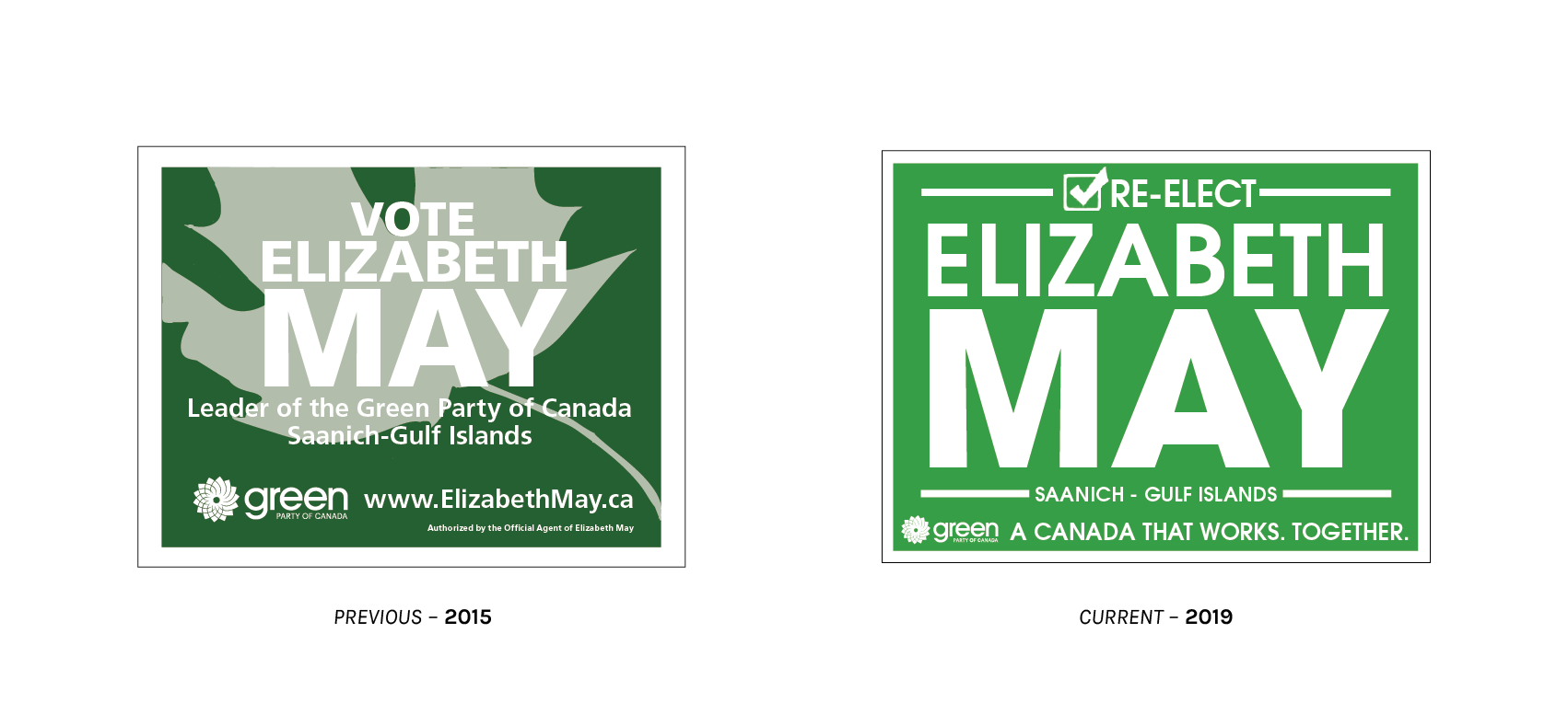
I have scoured the light and darkened corners of this earth (read: got intel from Vancouver Island) to bring you Elizabeth May’s in-riding lawn signs. Note that the 2015 examples are, through reprint or recycling, still in the wild for 2019 and see concurrent use with the new, standardized format common to (many) Green candidates. Also note that large-size placards intended for display on public autoroutes still carry the party’s 2015 slogan “A Canada that works. Together.” In fact, so does her own interpretation of the Green Party’s 2019 standard sign. The other candidates omit this from the bottoms of their signs. Also present are placards identifying the riding name on a yellow field and bearing the slogan “Forward Together” underscored by a yellow swash. “Forward Together” is part – but not all – of the party’s 2019 slogan. Deviating from a centralized standard is, as will be made evident, hardly a trait endemic to party leadership.
Yes, there are candidates out there producing coroplasts with what I will politely call exuberant deviation from any and all visual norms. The “coroplast” bit has also proven liable to stick in a few craws. This being the Greens and all, some candidates are averse to the idea of marketing themselves with a flood of single-use plastic. I admit, it is a bit strange to see urgent calls for a change in consumer behaviour proclaimed on corrugated plastic affixed to each individual lamppost on the avenue du Parc.
'This is hooliganism': Regina election signs fall victim to apparent mischief https://t.co/bhamCSIDwC pic.twitter.com/RkIlNMeOlv
— TheStarPhoenix.com (@TheStarPhoenix) October 8, 2019
Some solve this problem with plywood.
Ontario Green Party candidate takes innovative approach to lawn signs https://t.co/VShSdWo6Bx pic.twitter.com/UQpHczqEIF
— CBC London (@CBCLondon) September 21, 2019
Others, with branded yard waste bags.
L’art de sortir du lot: Stéphanie Dufresne entreprend une nouvelle campagne avec une seule pancarte https://t.co/zktCZ9GO94 pic.twitter.com/K3ar2cT6OL
— Le Soleil (@cyblesoleil) September 13, 2019
Still others order precisely one lawn sign and take it on a road show around the riding. (Note that Mme. Dufresne’s sign features the yellow-fielded riding name, but lacks the “Forward Together” – or, that would be “Avançons ensemble” – branding.)
The part of me stressing fealty to standards manuals shudders. The part of me which can appreciate the creativity and significant dose of self-help these candidates have undertaken to market an environmentalist party with environmentally-conscious media cheers. The party has little to lose from experimentation, and many Green adherents likely take exception to even the term “corporate design,” so I am more keen to reward boldness than castigate the disparate jumble. I just really, truly wish that it had been codified in a national style guide.
If the state-of-play is not messy enough, good news! The Québec Greens have a style of their very own:
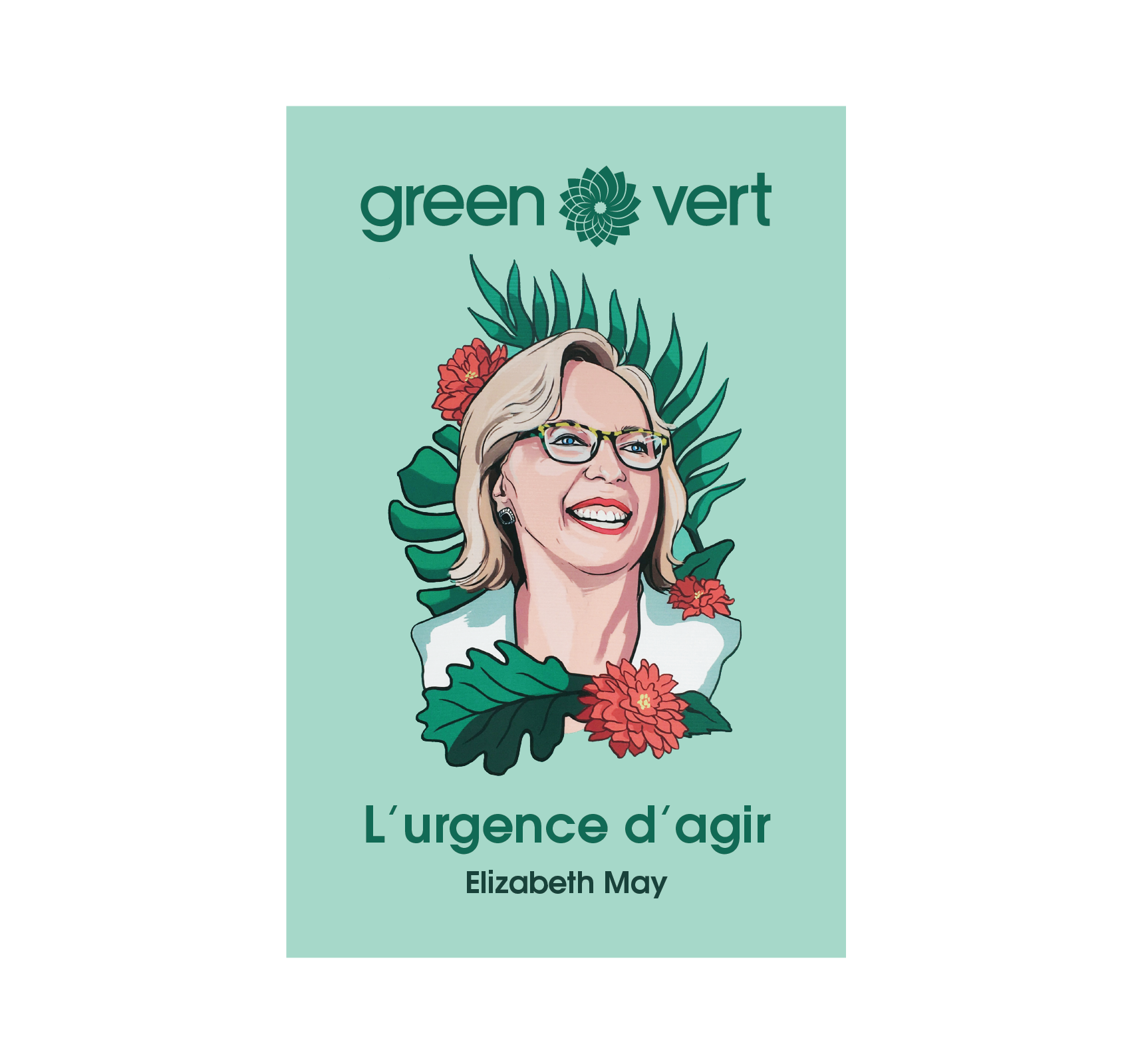
I really enjoy the leadership placard. First, as most other parties have decided to make their leadership scarce on signs in Québec. Second, because it is a simply lovely illustration. When this is all done and dusted, who knows, I may liberate one from the avenue du Parc. There is a clear antecedent for the choice of an illustrated portrait to be found in the most recent poster campaign of Québec Solidaire. With the QS scoring heartily on election night, it may become an established trend for Québec parties of the left to eschew the headshot and adopt this alternative approach to visual marketing.
Replacing the erstwhile campaign slogan « Ni à droite ni à gauche. Vers l’avant ensemble. » with « L’urgence d’agir » (trans: “The Urgency to Act”) may be the brightest move of the whole endeavour. The previous slogan, in addition to being needlessly complex, describing both party positioning and making a call-to-action, was not particularly strong. “Forward together” is an awfully weak call-to-arms considering the intense phraseology employed in the platform, while the “neither left, nor right” descriptor feels far more like an attempt to situate the party in the centrist tradition. If one takes the time to read Elizabeth May’s response letter to an article in Maclean’s, the intended meaning becomes clear. But many-to-most voters are not going to do that, and Québec voters in particular – who pay the most attention to what happens in Maclean’s on the occasions when it smears them – are not about to do that. The Green-curious voter will attempt to parse the slogan and arrive at a misperception. Succinctly making the pitch that this is a moment of exceptional emergency – and that only the Greens have a plan-of-action meeting the bar of sufficiency – is direct, memorable, and worthy of further consideration in the mind of the voter.
One quick note before jumping to the logo: The Québec (Federal) Greens have their own campaign website which is quite smartly illustrated in the same style as the placard seen above. Good stuff!
Immediately apparent when inspecting the construction of the Green Party wordmark is the use of Herb Lubalin’s Avant Garde, which makes the Greens the only federal party to be drawing typographical inspiration from the 1970s, as well as the only one to do so entirely in the lower case. So as not to deprive the type selection of its context: Lubalin’s storied history of progressive activism through graphics, in the days that such an action had potentially severe professional ramifications, cannot go without mention. The choice of Avant Garde does leave me scratching my head a little. It is rather coldly geometric, and does not carry the warmth, personality, and vitality I would expect of a party with a brand meant to evoke the splendour of the living environment itself.
Avant Garde, particularly contemporary use of (ITC) Avant Garde (Gothic Pro), is a unique taste which inspires strong reactions. When it is right, it can be quite pleasant. When it is wrong, it is a ‘70s omnishambles… and it is not so easy to get right. Thus, I must strenuously caution the Green Party, which lacks a real visual discipline and has demonstrated a propensity to put out heterogeneous, ad hoc graphic solutions, against heavy use of Avant Garde. For example, the “standard” lawn signs in British Columbia appear to be using various weights and casing styles of Avant Garde both exclusively and not terribly well. This is a face best left to the wordmark, even if I think the wordmark itself is not the smartest choice, while employing something more versatile elsewhere.
The symbol, is it a cornea, a carbide bit, a black hole, a buzz saw? Not quite. According to an HTML attribute buried in an old version of the Green Party website, the stylized sunflower whorl bearing more than a slight resemblance to the brand identity of British Petroleum (not to worry, the Greens had it first) forms another key point of differentiation between the GPC and the rest of the pack. Unlike every other national party, wearing their patriotism on their sleeves, the Greens choose not to incorporate a stylized maple leaf into their icon. The only thing identifying the party as Canadian is an (optional) “Of Canada” strapline added underneath the primary wordmark at a small point size. Speaking of small bits: The intricate lines cutting through the sunburst make reproductions at small sizes difficult without a noticeable decline in quality. It would behoove the Greens to consider adopting a low-complexity variant for use in tiny applications and low-fidelity printing processes.
The type, the symbol, that is all secondary. Central to the Green Party of Canada’s identity is… most definitely the green! The party has a miniature, web-only styleguide which remarks:
Our green is very important to our brand and should be used in virtually every case. It is used on the logo and in many other places as well. When used as a background the foreground should be in pure white.
I agree! More so than the other parties, colour treatment matters a great deal when that colour is an eponym. As such, I am quite disappointed that the GPC has standardized only their RGB and spot colours, leaving the four-colour process to be a bit of a hazy mystery. The placards detailed above provide ample evidence that, though the Greens understand the standardization imperative, coherent colour treatment has yet to blossom forth.
Alarmingly, one look at photography from Green Party rallies reveals that even in the same geographic area, even on marketing materials for the same candidate, there are deviations from the standard shade of green.
Perhaps nitpicking on individual candidates and riding associations is the wrong way to go about this. Let us consider some communications from the central office.
One thing is for certain: The Greens are not on the up-and-up as a direct result of their digital ad spend. In the seven-day period immediately preceding Thanksgiving, the party spent a paltry $15,621 on just 16 individual Facebook ads. There was no promotional activity recorded on Twitter. The demographic profiles of the audience for each individual posting are worth viewing. Audiences targeted are almost exclusively in British Columbia, though a few also show traffic from PEI and Ontario. French-language advertisements are 100 per cent exclusive to the province of Québec. (As we all know: Only Quebecers speak French, and all Quebecers speak French.) Beyond tight regional specificity, the ads are also very clearly stratified by target age. Inspect the data for appeals made to the two principal target cohorts: the 18-24 set and women over the age of 25.
In the figure above, I have included two promoted posts tailored to Gen Z and younger Millennials: one attack ad (at left), and one infographic card promoting the Green platform (right). There is no way to dress up the fact that the attack ad is a meme. The Green Party paid to disseminate a meme. An uninspiring sans serif, misaligned in a white text box at the top of the ad creative, captions a photo of a pipeline under construction as the “Conservative climate plan.” Beneath that, a caption reading “Liberal climate plan:” is perched atop the same photo with a transparent green overlay. It is a clever invocation of “greenwashing” and unsubtle allusion to the federal government purchasing an oil pipeline. The associated caption reads:
We’ve got the best plan, obviously. Your vote could make history. 💅
The nail polish emoji, per people keyed into such matters, is generally used to indicate an “air of nonchalance or indifference.” Indifferently saying that one’s vote could be important does not seem like the precise message the GPC was going for here. Might I humbly suggest instead placing a sassy Information Desk Person after the first line of copy, like so: “We’ve got the best plan, obviously. 💁”
I am much happier with the second posting, promoting the Green platform. My most immediate good feelings stem from the mere fact that it is not an image macro, and that some care went into the presentation. Two- to three-word distillations of Green policy planks are arranged like blocks – taking on the form of a descending staircase, for heaven only knows what reason. The text above the yellow brick staircase reads “The Green Platform is 🔥.” This is a proper use of the fire emoji, and that’s so lit.9
One cannot help but wonder why the one application of the colour green in these Green Party advertisements carried with it a negative connotation. I have, however, concluded that I do not want to think about these things any longer. My most sincere apologies that you had to see them.
The video spots uploaded to YouTube are, blessedly, a vast improvement over the Facebook ads. To be frank, if they were not, I would take an early retirement in the middle of research for this article.
This early-writ advert (published 23 September) titled “We’re not a one-issue party” quite neatly addresses the GPC campaign messaging imperative that I stressed in the introduction. Greens, your marketers appear to have found a direct uplink into my mind. In what may prove to be a controversial move, neither climate, nor the environment are invoked by name at all in this spot. Opening on leader Elizabeth May alone against a white backdrop, an ever-increasing cast of figures are brought on screen to highlight progressive platform planks relating to housing affordability, ethics and transparency in government, and electoral reform. “We stand,” the Greens venture, “for the same things that most Canadians stand for.” And then comes the big reveal. May brings up the opt-repeated claim that the GPC is more of her own personal project in electoral politics, at which time the camera pans outwards to reveal that all the actors seen previously, as well as throngs of new arrivals on screen, are candidates slated for the Green Party in the upcoming election. It is by no means a high budget affair. The acting could be far better, but one must bear in mind that these fine citizens are most emphatically not actors. The set design could, well, exist… but I am not sure that it has to. This ad addresses a real concern that real Canadians have. Seen less as a piece of art and more as a practical implement, it fulfils its purpose and does so cleanly.
Just for my own personal kicks, I will also share the Green equivalent of a televised attack ad. The 47-second spot entitled “Be the Change” dates to quite late in the electoral period, 17 October. The video opens on a background of rich black and haunting ambient noise, “You know that the world is out of balance,” pops on-screen for all of a second, before we cut to an actor sipping a hot beverage and staring forlornly out the window of a barren domicile. “You know that time is running out,” as a man icily, unblinkingly stares directly down the lens barrel. “You know that the system isn’t working,” laments another figure as he gazes off-screen with pursed lips. “Something needs to change.” By gum, you’re right, Green Party video! The music takes an upbeat turn. A waving flag of planet earth fades in, against a brilliant blue sky and above the crowds at the Montréal climate march. “Be the change,” punctuated as a command, with a full stop, fades in shortly thereafter. The final takeaway it offers as the seconds dwindle down? “Your planet, your conscience, your vote, vote Green.”
This is some wild stuff. There is not a word of voiceover, only chilling and ethereal background notes. It is an attack ad not on a specific party or leader, but on the system itself. It is an attack ad, a practically silent attack ad, nonetheless. It speaks directly, through active-voice “you” statements, to anxieties which the viewer holds. The ad is not overtly aggressive, it positions itself and the problems it addresses as of a gravity that puts them above simple aggression. It does not show Green Party leadership, it barely shows the Green Party logo, and it avoids all visual reminders of electoral politics entirely. It is weird. It breaks all the rules of political advertising – and I, for one, am fascinated.
BQ
Photo: Bloc Québécois
Leader: Yves-François Blanchet (Belœil—Chambly – Québec)
Slogan: « Le Québec, c’est nous. »
There is but one party left in this visual tour around Canadian politics, and it is a party for which most readers will not even be given the option to vote. It is astounding to consider, then, that this party inaccessible to the majority of Canadians, including near-everyone who primarily identifies as Candian, will in all likelihood net somewhere north – quite possibly far north – of 30 seats in the House of Commons. It will, with scant more than seven per cent of the popular vote, have single-handedly scuppered any Conservative shot at a majority government. It is a “progressive” party that vociferously defends state-sponsored discrimination. It is a sovereigntist party that participates in the Parliament of a state whose dominion they seek to exit. Stranger still, it was stripped of official party status less than a decade ago. Oh, and it suddenly lost seventy per cent of its sitting MPs as recently as 2018. This is the inscrutable boîte bleue that is Québec politics – this is an altogether uncertain mess – and this is the Bloc Québécois.
Last year’s obituaries for the independence movement, on the occasion of a Québec election in which every party – including our programmatically sovereigntist party – decided sovereignty was not a platform issue this go-round, may have been just a touch premature. But even here, there is a wrinkle. The Bloc Québécois, a federal party endorsing the position of Québec sovereignty, has campaigned tirelessly and near-singularly on serving as an Ottawa-based proxy and advocate for Premier François Legault’s agenda. My dear reader, François Legault is a federalist.
If that appears to make no sense, that is because it doesn’t. The National Question is the superficially intuitive, but incorrect, frame of mind through which to understand the Bloc. The BQ, with its genesis in the failure of Charlottetown, exists to represent (what they view as unitary) interests of the Québécois nation when no other party will step to the fore. If no party in a federal election offers the Quebecers a compelling village-relais, the Bloc Québécois is the combination Esso and St-Hubert built right into the autoroute: A safe harbour for the Québec national interest which is always open. This is how the very first federal election they contested net them the title of Official Opposition.
For the electoral prospects of the Bloc, it is a gift from on high that wildly discriminatory legislation, laundry lists of untenable policy from a purportedly non-federally-partisan Premier, and stupefying mismanagement of the immigration system are quite popular in Québec, yet go over like lead balloons stuffed with bowling balls in the ROC. That which would be fatal for a leader who must elect deputies outside of Québec to offer support is, for the regional interest party well-positioned and willing to advocate, a point de rassemblement drawing all comers near and far. The indelicate misrepresentations, smears, and gratuitous swipes at unrelated issues about and surrounding Québec that these scuffles may at times inspire from outside of our home only serve in the furtherance of that peculiar magnetism.
Painting the BQ as an emergency release value for national pique is not entirely fair, as it denies them agency as political actors. In truth, the party functions as a richly complex and empathetic sounding board, and counts among their ranks many skilful political professionals. It is certainly not to their detriment that leader Yves-François Blanchet is an unusually fantastic debater, in both official languages, in an election which has not exactly explored the heights of sober political discussion. It is my hope that, if we dig into the campaign materials a bit, we (all of us, my riding is Ville-Marie and I am learning, too) can come to a better understanding as to how the party, with its unique-in-Canada pitch that only a sliver of the country interacts with, functionally persuades voters towards such an electoral proposition.

The large-size, flagship, in-riding signage for Y-F Blanchet features the candidate standing alone en région in a sharp suit (no tie), sporting a close-lipped smile and staring down the camera as if he has a fantastic secret. A rotated and clipped square displays the Bloc tagline « Le Québec, c’est nous. » (“Québec, it’s us.”) in a heavy weight. The type on this sign is relatively fresh! The fonts in use are in The Northern Block’s Nuber Next superfamily (Heavy for tagline, Heavy Compressed for candidate particulars), a December 2018 release. At this size, legibility is excellent, even at the relatively tighter type tracking specified by the Bloc – no surprise for a geometric sans heavily influenced by Univers and the related neo-grotesques.

While differing in both size and layout, uniformity of appearance carries on down the roster. Placards for other candidates maintain the same type treatment as the leadership sign, and all still carry an off-kilter square of blue in the upper right. As the placards are a good deal smaller than the marquee example seen above, the blue patch drops the slogan in favour of the Bloc Québécois logo. With minuscule point sizes in play, it is difficult to read any information on these signs apart from the candidate’s surname and the Bloc logotype. Blanchet is back, and he stops with each prospective MP to take a selfie-style photo (in OQLF-approved French, we call this an égoportrait, which makes it seem much cooler). The leader’s eyes open wider, and his tight-lipped smile occasionally breaks out into a full-on grin. Clearly, he is at his happiest when he is with his team.
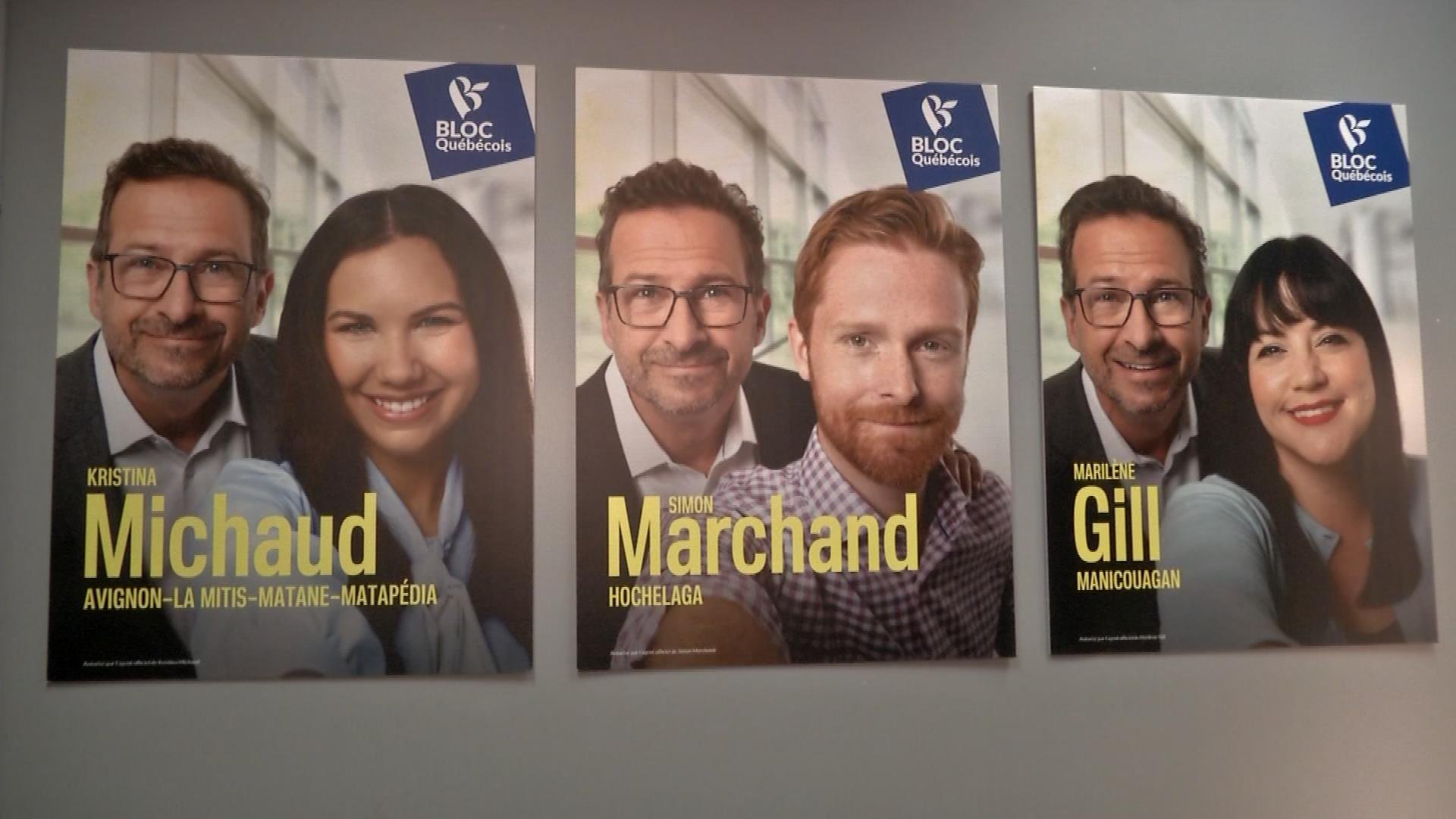
This marketing strategy makes Yves-François appear genuinely personable, like a team player, and with a style that is both professional (hence the suit) and just the slightest bit décontracté (hence the missing tie). The timing could not be more optimal, as the political selfie has never been a hotter ticket.
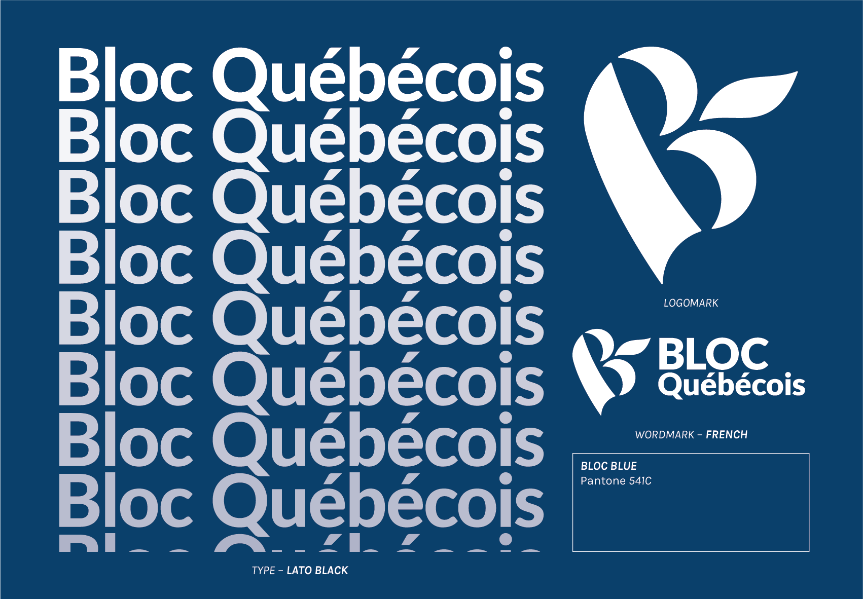
The Bloc has developed both a symbolic representation and a wordmark. The symbol, a heavily stylized B (signifying Bloc!), skewed to the left, reminds me in its form a bit of Alfred Hitchcock’s self-portraits. It is modestly creative, in that a swash springing forth between the lobes of the letter forms a fleur-de-lis. To the surprise of no one, there is a dearth of maple leaves. The typeface joining the symbol to form the wordmark is Łukasz Dziedzic’s Lato Black, not particularly remarkable but for the fact that the Liberals are using the same font. The symbol, with dramatic variations in stroke width, is tremendously expressive. The treatment of Lato, on the other hand, is not expressing much beyond a shrug. It is unclear to me why the word BLOC – both at a larger point size and senselessly in all-caps – is given prominence over Québécois in a party that exists solely to advance Québec interests.
I can only find one definition for the blue, and it is a spot colour, Pantone 541 C. Does that seem familiar? In their 2019 rebrand, the Conservatives switched to the same exact colour. This is such a positioning failure – for the CPC, the Bloc had it first – that I do not even know how to describe the error. The Pantone Matching System contains 1,867 spot colours, and you two had to settle on the same one? No wonder the Conservatives are struggling in Québec, for their posters are the same colour as a competing party!
Normally, this is the time when I would assess how the party tackled the challenge of a bilingual wordmark. The Bloc Québécois does not have a bilingual anything. The party is not known for communicating in English…
…that is, aside from this billboard in Ottawa.
I want to double back to the slogan for a minute. To understand the Bloc’s message, we really must unpack that slogan: “Québec, it’s us.” At the most superficial level: While the Conservatives and New Democrats speak directly to an idealized “you,” Bloquistes shift to the first-person plural in the objective case. But truly understanding this signalling device demands more than a simple translation. The “we” in Québec French is a thorny thicket of contested meaning. I have no doubt that Blanchet’s “us” includes the lovely people he took selfies with. I do, however, wonder about my own place. I am a Quebecer, I have no other home and desire no other home, my carte soleil is the same colour as anyone’s, and I dream in a non-official language. Am I, in the rhetoric of Blanchet, considered as the québécois that I assert myself to be?

Who is “we”? What is a Quebecer? Assorted political buttons (c. 1980)
The most prominent example of the Québécois « nous » also happens to be the most infamous. Jacques Parizeau’s career-ending concession speech following the defeat of the 1995 Québec referendum singularly defined both the event and the sum total of Parizeau’s legacy as bemoaning “money and the ethnic vote” as a force diametrically opposed to “us,” the Québec nation. The “us” in this address from a sitting Premier thus necessarily excluded anyone of another tongue – not only Anglos – or considered “ethnic” from their belonging in this place. It was an event which laid bare a fear many held about the sovereigntist project, that the civic nationalism of Québec – that we are all québécois, all entitled to live and thrive with full citizenship rights in a francophone state – was but a smokescreen for an ethnonationalist project seeking to exclusify the definition of Quebecer. One must bear in mind, this speech was shocking and appalling to a large contingent of sovereigntists, believers in the emancipatory power of the civic état, as well.
The Québec Nous is complicated. In the absence of any definite contours, it is far too easy to infer the worst. Wherever there is a nous, there must exist autres. Here, the Bloc instrumentalizes an undefined – yet purportedly monolithic, unitary, and one-dimensional – Québec identity for their political purposes. To arrive at a working definition as to what, per the BQ, constitutes “us,” some of their other campaign placards prove instructive.
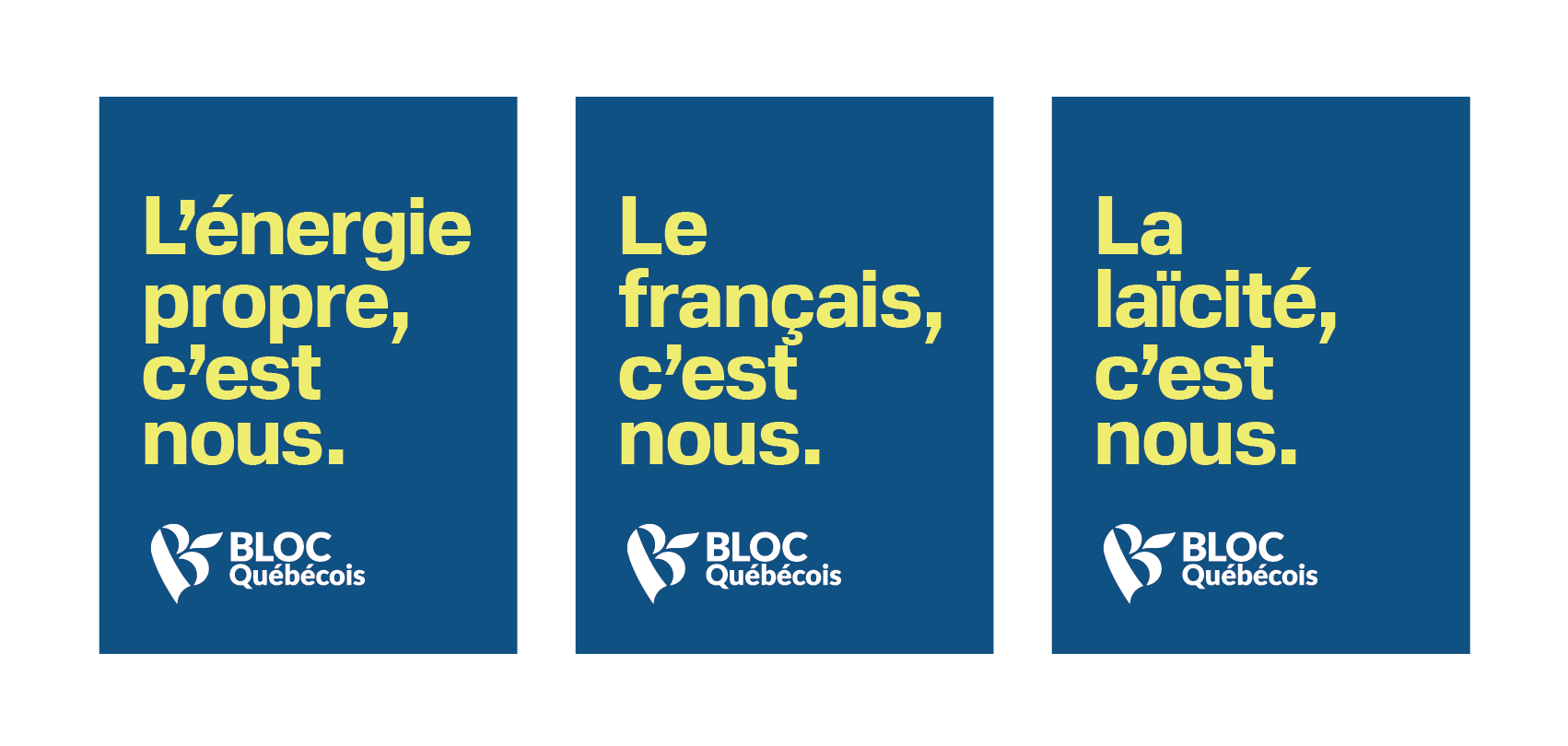
This is a type of political signage Québec has not really encountered before. In addition to coroplast panels promoting candidates, there are bite-size distillations of the platform planks the BQ identifies as most important. The campaign follows a “[noun], c’est nous” construction, just like the slogan. Clean energy development is identified as integral to the Quebecer identity. So too is the French language. And lastly… laicism. Yes, state discrimination against religious minorities really is important to the degree that they would include it in their top-three “ballot question” defining themes. It is necessarily exclusive, but it is popular and working. This clever branding device continues through to the BQ’s web presence. Regions? You’re “us,” as well. Montrealers, you folks just check back later.
I assumed that as this campaign resonated so strongly with Quebecers, one or more parties would adapt their own message to a similar approach in the next election cycle. How foolish I was.

All of three days out from the federal election, the NDP began hanging these « Les progressistes, c’est nous » placards, copied right down to the font family, around the Mile End.
It is a memorable slogan, it is a slogan controversial enough to get no-charge media airtime, and it implants in the viewer, through its invocation of identity, a short list of very simple yet powerful ideas. The branding is consistent throughout signs, websites, party platforms, and social media channels. For a 40-day campaign, it is shockingly professional. For a party that was in absolute shambles, I would have thought it impossible had I not personally seen it happen. The message discipline, message quality, and visual sensibilities of the Bloc are a force to be reckoned with.
The Bloquistes became that political force off of a skeleton crew and a shoestring budget. Their Facebook ad spend over the measurement period (7-13 Oct.) was the lowest of everyone featured today, at $5,009 on a paltry five promoted posts.
The ads are simply executed and brutally effective. Here is one published 12 October, just as advance polling was underway. There are no actors, no scene setup, and no camera work. The BQ, opting for a 9-second spot, realizes that on Facebook, land of infinite distraction and infinitesimal attention spans, shorter is better. And why pay a voice actor when up to 85 per cent of Facebook videos are watched without sound? The ad opens with the modified slogan device, cycling through the simple themes that appeared in their poster campaign, before reminding the viewer that advance polls are now open. It closes with the mandatory legal disclaimer alongside the official portrait of Y-F Blanchet. That’s it, that’s all. That is the whole advertisement. It reinforces the messages the BQ believes are integral to Québec identity, it reminds the viewer that one may vote early, and it closes out.

Through their unique position of having no electoral stake in how their message plays in the ROC, the Bloc can get away with truly remarkable things. Above, an Instagrammed defence of supply management so contrived that even Andrew Scheer would blush.
The Bloc did not release a choreographed campaign advertisement until 11 October, three-quarters of the way through the writ period and a short 10 days prior to the federal election. It is titled – what else – « Le Québec, c’est nous ». The clip opens on Blanchet laying out the positioning statement for the BQ as “the only party furthering and defending the interests of Québec – and only the interests of Québec.” It then proceeds to cycle through slogan-like devices, much like the Facebook post excerpted above. The final ten seconds offfer a montage of Bloc rallies while the official campaign theme song plays in the background.
You read correctly. Theme song. The campaign theme song is titled, you are not going to believe this, « Le Québec, c’est nous ». Is it exceptional message discipline, or is it an *ahem* broken record? Unlike some other notable campaign theme songs of late, this one is at least in proper French. Give it a listen.
Conclusions
I am really glad that this campaign period is over. It was, for Canada, uniquely exhausting and scandal-ridden in a way that, for people who have been following politics these past few years, was all too familiar in its eroding of every facet of dignity and the human spirit. An interrobanged “You can’t be serious?!” has become the byword describing many a confusing and captivating turn-of-events and, spoiler, they almost always are very much indeed serious. Let this long national sigh conclude already.
Who are the winners in this fight?
A lot of the slogans in the 2019 campaign invoke movement, and it seems that the Canadian parties have settled upon a favourite direction. From the Liberals imploring that we just “Choose Forward” already, to the Greens promising to move “Forward Together,” consensus is building around something frontwards being the correct way to move. The Tories won’t come out and say “forward,” but one presumes that “ahead” is vaguely in the forward direction.
Winning Direction: Forward

You were particularly popular this election. Particularly if you were not a person but a hypothetical, depersonalized “you” of non-descript and externally-imposed characteristics which the parties, in creating their slogans, pretended to create a dialogue with. The Liberals, in a roundabout way, did this as well. The “you” is not explicitly stated, but it is that “you” which is asked to “Choose Forward” for them. The Bloc, on the other hand, prefers a third-person, fictional “us.” I have gone into detail as to why their ill-defined “us” is particularly problematic, so I am not going to repeat it again here.
Winning Person: You
While putting this article together, I half-seriously tweeted:
“Are clients getting cheaper, or are free fonts getting better?” - a dissertation by me.
— Andrew Papenheim (@apapenheim) October 19, 2019
The Grits are using Lato, the Tory style guide prescribes Droid, Dipper lawn signs are in Roboto, the Greens use Montserrat on their website, and the Bloc put Lato into their permanent logo. It is true that free fonts are radically better now than they were when we were fresh, young things downloading page after page of awful grunge fonts from DaFont et al. Some of these typefaces are, if rapidly clichéd through over-use, quite professional. A few of the applications, particularly from the NDP, appear to have been driven more by speed and price considerations than artistic sense. That is tremendously disappointing.
Also curiously absent, perhaps in the quest to get this done as cheaply as possible, is any type from Canadian foundries. Canal by Montréal’s own Coppers and Brasses is a gorgeous, versatile, just-a-little-humanist sans serif inspired by Saint-Henri. Canada Type’s Gotham-like Gibson gets more use in political campaigns to the south of the border than it does in our own country. Bernie Sanders should not be the largest customer of Canadian type companies.
Favourite Price: $0

Most Canadian parties see some value in making a token visual appeal to patriotism through adaptation of our national symbols into their logos, the overwhelming favourite being stylizations of the 11-point maple leaf. The Bloc, again, zigs where others have zagged – though the fleur-de-lis is a visual symbol of their nation.
Winning Tree: Maple
I feel it is important to discuss the opportunities and limitations of this work.
There have been many works serving up hot takes on campaign slogans. There have been thinkpieces on the environmental impact of all this plastic. There has been an article or two comparing notes on pre-writ advertising, as well as collected soundbites on the platform introduction adverts that ran immediately following the writ drop. There have been no efforts to systematically catalogue the visual furniture of all national parties seriously contesting this election in a way which addresses the totality of visual application (from logomark to branded advert), comparative between parties, and internally longitudinal, showing evolution of party messaging over time. For those purposes, this article fills a gap. It is my hope that bringing this together, centralized in one place, proves instructive.
Among lawn signs, there may be an over-representation of Montréal. …well, can’t fix that, I am a Montrealer. What really brought this article together was logging tens of kilometres walking around the city, 18% grey card in hand, photographing campaign signage to re-construct in Illustrator. I have come as close as possible to what this election looks like from the perspective of someone in Québec. I also do realize, and have attempted to document extensively, that campaigns tend to be designed very differently in this place. If any only-in-Montréal assumptions bled over into the ROC content, I do apologize.
Further: I have aimed to be as accurate as possible in describing and replicating all visual works of the parties. This is not always possible. Only the Liberals, Conservatives, NDP, and Greens have any public-facing guidance for standardizing their logos. Only the Liberals and Conservatives make, through style guides, any serious attempt to publicly describe their respective visual systems. It would be tremendously beneficial for Canada to have each and every party release a full set of graphic standards – and I have tried to do something approximating that. We do not live in that idealized Canada yet.
The work is limited in part by the terrible quality of Facebook’s ad transparency tools. The API is a joke. It does not allow for bulk ad downloads, so I had to set a very narrow observational period and sift through everything by hand in a (I am being too kind) sub-optimal UI with practically non-existent search-and-sort capabilities. I would like to demonstrate through data which ads work and which just burned a pile of cash, but the engagement metrics are withheld. I really want to know precisely who saw what and why, but targeting criteria are similarly non-public.
Some groups are, in a vain attempt to keep this under 20,000 words, excluded from consideration. Small or upstart parties do also assert for themselves a place in our visual landscape, but I have excluded everyone that I judged likely to win zero seats. (A shame, as I have some thoughts about the logo of Parti Max Bernier.) Third-party advocacy organizations, such as Canada Proud, spent a considerable amount of money on marketing both before and during the writ period. Their efforts reach many Canadians and are significant, but this article is concerned primarily with managed communications from the parties themselves.
The work is also useful for its contemporaneous quality. I wrote it during the federal election period and before results came clear. The salience of marketing campaigns and rhetorical strategy always seem to be blindingly obvious after the fact, and ex post facto punditry has this odd habit of always being perfect. That will not necessarily happen this time. These are my own thoughts, gathered as they happened, during the lived experience of the 2019 campaign.
I am glad that you took the time to read and think about this. When we inevitably do this again (hey, it is a minority government, that may be soon), I would love to see an increased focus on and respect for graphics as language unto themselves – a language that francos, anglos, and allophones all intuitively understand at once. We process visual information 60,000 times more quickly than text, so it is also the fastest language we speak. It is important, articles like this are important, and Canadians should not be left on their own to figure out what it all means.
Hi, you made it to the end! I write TheRedChannel to increase civic-minded visual literacy. This work is available to the end user without advertisements and free-of-charge. I really like doing this, and I think it is important to try and keep it this way forever. If you saw something here that made you happy today, please do consider helping to keep the lights on and the servers running.
If you saw something that made you unhappy today, please flame me on Twitter!
-
That term is a trademark, but I am using it generically to refer to all corrugated plastic sign board products ↩︎
-
Twitter, that Mos Eisley of wired journalists, bickering academics, partisan flacks, and allied tradespeople, also sees political ad spend. I consider Twitter ads outside the scope of this article first because it serves a niche community, and second as only the LPC and CPC have actually bothered to purchase any. There is also the not-insignificant matter of scale. For example, the Conservatives have (to date) spent roughly a thousand dollars on Twitter ads over the course of the writ period, while they spent $262,437 on Facebook last week. Us twitizens will disapprovingly quote-tweet your content for free, thank you very much. If you have a comment or question about this decision, please reach out on Twitter. ↩︎
-
Papineau is a lovely riding of indomitable people and excellent food. I encourage you to visit! ↩︎
-
With technological change and consequent modifications in consumer behaviour, captioning dialogue-heavy advertisements has become particularly important. Pre-roll videos online often play automatically… on mute. ↩︎
-
Do note that the latter comparison is high absurdity. Andrew Scheer, as someone able to form a complete sentence and who likes to have a topic whilst speaking, is incapable of emulating the unique stylings of Donald Trump. ↩︎
-
This is an aside which does not really belong anywhere, but you may have noticed that the NDP platform is formatted with spaced en-dashes. If you have read these pages before, you may have also noticed that I am a fan of the spaced en-dash. It is heartening that the NDP is so, so very correct about something, but I will try not to let it cloud my analysis. Bringhurstians of the world, unite! We have nothing to lose but our overlong em-dashes. ↩︎
-
The NDP is the only party with a Québec specific logo aside from, I suppose, the Bloc Québécois. Not really sure if that example counts, though. ↩︎
-
That he is absolutely not alone in his difficulty to respond to this bill is a damning indictment of our politics. ↩︎
-
I’m so lit right now. Okay, okay, okay! ↩︎