Visual Identity at the First Democratic Debate: Day One
by Andrew Papenheim · 27 June 2019
I last wrote an overview of presidential campaign visual identity in early February, when I was fresh-faced and these bids were positively embryonic. It is a beautiful, comprehensive article, full of long-shots and bad logos and broken websites, that is absolutely worth your time – well, quite a bit of time: It also clocked in at fifteen thousand words. Based on the heart-warming reception that particular piece received1, I did intend for a timely follow-up. Here is the thing: A whole bunch of ringleaders proceeded to leap headlong into that circus tent. I could not do a stellar service, or even semi-okay service, to that many contenders. So be it. I would have to wait, it was decided, until the action starts picking up and heads start rolling.
So here we are at the first cull of the litter: The Democratic debate in Miami. (This is not the first time a Democratic event in Miami has graced these pages, and one can read all about their stock-graphic palm tree over here.) Right? Right?! …heavens above, they are letting twenty people onto this stage for a two-night, four-hour extravaganza. Oh, to be in the room when they made this decision. There are no under-cards when one plays the entire deck. Has my limited attention span not suffered enough? If the DNC can extract two consecutive evenings of primetime from my life, then surely I can bifurcate this into two articles. These campaigns are not quite embryos, though I hesitate to term them viable. It is through herculean chemical intervention that I am, however, still fresh-faced.2 I promise this go-around will contain 100 per cent fewer sex jokes in the endnotes. I’m excited! Let’s go!
We are following stage-position order today.
One may hop directly to: de Blasio, Ryan, Castro, Booker, Warren, O’Rourke, Klobuchar, Gabbard, Inslee, or Delaney3.
Much like last time, this is a long article which can get a bit unwieldy to navigate. There is a hamburger menu at the upper right which allows one to jump directly to their favoured candidates. And, just like last time, I do not own and make no claims of ownership over any of the graphic assets depicted below, which are the property of the relevant campaigns. Any identifying marks appear for editorial and informational purposes in the service of commentary on each aspirant's campaign visual identity. I have no affiliation with – and claim no affiliation with – any campaign in this primary.
Bill de Blasio
![]()
Date Announced: 16 May 2019
Slogan: Working People First
Polling at: 0 per cent (Emerson, June 21–24)
It is a damn shame to start out the gate with this example. There is no delicate way to comment on such an indelicacy. I do not know what to make of this wordmark, and I do not know what to make of this quixotic campaign, which appears to have been undertaken against the good counsel of everyone around the Mayor of New York. The logo, if it can indeed be called as such, is offered in a single construction, a bounded box with all the versatility and charisma of a Coroplast lawn sign dip-dyed in algal growth.
My initial fear was that de Blasio’s slogan was “BilldeBlasio.com,” though this proved incorrect. There is indeed a second construction, visible only in his launch video, offering up the tagline “Working People First.”
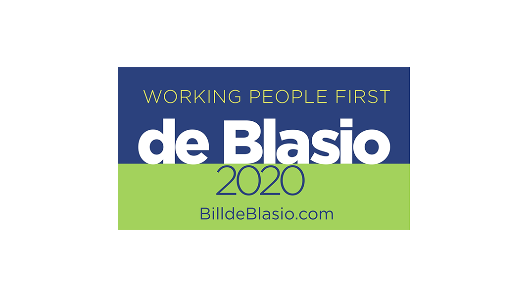
The spindly type on the lower field (with some bonus whispers of a typeface in the northern field, should one opt for the slogan-ized version) calls to mind ultra light cigarettes. De Blasio bespoke boldness and delivered something with all the depth of an airy disappointment.
The intended positioning is clear from the launch video and de Blasio’s particulars. This campaign is to be bold, brash, and quintessentially New York. One would hope, then, that de Blasio could come up with a more cutting riposte than hashtag-Con-Don.4 I do get the sense this is what he is getting at with that fat, crowded sans serif surname. The waif-like delicacy of supplementary text, then, makes even less sense. The whole project is mal-proportioned to the end.
The most explicit message I can take from this unsuccessful half-start at a visual identity is that the good mayor sure does want us to visit BilldeBlasio.com, so let us see what fresh hell awaits…
Built With: WordPress
Multilingual?: No 😞
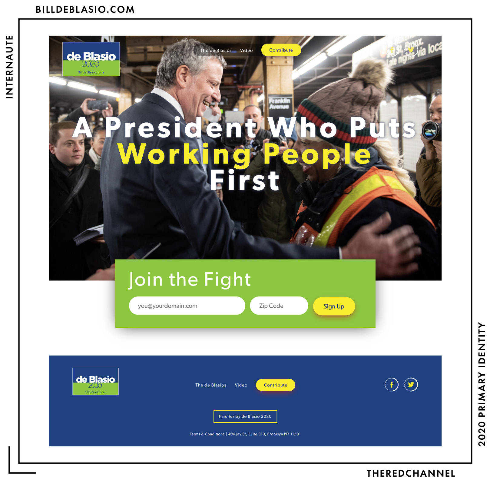
Upon first visit, Bill de Blasio’s webpage hijacks the browser and takes the viewer off-domain to an ActBlue landing page. Not only does this stymie any attempt to measure performance on pageload – a petty, élite concern for people of my persuasion – but it is uncouth behaviour for the viewing public as a whole. Should one successfully commandeer Chrome away from this imposition and still wish to visit the site, they are greeted with what I can only assume is an incomplete work.
The WordPress theme identifies itself as “wp-frns-pac.” I have no insight into who FRNS may be (financials are not yet up on the FEC portal), but the cryptic title sounds like a custom job. The first sign that this project is not precisely hemmed in on the edges arrives at the top of one’s internet browser. Despite launching a presidential campaign with an entirely different visual identity, one is greeted with a five-year-old favicon.
The type remains a disaster, but I like the old one more.
The eclecticism of the project is maddening. It is as if every decision was made ad-hoc and anew with each new photograph and line of copy. Consider the “About Us” page, where images receive drop shadows seemingly on whims. The site blends severe geometry and rounded elements, spartan fields of colour and radial gradients, flat design and the drop shadow. And not a lick of it makes sense.
The photography for the home page is not chosen with particular care and entirely obscures his social engagement icons at select viewports, including the one sampled above.
The social engagement icons, as well, are a bit of a mystery to me:

This is a solvable mystery, for a webfont is failing to load on de Blasio’s page that would have some headlines rendered in this style:

The font is in Production Type’s Acier family, and the reason it looks French is that it is. I quite like it. It is a playful, modernist display face that I may very well use some day, just not in anything remotely resembling this application. While it is novel here, I feel there may be good reasons why such ground was previously left un-furrowed. It does not work in this colour, paired with this body text, with this logo, or slapped on the web instead of in a glorious print project.
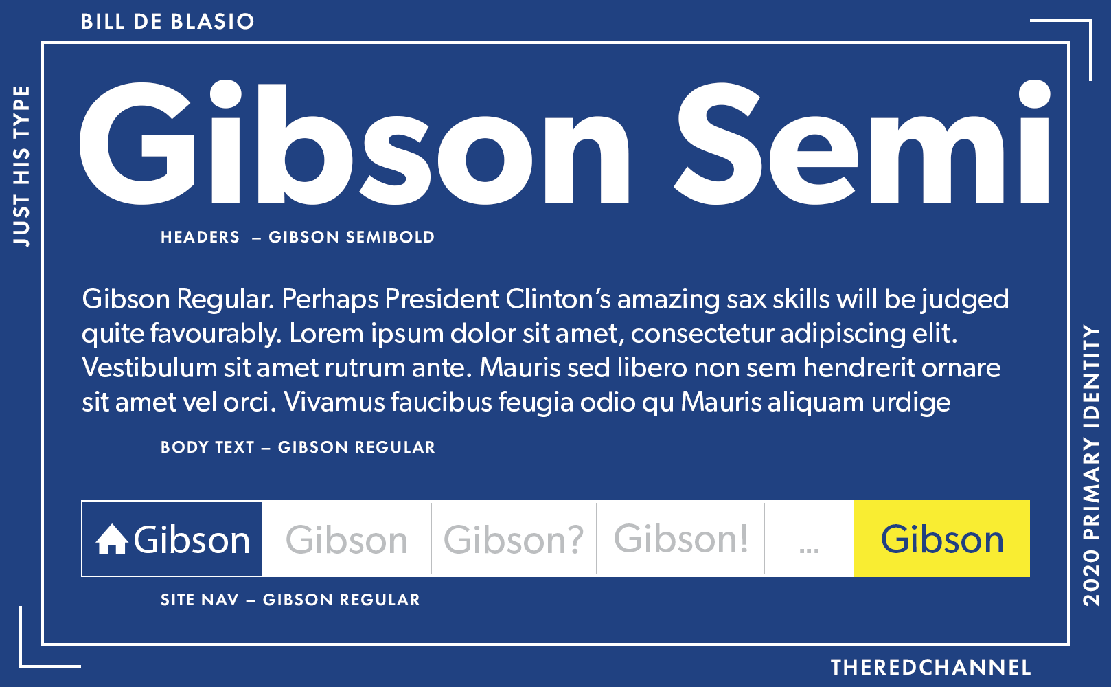
Since I could only get the display face to function by rooting around in the Internet Archive, it does not feel right to include it in the typographic profile. For me at least, the headings are displaying in CanadaType’s Gibson, as is the body text and the navigation bits. Perhaps it is a point of national pride, but I really, really enjoy Gibson. It is strongly reminiscent of Gotham, but plays much better as text rather than solely in display applications. Readability, finally! That is why I am so unbelievably disappointed in de Blasio’s desecration of this typeface. The spacing is physically painful, the sizes are awkwardly selected, and yellow text is just plain wrong. It is not groundbreaking to use a Gotham-like face. It is not even the best application of Gibson in this field, a nod which goes to a very different candidate indeed.
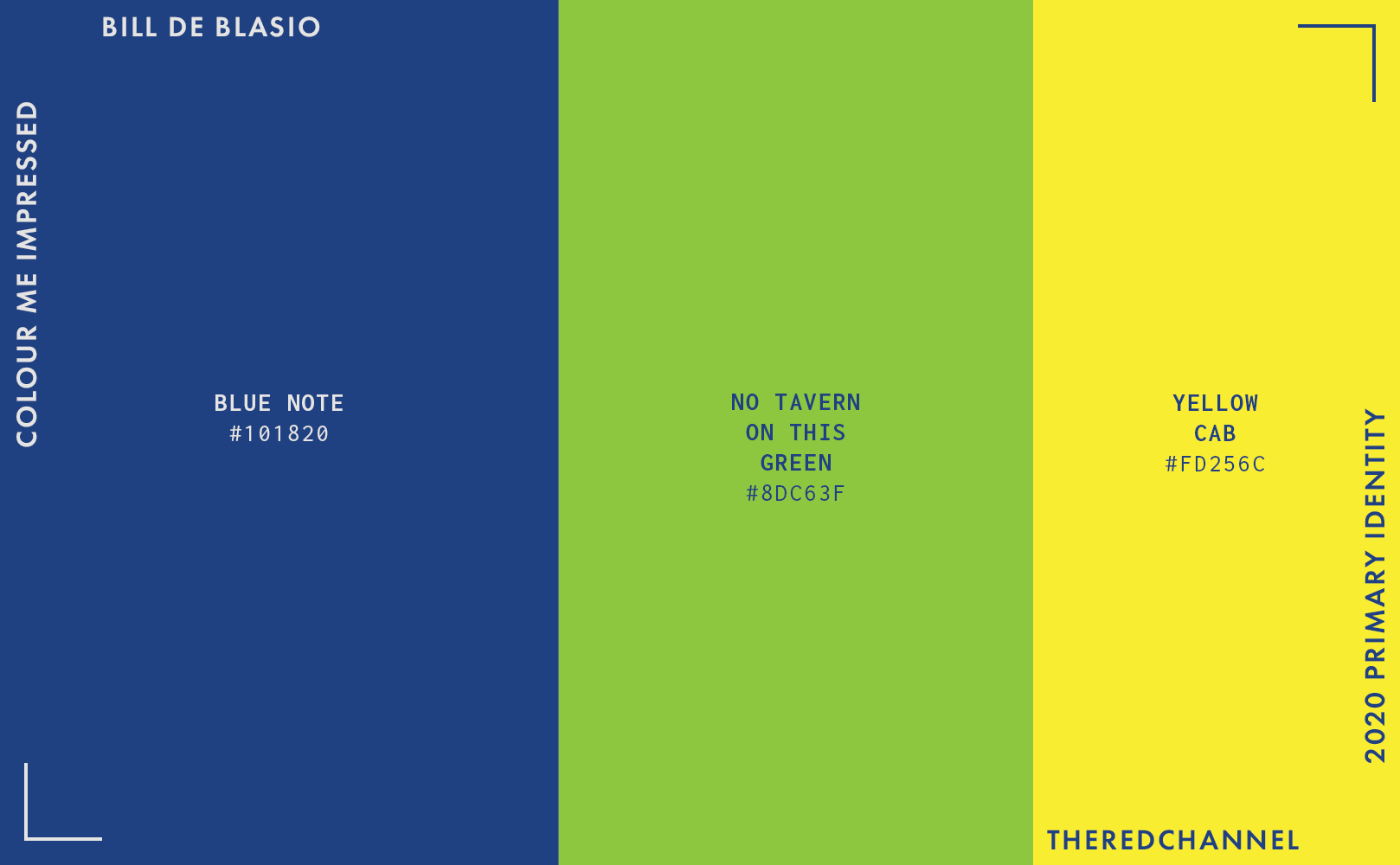
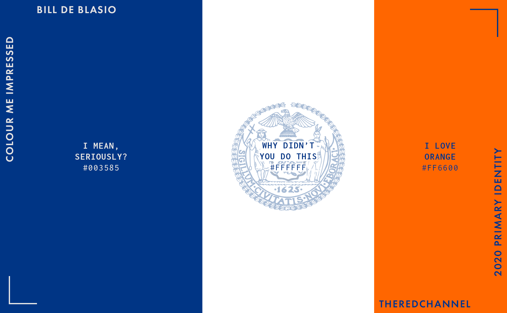
A discussion of this webpage cannot be complete without addressing colour. It is in colour that this visual identity falls most flat. This is true from the brackish green that recalls polluted waters as much as environmental stewardship, through to the most utterly conventional, C-suite friendly shade of blue that has been. The colours do not work together, and also do not work on their own. The choice to pair them with yellow as a tertiary is beyond strange. For what purpose yellow call-to-actions? Am I hailing a cab?
New York is a city of inexhaustible graphic talent, and I would appreciate an explanation as to how such a mistake could occur in such a place. Mayor de Blasio could find a palette which is both *ahem* palatable and regionally distinctive without venturing far beyond the confines of his office.
There is no merchandise for sale. This review is over. May I go now?
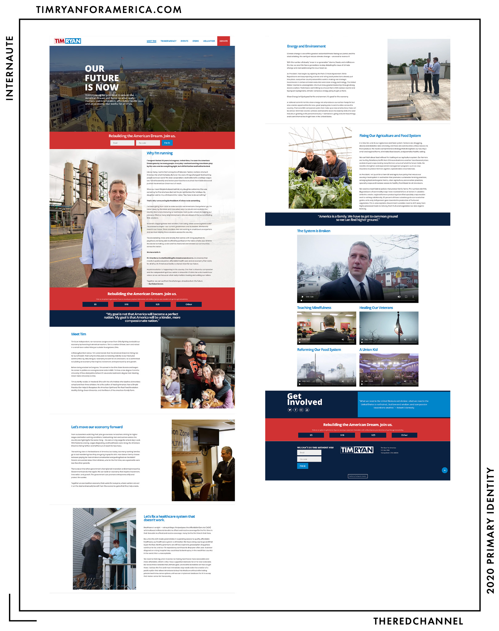
Tim Ryan
![]()
Date Announced: 4 April 2019, on The View
Slogan: Our Future is Now
Polling at: 0 per cent (Emerson, June 21–24)
My apologies, I see another rake-thin rectangle, and I simply must give it the Cory Booker treatment.
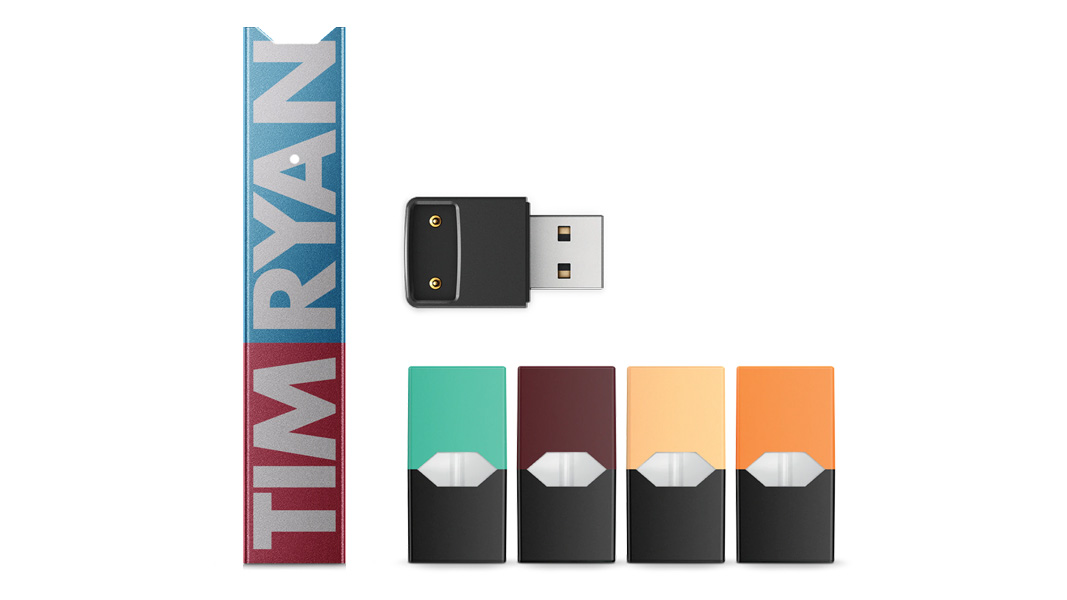
Ryan has the misfortune of being a relatively late entrant to this contest. His Kit-Kat wafer of cramped type thus hit the scene a good deal after Booker’s, while also boasting lacklustre colours in comparison to Booker’s rather ravishing blue. Unlike Cory 2020, the imbalance of fields makes this logo unavailable in a stacked construction. This is a shame, as it is when vertically stacked that Cory’s graphics look their best. Team Ryan opts for Futura Bold over Conductor (that is to say, favouring Best Buy to Bulgarian lottery tickets). I enjoy Futura as much as anyone – yes friends, I relish not getting fired over a font choice in corporate identity work – though here, too, is an unfortunate fault of originality: Many, many of his 2020 primary antecedents have opted to use either Futura, or a family showing a good deal of relation.
There is a stylistic alternate with a wiry border around the leftward division of the logo which does not look like it will reproduce gracefully at all.

Speaking of grace or a lack thereof, website!
Built With: WordPress
Multilingual?: No 😞
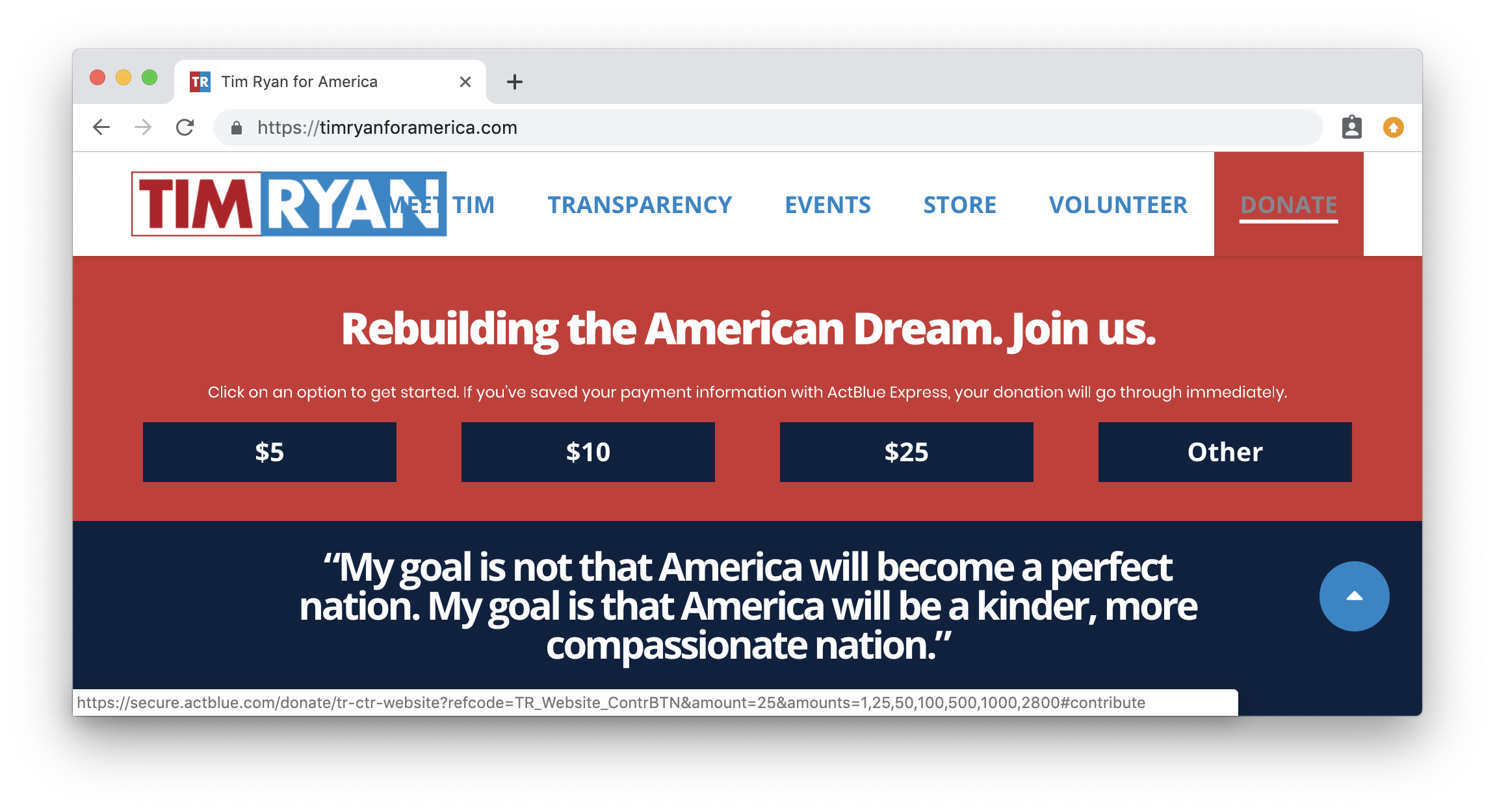
The good news is that I was not immediately put-off. The information density towards the top of the page is enjoyable, and the colour-blocking is both safe and well-done. Participatory language – this page is heavy on the first-person plural – is always welcome and reflects well upon the values of hard work and humility that guide this underdog, team effort. Unfortunately, the page also gets just plain heavy. Information density quickly goes off the rails, and the reader is left to fend for themselves in an unbreakable morass of body copy, punctuated only by a family photo or request for personal information and/or money.
This is also an example of a palatable result being attainable with off-the-shelf products and a little bit of attention, which is nice to see. Custom templating has run rampant as this primary progresses. The theme in use here is Bridge from Qode Interactive ($59 sticker price vs. if-you-only-knew what the call brands are paying for digital firms right now).
The production is more successful at certain viewports than others. Here, it looks a right mess:
Oof. The nav bar is breaking, the screen is cluttered, the kerning is discomfiting, the mouse-over colour for text is wretched, far too many colours are happening on my screen at once, and the interplay between colours is making me less-than-happy. Speaking of colour, how about we touch on that?
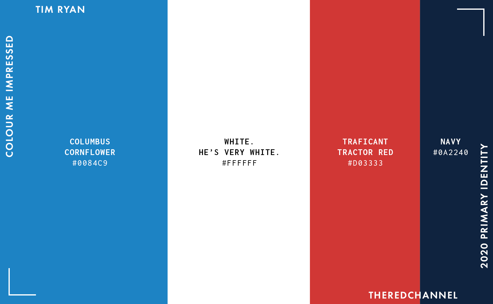
The blue matches up with the wordmark, so that is nice! The red does not, for what reason I have no idea. This is a very traditional, unadventurous palette. I am getting a good sense of who Tim Ryan is as a candidate. Uniqueness is eschewed for participatory, patriotic comity. Design choices reflect a level of care, but also a lack of the hyper-attention that would characterize a more tightly-managed ship. Ryan respects the reader’s patience and intelligence – or at least one would hope so, having to slog through those walls of text.
I feel this identity would benefit strongly from dropping one of these four colours. Either boost up the blue and navy (ditching the red altogether, save perhaps an errant call-to-action somewhere), or patriotism played straight in singular shades of red, white, and blue. I would strongly favour the duotone of blues, though I suppose I am not from Ohio. We all have our type:
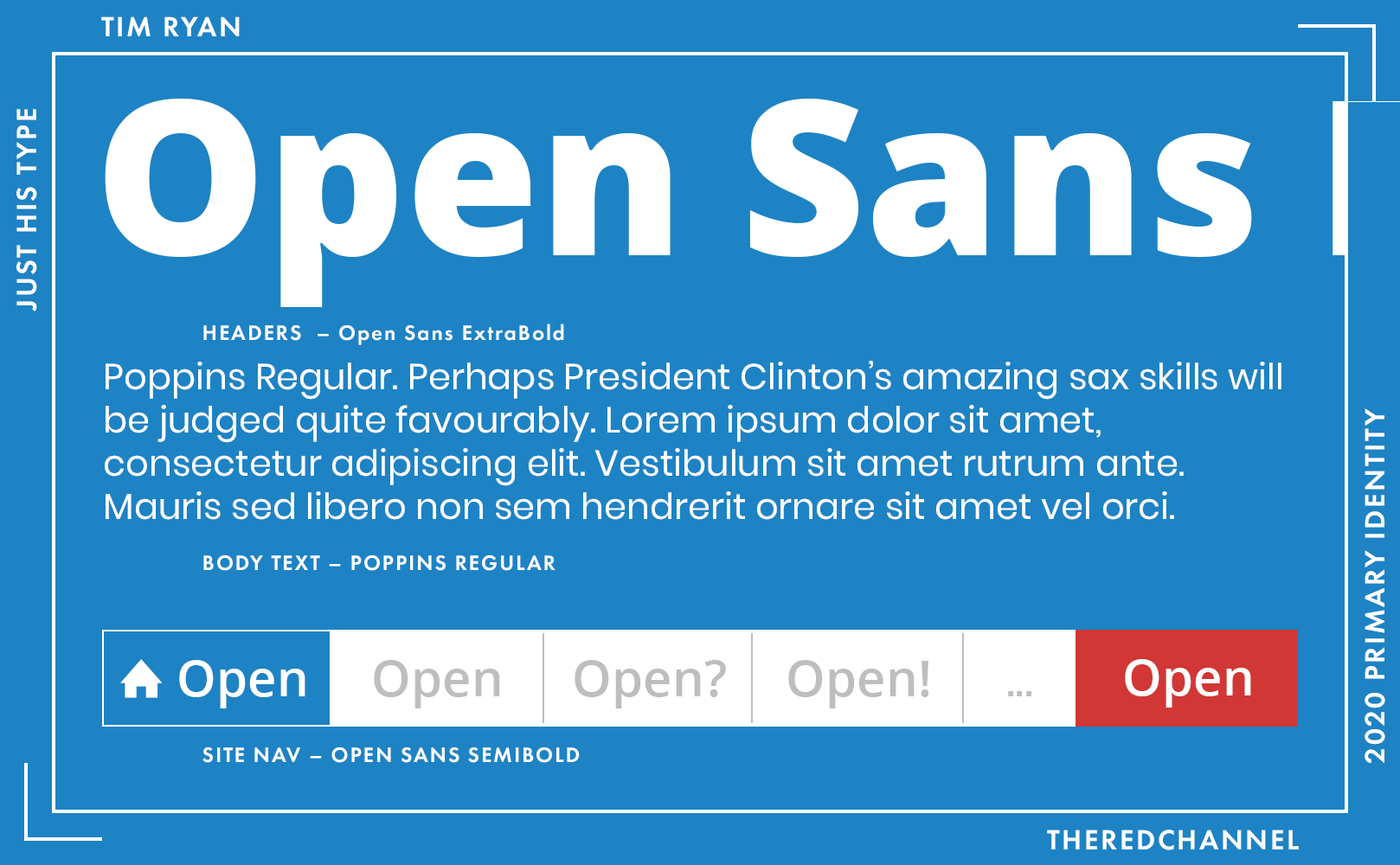
This entire website leans upon free fonts. Headings and nav are Steve Matteson’s Open Sans, while the body appears to be Poppins from the Indian Type Foundry. These are two workhorses among the ranks of free humanist and geometric sans, respectively. Poppins is clean, Futura-enough, and the price is right, though I do tend to prefer seeing it in heavier weights and setting headings. It looks excellent alongside a serif in the body, whereas here alongside the neutrality of Open Sans, I risk being lulled into a slumber.
But see: Ryan is safe and conventional. And quite thrifty, to boot.
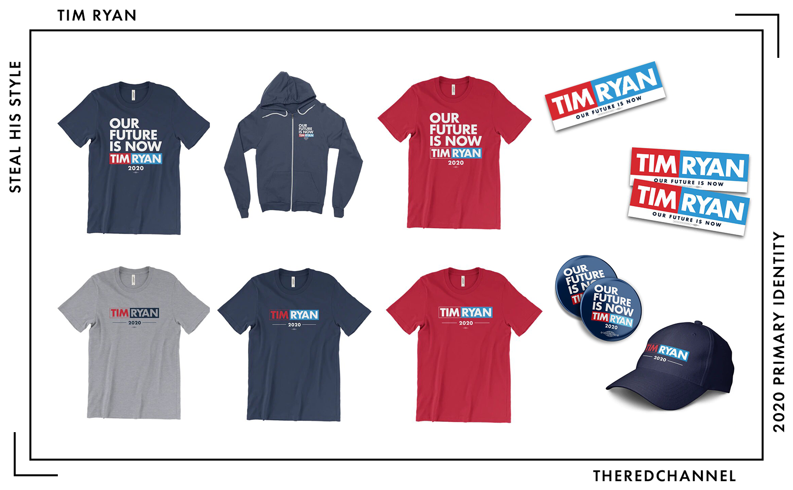
Number of SKUs: 15
Pride merch?: No 😞
Going rate for a T-shirt: $25.00
Tim Ryan’s merchandise assortment is on the smaller side. One’s options all involve the boxed logo, and a prospective purchaser may get it alongside either a date-impaled horizontal bar, or beneath Tim’s slogan in a bold sans serif. The latter looks much better (if dated) on the T-shirts than scaled down to nothing on a sweatshirt. Colour choices for textiles are limited, ith apparel in dark navy, a pretty smart red, or a confusing and un-successful heather grey. Many use the outlined stylistic alternate logo, and its delicacy makes it both difficult to see clearly and in cacophonous discordance from the other, bolder elements.
I wish you well, Tim!
Julián Castro
![]()
Date Announced: 12 January 2019
Slogan: Julián for the Future
Polling at: 0 per cent (Emerson, June 21–24)
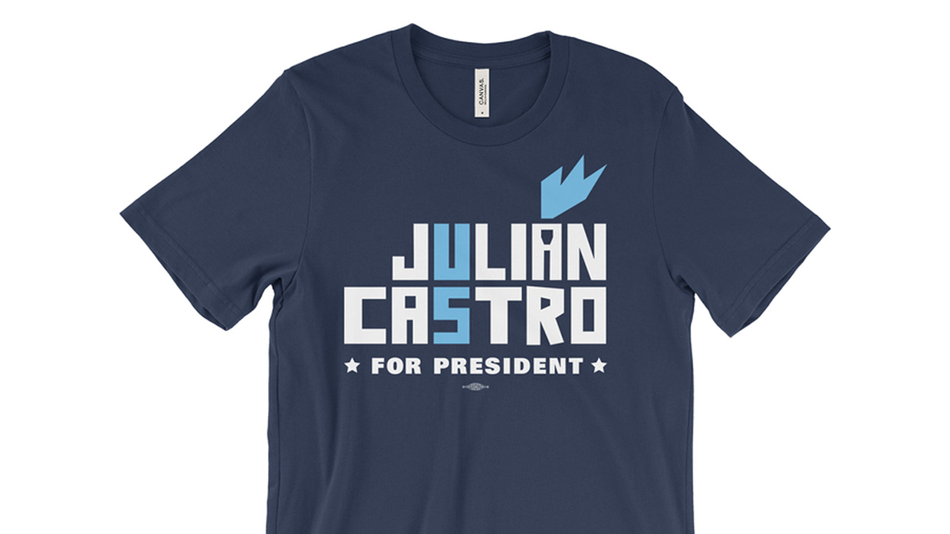
Finally, something with sustenance. It is yet another boxed-in wordmark, yes, but there are few things I want to see more than a box pieced with a diacritic mark. The choice to add a vibrant colour to such a mark is also refreshing and exciting. It very much continues the Democratic custom of big-and-crowded geometric sans of the Gotham-esque variety. Similarities to the big-G-font are no mere accident, the type is Mallory Black by Tobias Frere-Jones, who quite famously had a thing or two to do with Gotham. The angled cuts and personality in the heavy weights of Mallory pull it away from feeling trite and tired. This is a field with a lot of boxed-up wordmarks and a whole bunch of Gotham-like typefaces, yet Julián does not get lost among them.
Built With: WordPress
Multilingual?: Yes! 🤗
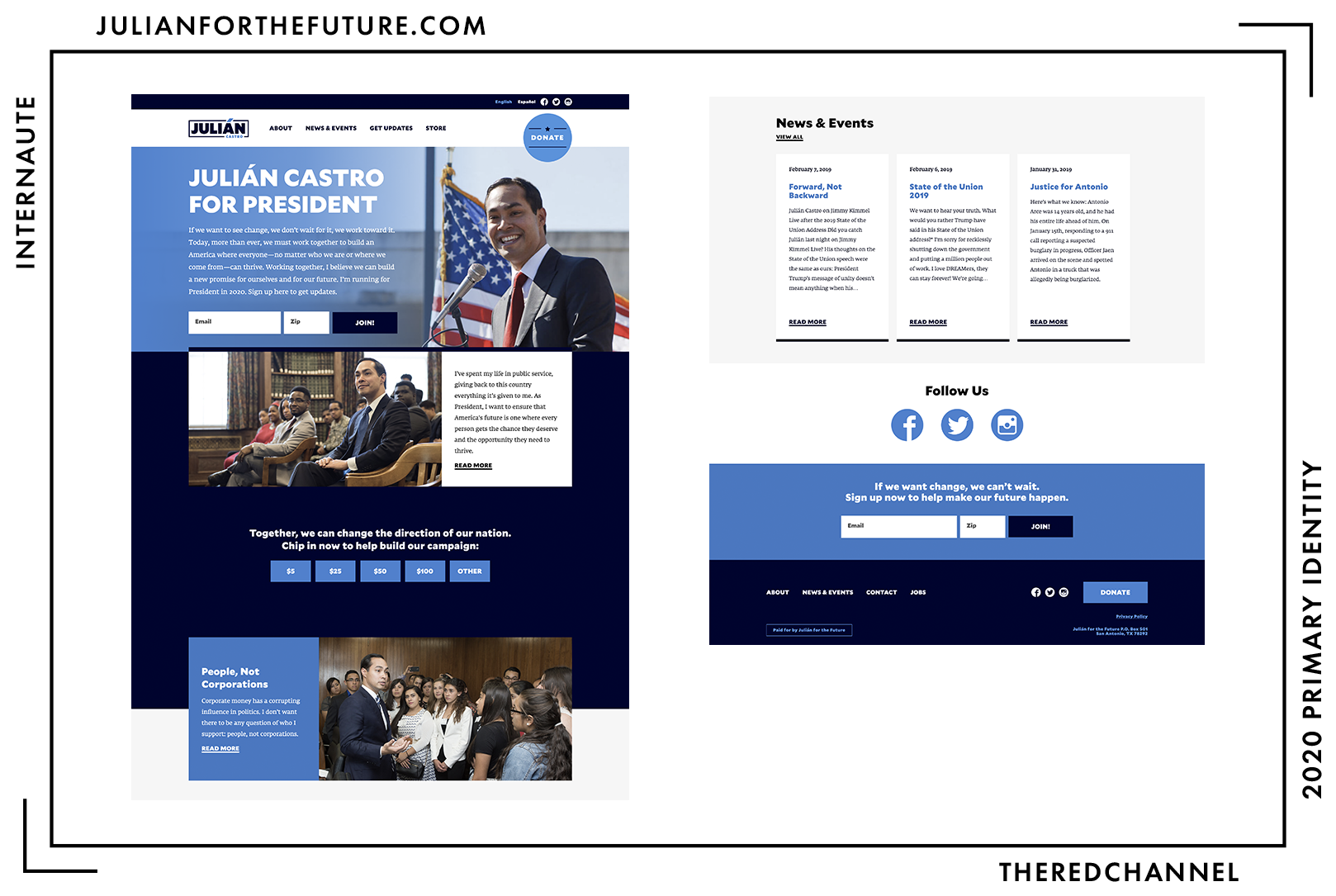
The web presence is not quite so triumphant. I do not fault it; the result is serviceable. It is a custom WordPress theme with the title “Castro for the Future,” but nothing about it seems particularly futuristic. Or even current. I vacillate over my feelings on how this page treats written information. At times, it feels expansive, relaxed, and a soothing tonic to the too-tiny text faces and overwhelming images found elsewhere in the primaries. There are, however, occasions on which the page, particularly towards the top (I do quite like the midsection) can feel claustrophobic.
The web theme stays entirely inside the box, sadly.
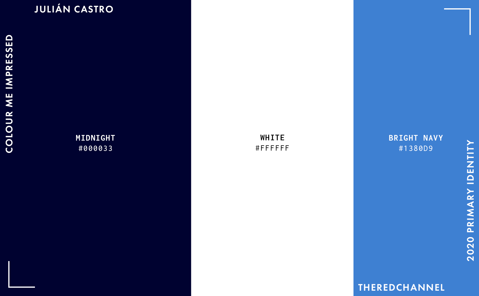
There is a lot to appreciate in the palette. Monochromatic blues will play sweet songs for the party faithful, and the choice of such dark and vibrant examples together is quite daring. The vibrant blue even serves to highlight the “Donate” button in lieu of a red! There is not a speckle of red in sight. Blue may be the party vestments, and blue logos are the globally-recognized sign of safety, but this treatment never fails to refresh and revitalize the esprit de corps following the star-spangled snooze-fests that typify a great share of political design. Do note that unlike Bill de Blasio, Julián had the good sense to ditch the yellow accent colour early on in the race.
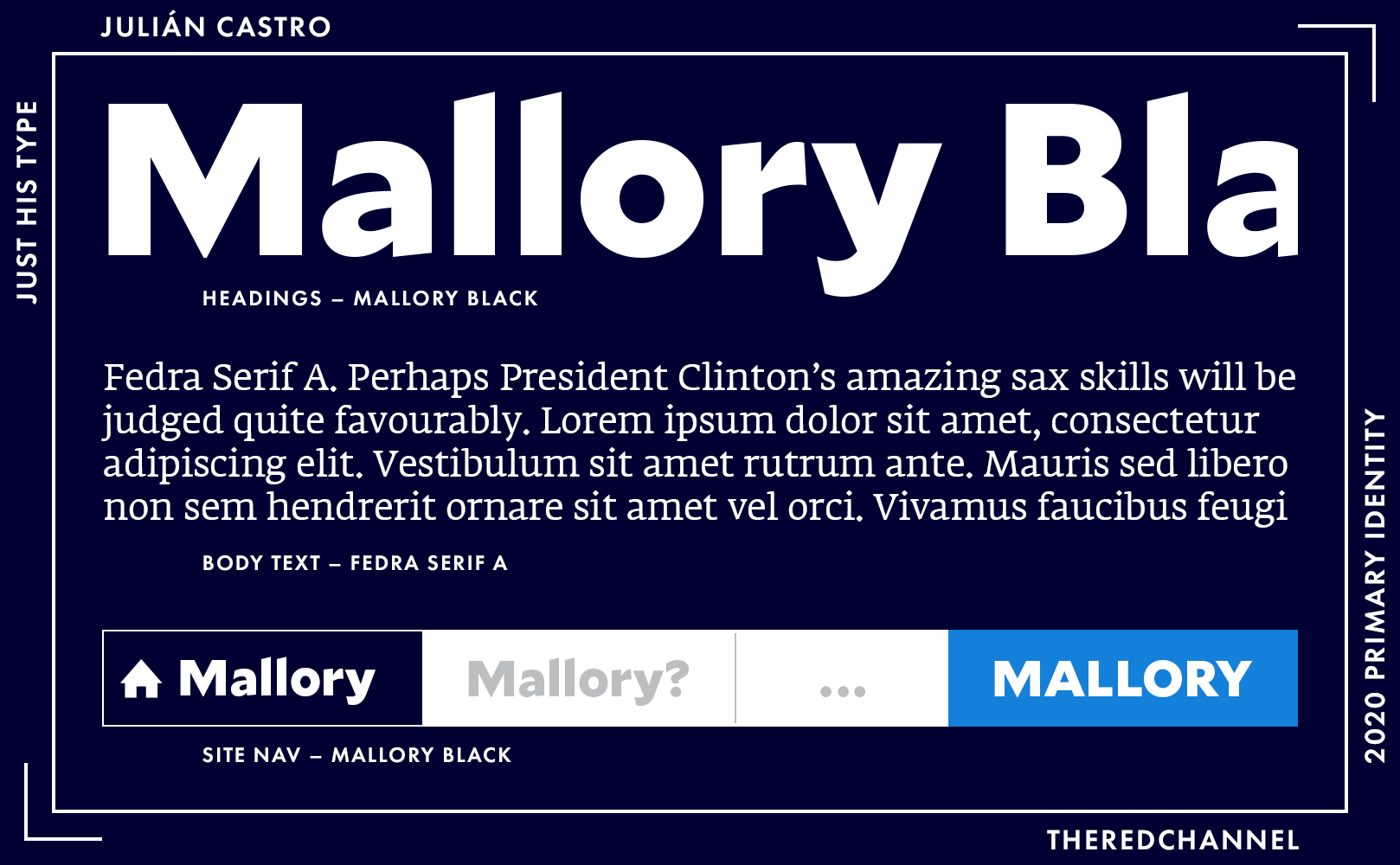
As mentioned prior, headings are in Frere-Jones’ Mallory, a clear nod to the Democratic Party’s long-standing love affair with Gotham. The body is Fedra from Typotheque. Both Mallory and Fedra take austere forms and tease them out at the margins-legible, but not overly self-serious. My only gripe may be that at this very heavy weight, the playful characteristics of Mallory do not downsample to small sizes well, and indeed are not designed to do so. A lighter weight may be the most appropriate choice for sub-headings and navigation.
This is the right identity for the right candidate. Austere sincerity which maintains a personality. An ode to Democratic tradition which breaks outside of the box mould – literally.
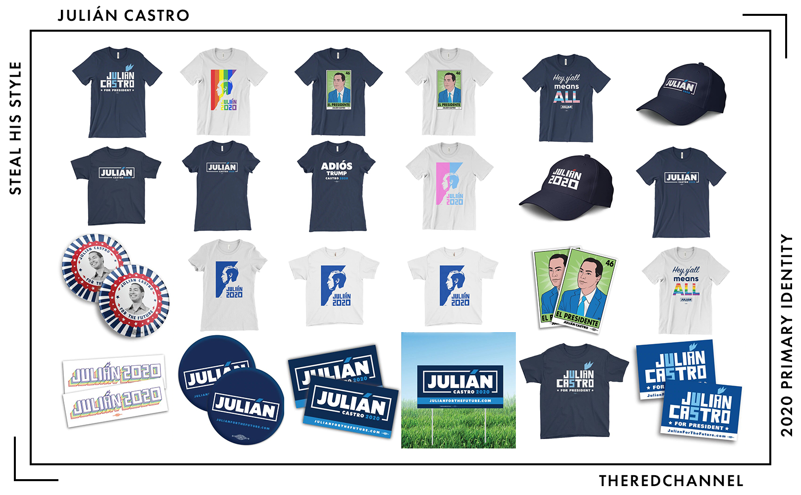
Number of SKUs: 25
Pride merch?: Yes! 🤗 (Rainbow and Trans pride colourways)
Going rate for a T-shirt: $25.00
Castro is comfortably mid-range in terms of the number of products offered for sale. Aside from the typical box-logo-slapped-on-garment, there are a handful of pleasant surprises:
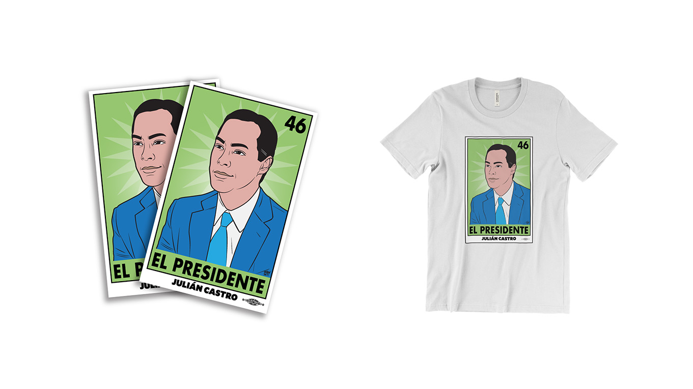
…such as a triumphant lotería card bearing Julián as El Presidente. (I purchased a T-shirt featuring a presidential lotería card that is different entirely.)
Julián Castro also has a line of merchandise designed by San Antonio printmaker Cruz Ortiz, who has done prior work for both Obama and Hillary Clinton.
It is quite nice, with the U and S set to line up on the vertical and the flame evoking liberty on the diacritic. As it is outside work and departs from campaign practice (Julián’s campaign does not identify by full name), it is tricky to evaluate for continuity. I nonetheless remain pleased to see Castro’s campaign incorporating the work of outside artists.
Cory Booker
![]()
Date Announced: 1 February 2019
Slogan: Together, America, We Will Rise
Polling at: 3 per cent (Emerson, June 21–24)
Shown above is the vertically-stacked construction of Booker’s logo. This is not the campaign’s favoured lockup, but it is my favoured lockup, so we are going to open with that one. More commonly encountered will be the bar magnet/Kit-Kat wafer/red-and-cyan Juul pen seen below:

This graphic, at the very least, tends to inspire a reaction in people. Which is more than can be said of a whole hell of a lot of the field. Unfortunately, one would not go broke betting on a reaction of… revulsion.
While I am not diametrically opposed to this brand, I know many thoughtful and lovely people who are. And I can understand diametric opposition, because this brand exists in constant opposition to itself. There is a reason one tends to insulate pure reds and blues with a whole lot of white. Here, they exist in equal proportion, uneasily abutting. On top of this, the logo is frequently displayed in a sea of rich black. Two autonomously dominant colours are duking it out while themselves surrounded by a synthetic, preponderantly powerful colour.
I have come to believe that this is the work of intention. Not only because us designers tend to agonize over the excruciating minutiae that collectively constitute the things which we do, but because the other curious stylistic choices in this mark reinforce that feeling of opposition. It is perfectly divisible and divisive, balanced yet imbalanced. The glyphs are exceptionally close-clipped, both to the boundaries of the rectangle (notice that in the first example, I provided ample bleed as breathing room) and tracked with the rest of the type. The exceptional variations in stroke thickness present in Conductor, a much-scoffed application, are a similarly arousing dialogue between extremes. Even the text colour itself is perfectly divided and Manichaean.
Cory 2020’s Schedule Bs are showing significant expenditures with the brand strategists at Do Big Things. It would be an error to dismiss strategy here out-of-hand. (And they should probably send me a standards guide. I am curious.)
The design philosophy underlying Cory 2020 is to arouse at any cost. As cynical as that is, it may just work. If it is burned into your retinas, at least it is in your retinas, eh?
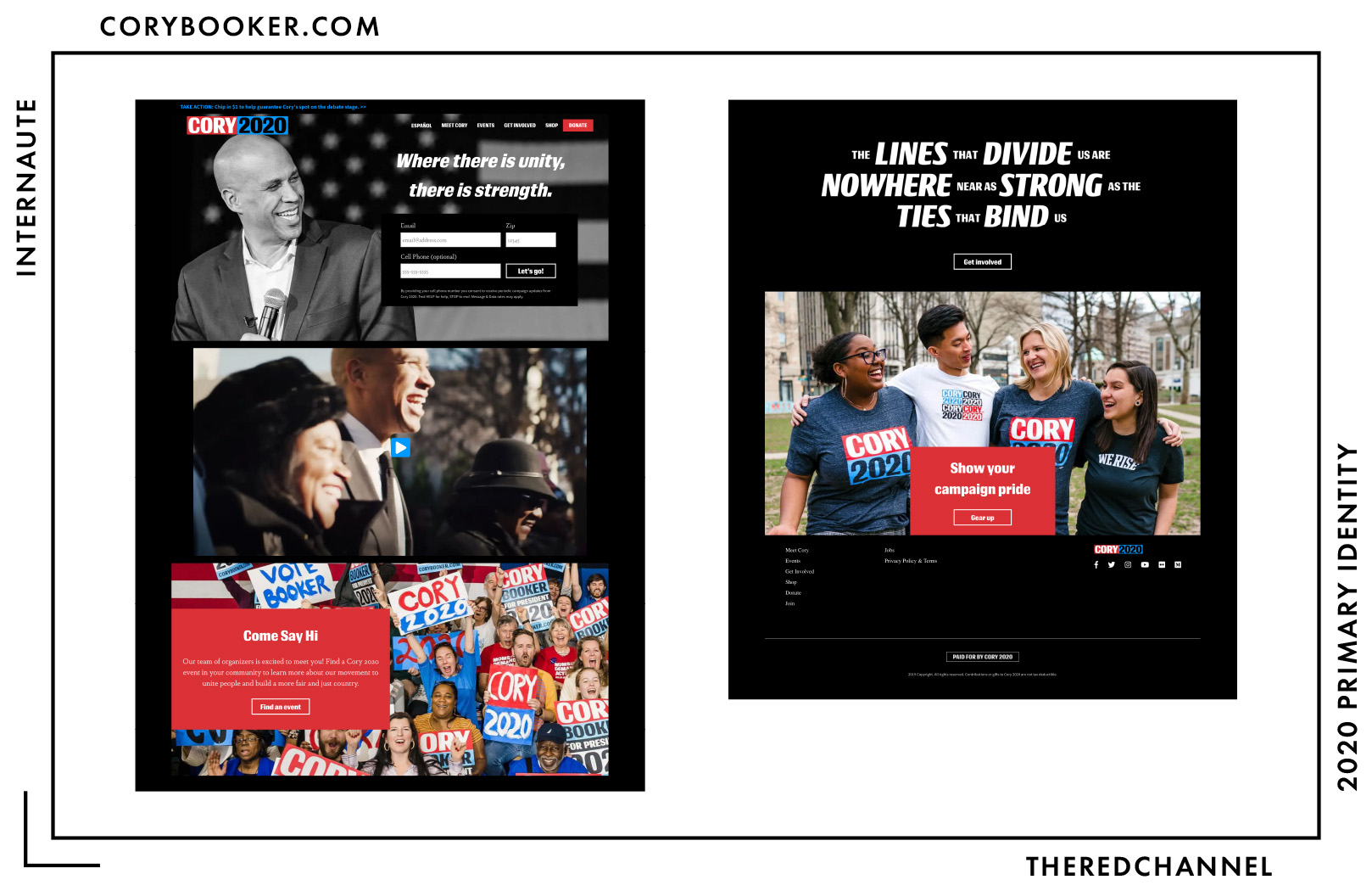
Built With: WordPress
Multilingual?: Yes! 🤗
Booker’s home page has undergone a significant re-design since launch, now using the custom “Bookerstrap” theme. It is much shorter, most body text has been repealed and replaced with headings, the proportion of red elements has increased compared to those in cyan, and the entirety of the page background is now rich black.
Then there is this perplexing graphic, which reminds me of nothing more than a title card from It’s Always Sunny in Philadelphia:
Do notice that it consists of large massings of a polarized font that are themselves arranged on opposite poles of an image.
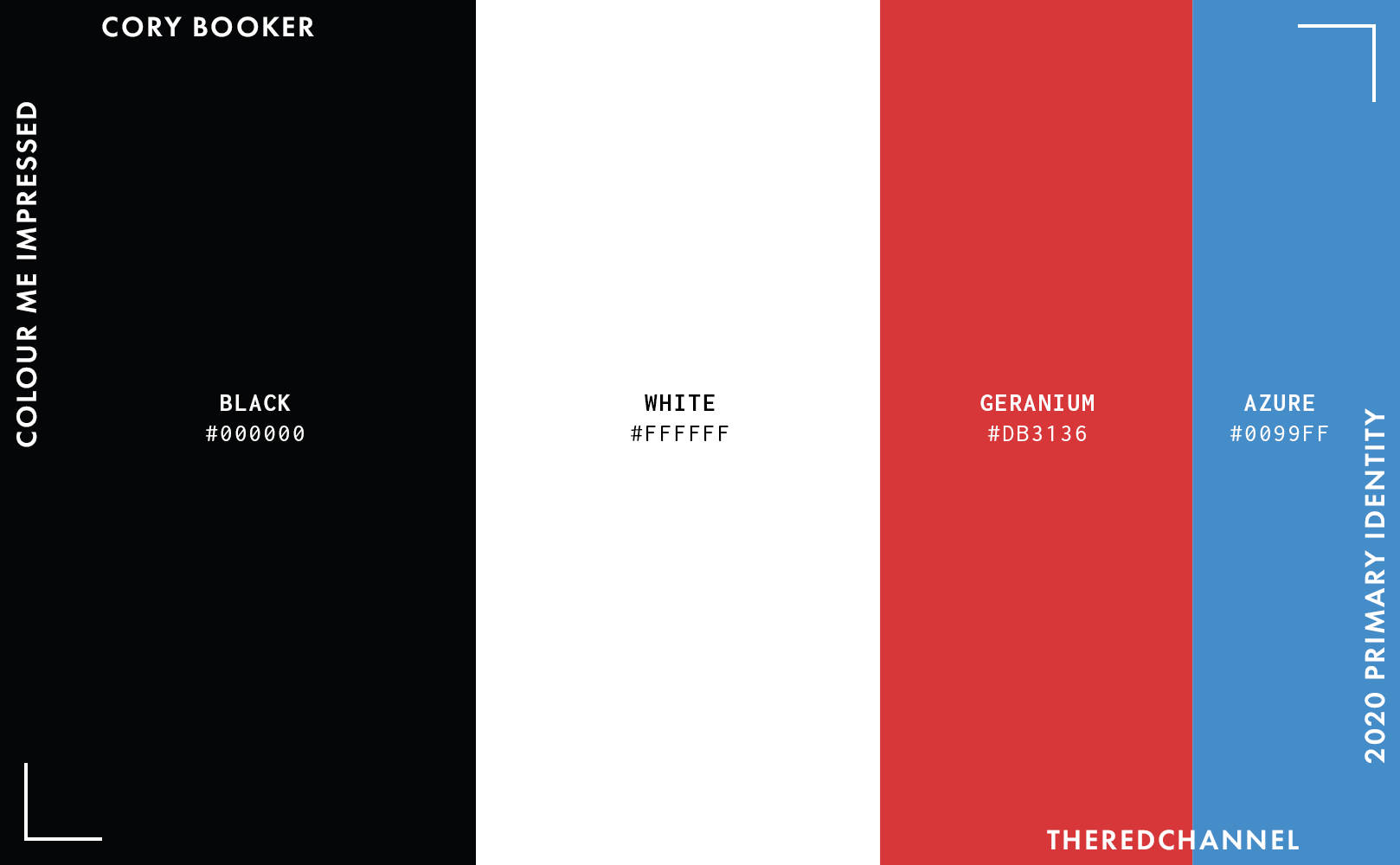
The colour palette is one of high contrast, with black dominant. The values in the stylesheet do match with those in the logo, which is not guaranteed and always a plus. The incorporation of copious amounts of black into a “standard” red, white, and blue colourway is as interesting as the very shades of red and blue selected. They are true and saturated, picked for youthful energy. The blue, I particularly adore. On eyestrain alone, I cannot fathom creating a project like this, though I can definitely imagine cribbing that cyan for later.
There is some interesting asymmetrical colour-blocking off of the main page, though I perceive it as more uncertain and imbalanced than emphatic. It should go without saying, but third-party sites do not play well with this branding.
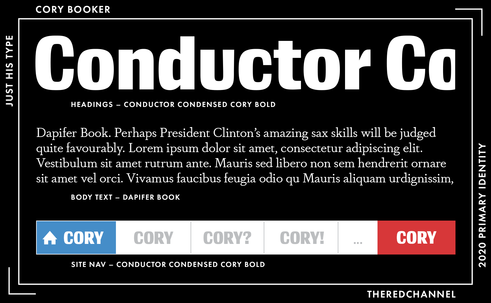
Booker’s campaign went for a custom heading display font. It is a modification of Frere-Jones’ Conductor, in a condensed width and bold weights. It is a technically interesting choice of type, quite far afield from anything we have seen in a presidential race prior, though it becomes over-bearing with ease. Body text – what remains of it – is the old-style Dapifer Book. It is also quite small, and legibility can be a challenge against a black background (most text-heavy pages remain white).
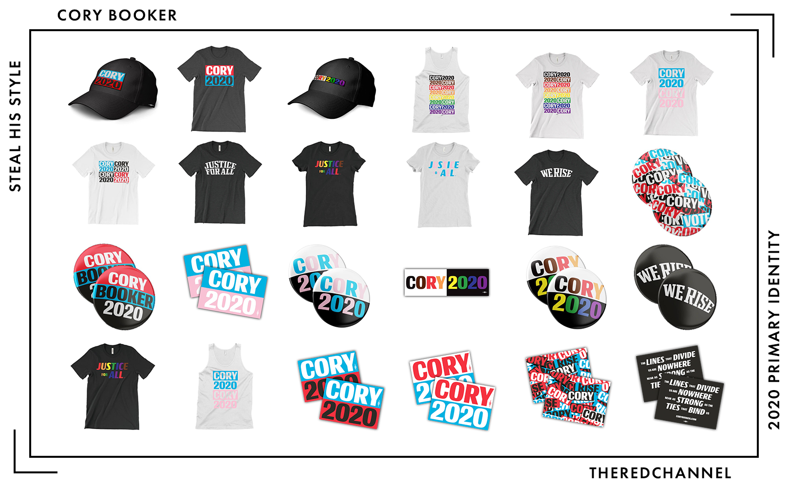
Number of SKUs: 27
Pride merch?: Yes! 🤗 (Rainbow and Trans pride colourways)
Going rate for a T-shirt: $30.00
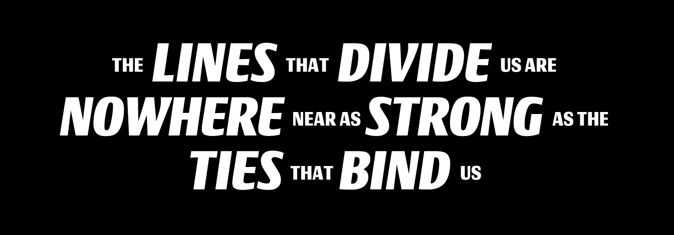
The redemptive quality to Cory Booker’s merchandise is that much of it (though not all of it) is on brand. Typifying the lot of it are the vinyl stickers:
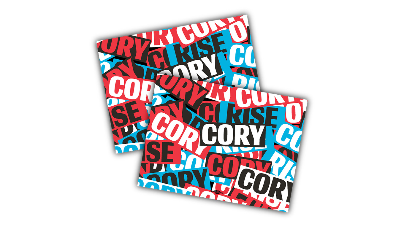
A chaos of Corys, close-clipped, contrasty, with Conductor everywhere. There is one more thing worth illustrating in the sticker section:
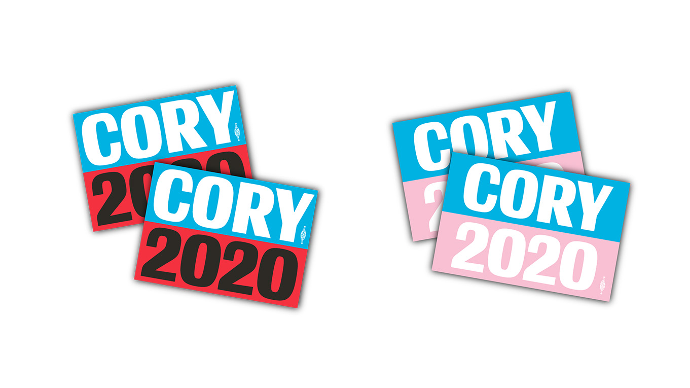
Compare the original stickers (at left) with the trans pride issue and note the importance of spacing. The trans pride stickers have adequate bleeds and are comparatively relaxed, less visually accosting than in some other applications of this brand identity.
I know that this is a substantial departure from common assessment. As practitioners, we must accept that we were trounced by a deliberately distressing red ball cap. All our care and consideration and over-long articles have been handily bested by a work of anti-design. Hashtag Give-Polarization-A-Chance?
Elizabeth Warren
![]()
Date Announced: 9 February 2019
Slogan: Nothing Yet :(
Polling at: 14 per cent (Emerson, June 21–24)
Warren’s visuals have been my not-so-secret favourite in this race for quite some time. There is, for a proletarian candidate, a sumptuousness to this style. I lack the slightest idea what the type in her wordmark is – in all likelihood either a custom face or (being that we have seen no further branded materials incorporating it) possibly hand-lettered. It takes modernist forms with ease, and yet has the softness of a woodcut. It conveys the characteristic organic qualities of a distressed face without the unmitigated aesthetic disaster that is a distressed software font. The underscore is weighty, generous, and authoritative. The colours are sublime, the richness of mint and deep navy cut by the occasional hint of amaranth. It simultaneously manages to feel both human and gosh-darned expensive.
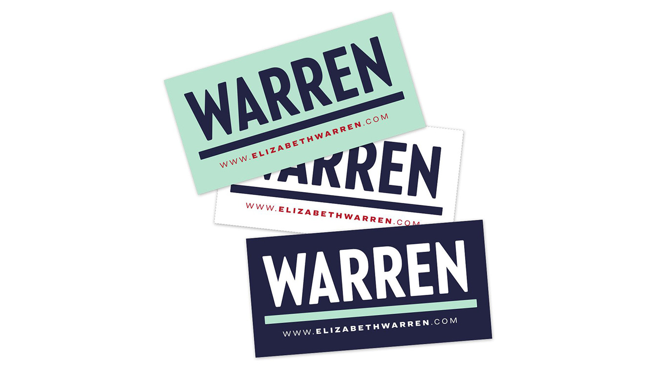
The work intends to be authoritative, opting for identification by surname alone, helped along by a big, honking underscore. This combination of sumptuousness and substance gives Liz-Warren-the-brand the sheer audace to, say, flood the Internet with white papers, which she is more than willing to show you on…
Built With: WordPress
Multilingual?: Yes! 🤗
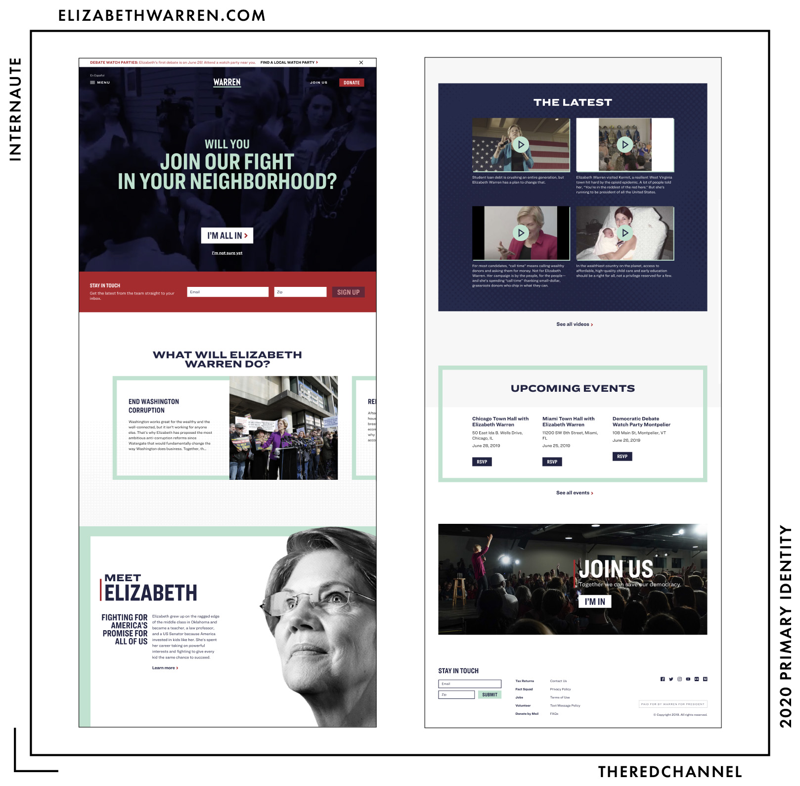
…a fleshed-out webpage. The site is reasonably compact. Information-dense, but legible, with text-based pitches, biographical information, and multimedia content in separate galleries that still readily accessible from one another. The page is packed to the rafters with JavaScript animations powered by the Greensock library, and while serendipitous the first time, they grow cloying on future interactions. It may suffer from a bit too much ambition clouding what is otherwise graphic simplicity.
The page incorporates horizontal scrolling, essential for brevity on a site known for prodigious policy proposals:
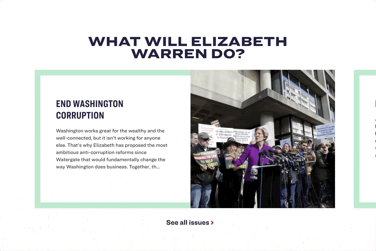
Warren is also the only candidate to place a survey specifically for non-supporters on her home page.
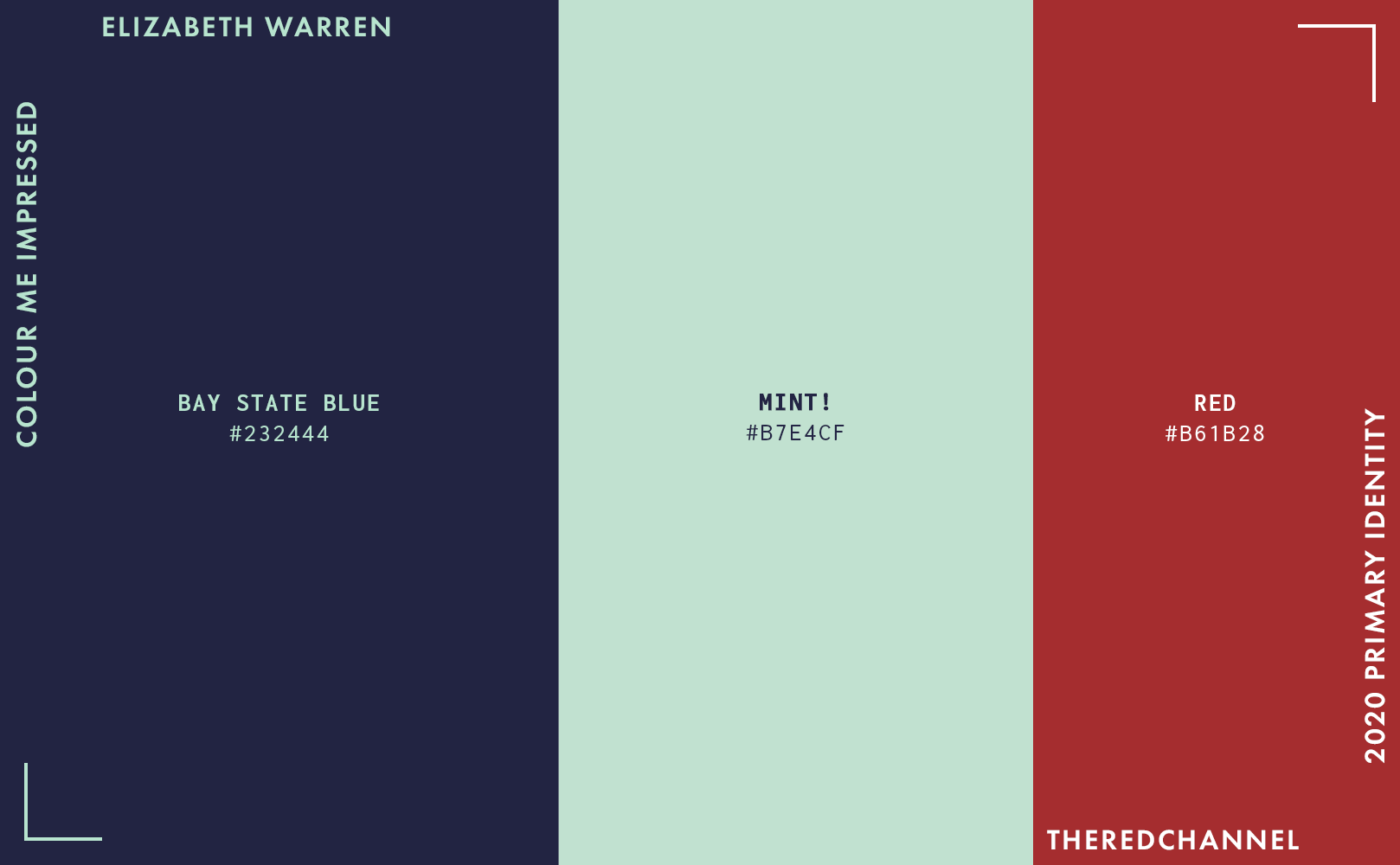
The colours in the stylesheet match the colours in the identifier. And they are spectacular.
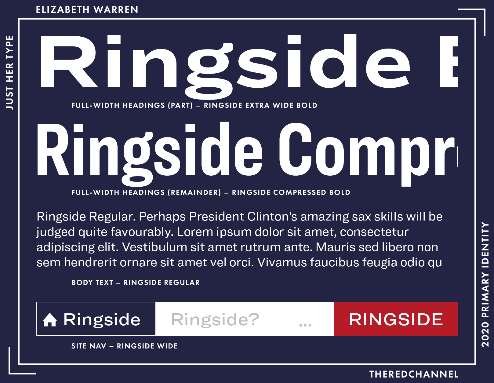
Warren is smart to use a single type family on her website, Hoefler’s Ringside, and maintains the differentiation of content and purpose through a great variety of weights and widths. It helps, of course, that Ringside is a smart and interesting sans serif. While the type is all from the same family, it is not an overly homogeneous family. The result? A consistency which does not feel monotonous. Ringside, much like Warren’s wordmark, is modern in disposition, yet unafraid to take cues from earlier, more organic and eclectic work.
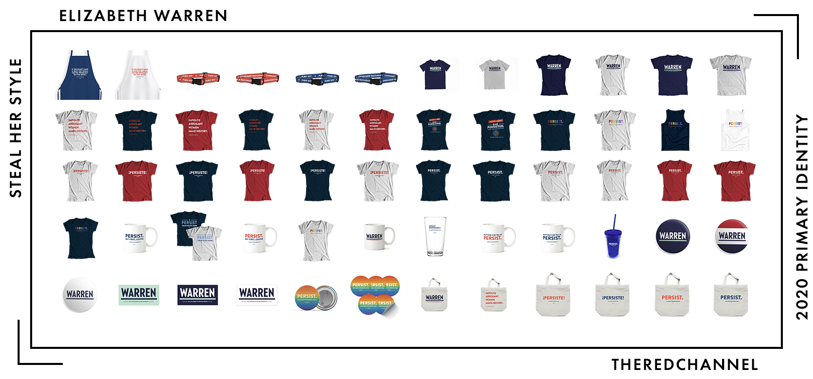
Number of SKUs: 267 (I know, right?!)
Pride merch?: Yes! 🤗 (Rainbow and Trans pride colourways)
Going rate for a T-shirt: $30.00
Liz Warren sells 267 different things, and I both lack the stamina to stuff 267 things into a single image panel and lack confidence that she will not introduce more by press time, so I am using a recycled (and still abridged) depiction of her merchandise assortment from February. On sheer variety and established brand equity, there are no contenders. Warren is unusurpable and unconquerable in efforts to merchandise herself, though not unquestionable. I do wonder if the amount of energy that goes into producing branded goods for fundraising, taken to this extreme, continues to generate satisfactory marginal returns. The candidate that follows in this article, Beto O’Rourke, very successfully fundraised nationwide for a Senate campaign off of a much smaller collection. Does there exist a limit, approaching which one’s offering is diverse enough to satisfy all comers? If there is, Warren is the closest.
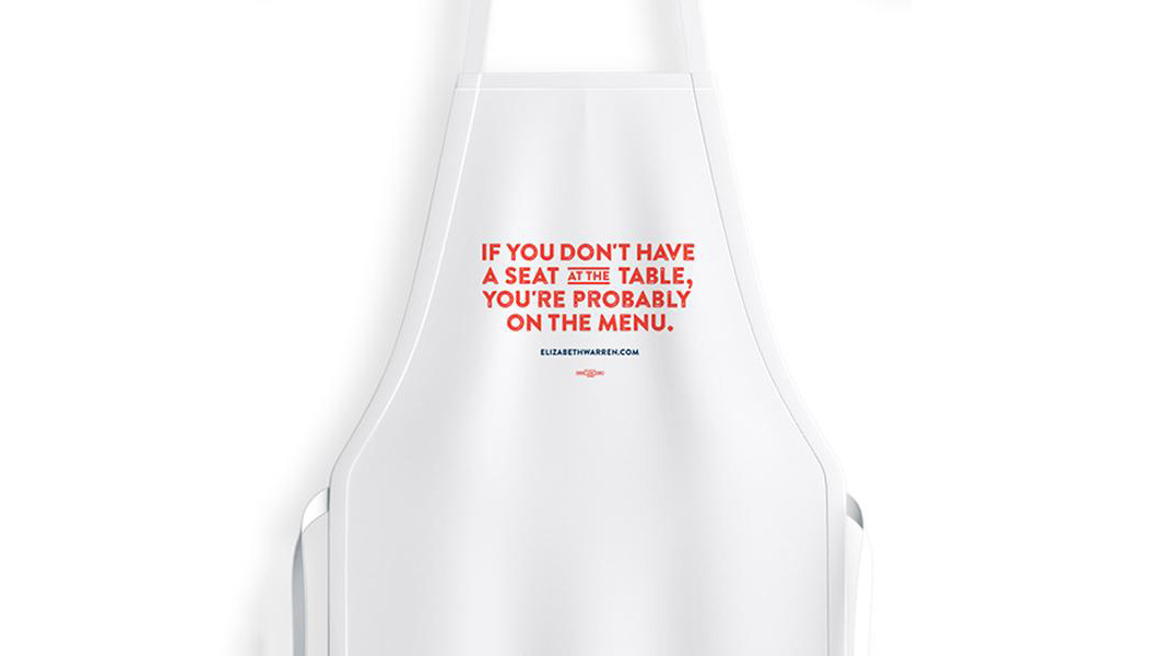
Warren has a real knack for clever merchandising off of her own interviews and conduct in the Senate, as the surfeit of goods containing some permutation of “persist” makes clear. Above is the campaign’s cooking apron, featuring a quote from her 2014 CNN interview reading: “If you don’t have a seat at the table, you’re probably on the menu.”
Warren best embodies the idea of branded goods, in that it is most emphatically not about slapping your logo on a print-on-demand T-shirt. A logo is only a brand if one is cattle. Warren’s merchandise incorporates and reflects a managed and manicured attitude, and that is what allows for it to be so diverse (yet coherent).
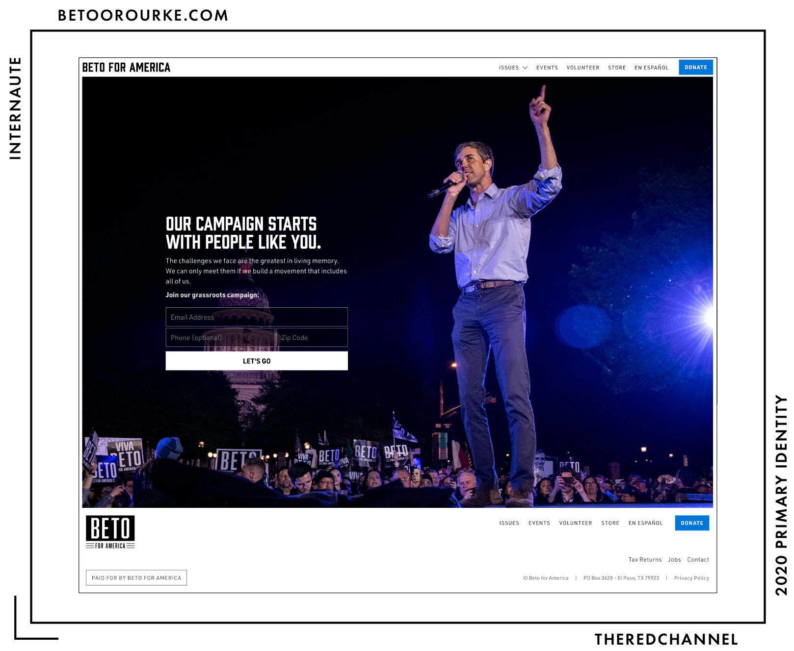
Beto O’Rourke
![]()
Date Announced: 14 March 2019
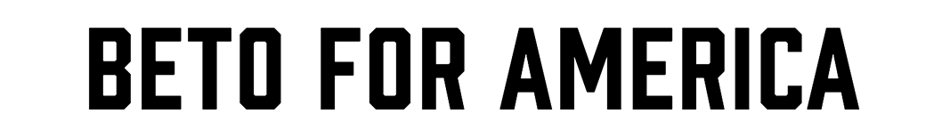
Slogan: Beto for America
Polling at: 1 per cent (Emerson, June 21–24)
Beto O’Rourke’s entry is a resubmission of prior art by Tony Casas, partner at Stanton Street (a digital outfit formerly owned by O’Rourke). No matter – it was decent the first time we saw it, and I think we can all stomach seeing it again. The identifying mark is the candidate’s given name, set in an octagonal chamfered stencil typeface, sufficiently condensed as to convince the entire party to go for condensed widths this election cycle. Beneath it, three horizontal bars are defaced either “For Senate” (2018, Texas campaign) or “For America” (2019, national campaign) to fill out a blocky, rectangular form.
An alternative typographic treatment used where height does not permit such excesses of vertical space is as follows:
Industrial to a fault, the logo gained renown as a monochrome mark during a time the Democratic Party was not afraid to explore the nether reaches of the colour wheel. It is a matter if dispute as to whether Beto’s branding is realized in black and white due to the politician’s affinity for punk rock, or emerging from a desire to message his candidacy in a less-partisan fashion. Parallels with fast food ketchup, however, are declared by the designer to be purely coincidental.
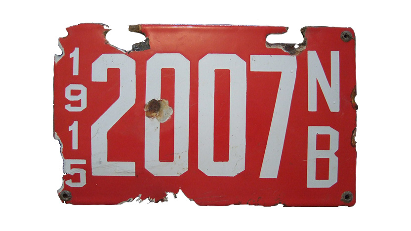
In its spartan sensibilities, it marks a significant departure from other recent projects-of-note (such as the oft-cited example from NYC’s Tandem). O’Rourke himself is also a fairly significant departure from candidates of late, with no shortage of peculiar habits. I am a big fan of incised, angular faces. They fill space well and become structural statements as much as – or more so than – descriptive ones. Some of my favourites mimic the lettering on porcelain licence plates, such as this 1915 enamel plate from New Brunswick:
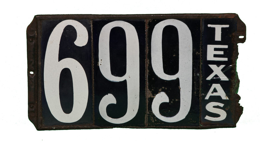
It is not, however, a particularly Texan choice. In the same time period, counties of Texas preferred immatriculation plates with flourish-terminalled, ornate numerals more similar to Hoefler’s Depot.
Beto is anomalous, and so are his design choices.
Built With: WordPress
Multilingual?: Yes! 🤗
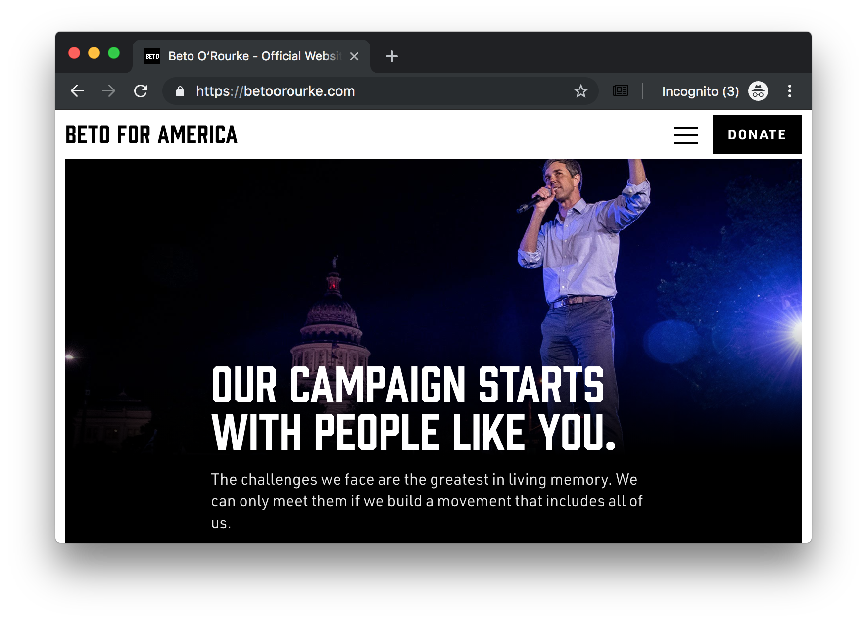
With such an aggressive, athletic display face, what struck me the very most about the web presence was its restraint. It is a custom WordPress theme titled, what else, “beto.” It is not geometrically experimental or daring. It does not utilize space terribly well, opting for a full-width header image which is not terribly high quality or exciting. The treatment of space is not a triumph. Text is all-around too small and difficult to read.
At some viewports, Beto loses his hand:
Oh no! Beto, your hand!
Notice, too, the removal of blue accents on the call-to-action. His team has been fiddling with the site the entire time I have been writing this article. At one point, the call-to-action was an entirely inappropriate beige.
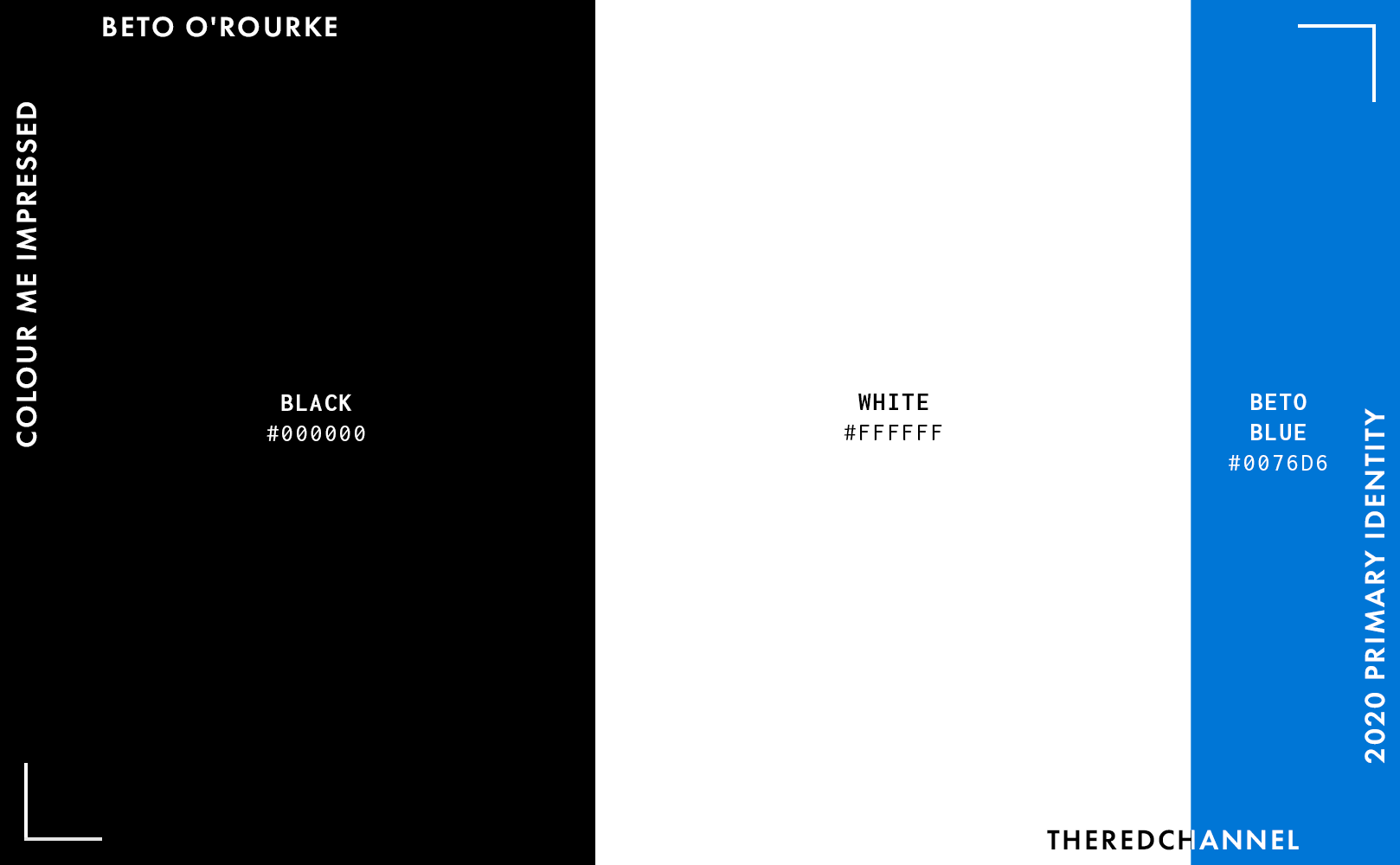
On the web, Beto pairs his signature black-and-white with sparse accents in blue. I am sticking with the blue, as that is the variant I liked the most. It mimics the lens flare in the cover photo, which was a smart choice.
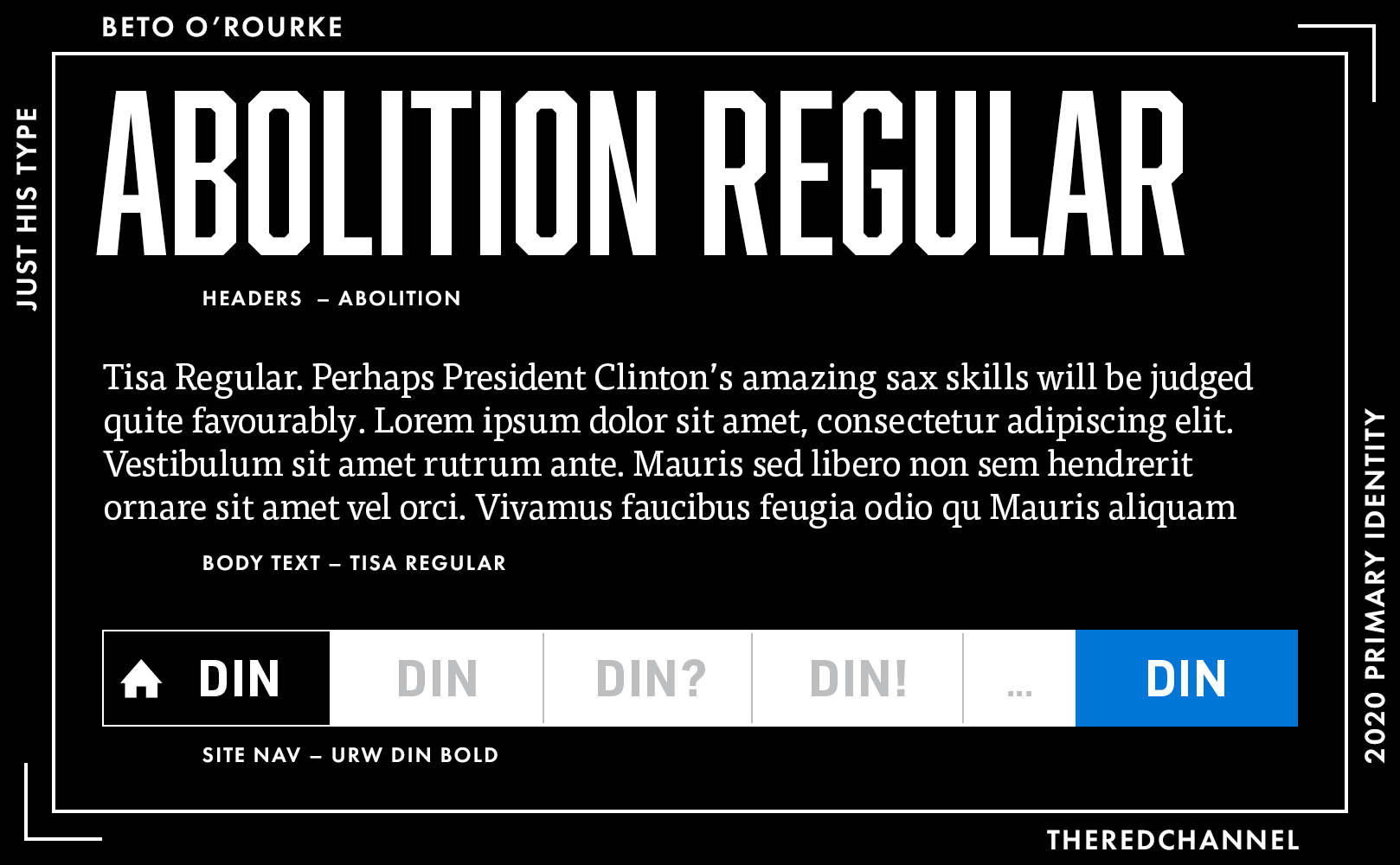
The name of that ubiquitous, iconic chamfered face is Abolition, from Font Foundry. Sub-headings and navigation are in URW DIN, while the body text is a thin wedge serif, FontFont’s Tisa. Not bad choices, they would indeed be legible if the website developed a proper sense of scale.
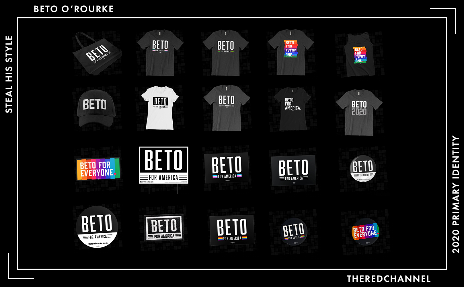
Number of SKUs: 28
Pride merch?: Yes! 🤗 (Rainbow and Trans pride colourways)
Going rate for a T-shirt: $30.00
Beto is so darned lucky, as he is afforded the tremendous opportunity to get away with using a whole lot of black. Black merchandise looks fantastic, and it is easy to make black look fantastic. This logo, recycled from the Senate run, has made cameo appearances on apparel far, far outside of Texas and became something of a phenomenon. Simple applications of a simple logo in a simple colour, not a bad way to rake in small-dollar donations.
Hat tip to the Pride-themed merchandise:
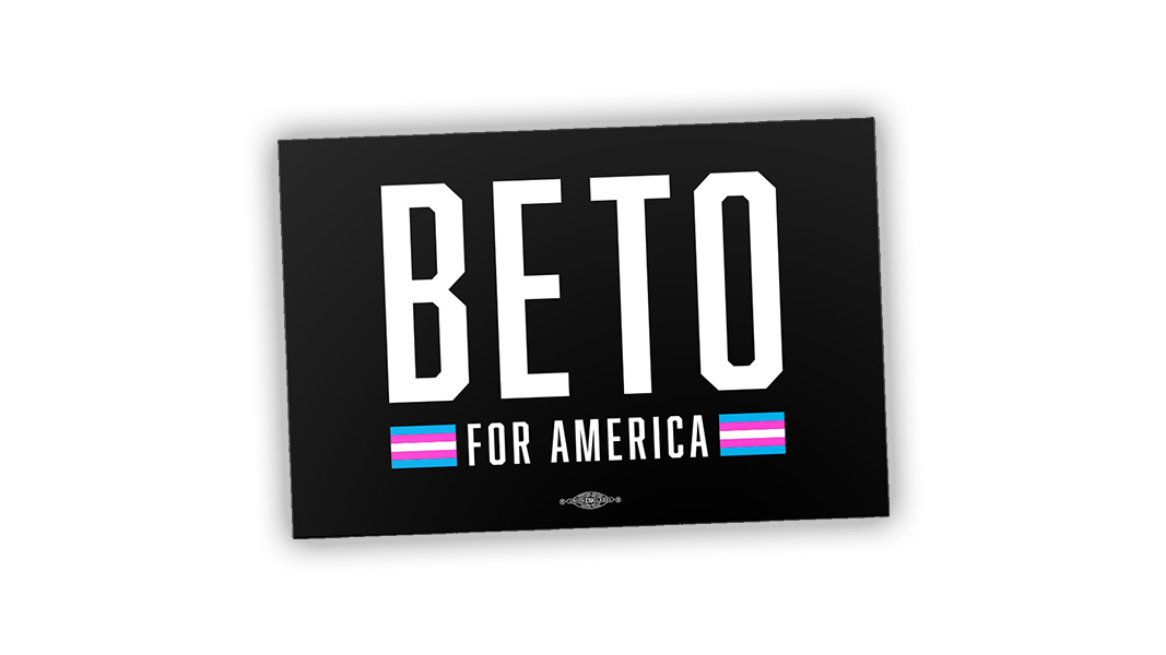
Converting the horizontal bars to Pride flags was a nice touch, a tactful way to incorporate a type of branding that necessitates bright colours into an identity that is overwhelmingly black.
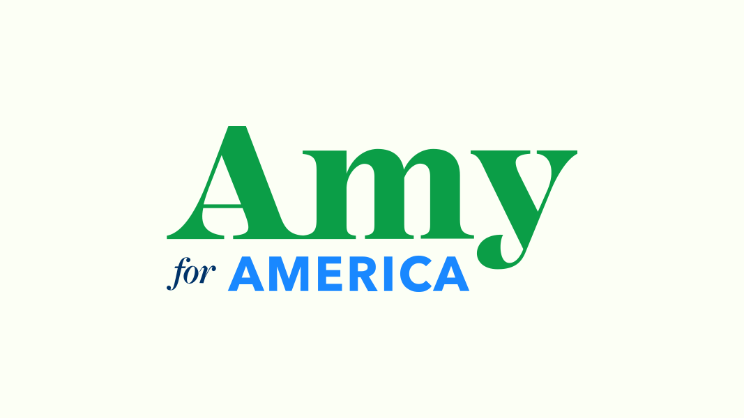
Amy Klobuchar
![]()
Date Announced: 10 February 2019
Slogan: Amy for America / Let’s Get to Work
Polling at: 1 per cent (Emerson, June 21–24)
Amy, Amy, Amy. I have an otherworldly compunction that presses me to handle this logo with kidskin gloves, as I want desperately to see more serif applications in politics. So, let me get that out of the way first: I strongly applaud the decision to go for a serif. It provides immediate differentiation, and we all have Retina Displays now, so the technical barriers to legibility are minimized. The freshest memory most of us share about serifs in politics is Kerry 2004, but this is 2020, and it is high time to overcome our serif scruples and superstitions.
I want to treat it nicely, I feel a duty to treat it nicely, but I cannot. The balance is uneasy, and the tag line not only unsuccessfully mixes typefaces (Freight Text and Avenir Next), but does not quite match with the face up top (Mackay). Freight Text and Avenir do not have to look awkward together, sometimes they can get along like old buddies. But, come on! There are three faces in one logo! How did anyone permit this to happen?
And the colours are not quite there yet. Observe the stylistic alternate:
This is a disaster. It is three typefaces and three colours. Oh, and it is on a field of ivory. Four colours?! The brighter blue feels quite uncomfortable alongside green, and none of it works at all against ivory.
It is distinctive, it looks like nothing else, but perhaps there are reasons for that. Three typefaces, in three sizes, in three colours, and three styles imparts a great deal of eclecticism into the effort, which I fear that the sheer mojo-bestowing BDE of selecting a serif may not wholly overcome.
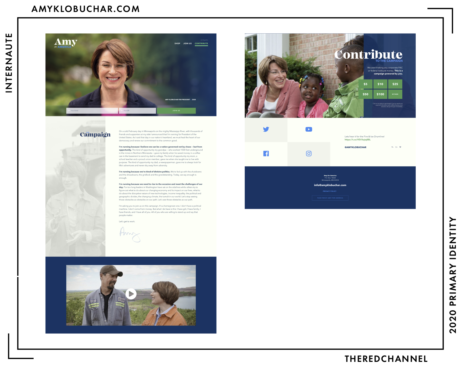
Built With: WordPress
Multilingual?: Yes! 🤗
Amy’s page has not changed much since her date of announcement. It is a WordPress site by Scotch Digital which uses the ScotchPress theme. The gradient across the full-width header image conveys the green-and-navy experience central to Klobuchar’s brand and gets away with itself, which is a nice surprise. Most gradient applications range somewhere between “fine [but dated]”, and “this was unacceptable at any vintage.”
It is coloured well, for both readability and maintaining visual interest. The use of an ivory in the background is surprising and pleasant. It is not spartan, but also does not overwhelm the reader with information. The choices of photography are considered and professional. As a whole, I find the website to be the most successful thing about Klobuchar’s campaign.
The social icons, which light up in all manner of discordant, technicolour vomit on mouseover, could use some tweaking:

The view on desktop is much nicer than on mobile, where some of the vector graphics used as headings get text-wrapped and otherwise shunted around to undesirable places.
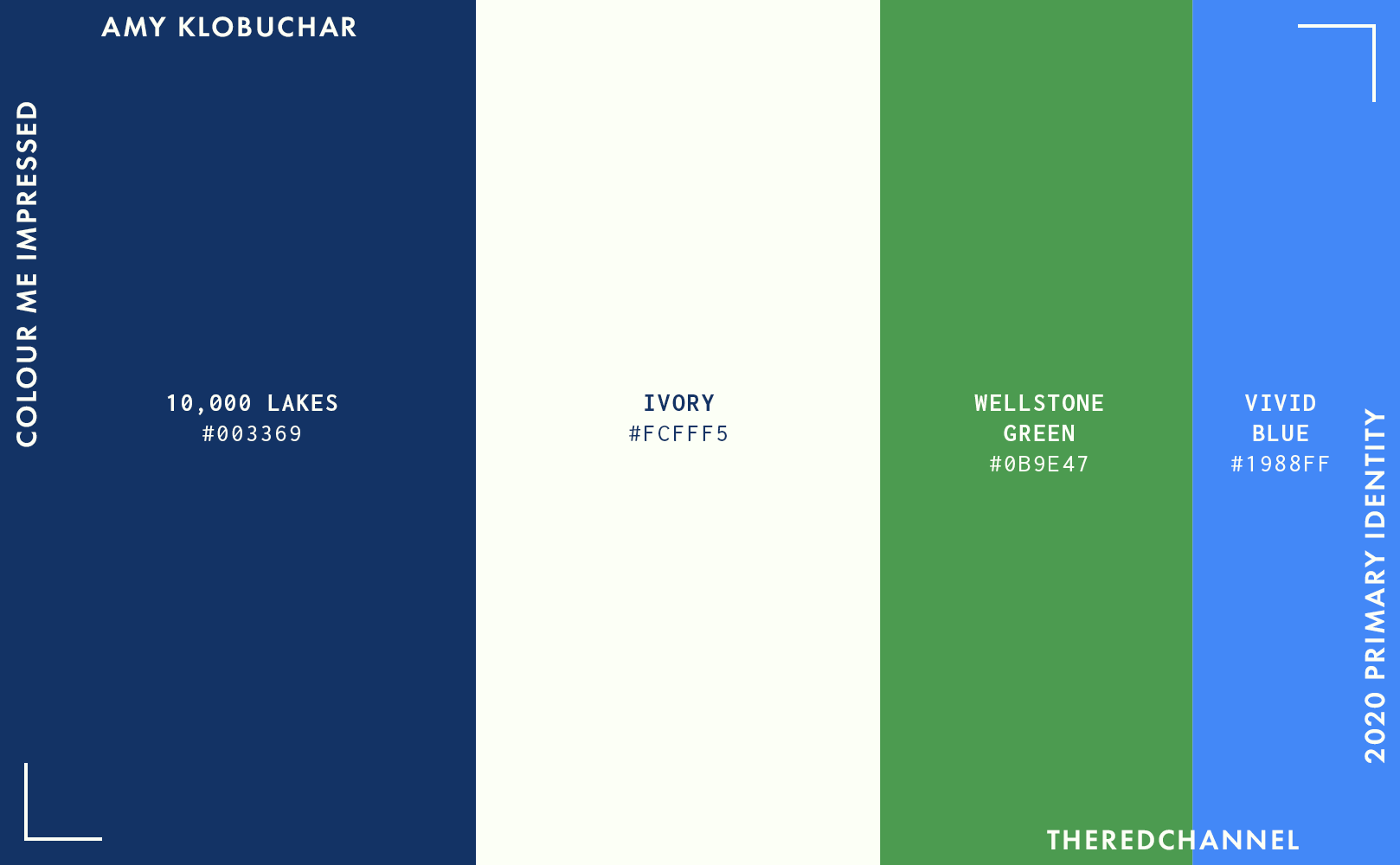
Aside from the serif in the wordmark, colour is the real point of departure from the field for the Klobuchar brand. Amy goes off into a field of her very own – and a verdant, Kelly green field, at that. I grew warmer to the green after seeing so many later entrants (viz. Bill de Blasio) flub that colour spectacularly.5
These colours, when the colourways are not managed by someone with the drive to wield office supplies as projectiles, can fall out-of-balance and telegraph their ill-will towards one another with abandon. When this happens, the entire effort appears vintage, and not a particularly appealing vintage. The ivory could feel quite expensive, though in an application with a whole bunch of shouty colours and a jumble of typefaces, refinement may be a reach.
On the green, I must remind the candidate yet another time:
Klobuchar is running for president, not selling me a tractor. A fresh and interesting choice, though demanding of both sparing and smart application. Do not leave the viewer awash in it. The line between verdure and véreux is quite thin, indeed. Let us hope this campaign does not reach its terminus in merely looking green around the gills.
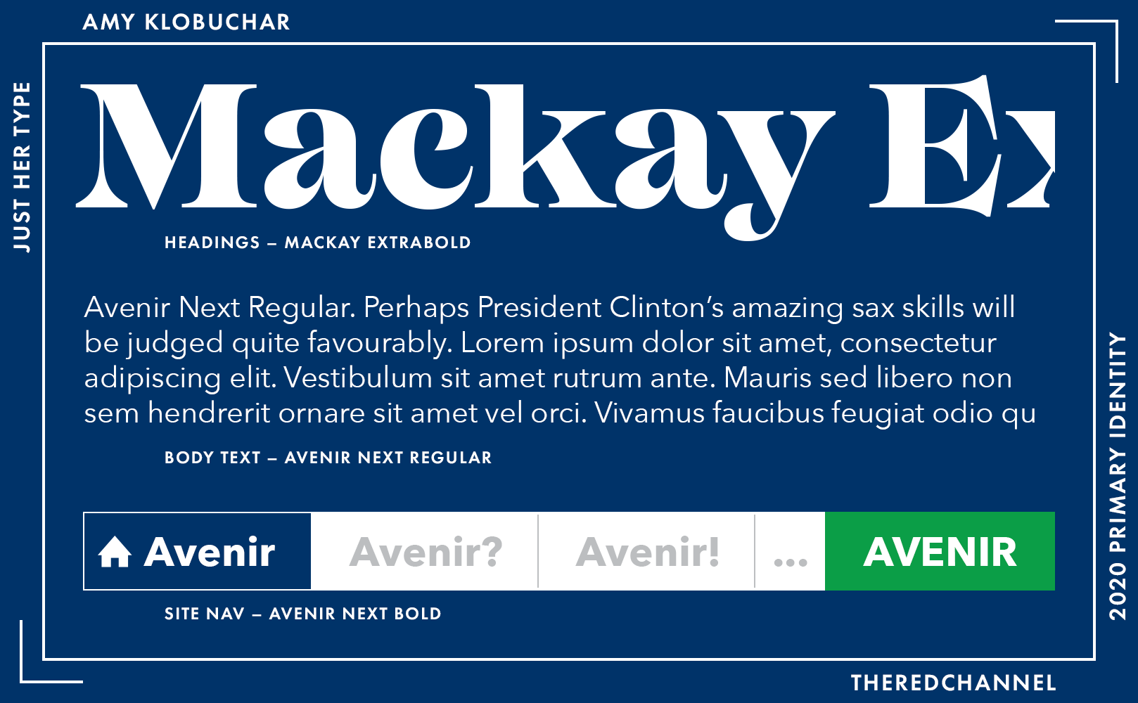
Mackay is a distinctive and characterful serif face. It is quite interesting on Klobuchar’s near-decorative headings! The distinction is, sadly, not at its artistic heights in the given name “Amy.” I have had multiple conversations on the appropriateness of the almost-canine terminal on the lower case Y. It is a polarizing feature, to say the very least. The other headlines on her website are more successful. Like Booker’s blue and de Blasio’s display face, this typeface is likely another “take a note of it, but use it somewhere better” feature of the 2020 campaigns.
The body text and navigation are Avenir Next, which is a readable text face. Better for this application than its close stylistic cousins such as, say, Futura. It is also interesting to see the geometric sans Futura-like as the text face instead of the display or in the logo, which is a departure from what other Democrats are doing.
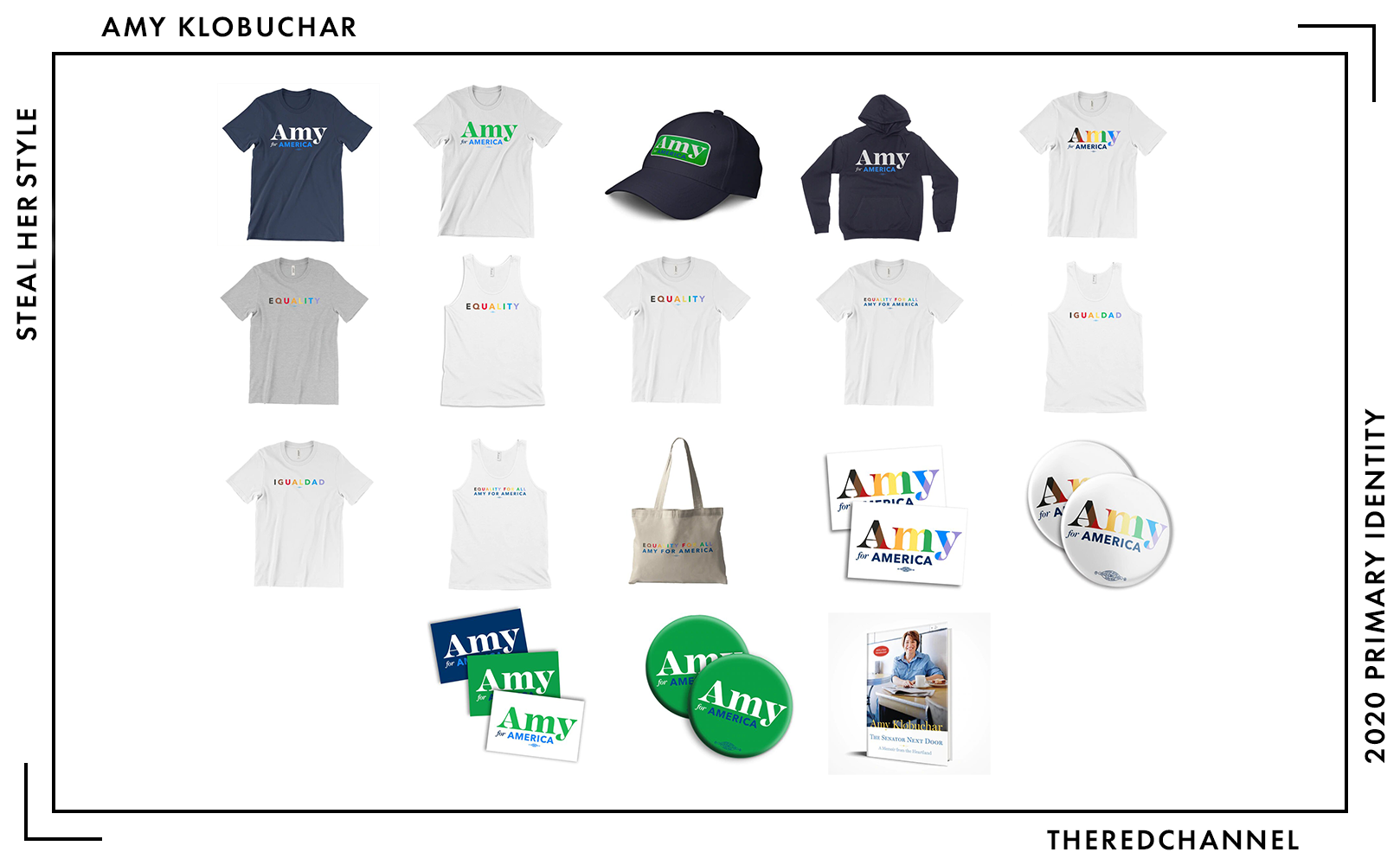
Number of SKUs: 25
Pride merch?: Yes! 🤗 (Rainbow colourway only)
Going rate for a T-shirt: $29.00
Amazingly, the merchandise shies from green textiles. But fear not: There is precisely one green button and one green bumper sticker. Wasn’t this supposed to be a focus colour?
I will highlight one distinctive article:
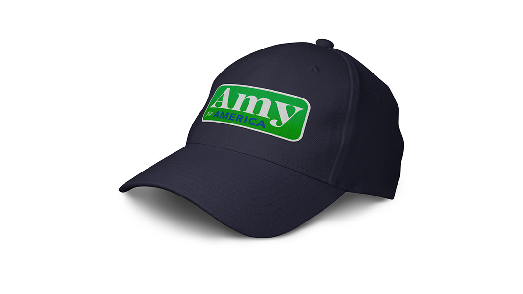
This ball cap features an embroidered patch which would be at home just as comfortably on some sort of agricultural implement. It takes a graphic element I would not make, and sticks it on a type of garment I would not wear. Given Klobuchar’s attempts to draw outside traditional bases of party support, perhaps that is not a bad thing. But someone – anyone – in this primary needs to do a branded transparent top already. Give me the people what I they want!
Tulsi Gabbard
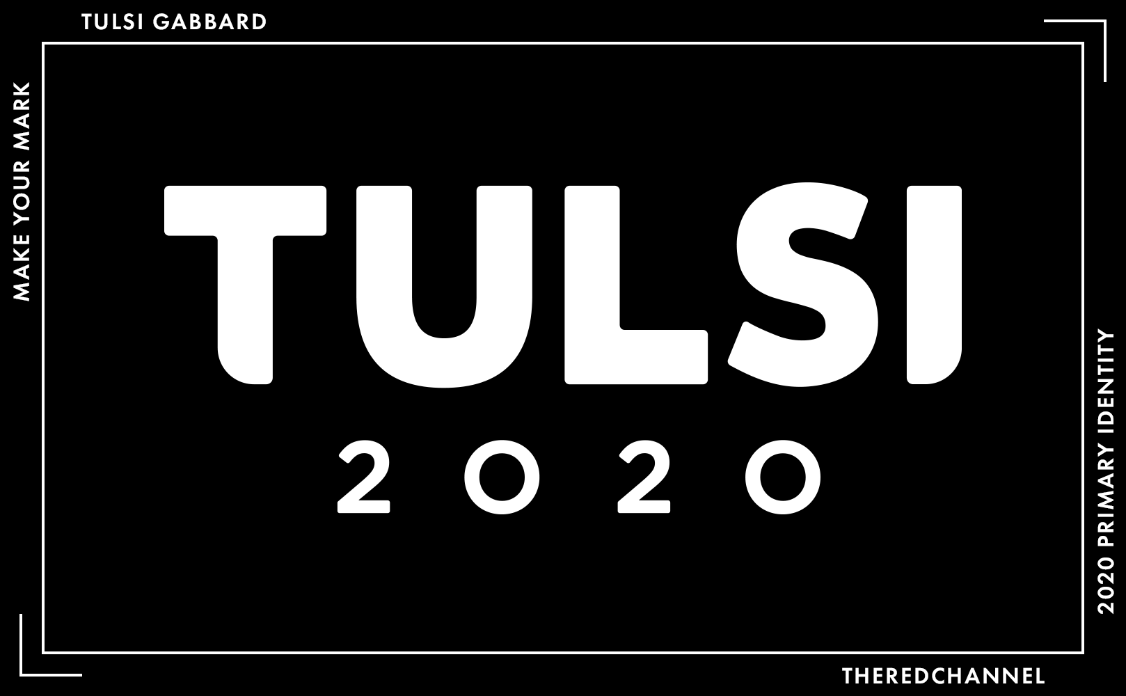
Date Announced: 11 January 2019
Slogan: Lead with Love
Polling at: 0 per cent (Emerson, June 21–24)
It is with a heavy heart that I announce the demotion of Tulsi’s blazing-impact-crater wordmark, which no longer appears fronting any pages of her website.
![]()
Our time together was too long.
My theoretical problems with her gradient-based application, namely that it was frequently unusable, appear to have borne out in reality for the campaign. It is unfortunate that my additional concern, that the mark is boring as all get-out, becomes readily apparent in monochromatic applications.
The rounding of the first and ultimate glyphs is not a success. It does not contribute in any meaningful way to a sense of balance, what with the yawning maw between L and S in the middle of the wordmark.
The switch to a nondescript monochrome identifier, however, did not signal a simultaneous blandening of the web presence:
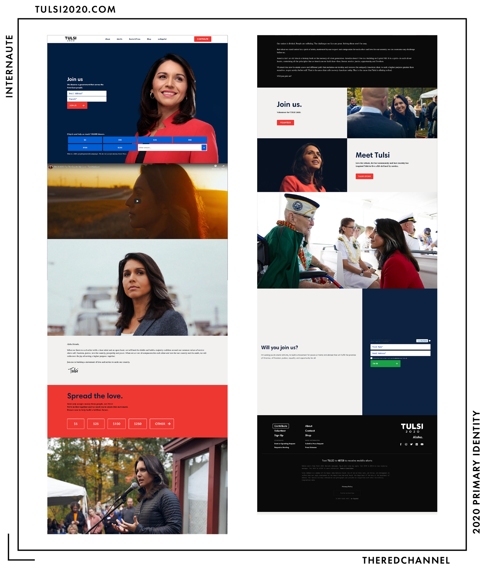
Built With: Drupal
Multilingual?: Yes! 🤗
The website, unlike the logo, is actually not boring! The full-width header is simple and show-stopping. The site begins with a tremendous application of colour, which is praise that I will allow to continue through to the remainder of the page. Perhaps the design team is a bit too heavy-handed with the red towards the middle, but it is still simple and smart. This is not a candidate I have much praise for on any matter whatsoever, yet I consistently see talent in the web work. Make of that what one will.
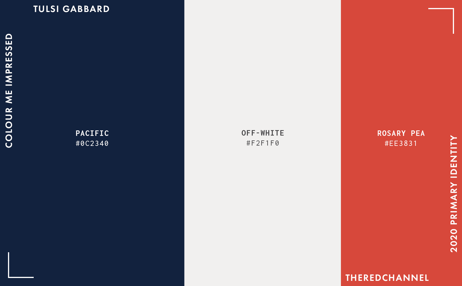
The colours are smart. I like the red, even if there is a lot of it. Extensive use of black is moderated with blocks of off-white.
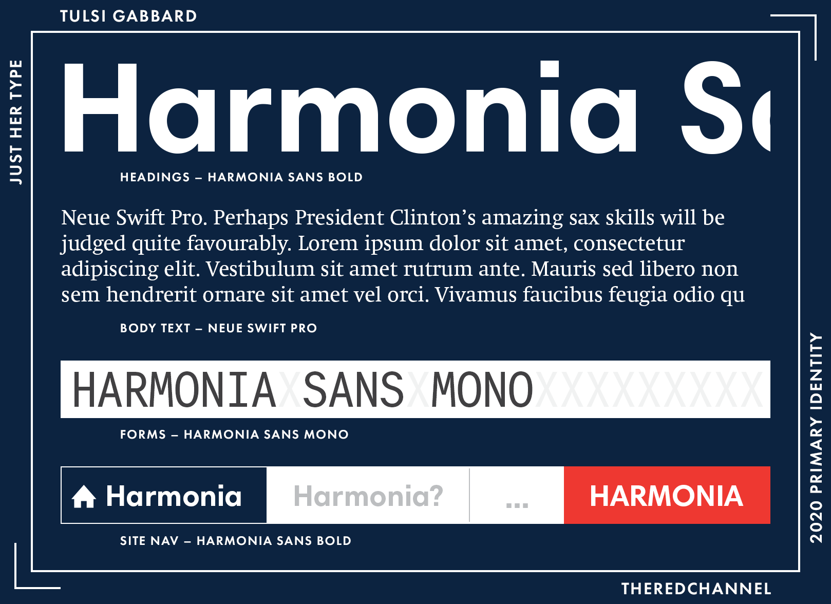
Her type has not changed from my prior assessment, so I will copy over the comments:
Body text is Neue Swift, a serif by Linotype. Headings are in Harmonia Sans(from Monotype), as are block quotes. All forms and the fine print in the footer are in – and this is the exciting one to me – Harmonia Sans Mono. Monospaced fonts in presidential campaigns! This is a brave, new frontier. How long before we are visited by the first web brutalist campaign?
It is smart to sample around within the same family, and all of these choices play quite well with one another. Harmonia is a nice geometric sans, and the complement of available styles and weights is luxuriously varied enough to handle pretty much any task Gabbard may throw at it over the course of a campaign. On the body copy in particular, she could stand to go up a few point sizes or set a lower maximum width on the text column, as it is quite laborious to read as-is. Characters per line clock in around a staggering 130 (80 is best practice for web).
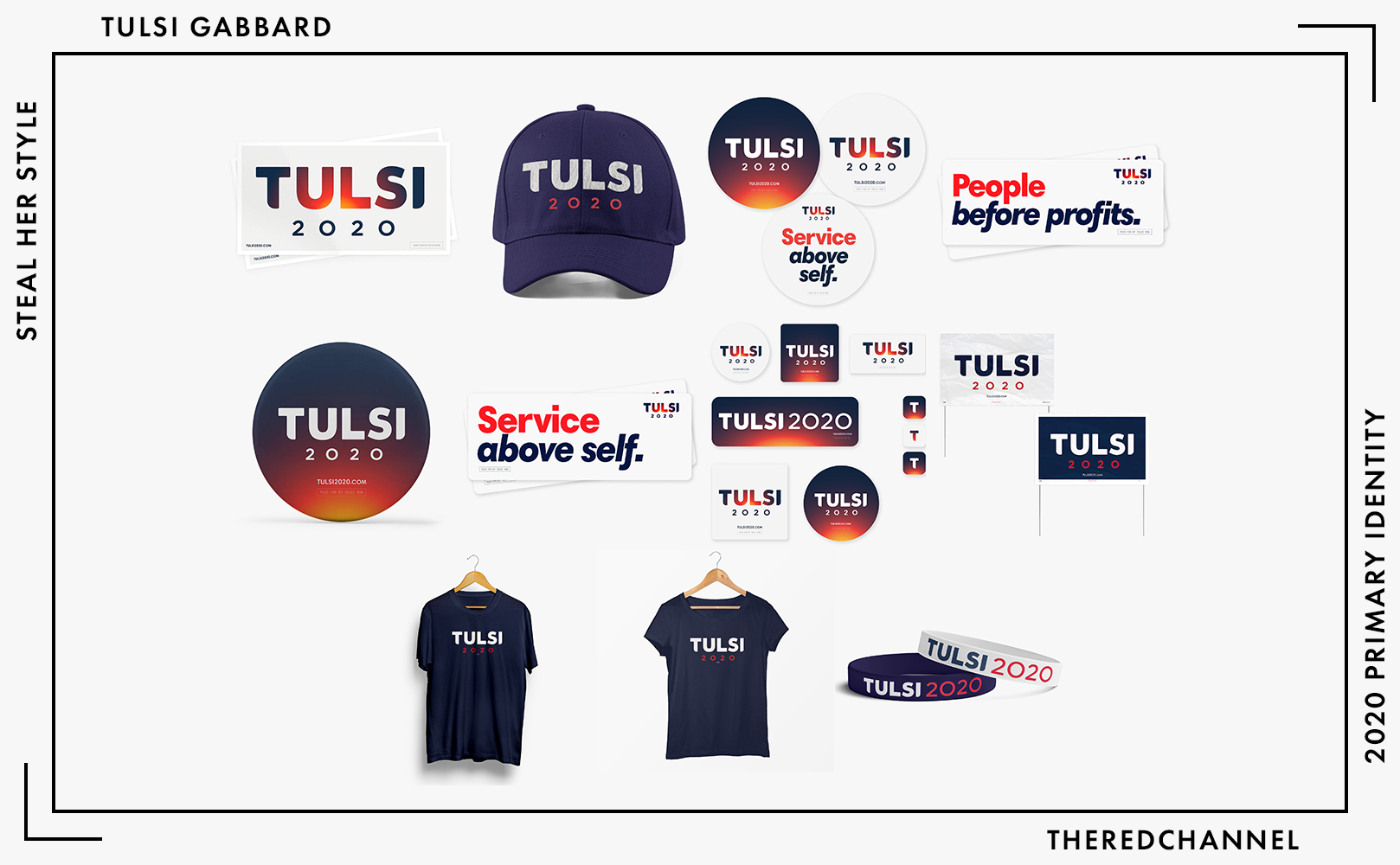
Number of SKUs: 11
Pride merch?: No 😞
Going rate for a T-shirt: $24.99
Of the candidates who bothered to put a store online, Tulsi’s is the smallest – and this is after it more than doubled in size (it was formerly four SKUs). Fans of the apocalyptic conflagration logo, rejoice! While abandoned online, a small selection lives on in her merchandise, though only on white products, as it tends to look atrocious paired with absolutely anything else.
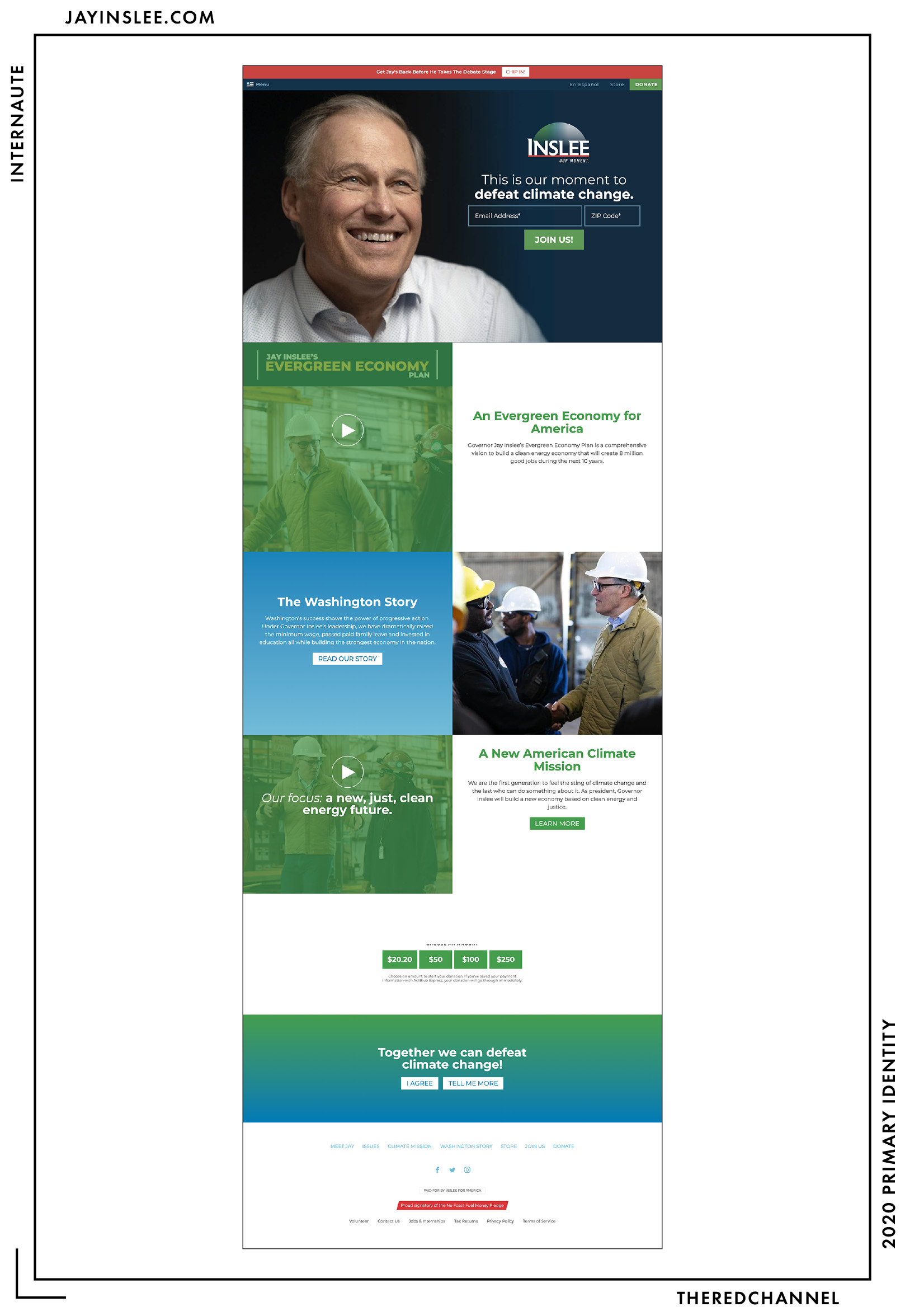
Jay Inslee
![]()
Date Announced: 1 March 2019
Slogan: Our Moment
Polling at: 1 per cent (Emerson, June 21–24)
…right. This one comes with prior criticism attached, and has been compared to everything from late ’90s telecoms to pharmaceuticals to a film studio vanity card on VHS. The assessment of the work as both dated and megacorp-esque is not an improper conclusion. I feel that a lot of non-revelatory criticism gets passed off by bestowing upon a branding effort the hand-waving descriptor “corporate,” but this mark is a near-celebration of all that corporate is and can be.
The gradients aren’t great. And there are two of them. There is the colourized gradient from green to blue, purportedly evocative of natural bounty and stewardship, with the added bacon bits of chaos that stem from having the entire hemisphere dissolve into transparency towards the bottom. This logo looks to present a nightmarish challenge to colour standardization between media – and the payoff would be minimal, as even the top-form applications have colours that are muted at the very best. It is the sort of graphical device which gets progressively degraded by sequential photocopying, baked-in crazing from compounding compression artefacts, and general mistreatment by support staff (or even just outside graphic artists on contract and in a time crunch!) and becomes a mess. Do not forget: Blue plus green makes brown. By the time Inslee withdraws consideration, the logo on the memo may be nothing more than an ethereal smudge. I cannot imagine a monochromatic application of the mark, something which every decent design should have, and without which a decent design is rarely ever born.
There are many ways to evoke the Earth stylistically, and I have no clue why they chose this one.
The idea behind the graphic, that we are dwarfed by the planet, seems to comport with the theme of this single-issue campaign. The subtle-serifed face in the wordmark, Astoria by Alan Meeks, is actually pretty darn interesting.6 The tracking between letters is atrocious, but it is an eye-catching choice. It is set in small caps, which I believe to be unique among the candidates this cycle, though that choice helps little in weakening the criticisms of its aged appearance. The tagline, however, undoes any typographic goodwill this mark may carry. While the serifs on the name hint backwards, “Our Moment” leans forward in an all caps sans serif, as if hastening its exit from this unnatural disaster, only to be contained with a full stop. To add technical insult to that injury, it is entirely-too-small and kerned dreadfully wide.
And the baseline. I have not a clue as to why it is red – nothing else is red – and it appears to be merely adding a tertiary (or maybe even quinary) colour into the mix for absolutely no good reason. The baseline of the type uneasily meets the underline, and the two squish up a bit – not only on the bowl of the S, but the entire baseline of the surname “Inslee,” which appears to be set into the understroke a by a hairline. Why does the red bar slant like the tagline when the text is upright? Why is anything slanting at all? Why?
Built With: Honestly, I haven’t a clue what platform this is. Hit me up on Twitter.
Multilingual?: Yes! 🤗
The main problem with the web presence is the treatment of colours. Much like the logo, there are a lot of them. I count four different blues, two greens, a grey, and a red – seven. The red underline from the logo gets a brief call-out in the footer. Other than that, the element of red is forgotten.
I understand the impulse: To shoehorn red, white, and blue into a design which, but for outmoded norms of politics, would be confidently green. I also understand that a lot of people are using green in less-than-successful applications, and there may be anxious pangs to swerve away. But in no universe does that require four separate shades of blue.
I am no fan of the amateurish gradients on the page, either. They shout their dissent from the rather sedate navy in the full-width header, and also serve to remind how washed out the colours in that logo truly are.
The layout is very simple, this is a dime-a-dozen template, but that is not necessarily a problem. It looks fine. It treats text mostly fine. There is lots of big, open space. The cards are simple, readable, and centre-aligned, with unremarkable fade-in transitions. It is a pedestrian, though not technically faulty, effort. The problem is and always has been the discordant and distracting treatment of colour.
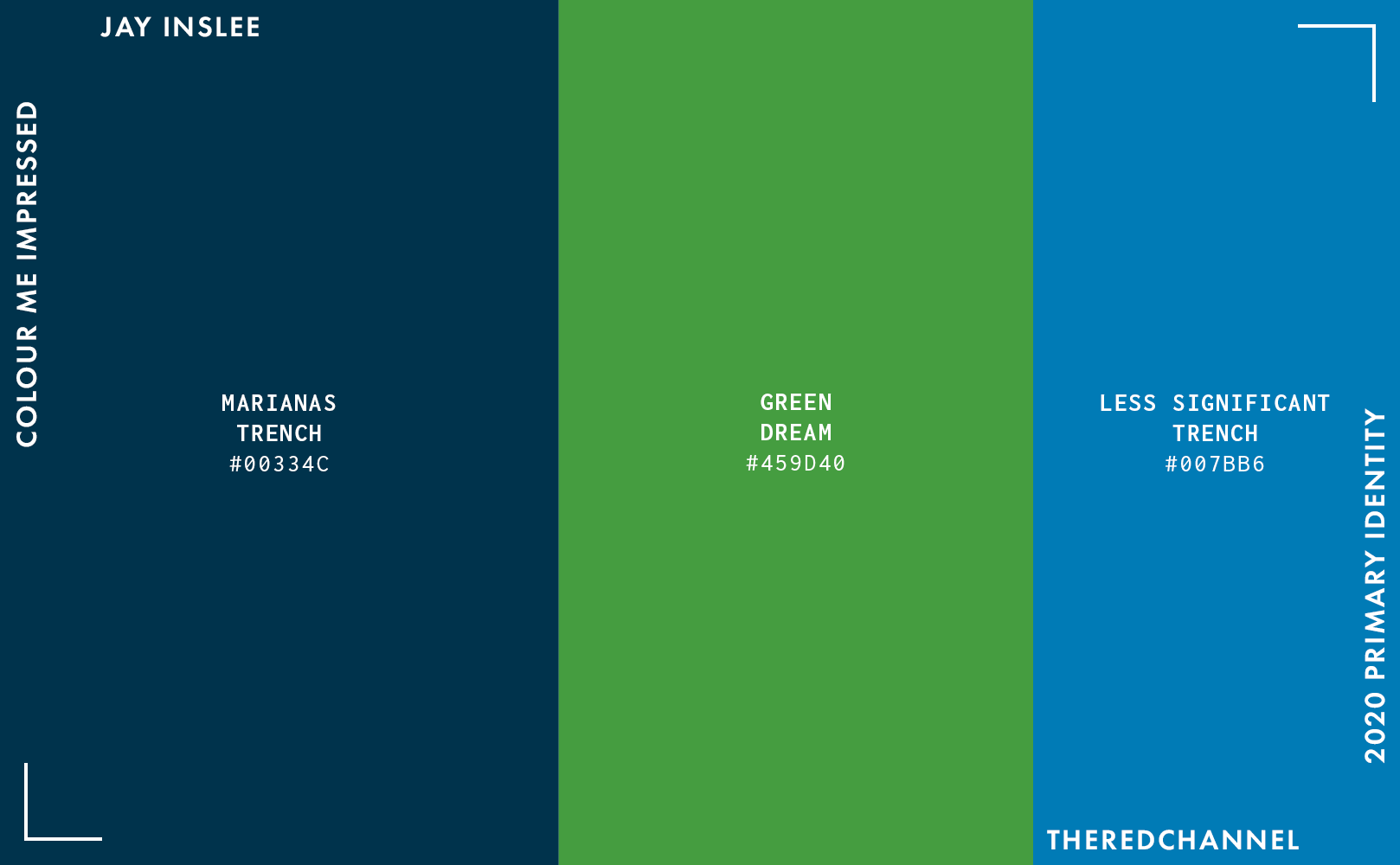
Here is a simplified palette. I removed some of the crufty shades which don’t get much play on the website, as I do not feel like dividing by seven. The navy is doing a lot of the heavy lifting in bagging this project the “dated” and “corporate” critiques. There is potential for it to look better, if only the graphical treatments were greatly simplified.
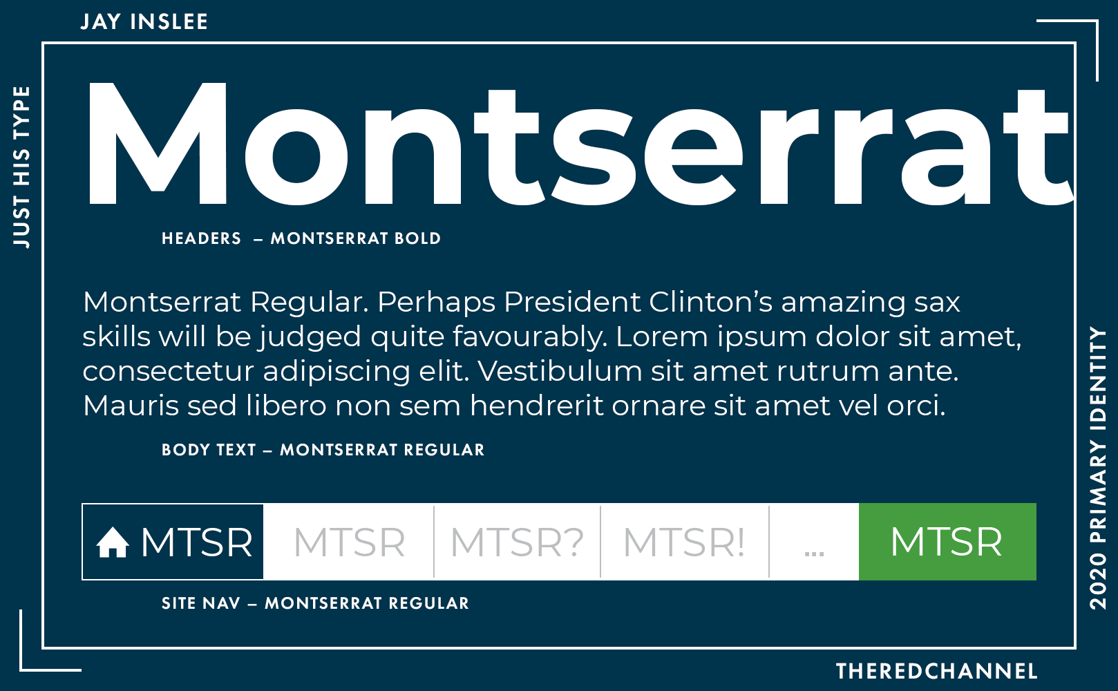
The hinted serif of the logo does not make a reprise in the web work. Every element is Julieta Ulanovsky’s ubiquitous Montserrat. It is a good font that people choose when they want to look the most like Gotham that is possible within the restrictive confines of “free.” Like every other choice made on the web, it is unremarkable.
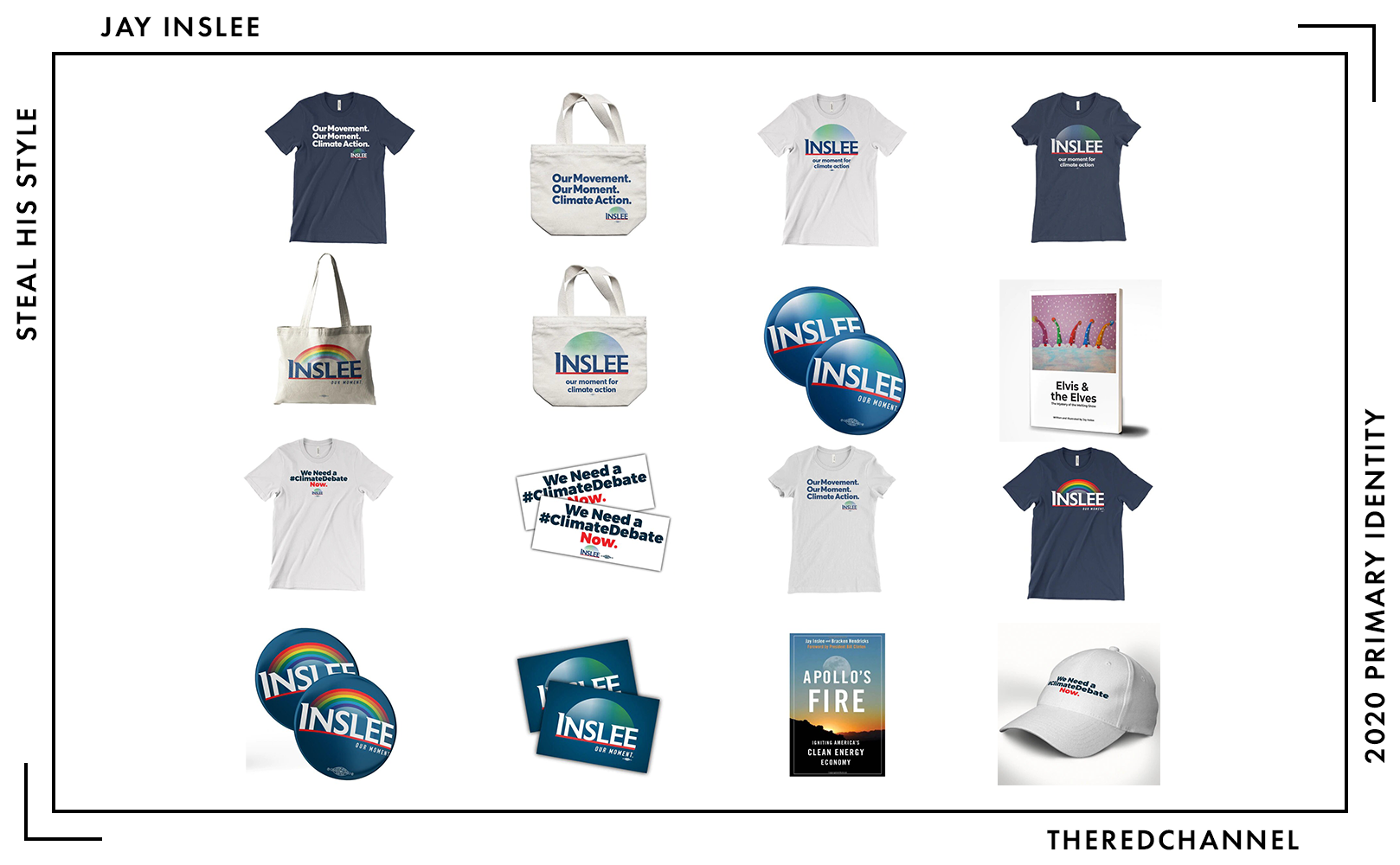
Number of SKUs: 21
Pride merch?: Yes! 🤗 (Rainbow colourway only)
Going rate for a T-shirt: $25.00
Not so sure what to say about the merchandise. It is all large, fairly insipid reproductions of the logo, plus two of Inslee’s books. One point of interest may be the applications on raw canvas:
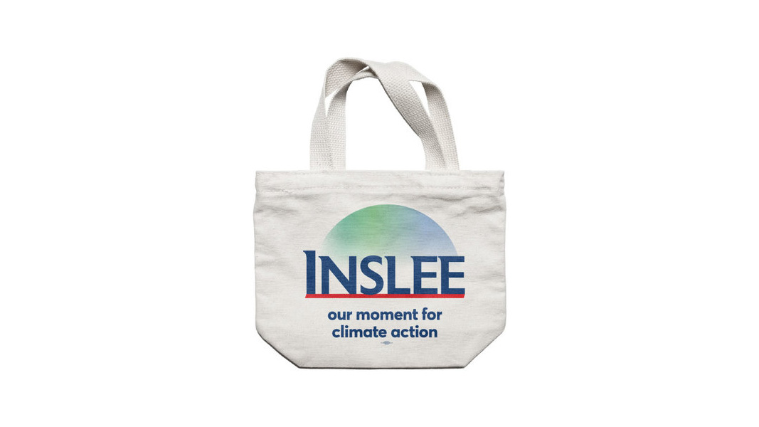
An interesting effort which reminds me how much I loathe transparency. The hemisphere is incredibly washed out, particularly when a comparison to red and navy is so readily at hand. Not sure why the awkwardly-applied slogan is lower case, but I am mostly just relieved to see the slanty strapline make an exit.
All in all, I would be delighted to see this brand if Jay Inslee was taking down Bannon in the Biosphere days.
John Delaney
![]()
Date Announced: 28 July 2017
Slogan: Focus on the Future
Polling at: 0 per cent (Emerson, June 21–24)
Delaney is still doing this. I must applaud the stamina. I lack that stamina, so I am just going to copy what I said about this thing earlier:
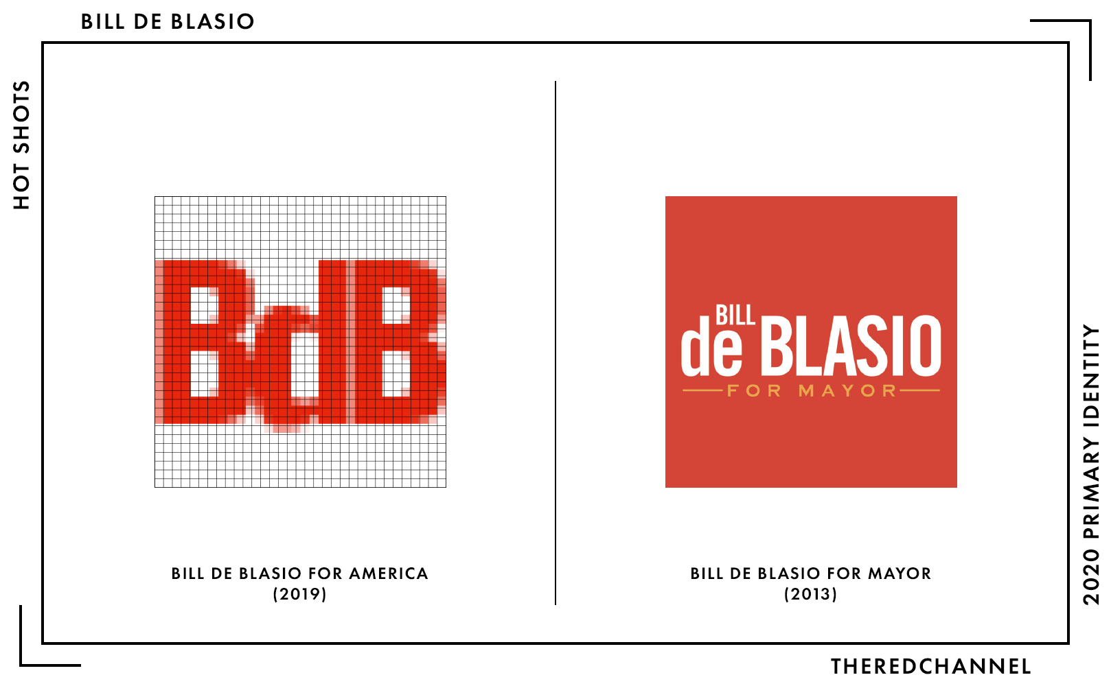
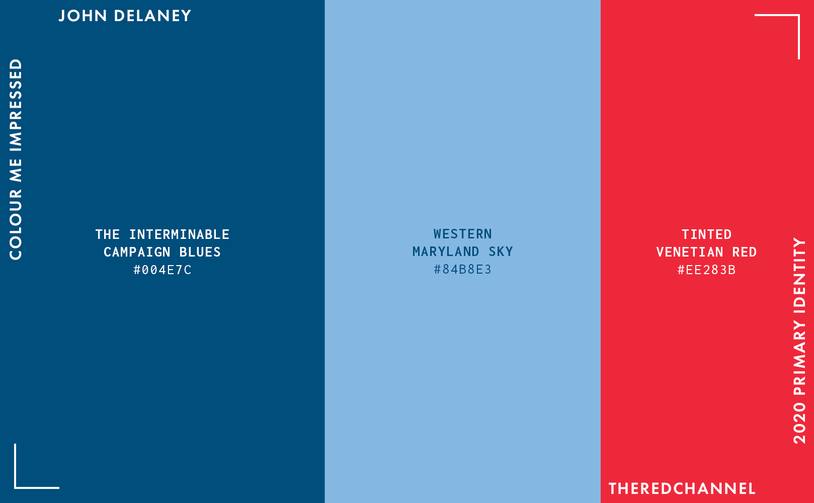
The colours are confined to the traditional U.S. political palette, a smattering of reds and blues, though the bit edging towards cyan is a by-no-means-original break from the monotony. Of particular note, the use of initial caps in the logotype stands relatively unique in the 2020 field. I do enjoy that the first letter suits itself well to being broken out for standalone use. It is a fine corporate mark, in corporate colours. Tireless, like anyone who has been campaigning for 562 days with another 632 to the general. Trusted. Sedate.
The defaced D appears – and I am fully aware this is from an original insight – rather directly cribbed from Sol Sender. We paved Obama’s pastoral paradise and put in… an autoroute? Not that I mind too much, as I could never turn down a decent D.
There is a new variant of the wordmark for Pride Month.
I actually think it is fun! Kudos on putting that (unoriginal) autoroute to good use, John!
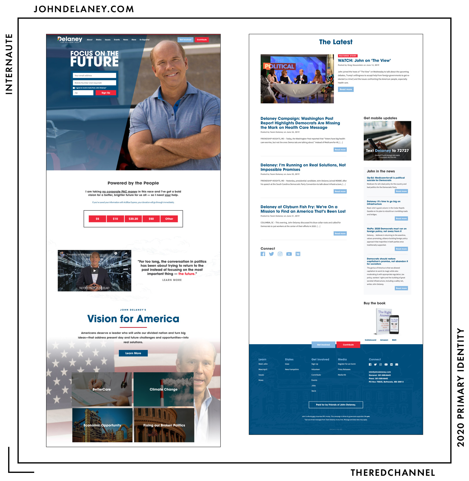
Built With: WordPress
Multilingual?: Yes! 🤗
This website improved greatly over the time since launch. Of course, with a campaign stretching back to 2017, the field of carbon dating becomes applicable. It is still not greatness by any measure, but I must applaud Delaney’s people for their dogged persistence.
The page stopped trying to take a half-hearted bite at the apple of trendiness-circa-2014 and, in doing so, improved a great deal. I mean, it had to, as I am no longer making comparisons between his district and Chernobyl! There is a lot of Avant Garde, the gratuitous and not-too-good photography is pared back, a lot more information is incorporated without the site taking on the atmosphere of a web-based version of Hoarding: Buried Alive. Oh, and there is finally a way to donate from the home page!
His header dramatically breaks upon a return to the top of the page, and it is the opposite of good.

The effort remains replete with low budget wackiness. For one’s consideration, I am providing the 30-second campaign spot, if only for the techno-glam green screen action going on at the end:
…neat. And yet Inslee’s brand is the one running several decades behind?
The colours are the same as always, and they remain unremarkable.
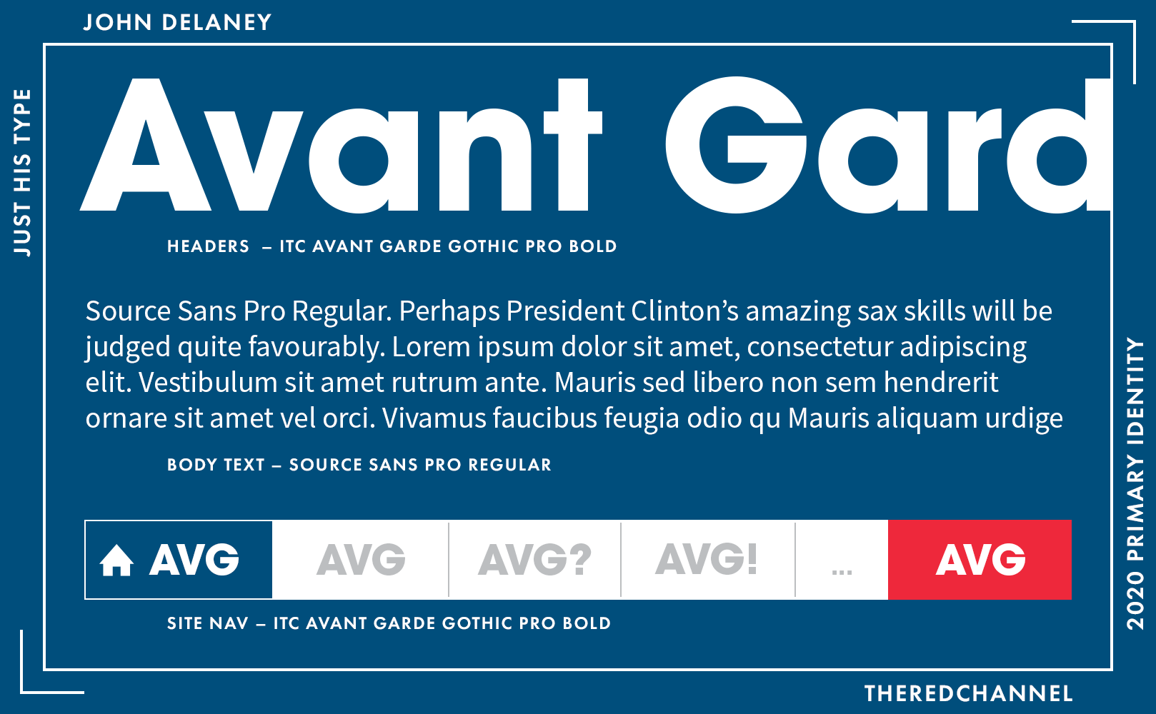
Headings and navigation on the website have now been matched with the Avant Garde in the wordmark. Raleway is out for the body and Source Sans, another freebie, is subbed in its stead.
It is fine work, safe work, and in no way distinctive work. We are going through twenty candidates over the course of two days, is this going to implant the Delaney brand – what little of it exists – into anyone’s memory? I will not remember it tomorrow. Heck, I likely will not remember it by the bottom of the page. And that is saying something, because – good news! – we are almost to the bottom of the page.
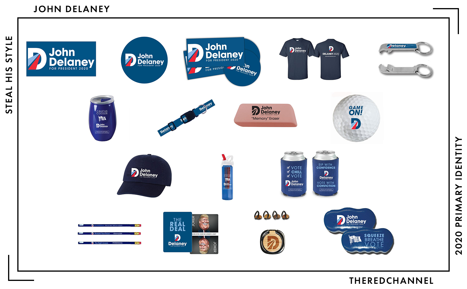
Number of SKUs: 16
Pride merch?: No 😞
Going rate for a T-shirt: $20.20
Delaney’s team had fun with the merchandise, and this is an area of definite distinction, even with the comparatively small assortment.
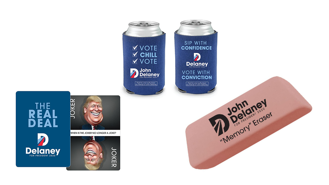
I am not holding these items up as in some way redemptive works of design, because they are not. Gaze upon the type treatment on that beer holder and despair! The ideas, however, from branded erasers to wipe one’s memory of the Trump administration to decks of cards with Donald Trump as the joker, have a sort of wacky yet earnest charm about them. This campaign, small as it may be, is indeed willing to try anything the marketing department dreams up. Oh, and Delaney’s copywriter needs a raise. From the “Memory Eraser” listing:
They may look like typical pink erasers, but these are no ordinary school supplies. Simply place one eraser beneath your pillow before falling asleep and by morning you’ll have forgotten all of the pain, invective, division, and incoherent ramblings of our 45th president. You’ll wake refreshed and ready to set about rebuilding America. And if troubling memories linger of Bannon, Flynn, Pence, Jared & Ivanka, Scaramucci, and all the rest, simply empty the entire bag under your pillow and sleep again like it’s 2009.
2009 is not coming back, we need truth commissions instead of wiped memories, and the news cycle moves at such pace that the only time we think about Scaramucci is when measuring tenure in Scaramuccis, but the idea of eraser-as-worry-stone is humorous. Delaney’s store is as if Archie McPhee ran for president, with similarly snowbally odds.
I love ending on a positive note! Bring a pink eraser on stage as a prop, John!
Conclusions
It is quite taxing to write these. I really wish for some of these good folks to drop out, if only so that I am permitted address the visual sensibilities of the remaining contenders in a serious and normal fashion. Everything is more digestible and personal in, say, a profile article. I am not writing 20 individual profiles. Certainly not for people polling at zero per cent.
À tantôt, we will do the rest tomorrow. See you then!
![]()
While you are down here, a small entreaty: I write TheRedChannel because I love states and I love the visual arts. I want everyone to have logos to study. All of this work is available to the end user without advertisements and free-of-charge. If you saw something here that made you happy today, please do consider helping to keep the lights on and the servers running.
If you saw something that made you unhappy today, please flame me on Twitter!
-
I really do read all the e-mails, friends! ↩︎
-
This content is not sponsored by this sanguineous acid mask, I am just a satisfied, smooth, and unnaturally radiant customer. Amuse your friends and thrill the ladies with this blood-red, $7 chemical peel! Most definitely not Health Canada approved, so those above the 49th parallel north may have to take matters into their own [freight forwarder’s] hands. ↩︎
-
Yeah, Delaney is still around, and will be forever. Focus on the future, darlin’! ↩︎
-
May this brief moment of condón joy in some way make up to the Latinx community for the mayor of one of the most multicultural, multilingual cities on the face of this Earth not bothering to localize his webpage in Spanish. ↩︎
-
My mother, a good and decent designer and Democrat if I ever met one, also lobbied me extensively on the need to be nicer to people choosing to use greens. Hi, Mom! ↩︎
-
This is to say: I disagree with Jon Last. His criticism is worth reading, regardless. ↩︎